The Carrefour Logo: History, Hidden C and Design
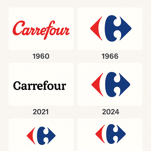
Most shoppers who walk past a Carrefour sign never notice the letter in the middle of it. Between the red arrow and the blue one sits a white “C,” formed entirely by the empty space, and it has been there since 1966. It is one of the neatest pieces of negative space in retail branding, and it belongs to a supermarket chain, not a design studio, which makes it all the more impressive.
The logo has changed very little in almost six decades. That restraint, along with a shrewd use of two colors, explains most of why it still works.
A Logo Built Around a Hidden Letter
Carrefour, the French retail giant whose name means “crossroads,” unveiled the logo in 1966. The original says the design was conceived by the French agency Graphéine. The brief was simple to state and hard to do: work in the letter “C” for Carrefour, but keep it subtle, almost invisible. The answer was two arrows, one red and one blue, pointing left and right, with a “C” formed in the negative space between them. It is so discreet that most shoppers never see it, and that is half the charm. The logo hides its main idea and still makes it plain to anyone who looks for a second.
The timing matters. Supermarkets were becoming social hubs in the 1960s, a postwar version of the town square. Carrefour, founded in 1959, was among France’s first hypermarkets, and its logo had to suggest access, choice and modernity. The arrows imply movement, the crossroads where shoppers meet the store, while the “C” ties the mark back to the name in a way that is playful without being cute. A good logo does more than label a brand. This one tells a small story every time someone spots the letter.
Red and Blue
The color scheme is deliberate, and it is a textbook example of balance. Red is the color of urgency and appetite, the color that says buy now. It is the hue of ripe tomatoes and sale signs, and it nudges shoppers to act. Blue does the opposite. It is calm and reads as trustworthy and reliable. Put together, they push toward impulse while promising dependability.
That pairing mirrors the business. Carrefour is a one-stop shop where you can pick up a last-minute dinner or a lawnmower on the same trip, and its colors cover both moods. The red draws you in and the blue reassures you. Choosing colors that match what a brand actually does is the lesson here. Understanding why two colors work together is what separates a good logo from a forgettable one.
Type and Negative Space
The lettering is as modest as the arrows. “Carrefour” usually appears in a clean sans-serif that puts clarity ahead of personality: no frills, just function. That restraint leaves room for the arrow motif, which is both geometric and dynamic.
The real craft is the negative space. The “C” is never drawn. It is implied, and the viewer has to complete it, which is a small act of participation that makes the logo memorable. It belongs in the same family as the FedEx arrow and the Amazon smile, logos that reward a second look. Intricate designs are easy to produce. A simple one with a clever twist is much harder, and it lasts longer.
The Crossroads
The arrows also say something about the name. A crossroads is a meeting point, and Carrefour presents itself as one for shoppers, suppliers and cultures. The left and right arrows suggest choice and variety, and the global reach of a company that operates in more than 30 countries. Wherever you are heading, the logo implies, Carrefour is on the way.
That idea still fits in 2025, as Carrefour expands its e-commerce business and its sustainability programs. The logo works as well on a phone screen as on a storefront, which is part of why it has never needed replacing. A logo should carry a brand’s character in its shape, and this one does.
Why It Has Not Needed a Redesign
Twitter and Pepsi have been through repeated logo changes. Carrefour’s 1966 design has come through decades with only minor tweaks. A logo that does not need constant updating is usually a logo that is doing its job. The clean lines and strong colors follow modernist principles: form follows function, and the beauty comes from simplicity.
Anyone designing a mark should aim for one that will not look dated by next year. Carrefour’s shows that a strong concept can outlast every fashion from bell-bottoms to TikTok.
The Logo Through Retail History
The logo has stayed constant while retail changed around it. In the 1960s it announced the hypermarket boom, when families drove to enormous stores for everything from bread to bicycles. In the 1990s it became a sign of globalization as Carrefour expanded into Asia and Latin America. Today it stands for omnichannel retail and appears on apps, delivery vans and recycled packaging.
Each period changed Carrefour’s messaging, but the logo held steady through all of them and gave the brand something fixed to navigate by. That is the case for consistency. A logo that can be adjusted without losing its core identity builds trust over decades.
Knockoffs and Cultural Friction
Carrefour’s logo has not escaped controversy. Knockoff versions have turned up on small independent stores around the world, with the arrows slightly off and the “C” less hidden. In 2019 a Chinese retailer’s strikingly similar logo set off online arguments about intellectual property. Imitation is flattering, but for the brand being copied it is mostly a headache.
There have been cultural problems too. In some markets the red and blue palette clashed with local color associations, and Carrefour had to adapt its branding. That is the hard part of running one logo across many countries. A design that looks great in New York might fall flat in Nairobi, and it is worth checking before it does.
The Logo and the Business
Carrefour’s share price (CA.PA) has had its ups and downs, but the brand, with the logo at the front of it, has kept a strong market presence. In 2024 the company reported €91 billion in revenue, driven by its “Carrefour 2026” strategy, which centers on digital transformation and sustainability. The logo’s recognizability supports that growth, appearing on everything from reusable bags to loyalty apps.
A logo does not show up on a balance sheet, but it drives the customer loyalty that does. A well-designed mark can affect a company’s bottom line, and Carrefour’s is a quiet example.
Holding the Brand Together
Carrefour’s identity rests on consistency. The arrows and colors unify a sprawling business, from hypermarkets to convenience stores, and they extend to private-label products like Carrefour Bio, where the logo signals quality. Familiarity comes from seeing the same thing many times, and trust comes from familiarity.
The same applies to a startup or a side business. Make sure the logo works on business cards, websites and social media before you commit to it, and then use it the same way everywhere.
Design Lessons
Carrefour’s logo offers several lessons for designers:
- Use negative space. The hidden “C” shows how empty space can do real work in a design.
- Balance your colors. Red and blue create emotional contrast, and the trick is worth borrowing.
- Keep it simple. Three elements (arrows, “C” and name) are enough.
- Make it mean something. The arrows reflect what Carrefour is, which is why they feel right.
These principles apply however the logo is made. The insight Carrefour’s designers showed, finding a letter in the gap between two shapes, is the part no tool will hand you.
Voice and Messaging
Carrefour’s visual language is friendly but confident. The arrows suggest openness and invite customers in, and the strong colors carry authority. Recent campaigns such as “Act for Food” fit that tone, emphasizing quality and sustainability, and the logo ties them together as shorthand for the company’s values.
Alignment is the point. A logo should amplify a brand’s message, whether that message is eco-conscious or edgy. Carrefour’s logo would be wrong for a goth boutique, and that is fine, because it was not designed for one.
Carrefour Online
Online, the logo does well. Hashtags like #Carrefour and #ActForFood extend its reach, and it turns up in Instagram posts, TikTok shopping hauls and threads on X. Its simplicity makes it easy to drop into memes, which is valuable in 2025’s attention economy. A logo that works online gets seen far more often than one that only works on a building.
Digital versatility should be part of any logo test. Check how a design looks as a thumbnail, an avatar and inside a filter, not just on a white page.
Technology, AI and the Arrows
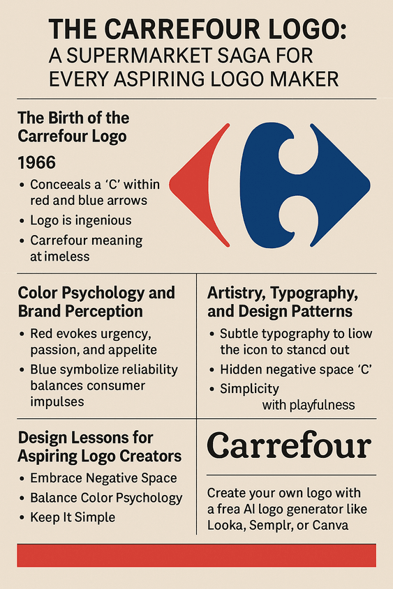
AI has changed how logos get made. AI logo generators such as Looka, Semplr and Canva turn keywords, colors and styles into finished-looking designs, which puts professional work within reach of small businesses that could never afford an agency. The results are only as good as the instructions, though, and a generator left to itself is unlikely to find a hidden letter in the gap between two arrows.
For a brand like Carrefour, the tools are more useful for testing than for inventing. A team might feed in “crossroads” and “red and blue” and get back arrows bent into hearts or a “C” spinning in 3D, then reject most of it as too trendy. They might also use AI to try variations for particular markets, such as a greener palette for eco-conscious regions, or a 2025 refresh with softer arrows or a bolder “C.” The decision about whether any of it improves on 1966 would still be a human one.
The Logo on Products and Services
The logo appears on a huge range of products and services, from fresh produce to financial products. Private-label brands such as Carrefour Bio, Tex and Simpl carry it as a signal of quality. Carrefour Drive, its click-and-collect service, and home delivery extend its reach, and partnerships with Uber Eats bring it to doorsteps in cities.
That range shows how flexible the mark is. Whether a brand sells cupcakes or cloud storage, its logo has to look right on packaging, apps and ads, and it is worth designing for that from the start.
Carrefour Against Its Competitors
Next to its rivals, Carrefour’s logo stands out for ingenuity. Walmart’s starburst is friendly but shallow, and Tesco’s blocky lettering feels utilitarian. Lidl’s primary colors are bold but have none of the story of Carrefour’s arrows. Carrefour’s logo tells a story; most of the others just state a name.
That narrative edge is the lesson. A distinctive motif, whether arrows, curves or a hidden letter, sets a brand apart, and a clever concept beats a generic one almost every time.
Carrefour in 2025
The “Carrefour 2026” plan, launched in 2022, is starting to show results, with a focus on e-commerce and sustainability. A June 2025 report noted 500 new convenience stores in Europe, each carrying the logo. The company has also launched plant-based products under the Carrefour Veggie label, in line with wider food trends.
Its messaging remains upbeat, with campaigns such as “Together for Tomorrow” focused on community and greener living. The logo runs through all of it, as relevant now as it was in 1966.
What Carrefour Gets Right
The Carrefour logo gets a lot out of very little: two arrows, two colors and a letter that is only there if you look for it. It has survived almost sixty years with barely a change because the idea was right from the start, and because the company has had the sense to leave it alone. If you are designing a mark of your own, the hidden “C” is a good reminder that the cleverest part of a logo is sometimes the part you did not draw.
If you want to try that kind of thinking on your own brand, you can create your own logo at semplr.com.


