The Heinz Logo: The Keystone Behind the Ketchup
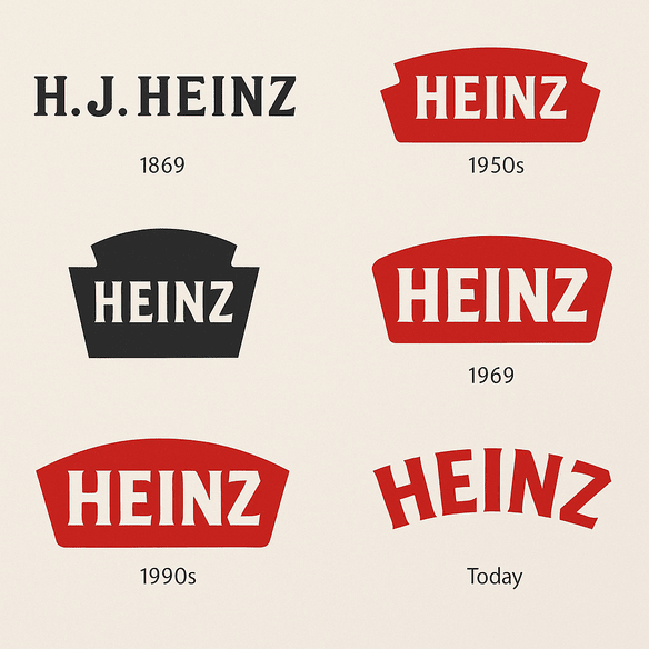
The shape around the Heinz name is a keystone, the wedge that locks an arch in place and the symbol of Pennsylvania, the state where Henry J. Heinz started bottling horseradish in 1869. More than 150 years later it is still on nearly every bottle the company sells. Most people who reach for the ketchup at a diner could not tell you what the shape is called. They would recognize it instantly anyway.
That is the Heinz logo’s great strength. It is not clever and it has never been fashionable, but it has been on the table, in the same red, for longer than almost any other food brand, and its history is a case study in what consistency can do.
From a Pittsburgh Basement to the Keystone
Henry J. Heinz began bottling horseradish in a Pittsburgh basement in 1869. The first logo was a plain wordmark with the founder’s name, built to inspire trust rather than to impress. By the late 19th century the keystone had arrived, a nod to Pennsylvania, the Keystone State, and it gave the logo the silhouette it still has.
Through the 20th century the logo was updated with the times. The typography was refined, and the bold red that is now practically synonymous with ketchup became central. What has kept it going is that it changed slowly enough to stay recognizable at every step. Each version looks like a relative of the last.
The Case for Red
The red is not only there because ketchup is red. Red is associated with appetite, urgency and warmth, which makes it close to ideal for a food brand. According to a 2023 study in the Journal of Consumer Psychology, red logos are 30% more likely than neutral tones to grab attention in food branding. On a crowded supermarket shelf, that matters.
Compare Hunt’s, whose logo uses a more subdued palette, or French’s mustard, with its sunny yellow. Heinz’s red stands out without needing to shout. A bold color can anchor a brand, but it works best when it matches the emotional pull of the product. Heinz is lucky that its product and its color are the same thing.
Type and Shape
The lettering is a clean custom typeface, in use since the 1980s, that balances friendliness and authority. The keystone usually frames the word “Heinz” and adds a geometric quirk that keeps the logo from being just another name in a box. Like Paul Rand’s IBM logo, it shows how much a minimal design can carry when it is used for long enough.
The design has stayed consistent even through updates in the 2000s that modernized its look. The slight curve of the letters sits well against the angular edges of the keystone. That is the balance to aim for in any logo: distinctive enough to own, simple enough to work on a bottle cap or a billboard.
What the Keystone Means
The keystone is more than a reference to Pennsylvania. In architecture it is the stone that holds an arch together, so it reads as strength and stability. For Heinz it stands for reliability: whether the product is ketchup, beans or soup, the shape tells you it is the genuine article. Like Nike’s swoosh or Apple’s bitten fruit, it is a simple shape that has picked up a lot of meaning over the years.
Not Chasing Trends
Heinz’s refusal to chase fashion has served it well. In the 2000s, when other brands added glossy gradients and shine (early-2000s Pepsi is the obvious example), Heinz stayed with clean lines, bold red and the keystone. That restraint is why the logo looks retro and modern at once.
Rumors of a new Heinz logo for 2025, supposedly a sleeker and more minimal update, have prompted both excitement and dread among fans. The dread is understandable. When a logo has been this stable, any change carries a risk of losing something people did not know they valued. Identity is worth more than trendiness, and Heinz has always seemed to know it.
A Fixture Across the Decades
The logo has been in the background of a lot of cultural history. It sat on the tables of 1950s diners. In the 1970s it appeared in TV ads set to Carly Simon’s “Anticipation,” which helped turn slow-pouring ketchup into a cultural joke everyone understood. Now it turns up in the TikTok era of #HeinzHacks, including the ill-advised idea of ketchup as a face mask, and on Instagram, where Heinz Beanz cans are as photogenic as avocado toast.
Through all of it, the logo has stayed shorthand for comfort food. It works in print, on packaging and in social feeds, which is the range any logo now has to handle.
Boycotts and Knockoffs
Heinz has had its share of trouble. In 2019 a boycott broke out in Canada after Heinz moved ketchup production from Ontario to the U.S., and some Canadians turned on the logo itself. More recently, knockoff products imitating the Heinz look have spread, raising questions about how well the trademark is being enforced.
A logo is only as strong as the legal protection behind it. For new designers, the lesson runs the other way: make sure your mark is genuinely your own. A design that drifts too close to a famous logo, however it was produced, is an invitation to a legal letter.
The Logo and the Balance Sheet
Heinz’s parent company, Kraft Heinz, has seen its stock (KHC) move around, closing at $35.12 on June 6, 2025, according to Yahoo Finance. The logo plays a quiet part in the business. Strong branding drives loyalty, loyalty drives sales, and Heinz’s share of the global ketchup market is around 60%, according to Statista.
That consistency has helped Kraft Heinz ride out inflation and supply chain problems. For a smaller business, a memorable logo is one of the few defenses against competitors that costs almost nothing to maintain once it is made.
One Brand, Many Products
Heinz’s identity is tightly managed. The logo, paired with lines such as “57 Varieties,” ties together ketchup, mustard, mayonnaise and everything else under one story. That consistency is why Heinz feels familiar rather than corporate. A logo should be the fixed point a brand organizes itself around, and Heinz uses it that way: the same keystone, the same red, across every product and every country.
Design Lessons
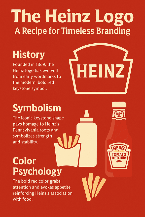
If you want a logo that lasts as long as Heinz’s, a few principles stand out:
- Keep it simple. Strip the design back to essentials, as Heinz’s clean wordmark does.
- Choose color for a reason. Red suggests hunger; blue suggests trust. Pick the emotion you need.
- Make it versatile. The logo should work on a bottle cap and on a billboard.
- Own a symbol. A keystone or a swoosh is something nobody else in your category can use.
- Iterate quickly, then stop. Try lots of versions early, and once you have the right one, leave it alone.
Playful but Confident
Heinz’s visual language is playful and sure of itself. The logo does not shout; it is more of a wink. Campaigns like the 2024 “Ketchup Fraud” ad, which poked fun at imitators, show how a steady logo gives a brand room to be cheeky in its advertising. The mark stays serious so the jokes around it can be silly.
Online, hashtags like #HeinzKetchup and #BeanzMeanzHeinz have millions of posts on X and Instagram, many with the logo in shot. A logo that reads on a phone screen matters as much now as one that stands out on a supermarket shelf, and Heinz’s does both.
AI and a Heinz Redesign
AI tools have changed how logos get made, and it is easy to imagine one being pointed at Heinz. Give an AI logo generator such as Semplr the brand’s basic traits (red, bold, reliable) and it might return a sleeker keystone, a minimalist wordmark, perhaps a 3D version with a futuristic glow. Some of the results would look about 90% like Heinz.
That last 10% is the problem. Generating options is easy; choosing the one that keeps a 150-year-old brand intact takes human judgment. These tools are a real help to startups, and a 2025 report by Superside predicts that 80% of logo design will involve AI. But a brand like Heinz would still need people to decide what to keep, which is most of it.
Beyond Ketchup
The logo appears on far more than ketchup: Beanz, soups, sauces and baby food. The famous 57 varieties were always a marketing figure, since Heinz makes thousands of products. Recent launches such as the 2025 Heinz x Absolut Vodka Bloody Mary sauce show the logo stretching into odd collaborations without strain. Hellmann’s is tied to mayonnaise and Kikkoman to soy sauce. Heinz’s mark covers a much broader range with ease.
Heinz Against Hunt’s and French’s
Next to Hunt’s softer red logo or French’s mustard-yellow script, Heinz stands out for boldness and clarity. Hunt’s feels generic, and French’s leans on nostalgia. Heinz manages to feel universal. Before settling on a design, line it up against your competitors’ logos and check that yours is the one you would notice first.
Recent News
For Valentine’s Day 2025, Heinz staged a “Ketchup Caviar” stunt, presenting tiny ketchup portions as luxury dining, as reported by Food & Wine. The logo was front and center, showing off the brand’s playful side. Kraft Heinz’s sustainability push, aiming for 100% recyclable packaging by 2030, has also attached the logo to environmental messaging, and #HeinzSustainability has trended on X as fans praise, and meme, the effort.
In the UK, Heinz’s new fish and chips sauce, nicknamed “Tartare 2.0,” has stirred debate. It is vegan, with an herbier recipe meant to refresh the classic condiment, but many see it as an expensive rebrand of the discontinued Tartare sauce. Some shoppers like the egg-free recipe. Others say it is old sauce in new packaging. It is not available in Canada, and despite Heinz’s claims about its versatility, it has not won everyone over.
What the Keystone Gets Right
The Heinz logo shows that a great logo does not have to be flashy. It has to be honest about what the product is, and it has to stay put long enough for people to learn it. A keystone, a name and a color that matches the product have been enough for more than a century.
The hardest part to copy is the patience. Heinz could have redesigned in any decade, and in most of them there was a fashionable reason to. It mostly didn’t, and that is why the bottle on the diner table still looks like the one your grandparents used.


