The Land Rover Logo: History of the Green Oval
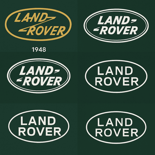
The Land Rover badge was designed to be read on a grille covered in mud. It is a green oval with blocky, utilitarian lettering, and more than seventy years after the first Series I left Solihull it has barely changed. In that time the cars went from farm equipment to some of the most expensive SUVs on the road. The badge stayed on the front of all of them, and it still looks like it belongs on a tractor as much as on a Range Rover.
That staying power is the useful part for designers. Land Rover never needed a lion, a wing or a crest. It had a shape, a color and a name, and it was disciplined enough not to add anything.
1948: A Badge for a Working Vehicle
The logo was born in 1948, when the first Land Rover rolled off the line in Solihull, England. Britain was still clearing up after the Second World War, and the Rover Company saw a market for a vehicle that could go almost anywhere, a sort of four-wheeled Swiss Army knife for farmers and engineers. The badge matched the machine: a plain green oval with the words “Land Rover” in bold sans-serif type. It made no claim to luxury. It claimed capability.
On the early Series I models the oval was often embossed on the grille, and it quickly became a mark of reliability at a time when many of the places these vehicles went had no roads at all. The design was about function first. It told the owner the vehicle would get through the mud, and it did not bother with decoration.
Why Green
The forest green was a smart choice. Green suggests nature, endurance and exploration, which is everything an off-road brand wants to say. It tells you the vehicle is at home in a field or a forest, not under showroom lights. Few car badges use color as directly, and that directness is part of why the oval is so easy to recognize.
In 2023 Jaguar Land Rover (JLR) announced a rebrand, and a new Land Rover logo came with it. The update was sleeker and more modern but kept the green oval at its core. Posts on X argued about it for weeks. Some saw a sensible step toward a cleaner, more modern look. Others thought it betrayed the brand’s rugged roots and made a Defender look like it was wearing a tailored suit. The fact that people argued at all says a lot about how attached owners are to that oval.
The Lettering and the Oval
The logo is a study in restraint. Its sans-serif type is clean, bold and plain, nothing like the flourishes on a Rolls-Royce badge. The original lettering was a bespoke design, made to stay legible even when it was caked in mud. The tone of the type is direct: it gets to the point and then gets out of the way.
The oval does its own work. Rounded shapes suggest continuity and toughness, which suits vehicles meant to outlast their owners. Set it next to Tesla’s angular, futuristic mark or Bentley’s winged badge and the difference is obvious. Land Rover’s design is grounded, both literally and in attitude. It looks like something you could bolt onto a gate.
What the Oval Stands For
There are no hidden pictures in the Land Rover logo and no clever symbols. Its strength is that simplicity. The green oval works as a badge of exploration, a quick signal that this brand is about rough ground rather than city streets. It does not need a lion or a laurel wreath, because the promise it makes is the journey.
That meaning has carried the brand through some big changes in who buys it. Land Rover began as a farmer’s workhorse and is now, in its Range Rover form, a luxury SUV favored by wealthy city dwellers. The logo has stayed constant through both, and it keeps reminding buyers that the brand is supposed to be about capability, not just status.
Evolution Without Revolution
The history of the Land Rover logo is mostly a history of small adjustments. The 2023 JLR rebrand produced a sleeker, more minimal version, but it kept the green oval, the bold lettering and the plain attitude. That balance between modernizing and keeping faith with the original is what keeps the logo from looking dated. It has stayed relevant by not chasing trends.
Rumors on X in 2025 pointed to more of the same: a flatter design that works better on screens. Whether or not that happens, the logo has shown it can adapt without losing what makes it recognizable. That is the skill worth copying. Know which parts of your mark are fixed, and let the rest move.
From Series I to Velar
The badge has ridden on every stage of the brand’s history. In the 1950s it was on the Series I, a boxy vehicle that could ford rivers and climb hills. By the 1990s it was on the Discovery, the family SUV that took Land Rover into suburban driveways. Today it sits on the Range Rover, a byword for comfort and money that still borrows credibility from its muddy ancestors.
Each era brought small changes, a tweak to the lettering or the proportions of the oval, but none of them cost the badge any recognition. That continuity is why a Range Rover Velar can feel connected to a 1948 Series I, even though the two vehicles have almost nothing else in common.
Copies and Criticism
In the 1980s and 1990s, knockoff vehicles from emerging markets often copied the green oval, and Land Rover fought a series of legal battles to protect it. The company has always been aggressive about its trademarks, and with good reason. A badge that stands for reliability loses value fast when it appears on vehicles that are not reliable.
More recently the logo has been pulled into arguments about luxury SUVs and the environment. A green badge on a fuel-hungry Range Rover strikes many people as ironic, and social media has not let the point go. Land Rover has responded by moving toward electrification, with hybrid models and a Range Rover Electric slated for 2025. A logo that once stood for rugged independence now has to carry a brand trying to show it can be greener in fact as well as in color.
The Business Behind the Badge
JLR’s parent company, Tata Motors, has had its share price supported by the strength of the Land Rover brand. In 2024 JLR reported a 22% increase in global sales, driven by demand for the Range Rover and the Defender. The logo is part of that. On a crowded road it is a quick signal of quality and ambition, and it sells adventure and luxury together.
The 2023 rebrand, new logo included, was part of a wider plan to position JLR as a leader in electric luxury vehicles. Investors seemed to like it: Tata Motors’ stock rose 15% in the months after the announcement.
The Same Oval Everywhere
Consistency explains most of the logo’s success. On a muddy Defender or a polished Range Rover Sport, the oval is unmistakable, and seeing it tells you what kind of vehicle you are looking at before you can read the model name. That kind of trust takes decades to build and very little to lose.
The same discipline carries through the marketing, from print ads to social media. The #LandRover hashtag has millions of posts on X, showing the badge in deserts, jungles and city streets, and in every one of them it looks the same.
Lessons for Logo Designers
Three lessons come out of the green oval. Keep it simple: the clean lines and small number of elements make the logo flexible and memorable. Use color on purpose: the green is a statement of intent, not decoration. And give it a story: the Land Rover logo stands for a way of life, not just a vehicle.
Those are judgments, not settings in a tool. A designer has to decide which story the logo tells and which color carries it, and the rest follows from those decisions.
How the Brand Talks
Land Rover’s visual language is as rugged as its vehicles. The logo anchors a message of adventure, durability and understated luxury, and the marketing usually pairs it with wide landscapes or hard off-road driving. It gets attention without trying hard, the visual equivalent of a low, gravelly voice.
Recent campaigns have leaned on that confidence. The 2024 “Defender: Built for the Wild” series used the logo as the focal point of spare, minimal ads and let the brand’s history do the talking. It is a bold approach and it works because the badge is so familiar.
#LandRover
Online, the logo is everywhere. The #LandRover hashtag is full of user-generated content, from overlanders documenting long expeditions to city owners posing with their Range Rovers. On X and Instagram the badge has become shorthand for adventure and aspiration, a lifestyle marker as much as a car brand.
That visibility also makes it a popular subject for fans who like to recreate or remix famous logos with online tools such as BrandCrowd. The fact that a recognizable version comes out the other end, however clumsy the tool, says a lot about how simple the original is.
AI and the Green Oval
AI logo generators such as Looka, Semplr and Canva now let anyone produce a logo in minutes, suggesting layouts, colors and fonts from a few lines of input. Some offer templates that borrow from famous marks, including Land Rover’s, which makes it easier for startups to look professional. These tools can copy the simplicity of the green oval. They cannot copy the seventy years of mud behind it.
Imagine Land Rover’s own designers using one for a hypothetical redesign. They type in “adventure,” “durability” and “green,” and get back a sleek oval with a gradient or a 3D effect. A generator could probably help refine the proportions, suggest alternative lettering or test variations for digital campaigns so the badge works on everything from Instagram to billboards. It would not know why the lettering had to be readable through dirt. That knowledge comes from the brand’s history, and someone has to bring it to the table.
The Range Under the Badge
Land Rover’s lineup covers a lot of ground. The Defender, relaunched in 2020, is a modern version of the classic off-roader. The Range Rover family, including the Sport, Velar and Evoque, serves buyers who want luxury. The Discovery is still the family choice, and the Range Rover Electric, due for a 2025 debut, is meant to show the brand’s commitment to sustainability.
Beyond the vehicles, there are branded jackets, watches and even adventure tours. The logo ties all of them together. On a keychain or a coat it works as a stamp of authenticity, which is the job it was doing on the first Series I grille.
Against Jeep, Mercedes and Toyota
Jeep’s logo, with its bold capital letters, has the same utilitarian feel as Land Rover’s, but it lacks the warmth of the green oval. Mercedes-Benz’s three-pointed star says luxury loudly and feels less connected to the ground. Toyota’s logo is recognizable but more abstract, and it has less of a story behind it.
Land Rover stands out because it is unapologetically itself. It does not try to look flashy or futuristic, and in a crowded market that plainness reads as trustworthy.
The Logo at a Glance
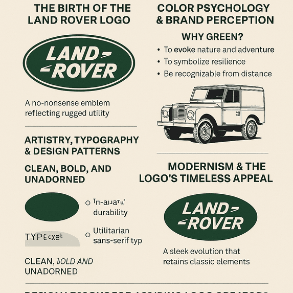
The infographic above sums up the story: the 1948 start, the green that never left, the lettering built for mud, and the gradual tidying up that led to the current version. Very little in that timeline was a sharp break, which is why the badge on a new Defender still connects to the first one.
Recent News
In 2024 Land Rover’s biggest story was electrification. The Range Rover Electric, teased in late 2023, promises zero emissions without giving up off-road ability, and the logo will appear on its charging screens and digital dashboards. The Defender’s role in the latest James Bond film also kept the brand on cinema screens, badge and all.
Coverage of the 2023 rebrand on X split predictably. Fans praised the modern edge and purists missed the old rugged charm. Both camps agreed on the basics, though: it is still green, still bold and still recognizably Land Rover.
The 2026 Land Rover Defender 110 Trophy Edition goes back to the Camel Trophy era. It comes in Deep Sandglow Yellow, a nod to the yellow off-roaders that ran those events, or in a quieter Keswick Green. It adds gloss black accents, Trophy decals, an Expedition Roof Rack and a raised air intake, mixing heritage with modern luxury. Pricing has not been announced, and the model ties in with the 2026 Defender Trophy competition.
What the Oval Gets Right
The Land Rover logo is simple, honest about what the product does, and loyal to its roots. Those are not exciting qualities, and they are exactly why the badge has outlasted every car it was first bolted to. The 2023 update could have thrown it away and chose to tidy it instead.
For anyone designing a logo, the takeaway is to choose a color and shape that say something true about the product, then resist every temptation to decorate them. A green oval on a muddy grille has done that job for more than seventy years.


