The Warner Bros Logo: A Century of the WB Shield
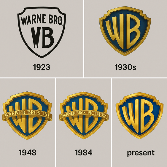
The Warner Bros shield has introduced films for about a hundred years, and it is one of the few studio logos that changes its mood from movie to movie. It goes dark and weathered before Harry Potter, glossy before Superman, and stays recognizably the same shield every time. Most corporate logos are protected from that kind of tampering. Warner Bros treats its mark as part of the film, and the shield has proved strong enough to take it.
It has been on screen from the silent films of the 1920s to the superhero releases of 2025, and it is a useful case study in how a simple heraldic shape can carry a lot of history without looking old.
1923: Four Brothers and a Shield
In 1923 four brothers, Harry, Albert, Sam and Jack Warner, founded the studio that would become one of the giants of cinema. The logo arrived the same year: a simple shield with “WB” on it, more ambitious than artful. It was a statement of intent as much as a design, a way of stamping ownership on the reels. The early versions were purely practical.
As the studio grew, the logo gained confidence. By the 1930s it had settled into the now-familiar shield, a heraldic shape that suggested strength and lineage in an industry not known for either. Paul Rand once described a logo as “a flag, a signature, an escutcheon,” and the Warner shield is very nearly all three at once. A plain beginning turned out to be a good foundation for something grander.
Gold and Blue
The colors were chosen with care. Gold suggests prestige, wealth and permanence, exactly what a studio making films like Casablanca wanted to project. Blue suggests trust and reliability, which grounds all that grandeur in something more approachable. Together they say: trust us, and we will put on a show.
The colors have also been used to tell stories. Posts on X have pointed out how the shield darkened across the Harry Potter films as the story itself grew darker. That is color as narrative, not decoration, and it is one of the more inventive uses of a corporate logo in film. If you are choosing a palette for a brand, think about what the colors mean before you think about whether they look nice.
Letters and Curves
The logo balances boldness and refinement. The blocky letters project authority, and the curves of the shield add elegance. Over the decades it has picked up Art Deco touches and sleek modernist versions, but the shield has always been the core. That consistency is the useful part. The details have been allowed to change because the main shape never did.
The 2023 redesign by Chermayeff & Geismar & Haviv, made for the studio’s 100th anniversary, polished the shield to a mirror-like shine and kept its structure intact. It is a good example of deciding what to keep and what to update, which is most of the skill in redesigning an established mark.
Why a Shield
In medieval Europe a shield stood for protection and family. For Warner Bros it works as a metaphor for a studio that guards its legacy and projects power, a fortress for its films. It also looks like something that belongs on a knight’s armor or a superhero’s chest, which has turned out to be convenient for a studio that owns DC’s characters. As our piece on the Batman logo shows, the right symbol carries a great deal of weight, so it is worth choosing one that tells your story.
Saul Bass and the 2023 Polish
The logo has changed with each era while staying recognizably itself. In the 1970s Saul Bass designed a version with a stark, almost brutalist simplicity. The 2023 version went the other way, with a polished digital finish. Both still read as Warner Bros, and that is the trick. A logo that wants to last has to be able to move with the times without abandoning where it came from.
The Logo Before the Film
From the noir films of the 1940s to today’s effects-heavy blockbusters, the shield has opened Warner’s films. It is the first thing audiences see before a Batman film takes them into Gotham or a Harry Potter film takes them to Hogwarts. Fans on X often point out how it changes to match each film, darkening for Deathly Hallows or shining for Superman.
That flexibility is rare and worth learning from. A logo can adapt to context, in color, texture or mood, as long as its shape stays the same. Warner Bros has turned that into a habit, and audiences now expect the opening logo to give them a hint of what is coming.
Complaints and Copies
The logo has had its arguments. There have been debates over redesigns and accusations of cultural insensitivity in some marketing campaigns. In 2024 some fans complained when the logo was altered for New Line Cinema films, arguing that it diluted the brand. Knockoffs have been a problem too, with cheap imitations of the shield on bootleg DVDs.
The logo has survived all of it. Any bold design will attract criticism, and planning for that is part of the job. A redesign that nobody complains about has probably not changed anything.
The Shield as a Business Asset
The share price of Warner Bros. Discovery, the parent company, has risen and fallen, but the shield has remained one of its most valuable assets. A strong logo reassures investors that something in a business is stable, even when everything else is moving. In 2023 the centennial redesign arrived alongside a rebranding of Warner Animation Group, a sign of plans to grow. For any company, a logo is part of the balance sheet as well as the look.
The Same Shield Everywhere
Consistency is what makes the shield work. On a poster or a streaming app, it is instantly recognizable, and it ties together films, TV shows and merchandise. That is brand identity in its most useful form: one visual anchor that tells people where they are. The test for any logo is whether it feels at home wherever it appears.
Lessons for Logo Designers
Three lessons stand out. First, simplicity scales: the shield’s clean lines work on billboards and on Blu-ray cases. Second, symbols matter, so choose shapes that mean something. Third, evolve with care; each redesign of the shield has respected what came before. Tools make experimenting easier than ever, but the shield’s history shows that good design comes from intention.
What the Shield Says
The logo communicates without words. The shield says trust, the gold says prestige, and the way it changes from film to film says the studio is still current. It balances seriousness with approachability, which is harder than it sounds.
Before you design anything, decide what your logo should say before anyone reads the name. Bold, playful, timeless? Warner Bros knows its answer, and every version of the shield expresses it.
Online
The logo is busy on social media. Hashtags such as #WarnerBros and #LogoDesign trend whenever a new film opens or a redesign sets off an argument, and the shield is everywhere on X. It works in a feed because it is simple enough to recognize at a glance. It is worth asking of any logo whether it will stand out in a timeline or disappear into the scroll.
Technology and AI
Technology has changed how the logo is made. The 2023 redesign used digital tools to create a sleek 3D effect that suits 4K screens. AI logo generators such as Looka, Canva and Semplr now let anyone produce a logo quickly. The Warner shield is a reminder of their limits. Understanding symbolism, color and context is what turns a generated design into a good one, and that still takes a person.
Imagine Warner Bros in a parallel universe, briefing one of these tools for a 2025 refresh: a shield that says Hollywood heritage but feels new. It might produce a minimal version without the banner, or something bolder with neon accents and a cyberpunk feel. Neither would capture what makes the logo work. A hypothetical redesign of a hundred-year-old mark would need human judgment to respect that history. The tool can draw; it cannot tell the story.
Films, Shows and Recent News
Warner Bros covers a lot of ground: films such as Superman (2025), TV shows such as Ted Lasso, and streaming on Max. A recent Superman clip set off arguments about how the hero is portrayed, with the shield at the front. The studio’s animation arm, now Warner Bros. Pictures Animation, has projects such as Coyote vs. Acme. A logo that appears on posters, streaming menus and merchandise has to scale across all of them, and this one does.
After years of waiting, Michael Mann’s Heat 2 is moving forward at Warner Bros., with the studio said to be “extremely enthusiastic” about Mann’s finished script, a dense, operatic prequel and sequel based on his 2022 novel. Adam Driver is rumored to play a young Neil McCauley, and Mann, who plans to shoot on film like the 1995 original, is casting actors to follow De Niro, Pacino and Kilmer. With a 2025 shoot planned and a possible late-2026 release, the Warner Bros shield will introduce another crime epic. Fans on X are already speculating about whether Pacino will return as Vincent Hanna.
More broadly, 2025 has been a strong year. The Superman footage has fans talking, and Nicholas Hoult’s Lex Luthor has drawn particular attention. The studio’s moves in animation and streaming show it adapting to a changing industry, and the shield ties it all together.
Against Disney, Universal and Paramount
Disney’s castle is dreamy but less flexible. Universal’s globe is bold but lacks the shield’s weight. Paramount’s mountain looks static next to Warner’s shield. What sets Warner’s logo apart is its willingness to change tone for each film, which balances personality and professionalism better than any of its rivals.
What the Shield Gets Right
The Warner Bros logo is a shield in gold and blue, redrawn by Saul Bass, polished for its centennial and repainted for countless films. It has never stopped being the same shield. That combination of a fixed shape and a flexible surface is the most useful thing it has to teach.
For anyone designing a logo, the takeaway is to choose a strong, simple form, give it colors that mean something, and then decide which parts are allowed to change. Warner Bros has spent a century proving that a logo can play along with its stories without losing itself.


