The Batman Logo: Its History and What Designers Can Learn
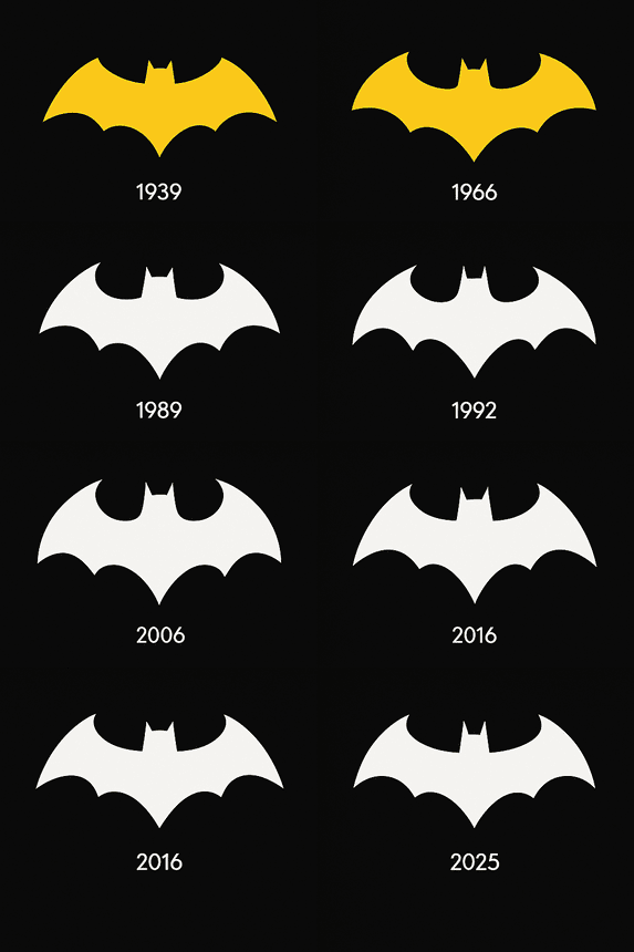
When Bob Kane and Bill Finger introduced Batman in 1939, the bat on his chest was small, black and so plain that nobody would have called it a logo. Since then it has been rounded off, sharpened, stretched and roughed up for almost every decade’s version of the character, and the silhouette has never stopped reading as Batman. That stubbornness is what makes it worth studying. A lot of famous marks survive by never changing. The bat has survived by changing constantly while keeping one thing fixed.
This piece follows the emblem from the comics to the films, looks at why black carries so much of the meaning, covers how DC and Warner Bros. have used and protected it, and pulls out the parts that are genuinely useful if you design logos yourself.
Where the Bat Symbol Started
Batman’s debut in Detective Comics #27 came with a modest chest emblem: a simple black bat with its wings stretched out, sitting on the costume like a gargoyle on a church ledge. It was not refined. It looked like something sketched in the margin of a school notebook, and that was part of why it worked. The shape was raw in the same way the early Batman was raw, a vigilante who scared criminals and did not explain himself much.
The emblem stood for a man who would rather punch crime than talk about it, and it did that job with no polish at all. What happened next is the more interesting story. Over the following decades the bat proved very willing to change, from the rounded, cartoonish versions of the 1960s Adam West era to the sleek, angular designs of recent years. Each one looks like the period that produced it. That is a better sign of a healthy logo than any single perfect drawing, because it means the idea is strong enough to be redrawn by different hands without falling apart.
Why the Bat Is Black
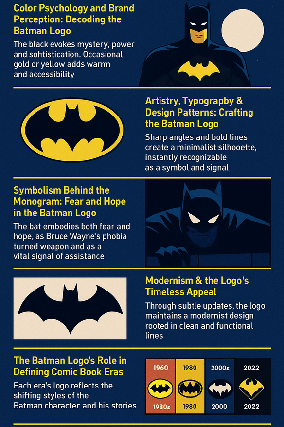
Black carries the bat symbol. It reads as mysterious and powerful, with a certain sophistication, and it has authority without raising its voice, which suits a hero who works at night. The logo has occasionally borrowed gold or yellow, most memorably in the neon-tinged emblem for Batman Forever, and the warmer color makes the character feel friendlier and easier to approach. Black always comes back, though, because black is where the character lives.
Part of the reason is contrast. A black bat on a chest, or thrown against the Gotham skyline, is about as stark as an image gets, and it reads two ways at once: a warning to criminals and a reassurance to everyone else. The lesson for designers is about restraint rather than range. Color psychology in logos is not about using as many colors as possible. It is about picking the one or two that tell your story and leaving the rest out.
Shape, Lines and Type
The bat is a minimal design. There are no flourishes and no decorative lettering to date it. It is built from sharp angles and heavy lines, which is why you can recognize it at a glance and at almost any size. Look at it long enough and you notice it doing several jobs. It is an animal, but it also works as a shield on the chest and as a signal in the sky, and most of the character’s mythology is folded into that one outline.
Typography rarely enters the emblem itself. When lettering does appear next to it, as in the title cards of Batman: The Animated Series, it tends to be bold and geometric, picking up the bat’s angles rather than fighting them. That balance of form and function is the useful part. Modern logo design mostly comes down to stripping away whatever does not help, then making sure what remains can carry the weight on its own. The bat is a good example of a mark where nothing could be removed without losing the idea.
Fear and Hope in One Shape
Bats are a good animal to build a symbol on, and the Batman story gives this one two meanings that pull against each other. It stands for fear: Bruce Wayne’s own phobia, turned into a weapon against the people who prey on Gotham. It also stands for hope, a sign that help is on the way. One image holds both. It came out of Bruce’s private trauma, yet the people of Gotham read it as a public promise.
That double meaning goes a long way toward explaining why the logo has lasted. People recognize the shape, and in the same moment they recall the story behind it. Designers can borrow the principle without borrowing the bat. A mark that means something specific to the people behind it, and is still legible to strangers, will outlast one that is merely attractive.
A Modernist Mark
The bat fits comfortably inside the modernist tradition: clean, functional and built to last, with form following function and no room for excess. Most of its changes over the years have been refinements within those rules rather than breaks from them. In 2025, posts on X teased a bold new look for Batman Vol. 4 by Matt Fraction and Jorge Jimenez, and the talk pointed in the same familiar direction: sharper and sleeker, but still unmistakably Batman.
That longevity comes from the design, not from luck. Because the core shape is so simple, each era can redraw it without breaking it, and the same basic symbol makes sense in 1940 and in 2025. If you are designing a mark that has to last, build that flexibility in from the start instead of hoping to add it later.
The Bat Through the Eras
You can track the character’s mood through his emblem. The 1960s logo was playful, in step with the campy TV series. Tim Burton’s 1989 version was gothic and gritty, matching his darker take on the character. Christopher Nolan’s trilogy in the 2000s gave the bat a militaristic edge, and the logo for 2022’s The Batman was raw and textured, which suited a film that leaned hard on the detective side of the character.
Through all of that, the core identity never moved. Each reinvention changed the surface and kept the silhouette, which is why no version ever looked like a different hero. Plenty of brands reinvent themselves and lose their audience along the way; the bat managed the opposite. For designers the practical point is to plan for change: decide early which parts of a mark are fixed and which are allowed to flex.
Knockoffs and Trademark Fights
Popularity has costs. Knockoffs are everywhere, from cheap T-shirts to bootleg toys, and every bad copy dulls the original a little. DC has answered with aggressive trademarking, covering the logo along with phrases like “Caped Crusader.” That gives the brand legal protection, but it also feeds arguments about creative freedom and how much of a shared pop-culture symbol any company should be able to fence off.
Cultural appropriation is not really a problem here. Over-commercialization is a fairer worry, since a symbol stamped on everything can slowly come to mean nothing. So far the bat has weathered it, which says a lot about the strength of the original idea. For smaller brands the takeaway is practical: keep clean, professional master files of your logo and stay in control of how it gets reproduced.
The Bat as a Business
The bat is also very good business for Warner Bros. and DC Comics. Comics, films and merchandise built around Batman bring in substantial revenue and have driven significant stock growth for Warner Bros. Discovery (WBD). In 2024, WBD’s stock rose 8% after The Batman’s streaming success on Max, a sign of how much market pull the character and his symbol carry.
Consistency is what turns that pull into lasting value. The same emblem across comics, films and games creates a halo effect, so goodwill earned in one medium carries over into the others and keeps fans loyal. That is the real return on cohesive branding, and it applies to a corner bakery as much as to a media company.
Consistency Over Decades
The details shift from one version to the next, but the fixed elements, the bat silhouette and the black palette, have stayed put. That is where the trust comes from. Wherever the symbol shows up, on a comic cover, a game screen or a movie poster, people know what they are getting before they read a word.
Startups can learn more from this part of the bat’s story than from almost any other. Pick your fixed elements early, use them the same way on every platform, and resist the urge to tinker each time a new channel appears. A brand that looks the same everywhere starts to feel familiar, and familiarity is most of what a logo is for.
Design Lessons From the Bat
Boiled down, the bat’s history gives designers four working rules:
- Keep it simple. Reduce the design to the parts it cannot lose.
- Give it meaning. A mark with a story behind it lasts longer than a pretty one.
- Plan for change. Design something that can be redrawn without being replaced.
- Use color to say something. Pick colors for what they mean, not for decoration.
None of these needs special software. Templates and suggestion tools can help a beginner put them into practice, but the judgment about what to cut, and what to keep no matter what, has to come from the designer.
A Logo That Speaks Without Words
The bat says what it needs to without a single letter. Bold, stark and a little intimidating, it communicates vigilance and justice at a glance, which is about the most anyone can ask of a logo. The spread wings read as a threat and as protection at the same time, depending on which side of the law you are standing on.
Saying that much with so little is hard, and most logos do not manage it. The bat is a good example to keep in front of you when a design starts piling up extra elements. Less really can carry more, provided the little that is left has been chosen carefully.
The Bat Online
Online, the bat is everywhere. Hashtags like #Batman and #DarkKnight gather millions of posts of fan art, cosplay and memes, and the symbol works in pixels as well as it ever did in print. A flat, high-contrast silhouette survives being shrunk to an avatar, recolored by fans and dropped onto a meme template, and it still reads as Batman.
That is a useful test for any logo today. If it stops working at the size of a profile picture on Instagram or X, it will struggle to travel, however good it looks on a business card.
Technology, AI and the Next Bat
Digital tools have changed how logos are made, and the bat has benefited. Designers can now refine its curves precisely and test new versions in an afternoon instead of a week. AI logo generators such as Looka, Canva and Semplr take that further, producing instant mockups that anyone can customize and download, which is handy for testing an idea or for a small business without a design budget.
It is easy to imagine whoever draws the next bat using one of these tools to rough out a dozen grittier variations of the silhouette before the real drawing starts. That kind of speed helps keep a long-running symbol fresh. The decision about which variation is right, though, still belongs to a person who understands the character.
From Comics to Coffee Mugs
The emblem appears on comics, blockbuster films, video games such as the Arkham series, and a seemingly endless stream of merchandise: LEGO sets, Funko Pops, even bat-shaped coffee mugs. DC’s licensing operation puts it in every corner of pop culture, from high-end collectibles to children’s pajamas.
Every one of those surfaces puts stress on a design. The bat survives being printed, stitched and molded because the shape is so simple to begin with. Before you commit to a mark, try it on as many real objects as you can, and pay most attention to the ones where it looks worst.
Batman Against Superman and Spider-Man
Set the bat beside its rivals and its advantages are easy to see. Superman’s “S” is bold but less versatile, since it is tied to a single color scheme. Spider-Man’s web is dynamic but lacks the bat’s stark simplicity. The bat can be black, gold, textured or flat and it is still a bat, and that adaptability is its edge.
Flexibility is what to aim for. Our look at other famous logos has more examples of designs that work across contexts, from T-shirts to billboards.
The Bat in 2025
Most of the 2025 logo news came from the comics. Posts on X pointed to a redesigned bat for Batman Vol. 4, due to debut in September and described as “bold” and “modern,” to suit Matt Fraction’s gritty writing and Jorge Jimenez’s dynamic art. A rumored Deadpool/Batman crossover could also put the logo somewhere unusually playful, mixing humor with the heroics.
DC’s core message has not moved: Batman is the ultimate human hero, flawed and relentless, and the logo is shorthand for that promise. Any brand mark works best when it lines up with a message that clear.
On screen, The Batman Part II has been delayed several times but is still on track, according to a recent update from James Gunn, who called Matt Reeves’ work “really important” and said he was eager to read the script. The film, an Elseworlds story starring Robert Pattinson that stays separate from the new DC Universe, is set for release on October 1, 2027.
What the Bat Gets Right
From the small black bat of 1939 to the rumored 2025 redesign, the symbol has been redrawn again and again and has never needed rescuing. Not every version was good. The neon Batman Forever bat has aged far worse than Burton’s, and some of the 1960s versions look more like a party decoration than a warning. But the core shape was strong enough to absorb the weaker versions and come out the other side intact.
That is the real lesson, and it is less glamorous than it sounds. Get the simple shape right first, attach a clear meaning to it, and then let each generation redraw it. Most logos fail at the first step.


