The Star Wars Logo: How It Was Made and Why It Lasts
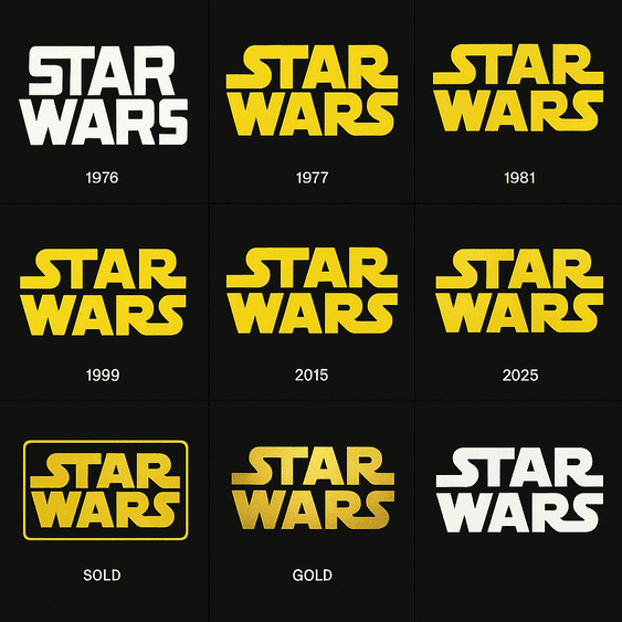
The Star Wars logo began in 1976 with designer Suzy Rice, who drew on the hard, authoritarian lettering of 1930s German propaganda and on sci-fi pulp covers. That is an odd starting point for a family adventure, and it is a large part of why the logo still looks so commanding. Since its debut in 1977 it has sat on films, toys, theme parks and streaming shows, and it has barely changed, which tells you how well it was drawn in the first place.
How the Logo Was Made
Rice was asked to create a logo for George Lucas’s space opera while the film was still in production. Taking cues from German propaganda graphics and pulp science fiction, she produced heavy, blocky sans-serif letters that felt powerful and a little dangerous. Before a single X-wing appeared on screen, the lettering already promised something big.
Dan Perri, who designed the film’s title sequence, later reworked the logo for the opening crawl, giving it the tilted perspective that makes it look as if it is sliding off into space toward a vanishing point. That shot is now as famous as the logo itself. It also shows the balance the design strikes: it is easy to read and familiar, yet it suggests a universe far larger than the screen. A good logo for any brand does something similar, connecting with people immediately while hinting that there is more behind it.
Gold on Black
Much of the logo’s effect comes from color. The classic version is gold, usually set against black. Gold suggests value, optimism and permanence, a good match for a story about hope and heroism. Black adds depth and menace and nods to the darker side of the saga, Darth Vader very much included.
The two together express the duality at the core of Star Wars: light against dark, adventure against threat. When you choose colors for a brand, aim for the same kind of fit. The palette should say something about the story you are telling, not just look attractive. Tools like Canva or Looka make it easy to try out palettes before you commit to one.
The Lettering
The typography is the logo. The custom geometric letters are bold and angular, with a slightly futuristic edge, as if they had been stamped onto the hull of a starship. They are tightly kerned, so the words lock together into a single unit, and the slight slant gives them a sense of motion. Every choice serves the film.
It also passes the basic tests of good logo design: it is simple and it scales. On a cinema poster or a child’s T-shirt, it stays legible and strong. A good logo, like a good Jedi, adapts to its surroundings. If you are building one, start with clean lines and a typeface that works at every size, and only then think about personality.
Hidden Motion in the Letters
The letters carry some symbolism of their own. The sharp, upward-angled “W” in “Wars” looks a little like a ship lifting off, and the long, swept “S” in “Star” suggests movement and distance. Together they point to the series’ big themes of exploration, conflict and destiny. These details are subtle, but they are part of why the logo feels active rather than static.
Software can help you reach for that kind of meaning. Tools like Semplr ask about your brand’s values and suggest symbolic elements based on them, so typing in “adventure” will get you something with a sense of movement. Do not expect the result to be as considered as Rice’s lettering, though.
Small Changes Over the Decades
The logo has been refined rather than reinvented. The 1999 prequels brought a sleeker version, and after Disney bought Lucasfilm the sequel trilogy, beginning in 2015, introduced further small adjustments. The modernist basics, clean lines and bold shapes, have kept it from aging. There are rumors of a 2025 redesign, but whatever happens, the logo has already shown it can absorb change.
Modernist design values clarity and wide appeal, and those principles show up in friendly modern brands such as Airbnb and Spotify too. The goal is a design that lasts, not one that matches this year’s fashion. Some logo makers, Looka among them, offer templates that try to strike that balance.
A Logo for Every Era
The logo helped define what science fiction looked like in the late 1970s, became part of 1980s pop culture and returned with the franchise’s revival in the 2000s. The original trilogy, the prequels and the sequels each used it to mark a new chapter while keeping a clear link to what came before.
That consistency is what a strong identity looks like. A logo makes a promise, and Star Wars has kept repeating its promise across almost fifty years. Small business or galactic empire, the logo should be the fixed point that everything else hangs on. Modern design tools make it easier to produce variations that still feel like one family.
Knockoffs and an Uncomfortable Influence
The logo has had its share of trouble. Unlicensed copies fill online marketplaces, on T-shirts and phone cases, and dilute the brand. In 2019 posts on X highlighted how closely bootleg versions imitated the original, which sparked arguments about intellectual property.
There is also the question of where it came from. Some critics argue that a design based on German authoritarian typography risks glamorizing militaristic imagery. Lucasfilm’s response has been that the style reflects the villainy of the Empire rather than endorsing it. Either way, it is a reminder that the sources you borrow from carry meaning with them. Generating many options can help you spot unwanted associations before you commit, but only if someone looks at them critically.
What the Logo Is Worth
When Disney bought Lucasfilm in 2012 for $4.05 billion, the value of the Star Wars name and logo was a big part of the price. By 2025 the films had taken $10.3 billion at the box office worldwide, and that success owes a lot to how recognizable the branding is. Star Wars has helped Disney’s stock (DIS), and merchandise alone has brought in billions.
The same principle works at a much smaller scale. A strong logo is worth a great deal, and for a small business a professional-looking mark can be the difference between seeming credible and seeming improvised. Your logo is often the first thing a potential customer sees, so it is worth getting right.
Lessons for Logo Designers
The Star Wars logo has plenty to teach. Simple designs scale; complicated ones fall apart on small screens. Story matters, so every curve should reflect what the brand is about. And you should test a design in every context it will appear in, from business cards to billboards, before you call it finished.
Logo makers like Canva can speed that up. Enter your name, choose a style such as “futuristic” and refine what comes back. Most free tools also generate mockups that show how the logo looks on products, a bit like having your own protocol droid for design.
Logo and Story Together
The logo speaks a language almost everyone understands. The bold letters and the gold suggest adventure and importance, which matches what the films are about: heroism, rebellion and destiny. The tight fit between the mark and the story is a big reason it works around the world.
For your own brand, match the logo to the mission. An eco-friendly product line might call for greens and natural shapes; a tech startup might suit something sleek and minimal. Some tools will analyze your messaging and suggest visuals to match, which is a good start as long as the final logo has a real reason behind it.
All Over Social Media
Online, the logo is everywhere. Hashtags such as #StarWars and #MayTheForceBeWithYou have billions of views, often with the logo alongside. On X, fans post their own takes on it, from tattoos to homemade merchandise, which keeps it visible in a way no studio could buy.
That shows how adaptable a logo needs to be now. It has to work as an Instagram profile picture and an X banner as well as on a poster. Make sure you have high-resolution files without watermarks, because a logo that cannot handle being shared is not ready for wide use.
Technology and AI
Logo design has changed completely since 1976. Rice’s logo was drawn by hand; today an AI tool could produce a hundred variations of it in seconds. Tools like Semplr use machine learning to track design trends and produce options that can look surprisingly polished.
For small businesses, that opens branding up to people who could never hire a designer. Free logo makers without watermarks put a professional-looking result within reach of almost anyone. The Star Wars logo shows that a strong design can sit comfortably alongside new technology, but it also shows how much the original thinking matters.
Films, Parks and Plush Toys
The logo now covers a huge range of products. Lucasfilm’s portfolio includes the films ($10.3 billion worldwide), Disney+ series such as The Mandalorian, and merchandise from LEGO sets to toy lightsabers and Baby Yoda plush toys. Galaxy’s Edge, opened at Disneyland in 2019, lets fans walk into the brand, and the logo is everywhere there.
That range proves how flexible the design is. For a smaller brand, it is a reason to think beyond business cards and picture the logo on packaging, in an app or on giveaways. Mockups are an easy way to check before you print anything.
The franchise has also kept finding new things to say. The season premiere of Andor made a pointed choice by putting a Black woman rebel aboard a spaceship at the center of a scene, a decision likely to upset the franchise’s more bigoted fans.
Andor, which builds on the excellent Rogue One, has Diego Luna’s Cassian guiding Niya, and makes the case that revolution is stronger than racism.
Against Star Trek and Marvel
Compared with Star Trek’s delta badge, the Star Wars logo is bolder and less abstract, built for impact rather than subtlety. Marvel’s logo is iconic but feels corporate, while Star Wars feels mythic. Narrative wins over function, and that is the difference.
It is worth studying the logos of your competitors to see what works for them and what does not. Then try styles that would separate you from them. The Star Wars logo succeeds because it looks like nothing else, and that is the goal for any brand.
If Lucasfilm Used an AI Logo Generator
Imagine Lucasfilm wanting a 2025 refresh on a tight budget and opening Looka. Someone types in “epic, futuristic, gold, black” and gets a sleek update back. The software suggests a sharper “W” and a glowing effect, and the core of the logo survives.
It is only a thought experiment, but it shows what these tools can do. Semplr and Canva both offer watermark-free downloads, so a brand can try many versions quickly. If Lucasfilm ever did release an AI-made logo, fans on X would argue for weeks about whether it honored the original or looked like a droid’s copy.
Star Wars in 2025
The franchise is still everywhere in 2025. The film Mando & Grogu is due in 2026 and Ahsoka Season 2 is coming to Disney+. Lucasfilm’s messaging stresses inclusivity and new ideas, and the logo sits on every campaign. At D23 in 2024 it was all over new merchandise, from lightsaber hilts to Grogu hoodies.
Fans on X keep speculating about a new logo for the next trilogy, and Lucasfilm has said nothing. The speculation itself shows how much the logo matters to people. Few brand marks get argued over like this.
What Star Wars Teaches
From 1977 to 2025, the Star Wars logo has shown that strong type, a meaningful palette and a willingness to change only the details can carry a brand for half a century. Rice’s blocky letters were a slightly uncomfortable choice, and they were the right one. If you want to make a mark of your own, Looka, Semplr and Canva are reasonable places to try ideas. Take your time with the lettering. Star Wars shows how much a logo depends on it.


