The Uniqlo Logo: History and Design of the Red Square
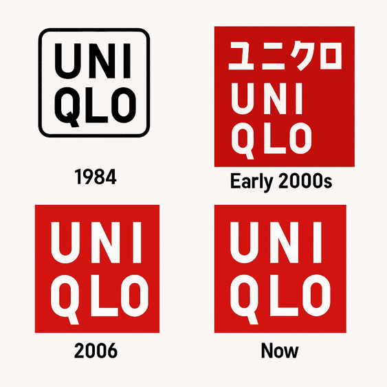
Uniqlo’s logo is two red squares, one with the name in Japanese katakana and one in Roman letters, and it is close to the plainest mark any big fashion brand uses. That plainness is the whole strategy. Most fashion logos compete for attention with monograms, crests or a famous signature. Uniqlo’s is flat red with white sans-serif letters, and it says almost exactly what the clothes say: functional, affordable and made for everyone. From its origins in Yamaguchi, Japan, to stores around the world, the history of the logo is mostly the history of a company deciding what it was not going to be.
That makes it an unusually useful case for anyone designing a logo. There is very little decoration to hide behind, so every choice, from the color to the shape of the box, is visible and has to earn its place.
From Unique Clothing Warehouse to a Red Square
The logo did not come out of a high-concept design studio. It came out of the practical thinking of Tadashi Yanai, the founder of Fast Retailing, Uniqlo’s parent company. When Uniqlo opened its first store in Hiroshima in 1984, it was called “Unique Clothing Warehouse.” The name was a mouthful and the logo was forgettable. The red-and-white square that everyone now recognizes only took shape in the early 2000s, after a rebrand.
Its roots are in late-1990s Japan, a country coming out of a long economic slump and looking for efficiency and value. The red square, carrying the name in clean white katakana (ユニクロ) and later in Roman letters, condensed the brand’s promise into one shape: affordable, functional clothing for everyone. It works like a contract. What you see is what you get, quality with no pretense.
It was also a statement of position. By going minimal, Uniqlo turned its back on the ornate monograms of luxury houses like Louis Vuitton and Gucci, and lined up instead with the Japanese taste for beauty in simplicity, often described as wabi-sabi. The first lesson is the obvious one: know your audience and make the logo speak its language. Uniqlo’s customers were not buying status, so the logo does not sell any.
Why Red and White
Color carries most of the emotion in a logo, and the red square is a deliberate psychological choice. Red is the color of urgency, energy and vitality, and it gets noticed without a word. Paired with white, it calms down and feels approachable rather than aggressive. That combination signals confidence without arrogance, which is a hard balance to strike.
This kind of color psychology in logos is not an accident. Red suggests action, which fits Uniqlo’s aim of making good clothes available to everyone, clothes that move with you whether you are commuting in Tokyo or walking through SoHo. White suggests clarity and universality and supports the “Made for All” idea. The general rule is to choose colors that tell your story, and to choose them on purpose. Software like Semplr can help you test palettes quickly, but the decision about what a color should mean comes first.
Type, Shape and Symmetry
The typography is carefully neutral. The sans-serif lettering, originally a custom face and later refined into something close to Helvetica or Futura, has no flourishes at all. The letters sit in their red square as neatly as commuters on a Tokyo train. The type is saying that the brand is there to serve, not to show off.
The shape matters as much. A square recalls other Japanese forms, the bento box and the tatami mat, and its symmetry reads as steadiness. This is a logo that stands still and acts as an anchor for a brand that puts function before flash. Simple does not have to mean dull. Clean lines and a bold shape can carry as much weight as an elaborate monogram, as long as they are drawn with care.
What the Square Stands For
Luxury monograms are often loaded with symbolism. Uniqlo’s logo is not. The square is close to a blank canvas, and customers are free to read their own meaning into it. There are subtle references all the same. Red on white recalls the Japanese flag, a quiet nod to national pride, and the katakana (ユニクロ) roots the mark in its home culture. The result feels both global and local, a universal shape with a Japanese accent.
That balance is a good target for any brand that sells outside its home market. A logo can be rooted in a place and still make sense to the rest of the world, but getting there takes human judgment about what those roots actually mean.
A Modernist Mark
The Uniqlo logo is a textbook modernist design: form follows function and ornament is treated as a crime. Its clean lines and flat color could have come out of a Bauhaus manifesto, and yet it does not feel old. In 2025, rumors of a Uniqlo logo redesign circulated on X, with fans guessing at a softer update with gradients. Uniqlo stuck with the classic design instead, which was the right call. Trends come and go. A design this simple does not need them.
The advice that follows is familiar but worth repeating. Avoid clutter, aim for clarity and let the core of the brand show. A timeless logo will outlast a fashionable one, and it is much cheaper to maintain.
A Flag for Affordable Quality
The logo has come to stand for a shift in fashion. In the 2000s it signaled the arrival of affordable clothing that did not feel cheap. By the 2010s it was tied to a kind of minimalist chic, cashmere sweaters and AIRism T-shirts that could hold their own against high-end labels. Seeing the red square on shopping bags and storefronts around the world told people that good clothes could be affordable and stylish at the same time. Uniqlo redefined the middle ground of fashion, and the logo was the flag it flew.
That is the bigger point about logos. A mark comes to stand for whatever the company does under it. Uniqlo’s square now carries an entire idea about accessible quality, and it got there by being attached to the same products for years.
Knockoffs and Criticism
Even a logo this clean has had its problems. In June 2025 Uniqlo flagged unauthorized use of its logo in Bhutan, where local businesses had been copying its branding, and the government ordered all the knockoffs removed within two weeks. Critics have also accused the brand of cultural appropriation, particularly over collaborations featuring ukiyo-e prints, arguing that they turn Japanese heritage into merchandise. Uniqlo’s response has been to say little and keep doing what it was doing.
Simple logos are easy to copy, which is one of their few weaknesses. The best protection is a mark that is clearly yours in its proportions and details, plus the legal registrations to back it up.
The Logo and the Business
Fast Retailing’s stock has risen sharply, and its market capitalization exceeded $70 billion in 2025. The logo has played a part. Its consistent presence in markets from Tokyo to New York has built trust and recognition, and analysts credit the brand, anchored by the red square, with supporting Uniqlo’s expansion into 26 countries and more than 2,400 stores. A clear logo works as shorthand for reliability, and shoppers act on that.
Uniqlo’s growth shows how closely branding and the bottom line are linked. A logo is a financial asset as well as a design, and it pays off most when it is used the same way for a long time.
One Logo on Everything
Uniqlo is very consistent. The logo is the same on a $10 T-shirt and a $200 coat. That steadiness extends to the brand’s “LifeWear” idea of clothing designed for everyday life, and the logo is what holds that identity together from one country to the next.
Any logo should be able to do the same: scale across products and platforms without changing character. If yours looks wrong on a tag, a bag or a phone screen, fix it before launch rather than after.
Lessons for Logo Designers
For all its restraint, the Uniqlo logo leaves room for play. The red square has been splashed across tote bags and reworked in collaborations with artists like KAWS, and it survives the treatment because it is so simple to begin with. The lessons are clear enough: prioritize clarity, take your cultural roots seriously, and test how far the logo can stretch. Tools like Leonardo.Ai, which focus on vector art for logos, can speed up that testing.
A Democratic Visual Language
The logo’s message is accessibility. The red square gets attention and the plain type feels inclusive, so the mark invites everyone in, from students to chief executives. The same idea runs through Uniqlo’s campaigns, including the 2025 “Wear Your World” initiative, which paired the logo with user-generated content on social media.
The Square Online
The logo does very well online. Hashtags like #UniqloLife and #LifeWear have collected millions of posts on X, and the clean design shows up clearly in Instagram Reels and TikTok haul videos. A logo now has to work as a tiny image in a feed, and a red square with white letters is about as screenshot-ready as a logo can be.
AI and Logo Design
AI is changing how logos get made, and Uniqlo’s is a good test case. ChatGPT can suggest color palettes or typefaces, and platforms like Looka produce downloadable logos without watermarks. A minimalist mark plays to what these tools do well, which is clean, scalable shapes. But studies from MIT suggest that leaning too heavily on AI can make creative work more uniform, and generated logos often lack character. Uniqlo’s square is simple, but it is not generic, and that difference comes from human decisions.
Products and Recent News
The logo appears on the full product range: AIRism T-shirts, Heattech layers and the Studio Ghibli collaborations. In July 2025, Uniqlo launched a Ghibli-inspired collection with Totoro and Kiki prints, with the logo subtly embossed on the tags. The company also uses AI for trend forecasting, analyzing social media and sales data to predict demand for items like puffer jackets, so that the red square ends up on things people actually want.
Fast Retailing reported a 25% jump in net profit, to $2.5 billion, in 2025, driven by the brand’s minimalist appeal and its focus on quality. Where much of fast fashion is built on disposable trends, Uniqlo’s durable HEATTECH and AIRism lines, each stamped with the red square, are built to last. The company has had difficulties in China, but the logo remains a global sign of reliability, and sustainability efforts such as RE.UNIQLO fit what shoppers increasingly want. That combination makes Uniqlo an outlier in fast fashion.
Uniqlo, Zara and H&M
Next to Zara’s sleek serif wordmark and H&M’s bold red lettering, the Uniqlo logo is the most restrained of the three. Zara’s feels like high fashion and H&M’s feels young. Uniqlo’s feels universal. It does not try to beat its rivals at their own game, and its simplicity lets it stand out without shouting, which is a big part of why it has aged so well.
If Uniqlo Used an AI Logo Generator
Suppose Uniqlo’s designers sat down in 2025 to revisit the logo with an AI generator. They could try softer reds or modular typography, keep the square and add a gradient for a more current look. That might produce a new Uniqlo logo that nods to trends without abandoning its roots. More likely, they would use the tool to test variations quickly and then keep the original. AI is good at producing options. Choosing among them is still a human job, and Uniqlo’s history suggests the choice would be to leave the square alone.
A Logo That Wears Well
The Uniqlo logo is functional, universal and quietly confident, and it has stayed that way for two decades. It shows what happens when a company decides what it stands for and lets the logo say exactly that and nothing more. Most brands add things to their logos over time. Uniqlo’s strength is that it has not.
The test it sets for any designer is whether the logo would still look right on a plain T-shirt in ten years. Uniqlo’s red square passes easily.


