The Lakers Logo: History of the Purple and Gold
How the Lakers Logo Began
The Lakers are named after Minnesota’s ten thousand lakes, and they have played in Los Angeles, a city not known for its lakes, since 1960. The logo they adopted there, a purple-and-gold basketball with the team name across it, has outlasted the mismatch and become one of the best-known marks in American sport. The team arrived from Minneapolis needing an identity that looked ambitious, and it got one: a stylized ball in motion that captured the swagger of a franchise that would go on to win a great deal. It read as a promise of showtime long before anyone used the word.
The original design is credited to a largely unsung graphic artist, and it leaned on simplicity: a basketball in motion, drawn in the royal colors of purple and gold. It did what a logo is supposed to do, which is identify. It tied a newly transplanted team to a city that lives on spectacle.
Purple and Gold
The colors do a lot of the work. Purple has long been associated with royalty and ambition and carries a hint of exclusivity. Gold suggests victory, wealth and aspiration. Put together, they are the color equivalent of a courtside seat at a Lakers game: openly luxurious.
They also balance each other. The purple brings a sense of trust and seriousness, and the gold adds triumph, and that combination is very good for fan loyalty. It makes the logo instantly recognizable whether it is on a jersey or a $200 sneaker.
Shape and Lettering
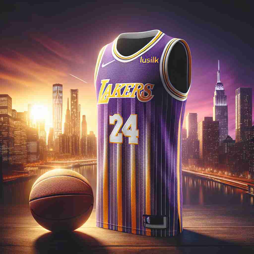
The logo is a study in restraint. Many sports emblems are fussy; this one is clean, close to minimalist. The basketball, with curved lines that suggest motion, sits with a bold sans-serif “Lakers,” and the combination feels both dynamic and solid. It is a design that could have been sketched on a napkin in 1960, and it would still look current if it were drawn for the first time today.
The lettering is the strongest part. The custom “Lakers” is assertive without being aggressive. It says the team is there to win and intends to look good doing it. That balance is a good lesson for any logo: put clarity ahead of clutter.
What the Logo Stands For
The Lakers logo is not a monogram in the usual sense, but its parts, the ball, the name and the colors, lock together into one symbol. It has become visual shorthand for a dynasty. The swooping lines of the ball suggest artistry as well as sport, a nod to the grace of players like Magic Johnson and LeBron James.
For a team like this, the logo is the way into everything else: championships, celebrity fans and a great deal of cultural cachet. It represents a lifestyle as much as a basketball team, which is part of why people who have never watched a game wear it.
Why It Has Not Dated
The logo has lasted because it never followed trends. Its modernist simplicity looks as fresh in 2025 as it did in 1960. It is the design equivalent of a classic black dress: versatile, elegant and never out of style.
That is a lesson for anyone making a logo. Trendy designs are easy to produce. Longevity comes from simplicity and versatility, and the Lakers logo works on everything from billboards to bottle caps, a flexibility most brands would envy.
The Logo as Fashion
The Lakers logo is a fashion item as well as a sports emblem. It went from the oversized jerseys of 1990s hip-hop to today’s sleek athleisure without looking out of place in either. It has turned up on runways, on red carpets and on Rihanna’s Instagram, and the purple-and-gold palette has inspired sneaker drops and streetwear collaborations.
That crossover appeal is not luck. Clean lines and bold colors make the logo easy for designers to adapt to almost any medium. It is a reminder that a great logo does not just sit on a product. It shapes the culture around it.
Knockoffs and Borrowing
The logo has its problems. Knockoffs are everywhere, from cheap T-shirts sold on Venice Beach to dubious “tribute” designs made in overseas factories. These fakes dull the brand’s aura, and the Lakers have fought them with trademark lawsuits and smart marketing.
There is also a debate about borrowing. The logo’s bold look has been taken up, some would say lifted, by brands outside the sports world, which raises the question of who gets to use its cultural power. It is a thorny issue, but it shows how much influence the logo has. A mark that starts arguments is at least a mark people care about.
The Business of Purple and Gold
The Lakers are not publicly traded, but their brand is extremely valuable. Forbes puts the franchise’s worth at more than $6 billion, and the logo is a big part of that figure. Every championship banner, every celebrity spotted courtside, every licensed hoodie sold at Target ties back to the purple-and-gold ball.
That is where branding turns into business. A strong logo drives revenue as well as looking good, and the Lakers are a clear case of design turning into money, at any scale from a franchise to a small shop.
Consistency
Consistency is the Lakers logo’s real strength. Over six decades it has changed only slightly, with small adjustments to the lettering and colors, and it has never left its core identity. That discipline is why it is instantly recognizable from Los Angeles to Lagos.
The same discipline applies to any brand. A logo needs to look the same on social media, packaging and websites, because a unified identity is what builds trust and loyalty over time.
Design Lessons
The Lakers logo offers four lessons. First, simplicity wins: a cluttered logo is a forgettable one. Second, color matters, so choose colors that tell a story. Third, versatility is essential, and a logo should work on a business card and a billboard. Finally, emotion counts. The Lakers logo carries a feeling of pride, ambition and winning, and people buy it for that feeling.
These principles apply whether a logo is drawn by hand or made with software. The aim is something that connects with people and sticks in their minds.
The Logo on Screens
The logo does well on screens. Its bold colors stand out, and its clean design scales from TikTok thumbnails to 4K broadcasts. That adaptability is a good example of visual language that works in a world of pixels, which is where most logos are now seen first.
Designing with digital use in mind is essential, but the Lakers show that digital success starts with a strong foundation: a design that is bold, clear and emotionally charged before it ever reaches a phone.
#Lakers
Search #Lakers on X and you will find millions of posts, many of them featuring the logo. Fan art and memes have spread it well beyond sport, and it turns up everywhere online.
The lesson is to design for sharing. A logo that gets fans talking, through hashtags or hoodies, has more reach than any ad budget can buy. The Lakers logo shows that a good design does more than represent a brand. It spreads it.
Technology, AI and the Lakers Logo
Technology has changed how logos are made, and the Lakers logo has benefited, polished over the years with Photoshop and 3D renderings for the digital age. AI is the bigger shift. AI logo generators such as Looka, Semplr and Canva let almost anyone create professional-looking logos in minutes without a design degree, and professionals use them too, to brainstorm concepts and test ideas.
It is easy to imagine the Lakers’ design team trying one to rough out a refresh, typing in “bold,” “regal” and “dynamic,” setting the palette to purple and gold and seeing what comes back. They would never actually overhaul the logo. But the exercise shows what these tools are good for: generating options quickly. Choosing among them, and knowing what not to change, still takes a person with a clear idea of the brand.
Making a Logo of Your Own
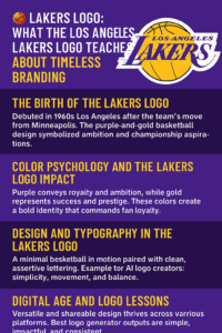
If you want some of the Lakers’ branding strength in your own logo, a few steps help:
-
Define your style. Are you bold like the Lakers or minimal like Apple? Write down a few words that describe the brand before you start.
-
Choose colors on purpose. Purple for luxury, blue for trust.
-
Keep it simple. A cluttered logo does not last. Aim for clarity.
-
Test versatility. Make sure the logo works on a business card and a billboard.
-
Get clean files. Whatever tool you use, make sure the final files are high-resolution and free of watermarks.
What the Lakers Logo Gets Right
The Lakers logo has lasted more than sixty years on a simple formula: one ball, one word and two colors that look expensive. It has been tweaked rather than replaced, and it has followed the team from the Showtime era to LeBron without looking out of date. Most sports logos are redesigned every couple of decades. This one shows what happens when a team gets it right early and has the sense to leave it alone.