The FedEx Logo: The Hidden Arrow and What It Teaches
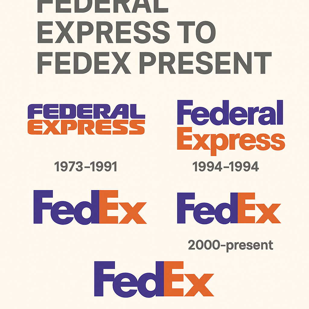
Most people look at the FedEx logo for years before they notice the arrow. It sits in the white space between the “E” and the “x,” pointing forward, and once you have seen it you can’t stop seeing it. Lindon Leader designed the logo in 1994, and the arrow is the reason it turns up in nearly every design-school lecture on negative space.
The rest of the logo is deliberately plain: two colors, five letters and no symbol you would notice at first glance. That combination of modesty and one clever idea is what makes it worth studying, especially now that software can produce a passable logo in seconds.
How the Logo Was Made
By the early 1990s, “Federal Express” was a long name for a company racing to dominate global logistics, and the business was being rebranded under the shorter FedEx. Leader’s brief was to suggest speed, reliability and global reach without shouting about it. His answer was typographic. He blended Futura Bold and Univers into a custom typeface, and then adjusted the spacing so that the gap between the “E” and the “x” formed an arrow: a quiet reference to the company’s promise of moving things forward.
The logo tells its story at a glance, and only if you look. That restraint is the main lesson in it. A simple design built on one clear intention can outlast a great many flashier ones, whether those come from a studio or from an algorithm.
Purple and Orange
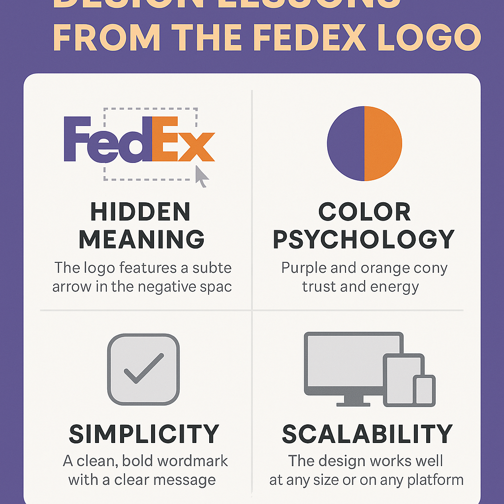
Purple and orange are not colors most people would put together for a corporate logo, and that is partly why they work. Purple, long associated with royalty and trust, gives the brand some weight. Orange is bright and urgent, the color of action. Together they look professional without looking stiff.
Color shapes first impressions, and one widely repeated statistic claims 93% of consumers judge products on color alone. FedEx’s palette, combined with the arrow, gives the impression that the package is already on its way. When you choose colors for your own brand, choose them for what they say about the business, not because they look nice together on a screen.
The Lettering
The type is the whole logo, and it is very well tailored. Leader’s blend draws on Futura Bold for the “Fed” and Univers for the “Ex,” balancing weight and clarity. The result feels approachable but still authoritative, which is harder to achieve than it sounds.
Choosing type is really about shaping how people see a company. Letterforms are images in their own right, and in a wordmark they carry the whole personality. Font libraries make it easy to try hundreds of options. The FedEx logo is a reminder to pick for legibility and character first. A great logo doesn’t need to shout. It needs to stick.
The Arrow
The hidden arrow is the logo’s party trick, but it is more than a gimmick. It stands for direction, progress and precision, the things a company handling 15 million packages a day has to get right. It is also a neat lesson in semiotics, the business of building meaning into images.
Symbols matter, whether it is Nike’s swoosh or FedEx’s arrow. The difficulty is making something that resonates without cluttering the design. FedEx managed it by hiding the symbol inside letters that were already there, so it adds meaning without adding anything to look at.
Why It Has Aged Well
Logo fashion comes and goes, from heavy gradients to 3D startup badges. The FedEx logo has ignored all of it. Its clean lines and restrained palette look as fresh now as they did in 1994, because it follows the old modernist rules associated with the Bauhaus: form follows function, and less is more.
Avoiding the trend of the moment is the surest route to a logo that lasts. FedEx’s design also shows how well simplicity scales, from the side of a truck to the tail of a plane to a phone screen.
A Logo Everyone Knows
FedEx’s logo has become part of everyday culture. It appeared in Cast Away, the film better remembered for a volleyball named Wilson, and it is on delivery vans in almost every town. It is the logo you see while anxiously tracking a parcel at 11:59 p.m. and hoping it arrives before Christmas.
That kind of reach is built over decades, not in a season. The logo has come through the dot-com bubble and the e-commerce boom without needing a change, which is the best argument there is for treating design as a long-term investment.
Criticism
Even a logo this admired has its critics. Some find it bland, lacking the emotional pull of Apple’s bitten fruit. Others point to the knockoffs used by low-budget courier firms, which wear away some of its distinctiveness. In 2010 a viral conspiracy theory even claimed the arrow was a subliminal symbol of corporate greed. It wasn’t.
No logo is loved by everyone, and anyone designing one should expect criticism. The useful skill is telling feedback that improves the design from noise that would only make it fussier, and staying true to what the brand is.
The Business Value of the Arrow
FedEx shares were trading around $250 in early 2025, and that price reflects brand equity as well as logistics. A 2019 Interbrand study valued the FedEx brand at $8 billion, and the logo is central to it. Recognition builds trust, trust builds revenue, and revenue pays for the trucks that carry the logo further.
For a startup the scale is different, but a logo is still a business asset rather than a decoration. Treat the decision accordingly, even if the budget is small.
Consistency
Whether it is on a cargo plane or a tracking app, the FedEx logo is instantly recognizable, and that sameness builds trust. When the van pulls up, you know who is at the door. A logo works as a flag and a signature at once, and both only work if they don’t change from one day to the next.
For a small business that means one version of the logo, one set of colors and one set of fonts, written down and used everywhere. FedEx’s discipline is a good model for any brand trying to stand out in a crowded market.
What Designers Can Learn
Three lessons stand out. Use negative space, because the gaps can carry meaning too. Put clarity ahead of flash, and make sure the logo works in black and white as well as color. And test relentlessly: Leader produced more than 200 sketches before he settled on the final design.
Software can speed up the iterating, but the precision that found the arrow came from a person looking very closely at letter spacing. That kind of attention is still the part that makes a mark memorable.
Saying More With Less
The logo communicates on two levels. The arrow says the company is going somewhere, and the colors say you can trust it to get there. That clear visual language is why it can be painted on 50,000 vehicles and 700 aircraft without losing any force.
Before designing your own, work out what your brand stands for, then ask how a shape or a color could carry that idea. FedEx turned a complicated promise about logistics into a few letters and a gap.
FedEx Online
The logo is popular on social media, where hashtags such as #LogisticsLife and #DesignInspiration bring it up for designers and delivery fans alike. Its clean design looks good on Instagram grids and X posts, and it shows how well a plain mark survives in a busy feed.
A logo now has to work on a website, in a TikTok ad and as a tiny app icon. FedEx’s shows that clarity is what makes that possible.
AI and the Arrow
AI tools have made logo design accessible to solo founders and small startups, and a free AI logo creator can now produce a polished design in minutes. That is genuinely useful. It also raises a fair question: could software have found FedEx’s arrow?
Imagine the FedEx board in 1994 skipping Leader and typing “a logo for a global courier service, fast, reliable and clever” into a generator. The result would probably be sleek, maybe with a swoosh or a globe. The arrow is much less likely. It came from someone noticing a possibility in the spacing of two letters, which is the kind of insight current tools rarely produce. They are good at iteration and weak at the one idea that makes a logo. Treat them as a partner for the first part of the job, not a replacement for the second.
Lessons From FedEx for Your Own Logo
If you are about to design a logo, with software or by hand, FedEx suggests a simple process:
- Define the brand first. Know whether it is about speed, trust or something quirkier. FedEx’s arrow came from its promise of motion.
- Pick a tool that lets you customize properly and download clean files without watermarks.
- Choose colors deliberately. Test which ones carry the feeling you want.
- Keep it simple. A cluttered logo is a forgettable one.
- Test it everywhere: business cards, websites, social media.
- Iterate a lot. Leader drew 200 versions before he found the arrow.
A Small Idea That Delivered
The FedEx logo works because of one small idea, executed with great care, inside a design that otherwise stays out of the way. The arrow, the colors and the relentless clarity all point the same direction, literally in the arrow’s case.
If you want to try your hand at something similar, Semplr is a free AI logo creator you can start with. Aim for something that says a lot without words, lasts for decades, and maybe hides a secret or two.


