The Versace Logo: Medusa, Gold and Greek Keys
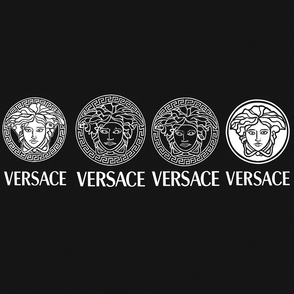
Most luxury houses sign their goods with initials. Versace chose the face of a monster from Greek myth, the Medusa, whose gaze turned men to stone. It is one of the strangest logos in fashion and one of the most effective. For decades it has stood for glamour, power and a fair amount of deliberate excess, and it has attracted knockoffs, controversy and imitators in roughly equal measure.
Where the Medusa Came From
Gianni Versace grew up in Reggio Calabria in southern Italy, a region full of the ruins the ancient Greeks left behind. The story goes that among those stones he came across the head of Medusa, her snake hair still carved in place. To him she was not only a figure from mythology. She combined beauty, danger and pull in a way he wanted for his own work. When he founded his house in 1978, the logo he chose was a circular emblem with Medusa’s head at its center, framed by an intricate Greek key pattern, at once threatening and regal.
It was an unusual choice, and a memorable one. Chanel and Gucci built their identities on clean, minimal marks. Versace went the other way. The Medusa is openly maximalist, true to Gianni’s belief that more is more, and it came with a story that went well beyond clothes. The choice was a statement of what the house intended to be: seductive, theatrical and impossible to ignore. Anyone designing a logo can take the first lesson straight from it. Begin with a story, and the drawing will follow.
Gold, Black and White
The palette is short: gold, black and white. Gold, long associated with wealth and with the divine, dominates and makes the mark feel expensive and exclusive. Black anchors it and adds a little mystery. White provides contrast and keeps the details legible. In the usual language of color psychology, gold means prestige, black means sophistication and white means clarity, and those happen to be exactly the qualities Versace wants people to see in it.
The effect is emotional as much as visual. The gold invites desire, the black keeps some distance, and the white keeps the whole thing from becoming heavy. That combination lets the logo stand out on a silk scarf as easily as on a leather bag. If you are choosing colors for a brand, by hand or in a tool like Looka or Canva, the test is the same: the colors should look good, but they should also feel right for what the brand is.
Chaos Inside a Border
The drawing is the heart of the logo. Medusa is rendered in fine detail, her snake hair curling in a tight, almost hypnotic symmetry. Around her runs the Greek key, a pattern from classical architecture that brings hard geometry to an otherwise organic, unruly image. When Versace sets its name in type, it usually uses a bold sans-serif that stays out of Medusa’s way.
The tension between those two elements is what makes the logo work. The Medusa is wild and the Greek key contains her, and the result looks both ancient and modern. It also makes the mark adaptable: it looks at home on a couture gown and on a perfume bottle. The broader lesson is about contrast. Pairing intricate detail with a clean structure gives a logo both richness and discipline, and either one alone tends to fall flat.
What Medusa Means
Medusa stands for a contradiction. She is beautiful enough to draw you in and dangerous enough to destroy you. In the myth, anyone who met her gaze turned to stone, which is an apt idea for a brand that wants to stop people in their tracks. Versace uses that double meaning to present itself as irresistible and slightly out of reach, and that combination is what luxury runs on.
The logo is a warning and an invitation at once. That ambiguity carries well online, where hashtags like #VersaceMedusa keep its mystique going. The general lesson is that a good logo works best when there is a story inside it that people can pass on.
Small Changes, Same Core
The logo has been adjusted over the years, but the core has not moved. The 1990s brought Medusa ’95, a sleeker and more architectural version with interlocking Greek keys. In 2025 posts on X claimed a more minimal redesign was coming to suit current tastes. Versace has so far resisted any dramatic change, and it is right to. A mark this distinctive would lose more than it gained by being simplified.
Trends pass. A logo tied to a company’s identity rather than to a fashion moment can outlast all of them. That matters for anyone using modern design tools, which make it easy to chase whatever looks current. They work best when there is a clear idea guiding them.
A Logo for Every Era
The Medusa has been part of fashion history from the supermodel 1990s to the influencer 2020s. In the 1990s it appeared on the loud prints worn by Naomi Campbell and Cindy Crawford, at the height of a very glamorous decade. In the 2010s it moved into streetwear, with rappers such as Drake wearing the Medusa on oversized T-shirts. Now it is a fixture on TikTok, where #Versace has billions of views.
It has lasted because it can change register. The same Medusa can look camp, chic or street depending on what it is printed on and who is wearing it. That is a useful quality in any logo: it should be able to move with the culture without becoming something else.
Knockoffs and Controversy
A logo this famous is copied everywhere, from Bangkok markets to Brooklyn street stalls, and counterfeits chip away at the exclusivity the brand depends on. In 2019 Versace drew backlash over a T-shirt accused of cultural insensitivity toward Hong Kong, and Donatella Versace apologized. Because the Medusa turns up on so many fakes, it has also become a focus for arguments about authenticity and appropriation.
Counterfeits are a backhanded compliment. They prove how much the logo is worth, and they also wear down its value. For anyone creating a logo, it is a reminder that a design needs to be distinctive enough to protect legally, something generic AI output often is not.
The Logo’s Commercial Weight
When Capri Holdings bought Versace in 2018 for $2.1 billion, much of what it was paying for was the Medusa and what people associate with it. The logo has driven sales of handbags, fragrances and home goods, with revenue reported at more than $1 billion a year by 2025. Posts on X have also highlighted recent collaborations, including a 2025 artist series in which Asian creatives reworked the Medusa, which helped generate attention and investor interest.
For a luxury brand, the logo is a guarantee of origin and the thing customers are really paying for. A well-built mark is a business asset as much as a piece of art, and Versace shows how much it can be worth.
Consistency
Versace’s identity depends on consistency. On a runway gown or a Versace Home vase, the Medusa is unmistakable, and that sameness reassures buyers that they are getting the real thing and the history that comes with it. It also shows the value of scalability. A logo has to hold up on a billboard and on a business card, and Versace’s detailed emblem manages it by keeping a strong circular outline that reads even when the fine detail disappears.
Lessons From the Medusa
The Versace logo offers several lessons for anyone making a logo:
- Tell a story. The Medusa myth gives the logo depth that no abstract shape could.
- Balance the bold with the simple. The intricate face sits inside a clean Greek key border.
- Use color on purpose. Gold, black and white each do a specific job.
- Avoid trends. A logo built around a passing style will date with it.
- Make it versatile. It has to work on fabric, glass, paper and screens.
Tools such as Looka, Semplr and Canva can help put these ideas into practice, but the judgment about what to keep still has to come from a person.
A Clear Voice
The Versace logo speaks the language of excess, confidence and seduction. Its visual style, bold, ornate and unapologetic, matches the brand’s message, which could be summed up as “be seen, be bold, be Versace.” That clarity is why the logo works across cultures, on runways in Milan and on the streets of Tokyo.
A logo has to communicate, not just look good, and that means every visual decision should line up with what the brand stands for. Software can speed that work up. Getting it right still takes human oversight.
On Social Media
The Medusa does very well online. Hashtags such as #Versace and #Medusa95 have produced millions of posts, from Instagram Reels to threads on X, and that constant visibility extends the brand’s reach. Social media has turned logos into a kind of currency, and a mark that people want to be seen with spreads by itself. For designers, that means checking that a logo still reads on a small screen, which is not easy for one as detailed as Versace’s.
Technology and AI
AI logo generators have opened logo design to almost anyone. Tools such as Semplr and Canva offer templates that borrow Versace’s bold look, but none of them get near its mythic depth. The Medusa came out of Gianni Versace’s childhood and imagination, and no prompt would have produced it. Technology is a useful tool here, not a substitute for having an idea.
Versace’s Products and the Prada Deal
Versace sells clothing, accessories, fragrances and home goods, all tied together by the Medusa. Recent highlights include the 2025 artist series in which four Asian artists reinterpreted the emblem, a new fragrance, Eros Flame, and an expanded Versace Home line with Medusa-decorated furniture.
The biggest news was the sale. Prada agreed to buy Versace from Capri Holdings for €1.25 billion ($1.38 billion), bringing two of Italy’s best-known fashion houses under the same owner. The deal, announced in April 2025, came after months of speculation and was nearly derailed by the market turmoil that followed President Trump’s tariff announcements. Versace had originally been valued at €1.43 billion, but the price came down with the slowdown in luxury spending, leaving the brand worth about 35% less than the $2.1 billion Capri paid in 2018. Prada chairman Patrizio Bertelli said the group was “delighted to welcome Versace to the Prada Group and to build a new chapter for a brand with which we share a strong commitment to creativity, craftsmanship, and heritage.” Together with the appointment of Dario Vitale as Versace’s creative director, the takeover points to a new phase for the Versace logo and the maximalism it represents.
Against Gucci and Louis Vuitton
Next to Gucci’s interlocking Gs or Louis Vuitton’s monogram, Versace’s logo has far more narrative in it. Gucci’s mark is sleek but tells no story, and Vuitton’s is iconic but static. The Medusa was a risk, a monster’s face on luxury goods, and it paid off. Daring to be different is easy to recommend and hard to do, and Versace did it.
If Versace Used an AI Logo Generator
Imagine Donatella Versace trying Looka and typing in “bold,” “mythical” and “luxury.” The tool would return a dozen Medusa-inspired designs. None would have the weight of the original, though one, perhaps a sleeker Medusa with neon accents, might be fun for a capsule collection. It is a light thought experiment with a serious point: even the best free tools cannot supply the personal history behind Versace’s logo.
Making a Logo of Your Own
The Medusa has lasted nearly fifty years because it combines a real story, a disciplined color palette and a shape strong enough to survive on everything from silk to glass. Most logos have one of those things at best. If you are working on your own, a tool like Looka, Semplr or Canva can get you a first draft, but start with the story you want the mark to carry, and let the drawing follow.


