The MTV Logo: How a Chunky M Rewrote the Rules
The MTV logo was built to be redrawn. When the channel launched in 1981, Manhattan Design gave it a fat, blocky “M” with a scrawled “TV” sprayed across it, and the shape was meant to be repainted, animated and dressed up differently on air from the start. At a time when a corporate logo was supposed to look the same everywhere, that was a radical idea, and it is still the most interesting thing about the mark.
How the Logo Was Born
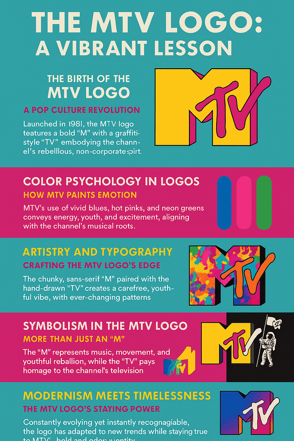
MTV arrived in 1981 and quickly became a cultural force. Its logo rejected the buttoned-up corporate design of the time. The “M” was chunky and heavy, and the “TV” looked as if it had been spray-painted over it by hand, like graffiti or a sticker slapped on a guitar case. Manhattan Design, whose team included Pat Gorman, wanted something that felt alive on screen, and the logo became the visual signature of the decade.
Compare it with the fixed logos of Pepsi or Ford at the time. MTV’s mark was designed for reinvention. It could be splashed with neon, dipped in tie-dye or pulsed in 3D, changing from one ident to the next. The core shape held everything together, and the surface was free to change. A logo that can’t move with its audience tends to fade, and MTV’s was built to move.
Color as Mood
Color does a lot of the emotional work in any logo, and MTV has always used a loud palette: electric blue, hot pink, acid green. Bright, saturated colors read as youth and excitement, which suited a channel built around music and a certain idea of freedom. Color reaches people before shape or text does, and MTV took full advantage.
The 2022 redesign leaned into gradients to keep the logo current for the TikTok era. Each change in color has tracked the mood of the moment, from 1990s grunge to 2000s bling. The lesson for a smaller brand is that color can be part of the story you tell, not just a fixed brand swatch. MTV is one of the clearest examples of a playful logo using color to start a conversation.
Type and Texture
The basic drawing is very simple: a chunky sans-serif “M” and a scribbled “TV” that looks like it was done with a marker. On top of that MTV layered endless variations in pattern and texture, from paint splatter to retro pixels, plus the Moonman statuette that became the face of the Video Music Awards.
That balance is the useful part. The logo is simple enough to doodle on a notebook but strong enough to carry a whole brand. Keep the underlying shape clean and memorable, and you can afford to be inventive with everything around it.
What the M Stands For
The logo isn’t a monogram in the traditional sense, but the “M” carries a lot. It stands for music, and by association for movement and a bit of mayhem. The hand-drawn “TV” points back to the channel’s television roots, and the constant reinvention reflects how fast youth culture moves. Whether it is covered in psychedelic swirls or glowing neon, the logo says the same thing: we are here, now, and loud.
For a designer, the point is that a mark should mean something. MTV’s logo works as a statement of purpose, and its attitude is built into the drawing, not added afterward.
Why It Still Looks Modern
The MTV logo is somehow both of its time and ageless. In 1981 it was a rude gesture at fussy corporate design, with a raw, do-it-yourself feel. Later updates, including the 2022 redesign with smooth gradients and animations for Instagram Reels, have kept it current without changing what it is. It set trends more often than it followed them.
Scalable vector versions keep it sharp on any screen, but that is housekeeping. What has kept it alive is authenticity. The logo looked like the culture it was selling, and that matters far more than chasing whatever is fashionable.
Four Decades of Pop Culture
The logo’s history works as a time capsule. In the 1980s it glowed in neon next to Madonna’s lace gloves. In the 1990s it picked up grunge grit alongside Nirvana. In the 2000s it shone with Beyoncé-era glamour, and now it shows up for Gen Z on TikTok. Each tweak reflected the music and mood of its moment.
That is the lesson for brands: evolve with your audience, but keep the core. MTV showed how to remix a look without losing what made it recognizable in the first place.
Knockoffs and Culture Clashes
A logo this bold invites imitation, and MTV has been copied by local music channels and streetwear brands borrowing its attitude. In the 1990s critics accused MTV of borrowing urban aesthetics without credit. The 2022 redesign started its own arguments, with some people online saying it looked more like a corporate Instagram filter than a logo.
The warning for anyone designing a logo is that it carries cultural weight. Originality matters, and so does being careful about whose visual language you are borrowing.
The Business Side
Paramount Global, MTV’s parent company, reported a market value of $30 billion in 2024, and MTV is one of the brands that gives it weight. The logo appears on merchandise, apps and social media, and it supports everything from advertising revenue to the Paramount+ streaming service.
It moves between T-shirts and TikTok filters without trouble, which helps build loyalty. A small business needs the same thing at a smaller scale: a design that works on a business card and on a billboard.
Controlled Chaos
MTV’s identity is controlled chaos. The core “M” and “TV” stay constant while the logo puts on new skins: glitchy animation, retro styling, bold gradients. Consistency builds trust and variation keeps things exciting, and MTV found a way to have both. If you plan variations for your own brand, write down the rules for what can change and what can’t.
MTV’s irreverent voice, in VMA promos and on social media, does as much for the identity as the logo does. The logo is the anchor. The personality, whether playful, bold or sleek, does the rest.
Lessons From MTV
If you want a logo with some of MTV’s staying power, a few principles come out of its history:
- Keep the core shape simple and punchy. MTV’s “M” is clean even when the decoration isn’t.
- Plan for variation. Decide in advance which colors and patterns can change.
- Know your audience. MTV’s logo looks young because the channel was for young people.
- Test at every size, from a favicon to a poster, and keep vector files.
- Start from something real. MTV’s rough edges came from where it came from, so dig into your own story before designing.
A Logo That Shouts
MTV’s logo doesn’t whisper. Its visual language is bold, playful and unapologetic, and it presents the channel as the pulse of youth culture. From glitchy VMA intros to retro throwbacks, it supports MTV’s mission of amplifying culture. For any designer, the order matters: define the brand’s voice first, then make the logo speak in it.
Hashtags and Social Media
The logo was made for social feeds long before they existed. It stands out in #VMAs posts and #TBT reels. In 2021 the #MTVID campaign had artists including Melina Matsoukas reimagine the logo around diversity, which boosted its presence on X and Instagram, and it still does well on TikTok.
Any new logo should be checked in that context. Mock it up as a profile picture, a post and a story. MTV’s history shows that a good design gets shared, not just seen.
AI Tools and an Analog Logo
The MTV logo predates AI by decades, but its spirit of experiment fits today’s tools. AI logo generators such as Looka, Semplr and Designs.ai make logo creation accessible to anyone and produce options faster than an ’80s hair-metal guitar solo. Their weakness is the same as ever: they generate, but a person still has to give the result character.
To stand out, customize heavily rather than taking the first design. MTV’s fearless experimenting is a reminder to push boundaries while staying true to what the brand is.
What MTV Makes Now
MTV has long since moved beyond music videos. It makes reality TV such as Catfish, runs award shows including the VMAs, and streams on Paramount+. Its merchandise, from tees and hoodies to sneakers, trades on the logo’s cachet, and social campaigns such as 2025’s #MTVUnplugged keep it visible on X and TikTok.
A logo that works across that many products has to be flexible by design, which is exactly how MTV’s was drawn.
MTV, VH1 and BET
Next to VH1’s sleek serif or BET’s bold star, MTV’s logo stands out for how much it can change. VH1 feels corporate by comparison. BET’s mark is strong but static. MTV’s shape-shifting is what sets it apart, and it is a good reminder that a logo has to be different from its competitors, not just good.
What If MTV Started Over With a Generator?
Imagine MTV’s team in 2025 typing “music, rebellion, bold” into a logo generator. They would get a neon “M” or a glitchy “TV,” download clean SVG files and drop them into VMA promos. The results might look Gen Z-ready, but they would be variations on a shape Manhattan Design drew in 1981, which says more about the original than about the software.
MTV Now
In 2025 the brand is still busy. A new gradient treatment of the logo for the VMAs got an enthusiastic response from fans online, and a rumored VR gaming experience built around the Moonman has had tech blogs talking. The #MTVUnplugged campaign, which spotlights new artists, fits the channel’s inclusive, rebellious image, and the music press still tends to treat MTV as a meeting point of music and culture.
The bigger story is less flattering. MTV was once the home of music videos and adventurous programming, and it changed television with shows such as TRL and Beavis and Butt-head. Since then the logo has been cropped and “Music Television” dropped, reflecting a schedule now full of syndicated shows like Ridiculousness. Netflix, with its minimalist logo built for screens, avoided the same fate by investing in original content and streaming. And YouTube’s rise took away MTV’s main job, since anyone could now watch any music video instantly. The lesson is uncomfortable but useful: a logo can stay iconic while the business behind it loses its way. Staying versatile, authentic and ahead of technology is what keeps a brand from becoming a relic.
The Logo That Was Meant to Change
More than forty years after it first appeared, the MTV logo still makes the argument it made in 1981: a strong underlying shape can take almost any amount of decoration. That idea has since spread to brands far from music television. The channel’s fortunes have dipped. The logo, rude, simple and endlessly redrawn, is still one of the best things it ever made.


