The Netflix Logo: How the Red “N” Became a Streaming Icon
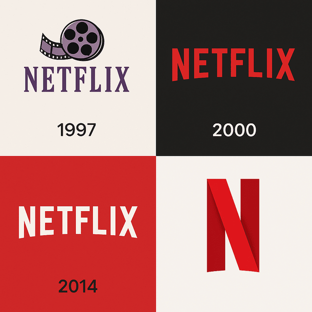
Netflix’s first logo, in 1997, had a strip of film reel curling through the name and a muted palette of purple and black. It looked like a video rental shop, which is more or less what the company was. Two decades later the reel is gone, the purple is gone, and the brand fits into a single red letter that shows up before Stranger Things and The Crown on hundreds of millions of screens. Few logos have been cut down so far and come out stronger.
From DVD Mailers to a Red Wordmark
In 1997 Netflix mailed DVDs, and its logo belonged to the age of Blockbuster and VHS. The film reel wrapped around the wordmark gave it a cinematic feel, but the muted colors and busy layout had none of the punch of modern branding. As the company moved from mailing discs to streaming, the logo had to keep up.
By 2000 the reel was gone, replaced by a cleaner red-and-white wordmark with a 3D shadow, very much of its moment and a little reminiscent of early-2000s PowerPoint slides. In 2014 Netflix introduced the logo most people know now: a sleek, bold red sans-serif wordmark, flat, with a slight curve along the bottoms of the letters that makes it feel friendlier than it first appears.
The real breakthrough came in 2016, with a standalone “N” icon. Designed by Gretel NY, it stripped the identity down to one letter in one color, and it arrived just as Netflix was becoming a global company. Paul Rand’s old line that “a logo doesn’t sell, it identifies” fits it well. The N does not try to describe anything. It marks Netflix on apps, televisions and, before long, in memes.
Why Red
Red is associated with energy, passion and urgency, which suits a service whose business depends on getting you to press play and keeping you there. It is bold and immediate, and it cuts through a crowded home screen. Set it against YouTube’s more playful red play button or Hulu’s calmer green and the difference in tone is clear. Each color tells its own story. Netflix’s red is a call to action.
The lesson for anyone choosing brand colors is to choose on purpose. Bright yellows and blues read as playful. Blacks and golds suggest sophistication. Netflix shows how much one well-chosen color can do when a brand commits to it completely and uses it everywhere.
Type and Restraint
The wordmark is a thick, modern sans-serif, identified as Bebas Neue, with a slight curve at the edges that balances authority with warmth. The serif-like flourishes of the early logos are long gone, and what is left is built for clarity and scale. On a phone or a billboard, the wordmark and the N stay sharp and legible.
The skill is in what is missing. There are no gradients, no shadows and no ornament, which is exactly why the logo adapts so easily from one platform to the next. That restraint is easy to admire and hard to practice. It is tempting to add one more detail, and almost always a mistake. A minimal design only works if it has been refined enough not to look generic, and that refinement is where most of the effort goes.
What the N Suggests
The N is both a letter and a picture. Depending on how you look at it, it is a ribbon, a doorway or a folded strip of film. That ambiguity seems deliberate, and Fast Company’s design site praised exactly that quality when the icon appeared in 2016. The N stands for Netflix, but it also hints at stories, as if inviting you into a world.
A single, suggestive shape can carry a lot of meaning. If you are designing a monogram, look for a form that reads clearly as the letter and leaves some room for the viewer’s imagination.
Modern and Adaptable
The Netflix logo is modernist in the obvious ways: clean lines, bold color, no fuss. Its staying power comes from its adaptability. Brands tied to one era, such as Blockbuster with its ticket-stub logo, aged with that era. Netflix’s design looks as current in 2025 as it did in 2014.
Design for today, but think about tomorrow. A logo that depends on a fashionable effect will need replacing when the fashion passes. One that depends on a strong shape and a clear color can simply be tidied up.
A Logo for Each Era
The logo’s history follows the company’s. The early versions belonged to a scrappy startup; the current one belongs to a global giant. Each redesign lined up with a change in the business, from DVDs to streaming to original programming. The 2016 N arrived alongside Netflix’s expansion into more than 190 countries.
In that sense the logos mark eras, in the way MTV’s logo came to stand for the music video boom of the 1980s. A redesign works best when it follows a real shift in what the company does, not when it is a cosmetic refresh looking for a reason.
AI and a Branding Backlash
Netflix’s use of AI has caused some trouble for its image. In 2025 the company announced AI-generated ads for its ad-supported tier, and critics warned of intrusive “AI slop” interrupting shows. A poorly AI-upscaled version of A Different World was criticized for distorted visuals and raised questions about quality control.
Neither episode had anything to do with the logo directly, but both affect what the red N stands for. A brand built on quality storytelling has to be careful about anything that makes it look careless. AI can be a powerful tool, and it still needs someone checking the output.
The Business Behind the N
Netflix’s stock (NFLX) has climbed alongside its brand. The company went from a $7 billion valuation in 2010 to more than $300 billion in 2025, and its unmistakable identity is part of that story. The logo works as a signal of quality to subscribers, and the same red N on apps, ads and merchandise reinforces that trust everywhere it appears.
The Same Everywhere
Consistency is Netflix’s great strength. On a smart TV, a phone or a billboard, the logo is the same: red, bold and clear. Netflix’s 2015 rebrand with Gretel NY brought its interface, print and digital materials into line so the experience feels seamless wherever you meet it.
Small brands can do a version of this cheaply. Use the same logo, fonts and colors on business cards, social media profiles and the website, and write down the rules so nobody improvises.
Lessons From Netflix
Four lessons stand out. Simplicity wins: a cluttered logo is forgettable and a clean one lasts. Know your audience: Netflix’s red appeals to people looking for excitement, not calm. Iterate: the logo changed as the business changed, and yours can too. And customize: a starting point from a template or a generator is fine, but the finished logo has to be yours.
Playful and Commanding
The logo sits inside a visual language that is both playful and authoritative. The app, with its large thumbnails and the N in the corner, feels like a curated cinema. Few brands manage both moods at once. Netflix does it by keeping the logo serious and letting the artwork around it have fun.
If you are trying to strike the same balance, decide which part of the identity carries the authority and which part carries the personality. Asking one element to do both usually produces a muddle.
#NetflixAndChill
The logo is a social media fixture. Hashtags such as #NetflixAndChill and #NetflixEverywhere have spread it well beyond the app, and the N turns up constantly in fan art and parodies. At that point a logo has gone past branding and become part of the culture. A simple, shareable mark helps that happen, because people can redraw it and remix it without losing the reference.
Technology and AI in Logo Design
Netflix is leaning further into AI, with a 2025 chatbot and search features built on OpenAI technology. Logo design is moving the same way. AI logo generators such as Logomaster, BrandCrowd and Semplr produce dozens of options in seconds and let you adjust colors, fonts and layouts. The risk is that the results look generic.
Imagine Netflix trying one for a 2025 redesign. Type in “bold, modern, entertainment,” choose red and sans-serif, and you would get a dozen N variations, some angular and some curvy. Netflix’s designers would pick the best and refine it until it was scalable and meme-ready. The tool might spark an idea; the curation is what would make it iconic, just as it did with the bespoke N.
More Than Streaming
The logo now fronts a much bigger business. Beyond streaming, Netflix offers games, live events such as the Mike Tyson vs. Jake Paul fight, and an ad-supported tier. A 2025 revamp of its TV app added AI-powered search. The logo is the thread through all of it, which only works because it is simple enough to sit on a game screen, a boxing ring and a TV menu without looking out of place.
Netflix Against the Competition
YouTube’s red play button is lively but less flexible. Hulu’s green wordmark is understated. Disney+’s blue arc is elegant but tied closely to Disney. Netflix’s red N is bold and adaptable, and it works across cultures and devices. It is also simpler than Amazon Prime’s busier arrow logo.
The aim for any logo is the combination Netflix found: distinct enough to be yours, plain enough to be understood anywhere.
Recent News
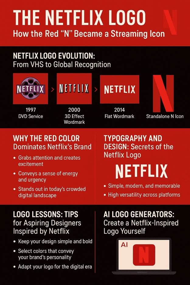
Netflix has been busy in 2025. AI-generated ads are planned for 2026 and are meant to blend in with shows, though they risk annoying viewers. A new homepage and AI-powered search have arrived for iOS users. The departure of the company’s VP of Generative AI for Games suggests some internal reshuffling. All of it means the brand, and the logo with it, has to stay flexible through a lot of change.
Tudum 2025 streamed live from the Kia Forum in Los Angeles on May 31, 2025, at 8 p.m. ET, a celebration of shows such as Stranger Things, Squid Game and Wednesday. The 90-to-120-minute variety show offered sneak peeks and cast reunions, mixing marketing with entertainment. Sofia Carson hosted, Lady Gaga performed, tied to her viral Wednesday moment, and WWE stars such as CM Punk appeared alongside celebrities like Ben Affleck, who was promoting The Rip.
The event is part of a bigger move into live programming, which already includes the Jake Paul vs. Mike Tyson fight, NFL Christmas games and the Katie Taylor vs. Amanda Serrano rematch on July 11 at Madison Square Garden. Tickets for the 9,500-seat Tudum event sold out within a week, the kind of demand usually seen at Comic-Con or Disney’s D23. Tudum is not a big earner, but its reach, with 78 million social media views in 2023, shows how good Netflix is at fan engagement. The red N sits at the center of all of it.
What the Red N Gets Right
Netflix’s logo works because the company kept removing things. The film reel went, then the shadow, then most of the word, until a single red letter was enough. Each step followed a real change in the business, and none of them threw away the color that ties the versions together.
For anyone designing a logo, that is the lesson: commit to one strong color, simplify until it hurts, and redesign only when the company itself has changed.


