The Barbie Logo: How a Pink Script Became a Brand
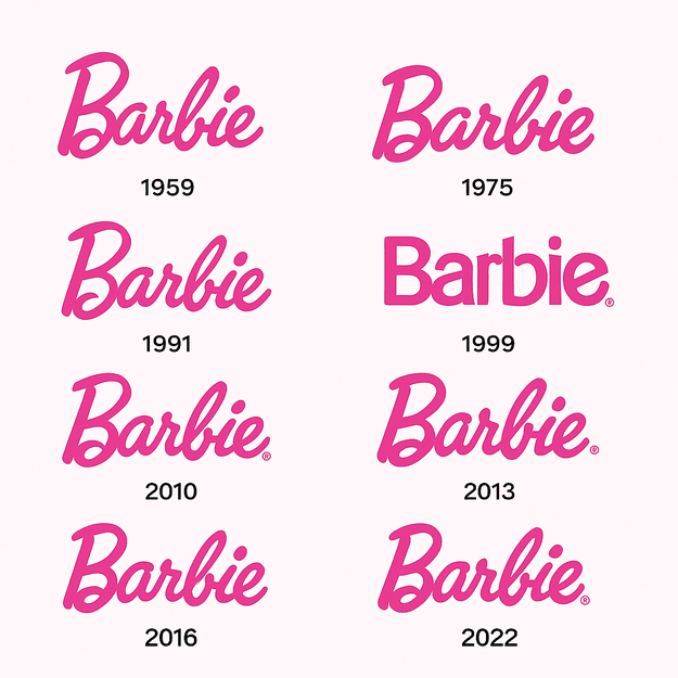
When Ruth Handler introduced Barbie in 1959, the doll’s name came in a cheerful handwritten script, in pink. More than sixty years and several redesigns later, the logo is still pink and still a script, and that stubbornness is most of the reason it works. The original lettering was a custom typeface that Designmantic has described as girly, fun and confident, and it set the tone for a brand that would change how toys talked about femininity. It read like a personal note, charming and hard to ignore, and it introduced the doll as a promise of glamour and possibility.
The first logo was drawn by hand, not assembled from a font menu. It used a display script that recalled a 1950s film star signing autographs, and the handwriting gave it intimacy, as if Barbie were a friend rather than a product. That warmth helped hook a generation and turned a doll into a lifestyle.
Barbie Pink
Barbie Pink is bright, saturated and impossible to miss, and it is the heart of the logo. Logome.ai describes it as evoking feminine glamour and nostalgia, and it manages to be playful and polished at the same time. In the usual reading of color psychology, pink stands for joy, optimism and approachability, which suits a brand built around children’s daydreams. It is no accident that Barbie’s pink is now as recognizable as Coca-Cola’s red or Tiffany’s blue.
The exact shade has moved over the years, from pastel in the 1980s to a deeper, more fashionable pink in 1999. Each shift tracked the mood of the time: lighter pinks for a softer, more inclusive feel, bolder pinks for a more confident, modern image. The color works as emotional shorthand. It tells you what the brand stands for, roughly “you can be anything,” without a word. If you are designing a logo, choose a color that tells your story, not just one that stands out.
The Script
The Barbie logo is above all a piece of lettering. Its custom script, probably drawn by hand, mixes elegance with play. Logodesignvalley.com has described it as conveying elegance, sophistication and a hint of playfulness, and that combination makes it instantly recognizable. Most modern logos use geometric sans-serifs. Barbie’s cursive harks back to a time when handwriting was a craft, and it looks effortless while being anything but.
The lettering has changed gradually. In 1991 the logo briefly went sans-serif, following the minimalism of the early 1990s, and then returned to cursive. The 1999 redesign, set at a jaunty 45-degree angle, added a signature-like flourish and made the logo look more like an autograph than ever. The lesson is that consistency usually beats trends. A logo should evolve rather than be reinvented, and Barbie’s short sans-serif detour is the exception that proves it.
What the Script Stands For
The Barbie logo is not a monogram in the usual sense; there are no interlocking initials. But the script works like one, as visual shorthand for the brand’s identity and its message of empowerment. The curly “B” sits at the front like a crown, a sign of Barbie’s long reign in pop culture, and for generations of fans the logo is a badge of belonging. A good logo tells a story at a glance, and this one says fierce, feminine and permanent.
Its simplicity matters too. Where cluttered logos compete for attention, Barbie’s one-color script shows restraint. Simple logos scale, and this one works as well on a doll box as on a billboard.
The 2022 Polish
The 2022 Barbie logo redesign was a subtle update, not an overhaul. It kept the cursive, tightened the spacing between letters and deepened the pink to suit current tastes. Barbie has a knack for staying modern without losing her identity, and Logome.ai has noted that the logo’s consistency shows off the brand’s innovation while respecting where it came from.
Compare that with brands such as Pepsi, which overhaul their logos every few years to chase trends. Barbie’s logo is more like a little black dress, classic but adaptable. The lesson for designers is to build something that can flex with the times without forgetting its roots.
The Logo Through Fashion Eras
Barbie’s logo has worked like a fashion mood board. In the 1970s it took on a bolder cursive that matched the confidence of the disco era. In the 1980s the script became more refined, in step with Barbie’s turn toward career dolls. In the 1990s a sleeker sans-serif version reflected grunge-era minimalism, though not for long. Each version captures its decade, which shows a logo can be a time capsule and still look ahead.
That adaptability is a big part of why Barbie remains a cultural fixture. The logo sells an idea of fashion, freedom and possibility along with the dolls. Among playful brands it is one of the best examples of mixing nostalgia with a forward-looking style.
Knockoffs and Criticism
Barbie’s logo has had its share of trouble. Knockoffs put pink cursive on everything from cheap dolls to T-shirts, wearing down the brand’s premium image. There is also a long-running cultural debate: some critics argue that Barbie’s hyper-feminine branding reinforces stereotypes. Barbie has answered by diversifying the doll line and keeping the logo welcoming, a pink signal meant for everyone.
The 2025 Barbie Box Challenge, in which people used AI to generate Barbie dolls of themselves, started a fresh argument. BBC News reported experts’ concerns about the use of copyrighted data and the environmental cost of AI. The challenge copied the logo’s lettering and the packaging closely, which raises real questions about how much control a brand has over its identity once AI tools can reproduce it on demand. Barbie’s response so far has been to carry on as usual.
Branding and the Bottom Line
Mattel, Barbie’s parent company, has seen its stock rise along with Barbie’s branding successes. The 2023 Barbie movie, with the logo on every piece of merchandise, raised Mattel’s revenue by 16% year over year, according to financial reports. The logo’s presence on dolls, clothes and movie posters drives loyalty and sales. A logo is a business asset as much as a piece of design, and Barbie’s has made Mattel a great deal of money.
Consistency
Barbie’s identity is a lesson in consistency. The pink script has stayed constant while the dolls have changed from Malibu Barbie to Astronaut Barbie, and that consistency builds trust. VistaPrint’s advice that a logo should reflect a brand’s personality, playful or sophisticated, fits here, because Barbie’s logo manages to be both. It is a useful model for anyone trying to balance creativity with coherence.
For businesses this means settling on a core visual language and sticking with it. Whatever tool you design in, make sure the logo tells the same story everywhere it appears.
Design Lessons
If you want a logo with Barbie’s staying power, these are the main points:
- Keep it simple. Barbie’s one-color script shows how little a logo needs.
- Know your audience. Pink speaks to dreamers of every age; your logo should speak to yours.
- Evolve instead of starting over. Small changes have kept Barbie fresh without losing fans.
- Use color on purpose. Choose colors for the feelings they carry.
- Test ideas quickly. AI logo makers such as Looka can produce dozens of options in seconds, so you can try styles like Barbie’s cursive before committing.
Wix points out that AI logo generators are good for quick, affordable designs, especially for startups. Barbie’s logo shows that a simple design can become legendary with the right strategy behind it.
The Logo’s Voice
The Barbie logo says a lot without words. The cursive winks; the pink promises fun. That visual language has carried campaigns from “You Can Be Anything” to the “Barbie World” look of the 2023 movie. A logo should get the brand’s character across instantly, and that is as true for a bakery or a tech startup as for a doll. Think of it as a handshake.
Barbie Online
Online, the logo spreads easily. #BarbieBoxChallenge trended in 2025 as people posted AI-generated dolls in packaging modeled on Barbie’s. The cursive and the pink are instantly recognizable on TikTok and Instagram, which shows how well the logo has made the move to screens. Any logo now has to work on social media, where attention spans are very short.
AI and the Barbie Brand
AI logo tools such as Looka and Canva have made it possible for almost anyone to make a logo in minutes. ZDNET has noted that platforms like Hatchful produce more cohesive, less generic logos by letting users adjust styles and colors. Barbie’s logo, with its clean lines and strong color, could easily be reworked by such tools into endless variations that keep its essence.
AI also raises harder questions. The Barbie Box Challenge showed how easily AI can imitate Barbie’s branding, and critics have raised privacy and copyright concerns about uploading personal photos and copying a protected identity. For small businesses, on the other hand, AI logo makers are a real help, offering professional-looking designs at very low cost.
Barbie Beyond the Doll
The logo appears on far more than dolls. Clothing, makeup, furniture and the 2023 Barbie movie all carry the pink script as a seal of aspiration. Mattel’s licensing includes Barbie Dreamhouses, Hot Wheels crossovers and even a Barbie-themed Xbox, and every product carries the logo, holding the whole range together. It shows how far a logo can stretch across different media.
The Lego logo is a useful comparison. Its bold red square and white lettering go well beyond plastic bricks, appearing on theme parks, video games and films. Its simple, versatile design is recognizable everywhere it goes, which shows that a logo’s strength comes from adaptability and emotional connection.
Against American Girl and Bratz
Next to competitors like American Girl and Bratz, Barbie’s logo stands out for simplicity and longevity. American Girl’s logo, with its star motif, feels patriotic but less flexible. Bratz’s bold, graffiti-style logo is rebellious but lacks Barbie’s lasting elegance. Barbie’s sits in the middle, playful and polished at once.
If Barbie Used an AI Logo Generator
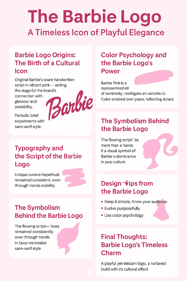
As a playful exercise, imagine Barbie in 2025 reworking her own logo with an AI tool. She types in “Barbie,” picks “playful” and “feminine” and, naturally, pink. The software produces variations from bolder cursives to minimal sans-serifs, ready to use. She adjusts the letter spacing, maybe adds a sparkle, and ends up with something fresh but familiar.
The exercise shows how free tools can help even a big brand test ideas. A Medium article described tools like Fiverr Logo Maker as producing sleek, modern designs with little effort, which suits a brand that wants to try new looks without a long agency process.
Barbie in 2025
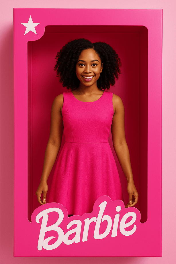
In 2025 the Barbie logo is everywhere. The Barbie Box Challenge went viral, with people generating dolls of themselves in Barbie’s familiar packaging and decorating the boxes with their own touches. The 2023 movie still drives merchandise sales, with the logo on everything from T-shirts to popcorn buckets. Mattel’s push for inclusivity, with new dolls that have disabilities and a wider range of skin tones, keeps the brand current, and the logo ties it all together. Mattel’s newer eco-friendly packaging, also carrying the logo, plays to sustainability-minded younger buyers. The challenge has even spawned competitions around the world, with creators competing for Barbie-branded prizes.
Why the Script Lasts
Barbie’s logo has survived because Mattel kept the two things people recognize, the pink and the handwriting, and let everything else move. The one time it dropped the script, in 1991, it came back quickly. That is a useful lesson for any brand: find out which parts of your logo people actually remember, and protect those.
If you are starting a brand of your own, a free tool like Semplr is a fine place to sketch the first version. Then do what Barbie did: pick a color and a letterform worth keeping, and keep them.


