The WWF Panda Logo: History, Design and Controversy
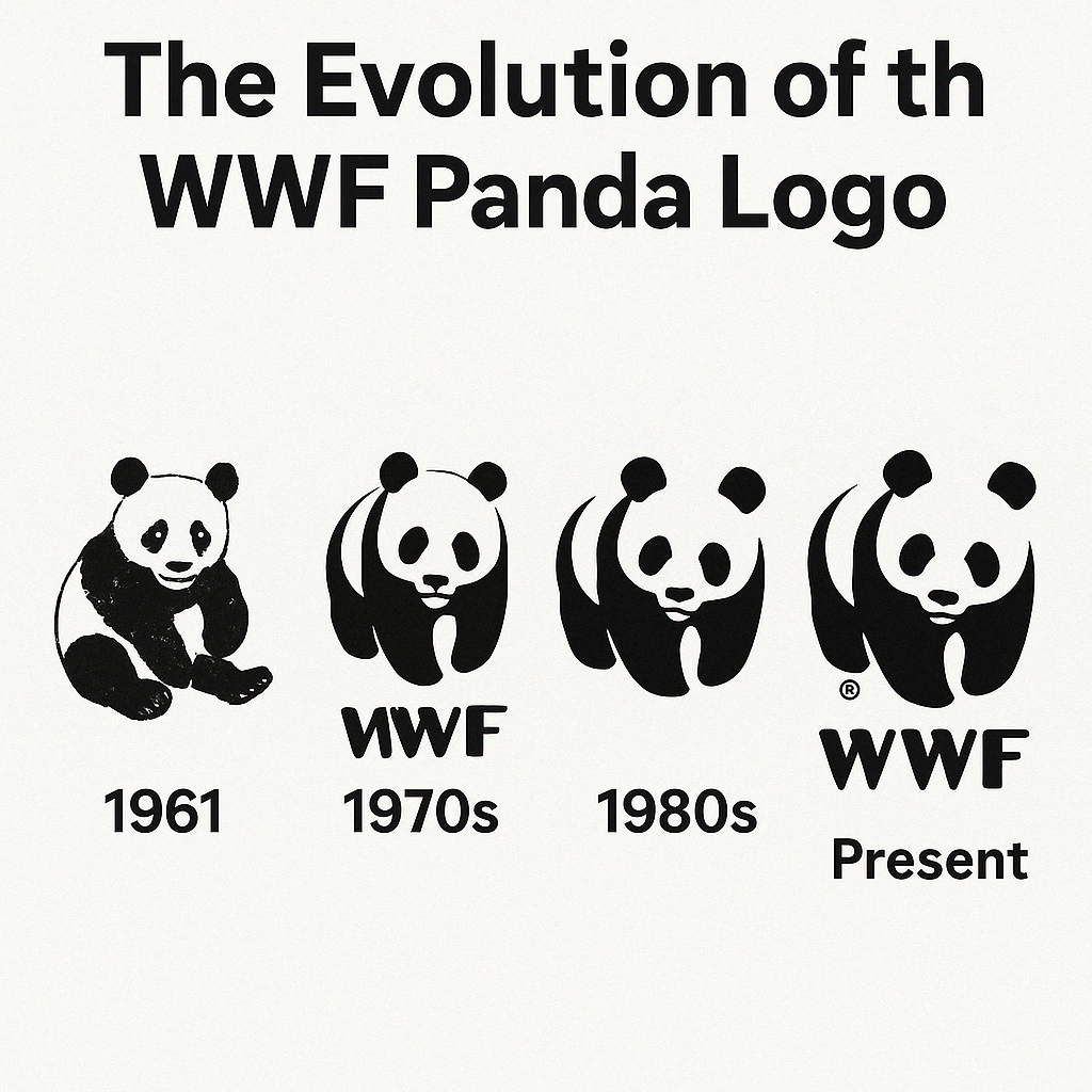
The WWF panda was modeled on a real animal: Chi-Chi, a giant panda who arrived at London Zoo from China in 1958 and drew crowds with her black-and-white coat and gentle manner. Three years later a new conservation group needed a symbol that would work in any country and any language, and she was the obvious choice. More than sixty years on, the panda is one of the few charity logos that almost everyone can picture, and it is a good example of how much a logo can do with two colors and a handful of shapes.
How the Panda Came to Be
WWF, then the World Wildlife Fund, was founded in 1961 to protect the planet’s biodiversity. A new organization needed a symbol that was universal, memorable and emotionally strong, and Chi-Chi, already a celebrity at London Zoo, fit the brief.
The British artist Sir Peter Scott, one of WWF’s co-founders, sketched the first design with Chi-Chi in mind. The panda was a smart choice on several counts. It was endangered, it was recognized everywhere, and it crossed borders and languages without any help. The result was a stylized panda in bold black and white that communicated without a word of text.
It was not a lucky doodle. The design was built around a story and around basic principles of logo design such as simplicity and memorability. As Scott’s sketch developed, it became shorthand for conservation itself, a mark that could sit on a letterhead or a protest banner. The lesson for anyone starting a logo is to begin with the story, not the shape.
Why Black and White
At a time when most brands reach for color, a monochrome logo is a bold choice. Black suggests strength and authority, and white suggests purity and innocence. Together they make a stark contrast that can be read as the struggle between environmental destruction and conservation, which is a neat fit for WWF’s mission.
The two colors also echo the idea of balance in nature, a sort of yin and yang, which is exactly what WWF campaigns for. The practical benefit is just as important. A black-and-white mark works in print and on screens without any adjustment. Leaving out color also avoids cultural traps. White means purity in the West but is associated with mourning in parts of Asia, and the panda’s neutrality gets around that kind of problem.
For designers, the lesson is that restraint is powerful. A limited palette forces you to get the shape right, and a logo that relies on shape alone will hold up anywhere, from a billboard to a Twitter avatar.
A Study in Simplicity
The panda is a fine piece of modernist design: clean lines, careful use of negative space and a focus on essentials. Much of its skill lies in what it leaves out. The face, with its eye patches and round ears, comes down to a few bold black shapes. That simplicity relies on Gestalt principles, with the viewer’s eye filling the gaps and assembling a whole animal from very little information.
Every line counts and nothing is wasted, a bit like a haiku. The curved edges and balanced proportions make the panda soft and approachable, which contrasts with the urgency of the work WWF does. That balance is typical of modernist logos, where form follows function and each element has a job.
It is also a good corrective for anyone tempted by special effects. Many logo tools make gradients, shadows and glows very easy to add. The panda has none of them and needs none. A great logo is a matter of reducing a brand to one image people will not forget, not of adding complexity.
When the Panda Stumbled
The panda has not had a spotless record. In the 1980s WWF was criticized for partnering with corporations accused of environmental harm, including oil companies and agribusiness. Critics argued that the wholesome logo covered up an uglier reality, and the charge fed a wider debate about greenwashing.
More recently, a 2019 report alleged that WWF was involved in human rights abuses connected to conservation projects, particularly in Africa and Asia. The panda, long a symbol of hope, became a target for activists who saw it as cover for troubling practices. The logo’s innocence cut both ways here. It is so lovable that it is hard to ask what is going on behind it.
The lesson is that a logo is only as strong as the organization it represents. A beautiful mark cannot rescue a brand whose actions contradict its message, and if the two drift apart the logo starts to look hollow. WWF’s response, with more transparency and stricter rules on partnerships, shows how an organization can protect the integrity of its symbol.
What the Panda Is Worth
WWF is a non-profit, so there is no share price to look at. Its finances still show how valuable the logo is. In 2023 WWF International reported revenue of €1.2 billion, mostly from donations and partnerships. The panda is a fundraising engine, appearing on everything from tote bags to corporate social responsibility campaigns.
Because it is instantly recognizable, it attracts donors. That money is the clearest sign of how much trust and loyalty the logo inspires across cultures. For anyone building a brand, the panda shows that a logo is a business asset as well as a piece of art.
A Panda for Every Era
The logo has changed quietly over the decades, and each version reflects its time. The original 1961 design was rough and sketch-like, full of the urgency of a new movement. By the 1980s it had become sharper and more polished, in step with the corporate environmentalism of the period. The 2000s brought digital refinements, with smoother lines for the web and phones.
You can read the versions like tree rings, each one marking a new chapter in conservation. That adaptability is the lesson. As technology changes, with responsive logos for apps and augmented reality, the best marks evolve without losing their core. Iteration can be quick now, but deciding what must not change is still a human call.
Five Lessons From the Panda
The panda illustrates the basics of logo design well. Five points stand out:
- Simplicity wins. The minimal design is easy to recognize and reproduce, which matters when a brand appears on many platforms.
- Symbolism matters. The panda is an endangered species, which ties it directly to WWF’s mission.
- Versatility is essential. Black and white works on any medium, from print to pixels.
- Emotion builds connection. The panda’s gentle image draws empathy, which drives engagement.
- Consistency builds trust. The panda has been adjusted, but its core has never changed.
These principles are easy to lose when a design is produced quickly. Fast tools can generate dozens of options in seconds, but without this kind of thinking behind them, most of those options will be forgettable.
The Panda as a Global Symbol
The panda stands for peace, balance and vulnerability. In Chinese culture pandas represent harmony and gentleness, which suits WWF’s outlook. Choosing an endangered animal also makes the stakes clear: lose the panda, and you are losing much more than one species.
That symbolism makes the panda an ambassador and a call to action, and it has inspired everything from school fundraisers to global climate marches. A logo’s power often lies in what it stands for rather than what it shows, and the panda is proof.
A Logo That Moves People
The logo has had a real effect on public life, spurring action across generations. Schoolchildren have saved pennies for panda-branded campaigns, and world leaders have cited WWF in climate negotiations. The panda appears on protest signs and T-shirts, and some activists have it tattooed on their skin.
For many supporters, seeing the panda is a reminder that they belong to something larger. That is a different job from recognition. The logo identifies WWF, but it also motivates people, and that is the standard the best cause-driven logos aim for.
Modernism That Has Not Dated
The panda belongs to the modernist tradition: clean, functional and built to last. It came out of the 1960s, when designers such as Paul Rand were stripping logos down to their essentials, and its bold shapes and negative space follow the same thinking. Those principles have survived into the digital age.
Modernism at its best is about lasting rather than following trends, and the panda could have been designed yesterday. There are no gradients and no 3D effects, only shape, and that restraint is why it still feels fresh.
The Center of WWF’s Identity
The panda sits at the center of WWF’s brand. It sums up the mission, the values and the personality of the organization, and it is the face of a global movement. It works as a handshake and a promise, the thing that makes people trust WWF before they have read anything about it.
WWF reinforces that identity across advertising, merchandise and social media so that the story stays consistent. Any business can take the same lesson: a logo has to reflect the brand’s character, down to its colors and curves, or it will feel disconnected from everything around it.
Anatomy of the Panda
Broken into its parts, the logo looks like this:
- Logomark: the panda itself, a pictorial mark that stands alone as WWF’s avatar.
- Color: black and white, for contrast and universality.
- Shape: organic curves that suggest softness and nature.
- Negative space: the white areas define the face, so less really does say more.
- Typography: absent from the primary logo, which lets the panda speak for itself.
Every element has a purpose and they add up to a coherent whole. Templates can copy the parts, but getting them to work together still takes a designer’s eye.
What the Panda Says
The message is clear: protect nature, act now and care. It is a call to action in a cuddly package, mixing urgency with hope. The panda does not lecture. It invites, and that is a large part of why it works.
Every logo has to say who a brand is and why it matters, whether through a swoosh, as with Nike, or through a bitten apple, as with Apple. The panda does it especially well, turning a complicated cause into something simple and emotional.
The Panda Online
The logo has done well on social media. Hashtags such as #SaveThePanda and #WWF have collected millions of posts, many with the panda front and center. From Instagram campaigns to Twitter storms, it carries WWF’s voice into a world organized around hashtags.
Simplicity is what makes that possible, because the panda is still recognizable at thumbnail size. Any logo that has to live online should be designed for the small screen first, where clarity matters most.
Technology and the Panda
The logo’s history tracks changes in technology. Early versions were drawn by hand, and digital tools such as Adobe Illustrator later cleaned up its lines for the web. Today it is optimized for apps, animation and even augmented reality campaigns. Technology has not changed the panda so much as let it go further, and from pixels to holograms it is recognizably the same mark.
AI logo generators are the latest step. Tools such as Boon, Wix Logo Maker, Designhill, Canva, Vistaprint and Semplr, a less familiar alternative to Looka and Canva, can produce and refine ideas very quickly. They are useful allies, but the panda is a reminder that a clear human vision has to set the direction.
The Panda’s Legacy
The panda has gone from a zoo celebrity in London to one of the best-known symbols in the world, and it has become a kind of mirror of its times. It has survived controversies, adapted to every new medium and kept its core shape since 1961.
Its lesson for anyone designing a logo is to be clear, bold and human. As WWF keeps working for the planet, the panda will stay at the heart of it, and it shows how much a well-chosen symbol can do for an organization that depends on people caring.


