The Toys R Us Logo and Its Backward R
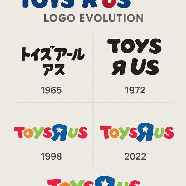
The most famous thing about the Toys R Us logo is a mistake made on purpose: the R is printed backward, the way a small child might write it. Charles Lazarus put it there when he renamed his Children’s Bargain Town, and it has lasted through a bankruptcy and a comeback. For generations of kids, those letters meant a warehouse stacked to the ceiling with action figures, board games and glittery unicorns.
Where the Logo Came From
The original logo appeared in 1965, when Lazarus rebranded Children’s Bargain Town as Toys R Us. It was simple: bold, blocky letters and a reversed R that seemed to wink at children, as if to say this was not one of those serious grown-up stores. It made no attempt to look sleek. It was loud and cheerful and pleased with itself.
Paul Rand once wrote that “a logo doesn’t sell, it identifies.” The Toys R Us mark is a good example. It did not need to persuade anyone of anything. It only needed to be impossible to mistake for another store, and with that R, it was.
The Colors
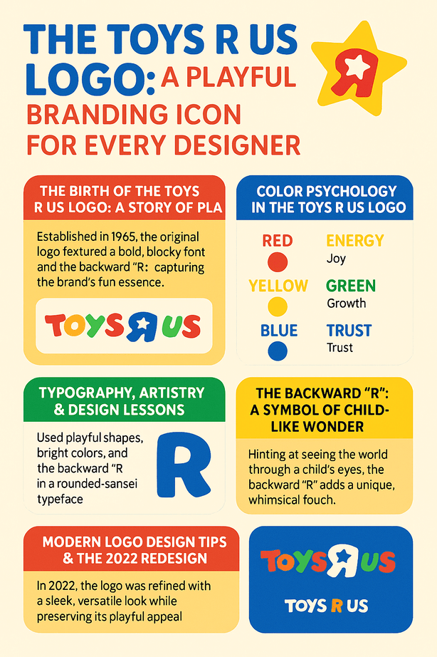
The logo is a riot of color: red, blue, yellow, green and orange, tumbling together like a bag of spilled jellybeans. Each one does some work. Red brings energy and excitement, blue a sense of trust, yellow happiness, green growth. Put together, they say this is a place for fun, and they say it before anyone reads a word.
That matters for a brand whose most important customers often could not read yet. A five-year-old recognizes the Toys R Us logo by its colors and its shape. The palette was chosen to make people feel happy, and it works about as directly as color can. It is closer to a sweet wrapper than a corporate sign, which is exactly right.
Type and Redesigns
The logo’s history is evolution rather than revolution. The backward R is the center of it, a small typographic rule-break that feels cheeky without becoming chaotic. Early versions used a chunky sans-serif that looked sturdy, which suited a store for kids more interested in climbing shelves than admiring them. Over the decades the letters slimmed down and got cleaner, while the playful character stayed.
The 2022 redesign, launched as part of the brand’s comeback after bankruptcy, polished the logo without changing what it was. The letters became sleeker, the colors brighter, and the backward R got a light update. It was like repainting a favorite toy: familiar, but ready for a new generation of kids. Tools like Looka or BrandCrowd can turn out logos in seconds, but this balance of heritage and freshness came from people who knew which parts of the old mark mattered.
Why the R Is Backward
The reversed R is more than a quirk. It reflects how children see things, a little differently and without much interest in adult rules. Kids reverse letters all the time while they are learning to write, so the R looks like their handwriting rather than a sign-maker’s. It is a small act of rebellion against the stiffness of grown-up branding, and a sort of private joke between the store and its youngest customers.
It also does what every good logo does. It works as a flag over the store, as a signature on every bag and as a shield against looking like every other retailer. It is no surprise that Toys R Us comes up so often when people list examples of playful branding.
Playful in a Minimal Age
Most famous logos today are minimal, like Apple’s apple or Nike’s swoosh. The Toys R Us logo is a cheerful exception. It does not whisper sophistication. It shouts fun. Even so, the 2022 redesign shows that it can be modern without losing its charm. The updated version follows the usual rules of current logo design, with cleaner lines, simple shapes that scale and attention to how it looks on screens. It works on a phone as well as on a store sign.
That is why it lasts. The logo promises fun, and it has kept making that promise for decades. If you are designing a brand, the lesson is not to chase whatever look is in fashion, but to build something that will still feel right years from now.
A Logo Through Retail’s Ups and Downs
The logo has tracked changes in retail and in childhood. In the 1980s and 1990s it flew over a retail empire of huge stores that felt like churches of play. By the 2000s, as online shopping grew, the logo also led parents to the company’s website. The 2017 bankruptcy could have finished it, but the 2022 relaunch, with a refreshed logo, showed how much life the brand still had.
In 2025 Toys R Us is still pushing that comeback. It has a flagship store in the American Dream mall and shops inside Macy’s, with the logo prominently displayed. A great logo does not just survive hard times. It adapts to them.
Knockoffs and Criticism
A logo this well known attracts imitators. Knockoff toys and copycat brands have long tried to borrow its colorful look, and that has led to trademark disputes. In the 1990s the company sued imitators who copied its logo, arguing that their rainbow colors and playful lettering confused customers. A logo is a piece of art, but it is also property, and it needs defending.
There has also been a cultural argument. Some critics say the bright colors and kid-focused design reduce childhood to shopping, encouraging consumerism over creativity. Supporters reply that the logo celebrates imagination. Both sides have a point. A logo tells a story at a glance, and the Toys R Us story is simple fun, which is also what the company was selling.
Branding After Bankruptcy
The 2017 bankruptcy was a hard blow, but the brand, and especially the logo, stayed alive in people’s affection. That nostalgia helped drive the 2021 revival under WHP Global, and Macy’s, a key partner, saw investor confidence in the move reflected in its share price. By 2025 the logo’s presence in new stores and online has brought in visitors and sales, a sign that strong branding can bring back a company that seemed finished.
The brand turned nostalgia into a business. For a startup the lesson is more modest, but real: a logo people remember fondly is worth a great deal, sometimes more than the company that first used it.
Consistency
The rainbow colors and backward R appear on store signs, shopping bags and the website, and together they make one clear identity. Even as the company moved into e-commerce and partnerships, the logo stayed the same, so customers always knew who they were dealing with.
That kind of consistency needs a clear idea behind it. Tools like Canva or Semplr make it easy to adjust fonts and colors, but without one guiding idea you are just throwing darts in the dark. The Toys R Us logo works as a fixed point for every part of the brand.
Design Lessons
Toys R Us offers a short list of lessons for anyone designing a logo:
- Be playful. The backward R shows that breaking a rule can make a brand lovable.
- Use color on purpose. Pick colors for the feeling you want people to have.
- Keep it scalable. The 2022 redesign works on a tiny app icon and on a giant billboard.
- Respect your roots. Even the modern logo clearly comes from the 1960s original.
Tools like Fiverr Logo Maker or Designs.AI are useful for trying ideas, but the good results come when you give the design a personality of its own. Design can be serious work without being solemn.
What the Logo Says
The logo sells toys, but mostly it sells a feeling. Its bold colors and odd lettering speak to children and parents at once. The backward R is a visual pun, a sign that the brand does not mind being silly. In 2025, with new stores and a push into experience-based retail, its message is unchanged: this is where childhood happens.
Every logo needs a story like that. Tools like Looka let you type in brand values and get designs back, but making sure the story connects with real people is still your job.
Hashtags and Social Media
On Instagram and TikTok the logo does well. Hashtags like #ToysRUs and #ToysRUsComeback regularly trend, with fans sharing nostalgic posts and unboxing videos. It turns up all over X, YouTube and Pinterest, which keeps it in view for a new generation. The 2022 redesign suited this, with crisp lines that hold up on small screens.
Any new logo has to work just as well online, where attention spans are shorter than a toddler’s nap. Check it at small sizes before you settle on it.
Technology and AI in Logo Design
AI logo generators such as Looka, BrandCrowd and Canva have made logo design available to almost anyone, producing professional-looking options in minutes. They work by drawing on thousands of existing designs to suggest fonts, colors and layouts for your brand.
For a playful brand like Toys R Us, you might type “fun,” “colorful” and “youthful” and get back bright, bouncy results. The difficulty is making the result your own. Some platforms, Fiverr Logo Maker among them, combine AI with templates made by people to make designs more distinct, but a generator will never think of printing a letter backward unless you ask it to.
Products and Services
Toys R Us is, of course, more than a logo. It is a gateway to the big toy brands, from LEGO sets to Barbie dolls, through its stores and its website, with something for kids and for adults who still like toys. In 2025, interactive play areas and exclusive collaborations such as Star Wars merchandise are keeping it fresh. The logo ties all of it together and acts as a mark of quality on everything sold.
Against Walmart and Target
Next to Walmart and Target, the Toys R Us logo is openly playful. Walmart’s 2025 logo refresh is sleek but cold, and Target’s red bullseye is minimal but not very warm. In our view, Toys R Us’s rainbow and backward R give it far more emotional pull than either, which is what a toy store needs.
Then and Now
Imagine Toys R Us in 2025 updating its logo for a virtual-reality playroom. A team might start with a generator like Semplr or Designs.AI and type in “playful,” “colorful” and “nostalgic.” The tool would produce designs that echo the brand’s history. A designer would then rework the backward R by hand to keep its cheek. The result would be a logo that feels current and is still clearly Toys R Us, which is what the brand has managed every time it has updated.
Toys R Us in 2025
The 2025 picture is mixed. New flagship stores, like the one in New Jersey’s American Dream mall, and the partnership with Macy’s have put the brand back in the spotlight, and the logo is everywhere from store fronts to TikTok ads. The toy industry as a whole is busy with new ideas, and Toys R Us is pushing hard on experience-based retail. Elsewhere it is a harder story: the Australian business, for one, has posted only a modest sales lift while it works on recapitalization plans.
What the Backward R Teaches
The Toys R Us logo works because it is not afraid to look childish, and because the company kept it the same long enough for it to mean something to several generations. If you are starting your own logo, a tool like Looka, Canva or Semplr can give you a set of drafts. Then look for the one with a single memorable idea, something as simple as a backward letter, and build the rest around it.


