The Timberland Logo: A Tree, an Oval and Fifty Years
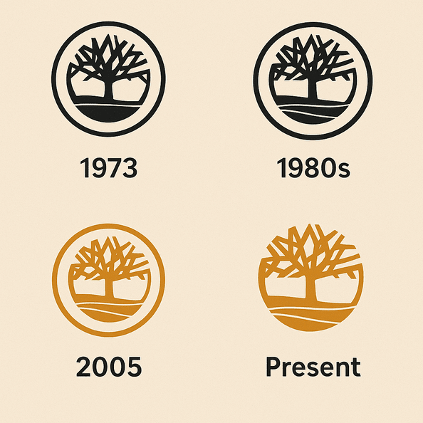
The Timberland logo was drawn for a waterproof work boot sold to New England laborers in 1973. Twenty years later the same tree was a fixture of New York hip-hop, and the logo had not changed at all. That is unusual. Most brands that cross from one audience to another redesign along the way, or get redesigned by their new fans. Timberland kept a tree inside an oval and let the people wearing it supply the new meaning.
The design itself is plain: a stylized tree, a rugged oval around it, a bold name. It has stood for durability and the outdoors for five decades, has picked up a large dose of urban credibility, and has survived counterfeiters and a few awkward arguments about who gets credit for its popularity.
1973: A Boot and a Tree
The logo arrived in 1973, when the company founded by Nathan Swartz introduced the yellow waterproof boot that would become its signature product. The boot was built for blue-collar workers in New England, people who needed footwear that survived mud, snow and long shifts, and the brand’s whole outlook was about utility. The logo matched it. A stylized tree in an oval is about as earthy and unpretentious as a mark can get, and it was clearly meant to suggest the outdoors while still looking tidy and professional on a box.
The choice of a tree was not an accident. Trees stand for strength and growth almost everywhere, and the image lined up with the promise of boots that could take hard conditions. The oval works as a frame and a shield, closing the tree in and protecting it. That mix of an organic shape inside a geometric one is a large part of why the logo has aged so well. It looks right on a construction site, and, as it turned out, in a hip-hop video.
It also set Timberland apart from the fashion houses of the time. Luxury brands traded on flashy monograms. Timberland’s mark made a quieter promise, that the thing it was stitched onto would hold up.
Green, Brown and Wheat
The brand’s colors come straight from the landscape: deep greens, rich browns and, on the boot itself, the wheat yellow that everyone recognizes. Green suggests nature and growth, and it lines up with the company’s environmental programs. Brown reads as solid and dependable, the color of leather and soil. The wheat of the boot adds some warmth, which keeps the palette from looking gloomy.
Nothing in that palette shouts. It says “trustworthy” and “outdoors” without any help from slogans, and that restraint is part of why it has worked for very different groups of people, from hikers to sneaker collectors. The useful point for anyone choosing brand colors is that the best palettes describe the product. If your colors could belong to any company, they are not doing much.
Type and Shape
The lettering that usually sits next to the tree is bold and plain, a sans-serif in the Helvetica family or a custom face close to it. It is functional and does not try to be clever, which suits a company that sells boots rather than jewelry. The tree has simplified branches and a heavy trunk, and the gaps between the branches matter as much as the branches themselves. Because the drawing is built from a few strong shapes and plenty of negative space, it scales from a tiny leather tag on a boot heel to the side of a building without losing detail.
Put it next to the dense monograms of Louis Vuitton or Gucci and the difference is obvious. Those logos impress by being intricate. Timberland’s impresses by being easy to read at a distance and hard to forget. If you are designing a mark that has to be stamped, embossed or embroidered, this is the model to copy: fewer lines, thicker lines, and nothing that falls apart when it is small.
What the Tree Means
Beyond the obvious reference to nature, the tree has come to stand for resilience and community, ideas the company has leaned into with its tree-planting campaigns. The oval adds a sense of unity and protection, which fits a brand whose whole pitch is keeping the elements away from your feet.
The more interesting meaning arrived in the 1990s, and Timberland did not plan it. The boots became a staple of New York’s hip-hop scene. Esquire has written about how rappers and hustlers in Harlem adopted them, and with them the logo, as a sign of street credibility. Wearing “Timbs” said you were tough and authentic, and it worked whether your roots were rural or urban. That crossover turned a workwear emblem into a global style symbol, and it happened because the people wearing the boots decided it should.
Why It Still Looks Current
The logo fits modernist principles: clean lines, nothing extra, function first. What saves it from looking cold, the way some tech logos do, is the subject. A tree is a warm, living thing, and even in a stripped-down drawing it brings some of that warmth along.
That balance has kept it relevant for more than fifty years. Maximalism, retro-futurism and plenty of other trends have come and gone in that time, and the tree has ignored all of them. Simple shapes with a clear meaning tend to outlive fashions. Designers who want a logo to last should spend their effort on choosing the right symbol and drawing it cleanly, and very little on whatever style is popular this year.
One Logo, Several Eras
You can trace a short history of American style through this logo. In the 1970s it marked blue-collar work clothes. In the 1990s it became a pillar of streetwear, helped along by artists such as Wu-Tang Clan and Jay-Z. In the 2000s the company’s sustainability campaigns tied the tree to environmental causes. Today the brand sits somewhere between all three: rugged gear that also passes as fashion.
Few logos are as comfortable on a building site as on a runway. Timberland managed it without redrawing anything, because the mark was neutral enough to take on new meanings without fighting the old ones. Designers can borrow the principle. A logo that is too specific to one audience has nowhere to go when a new audience shows up.
Fakes and an Uncomfortable Debate
Popularity brought copies. As the boots took off in streetwear, counterfeits flooded markets from New York to Nairobi, most of them imitating the tree and the oval closely enough to fool a casual buyer. Every fake weakens the original a little. Timberland has introduced anti-counterfeiting measures, but the problem has not gone away.
The second problem is harder. Critics have argued that the brand was slow to acknowledge how much of its cultural standing came from Black communities who turned the boots into a symbol. The logo’s value had been built, in part, by people the company was not talking to. Timberland has since worked with artists and activists to address that, though the debate has not fully settled.
Both problems point to the same lesson. A logo belongs, in practice, to the people who wear it as much as to the company that owns it. Authenticity means recognizing them.
The Business Side
Timberland is owned by VF Corporation, whose stock has had a bumpy few years. The brand has been one of its steadier assets. VF reported revenue of $10.5 billion in 2024, with Timberland a significant contributor thanks to its international reach, and the logo’s recognizability helps sell everything from boots to apparel to accessories, particularly in emerging markets.
That is the commercial case for a strong mark. People pay more for a product they trust, and a familiar logo is how they spot it on a crowded shelf. Nike is the obvious comparison, and its swoosh shows the same thing at a larger scale: a mark that is memorable and easy to sell.
Same Tree Everywhere
Timberland uses the same tree and oval on boots, backpacks and everything in between. It does not make a playful version for one product line and a serious one for another. That sameness is what builds trust. A buyer in Tokyo and a buyer in Tennessee see the same mark and expect the same quality.
Small brands tend to underrate this. They tweak the logo for each new channel, add a gradient for social media, squash it for a banner. Each change seems harmless, and together they leave customers unsure what the brand looks like. Pick one version, write down how it is used, and stick to it.
Design Lessons From Timberland
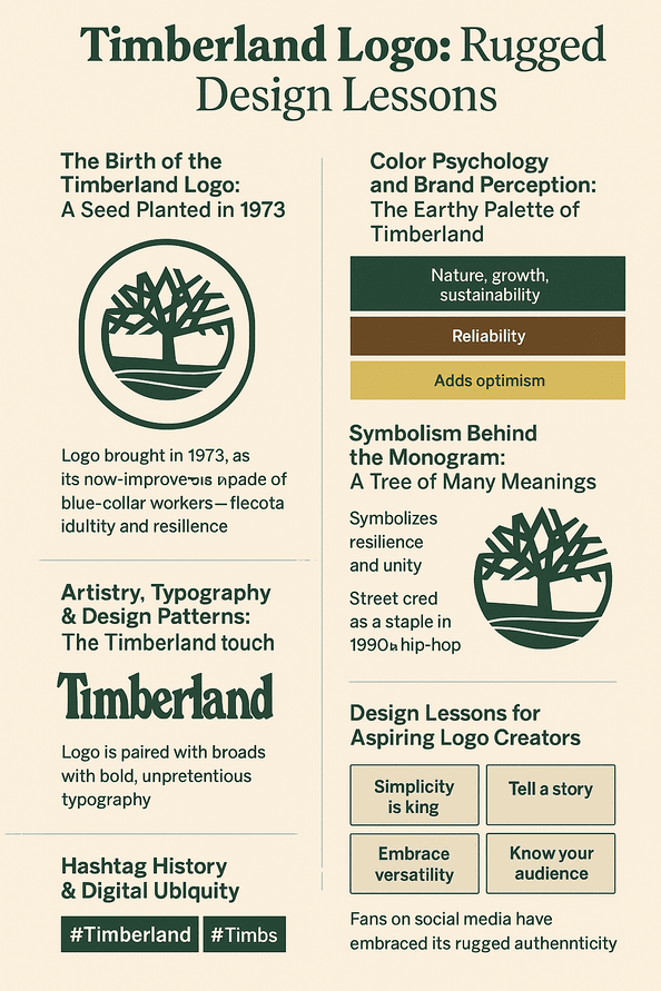
Four lessons stand out:
- Keep it simple. A tree and an oval have carried the brand for fifty years.
- Make every part mean something. The tree, the oval and the colors each say something about the product.
- Test it at every size. The logo has to work on a boot tag and on a billboard, so check both early.
- Know your audience, and be ready for a second one. Timberland’s logo speaks to construction workers and to rappers, and it did not have to change to do so.
How the Logo Talks
The visual language is rugged and honest. The values behind it, durability, adventure and sustainability, are all visible in the drawing, and you get them at a glance without reading anything. That clarity is rarer than it should be. Plenty of logos try to say five things and end up saying none.
If you are designing a mark, write down the one or two ideas it must carry and check every element against them. Timberland’s tree would fail that test if it had a sunrise behind it or a mountain beside it. It passes because it does not.
#Timbs
Social media gave the logo a new audience. Hashtags such as #Timberland and #Timbs have collected millions of posts on Instagram and X, with fans photographing their boots on city streets and mountain trails. The tree is bold and simple enough to read in a small square photo, which is not true of many older logos.
The phone screen is now a standard test. If a mark turns to mush at the size of a thumbnail, it will struggle online, however good it looks on a shop sign. Timberland’s passes easily.
AI Tools and a New Timberland Logo
AI logo generators such as Looka, Canva and Semplr now let anyone produce a professional-looking logo in minutes. They draw on design conventions, color theory and type pairings, and they are good for getting a set of options on the table quickly. ZDNET has pointed out their weakness, though: AI-generated logos often miss the human touch needed to capture what a brand is about.
Imagine Timberland’s designers typing “rugged,” “nature” and “sustainability” into one of these tools to brainstorm a new logo. They would probably get variations on the tree: a sleeker one with angular branches, or a 3D-rendered oval. Some might be interesting starting points. None would know about Harlem in the 1990s or the yellow boot. Generated designs work best as rough sketches, with a person deciding what to keep and refining the result with intent.
More Than Boots
The tree now appears on jackets, hoodies, backpacks, watches and outdoor gear. The Timberloop program lets customers send back old products to be recycled, extending the brand into what happens after a purchase. Across all of it, the logo works as a quality seal that ties very different products together.
The brand has also been experimenting with retail. In 2025 it opened immersive stores in London and Tokyo where the logo is projected onto interactive displays, mixing physical and digital branding. A simple mark makes that kind of thing easy, because it holds up whether it is printed, stitched or beamed onto a wall.
Timberland Against The North Face and Columbia
The North Face’s half-dome is sleek and modern, and it says “adventure” clearly, but it has none of the organic warmth of Timberland’s tree. Columbia’s geometric mark feels clinical by comparison and carries little cultural weight. Timberland’s logo comes out ahead because it bridges utility and style, so it appeals to hikers and to hypebeasts at once.
The difference is emotional more than technical. All three are competent logos. Only one has a story that people outside the outdoor market care about, and that story is what lets it travel.
Recent News
Timberland marked its 50th anniversary in 2025 with a documentary, This is Not a Boot: The Story of an Icon, that traced the brand’s history with the logo at its center. It also released a collaboration with Supreme featuring boots with an oversized logo, a direct reference to its hip-hop following.
Sustainability remains a priority. The company has committed to net-zero emissions by 2030, and the logo now appears on recycled packaging. Then there is the Pabst Blue Ribbon collaboration: a limited-edition work boot with a built-in bottle opener, sold in classic tan or PBR-blue leather for $180 on timberland.com, with a matching shirt, hat and sweatshirt. It is a joke, but a well-judged one, and it fits a brand that has always sold to construction workers and to hip-hop fans at the same time.
What Timberland Gets Right
The Timberland logo has done one thing for fifty years: put a simple tree in an oval and keep it there. Its strength comes from that patience. The company let new audiences give the mark new meanings and did not chase them with redesigns.
For anyone designing a logo now, the lesson is unglamorous. Choose a symbol that fits the product, draw it with as few lines as it needs, and use it the same way everywhere. Then wait. The meaning a logo ends up carrying is often decided by the people who wear it.


