Ford’s Blue Oval: The History of the Ford Logo
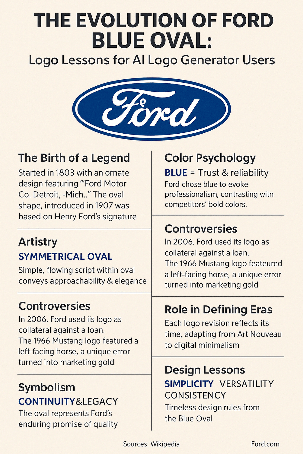
In 2006 Ford put its own logo up as collateral. The Blue Oval, along with other company assets, was pledged against a $23.5 billion loan to get the company through the auto industry’s crisis, and it took Ford until 2012 to get it back. Few logos have ever been treated so literally as money. That the bank would accept it says more about the value of a well-run brand mark than any marketing study could.
The oval itself is not dramatic: a blue ellipse, a silver edge and a handwritten word. It has taken more than a century to get there, and the route it took is the interesting part.
From an Ornate Badge to a Signature
When Henry Ford founded the Ford Motor Company in 1903, its first logo looked nothing like the oval. It was an ornate, green-tinted badge with heavy Art Nouveau styling that read “Ford Motor Co. Detroit, -Mich.-” in swirling script. It was fancy in the manner of its time, and it was not built to last. The company was ambitious but had not yet settled on how it wanted to look.
In 1907 Ford’s British agents, Perry, Schreiber and Thornton, introduced an oval shape to signify “reliability and economy.” That was the turning point, the first appearance of the form that would eventually stick. Then in 1911 Ford’s assistant engineer, C. Harold Wills, created a logo based on Henry Ford’s own signature. It was a smart move. A signature is a personal guarantee, and putting the founder’s name in his own hand on every car said that Henry Ford stood behind it. That script, refined over the decades, is still the heart of the logo.
The early history is a reminder that famous logos do not arrive finished. Ford’s took years of trial and error, and the most important element, the signature, came from an engineer rather than a designer.
Why the Oval Is Blue
Henry Ford is said to have liked the color, but that is not the whole explanation. In color psychology, blue stands for trust, reliability and calm, exactly what a car maker wants buyers to feel. It is no accident that banks and car companies both lean on it. The deep royal blue of the oval, with its silver border, looks professional and a little formal, and the white script adds a clean, elegant contrast.
Compare it with Ferrari’s red, which is all passion and speed. Ford’s blue is the steady hand on the wheel. It does not promise excitement. It promises that the car will get you to work and back home again, which for most buyers is the more important promise. Pick colors that match what your brand actually offers, not what sounds exciting.
The Shape and the Script
The logo works because it is simple. The oval, introduced in 1907 and adjusted many times since, suggests continuity and smoothness. It is softer than a circle and less rigid than a square, which makes it feel approachable. The script, taken from Henry Ford’s signature, is personal and has not dated, its flowing curves reading like a handwritten promise.
Ford tried several other logo design patterns along the way. The 1912 logo, a bird-like badge, was a bold detour that did not last. By 1927 the oval was on the radiator of the Model A, and from then on it was the company’s mark. The 2003 “Centennial Blue Oval,” designed for Ford’s 100th anniversary, streamlined the design and removed 3D gradients for a flat look that worked on screens as well as grilles.
The pattern is iteration. Ford started with a bold idea, refined it repeatedly and kept simplifying, and the logo got better each time it lost something.
Pawning the Oval, and a Horse That Ran the Wrong Way
Even icons hit bumps. The 2006 decision to pledge the logo against the $23.5 billion loan made headlines and felt to many observers like mortgaging the family silver. Ford reclaimed the logo in 2012, but the episode raised a real question about brand value: could a logo be worth billions? For Ford, apparently, the answer was yes.
The 1966 Ford Mustang logo had its own odd story. The horse galloped left instead of right, a quirk often blamed on a foundry error. Ford presented it as a sign of the Mustang’s wild, free spirit, and a possible mistake became a selling point. Both stories show that logos collect narratives as well as meanings, and that a company can sometimes shape those narratives in its favor.
The Logo and the Share Price
The Blue Oval also has a financial dimension. As of April 2025, Ford’s stock was trading at around $10 to $12 a share, a sign of resilience in a volatile market. The logo’s global recognition helps investor confidence because it signals stability and history. A strong logo cannot fix a bad balance sheet, but it can make a company feel safer to back. During the 2006 crisis, pledging the logo showed its intangible value in the plainest possible way, and the funds it helped secure let Ford push toward electric vehicles and smart technology.
For a startup, the lesson is that a logo is an asset as well as a piece of art. The real value comes from building a symbol people trust, which takes years of consistent use, not a clever first draft.
The Logo Through the Decades
Each version of the logo reflects its era. The ornate 1903 badge belonged to the early 20th century, when cars were luxury items. The 1927 oval, sleek and industrial, matched the optimism of the Roaring Twenties. In the 1950s the streamlined look echoed postwar prosperity, and the 1976 version, with its metallic sheen, nodded to the space age. The flat, minimal 2003 Centennial Blue Oval was designed for the digital age, and it showed that Ford could change without losing its identity.
A logo has to belong to its time without chasing trends. Ford’s has done that by changing the finish, the gradients and the shine, and leaving the oval and the script alone. Red Bull’s logo shows a similar balance between modernity and timelessness.
What Designers Can Learn
The oval is a good illustration of the basic principles of logo design. It is simple: the shape and script are recognizable at a glance. It is versatile: it works on cars, in ads and in apps. And it is consistent: despite all the tweaks, the oval, the script and the blue have stayed. It is a case study in restraint, a logo that has evolved without ever being reinvented.
Clarity and scalability are the practical takeaways. A logo has to look right on a business card and on a billboard. Ford’s also shows the value of balance: the symmetry of the oval and the flow of the script pull against each other just enough to look harmonious.
What the Oval Stands For
The symbolism is straightforward. The oval suggests continuity, an unbroken line of history. The blue signals trust, and the silver border hints at craftsmanship. The script, rooted in Henry Ford’s signature, is a personal pledge of quality. Taken together, the logo says that the company has been here a long time and intends to stay.
Compare it with Apple’s bitten apple, which hints at rebellion, or Nike’s swoosh, which is all motion. Ford’s logo is quieter and steadier, more a family friend than a rock star. Every element carries some meaning, from the shape to the shade, and that is worth copying.
A Logo That Moved the World
The Blue Oval is a cultural icon as well as a corporate one. It was on the Model T, the car that put America on wheels, and later on the Mustang, a symbol of freedom on the open road. Ford’s history is bound up with the American dream of mobility, ambition and possibility. With a presence in more than 100 countries, the logo is familiar from the streets of Tokyo to the motorways around London.
Its influence reaches into branding itself. Ford’s long, consistent use of the oval encouraged many other companies to take visual identity seriously. It shows how a logo can grow beyond the products it sits on and become cultural shorthand.
The Digital Oval
Modern logos have to be simple and work on screens. Ford’s 2003 redesign, with its flat treatment and clean lines, was ahead of many of its peers. The Centennial Blue Oval is as clear on a smartphone as it is on a car, which suited the company’s move toward electric vehicles and connected technology.
Today plenty of small businesses start a logo with an AI logo generator, which can produce screen-ready, scalable files in minutes. Ford’s example is a useful check on that speed: the oval got where it is through a century of deliberate refinement, and a heritage brand can stay current only if each change keeps what people already recognize.
Anatomy of the Blue Oval
Broken into parts, the logo is easy to read. The logomark, the oval, is the anchor and is recognizable even without text. The wordmark, the Ford script, adds personality. The color scheme of blue, silver and white conveys trust and polish. The composition, the script centered inside the oval, is balanced and readable. Every element has a job and nothing is wasted.
The anatomy works as a template. Make sure the mark and the wordmark support each other, and use composition to guide the eye to what matters. Intentional design is what makes the difference.
What the Logo Says Without Words
A good logo communicates silently, and Ford’s says that the company is reliable, inventive and not going anywhere. The continuous line of the oval suggests endurance, the blue promises trust, and the script adds warmth. It feels like a handshake. That message has helped Ford through crises from the Great Depression to the 2008 recession by reassuring customers that the company would still be there.
When you design a logo, decide what it should communicate before you draw anything. Does it need to say bold, or friendly, or dependable? Ford’s logo knows exactly what it is saying.
The Oval on Social Media
Posts tagged #Ford or #BlueOval get millions of views, from Mustang devotees to drivers showing off the electric F-150 Lightning. The logo’s simplicity helps: it is instantly recognizable in a thumbnail. That online presence has helped the brand with younger audiences.
Any business now needs a logo that works on Instagram and X as well as on paper. Ford’s shows that a mark has to hold up in pixels as well as in print.
Growing With the Company
The logo has grown with Ford, from a young car maker to a global giant. Technology has played a part: the 2003 redesign relied on digital design tools, and the logo’s adaptability has supported Ford’s expansion into electric vehicles and autonomous driving. The trick has been to use new tools to refine the mark without losing its history.
That is the general lesson. Technology can speed up the work and free time for creative decisions, but a brand moves forward best when it stays recognizably itself.
A Century in One Curve
From its ornate beginnings to the flat, screen-friendly version of today, the Blue Oval has come through controversies, marked several eras and become part of everyday life in dozens of countries. Its strengths are simplicity, meaning and the ability to adapt without being replaced. The next time you see the oval on a Mustang or an F-150, it is worth remembering that it was once pledged against billions of dollars, and that the lender considered it good security.



