The NASA Logo: The Meatball, the Worm and Back Again
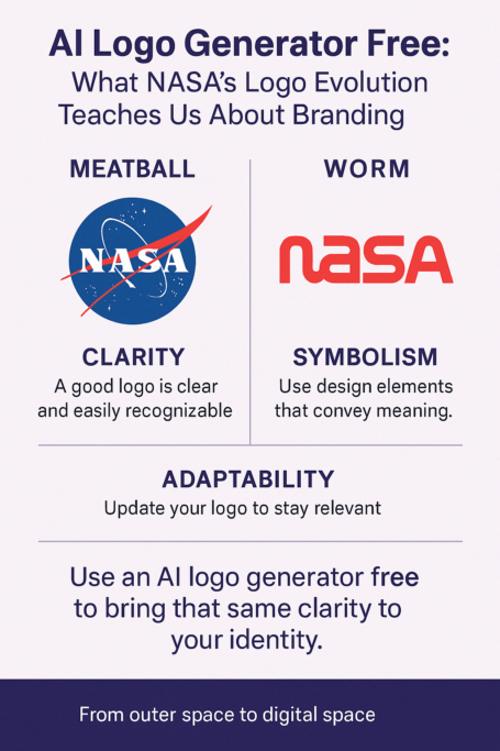
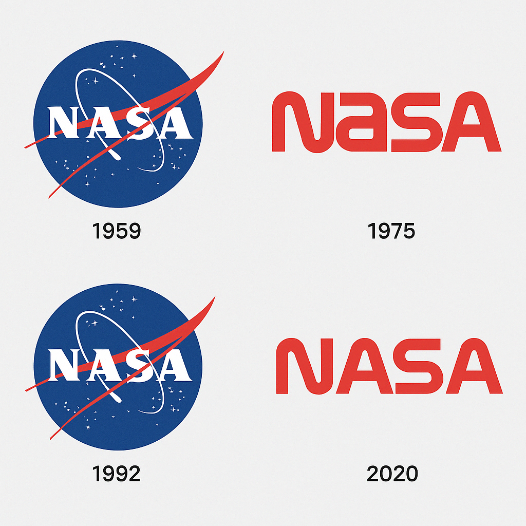
NASA has had two famous logos and has fired each of them once. The busy “meatball” of 1959 was replaced in 1975 by the sleek red “worm,” and in 1992 the agency threw the worm out and brought the meatball back. Few organizations have run such a clear experiment in what people actually want from a logo, and the result was not what the modernists expected.
The two marks sit at opposite ends of design thinking, one crowded with symbols and one stripped to a single word. Between them they cover most of the choices anyone faces when designing a logo today, whether with a pencil or with an AI generator.
The Meatball, 1959
NASA, the National Aeronautics and Space Administration, was founded in 1958 in the middle of the Cold War space race. A year later James Modarelli, an employee who worked as both artist and engineer, designed its first logo, the one everyone calls the meatball. It was a deliberate design packed with meaning: a blue sphere for a planet, a red chevron for a wing (aeronautics), a white orbit for space travel, and stars scattered across the field. It was bold, busy and full of optimism.
It was a badge for a new era, and it looked like one. But all that detail had a cost. The meatball was hard to reproduce on uniforms and documents, and by 1975 NASA wanted something simpler. It hired Danne & Blackburn, who produced the worm, a minimal, red, futuristic logotype. Not everyone was happy about it.
The worm is the obvious model if you want a simpler logo, and modern AI logo generators are quite good at stripping an idea down in the same way.
Meatball Versus Worm
The meatball is illustrative, almost baroque, with layer on layer of elements. It is closer to a painted emblem than a modern logo. Every curve and star means something, but you have to look for a while to read it all.
The worm, introduced in 1975, is the opposite: the letters NASA in a red, sans-serif logotype that looked like the future. Clean lines and a single color made it feel at home in a more technical age. It was easy to scale and easy to reproduce, and it had a cool confidence that the meatball, for all its charm, never had.
Yet in 1992 NASA went back to the meatball, largely because of nostalgia and public affection. The worm was efficient, but it lacked the meatball’s warmth. The back-and-forth between complexity and simplicity is a good summary of what a logo needs:
- Clarity: it should communicate at once.
- Adaptability: it has to work in every medium.
- Emotion: it should feel human, not clinical.
The worm won on the first two and lost on the third. That turned out to matter more than the designers expected.
The Colors
The meatball’s blue sphere suggests trust and infinity, which grounds the agency’s huge ambitions. The red chevron adds energy, urgency and a sense of invention. White stars on a dark field are pure aspiration. It is a palette that manages to be serious and dreamy at the same time.
The worm went all-in on red, which was a bold choice. Red suggests passion, power and progress, and it suited NASA’s push into the shuttle era. It also risked looking aggressive, and some felt it clashed with the agency’s scientific character. When the meatball came back, its more balanced palette brought back a calm kind of authority. If you are trying colors in a free logo tool, this is a useful test: decide what each color is saying, not just whether it looks good.
The Logo War
NASA’s own history of its symbols shows how much argument they caused. The worm’s arrival in 1975 split opinion. Traditionalists loved the meatball’s richness; modernists championed the worm’s clarity. NASA administrator James Fletcher reportedly called the worm “too corporate,” while others saw it as a fresh start after Apollo.
Retiring the worm in 1992 did not end the argument. In 2020 the worm reappeared on a SpaceX Falcon 9 rocket, and posts on X filled up with #TheWormIsBack. Some fans loved the retro-futurism; others complained that it diluted NASA’s heritage. People get attached to logos, and changing one is an easy way to start a fight.
A Logo for Each Era
NASA’s logos line up with distinct chapters of its history:
- 1959 to 1975, the meatball: the start of space exploration, from Mercury to Apollo.
- 1975 to 1992, the worm: the shuttle era, with its focus on efficiency and progress.
- 1992 to now, the meatball again: a return to heritage and an age of international collaboration.
Each change reflected what the agency cared about at the time. The meatball’s complexity suited the bold 1960s; the worm’s sleekness fit the technology-minded 1980s. Today the meatball stands for long-term ambition and sits on missions like Artemis. It shapes how the public sees NASA as much as any press release does.
What the Symbols Mean
The meatball is a small manifesto. The sphere is Earth, or any planet we might reach. The chevron points back to NASA’s roots in aeronautics, and the orbit loops around it all. The stars stand for everything still out there.
The worm is abstract, but it says something too. Its flowing letters suggest motion, like the arc of a rocket, so the logo seems to move even when it is still. Both designs, in their different ways, sum up the mission: explore, connect, inspire.
A Logo People Wear
Both logos now have a life well beyond the agency. Hashtags like #NASAmeatball and #NASAlogo collect fan art, memes and tattoos. Posts on X in 2023 showed the worm on merchandise, patches and even sneakers. Very few government logos end up on people’s feet, and that alone says a lot about how much affection these designs carry.
Modernism and the Worm
Both logos belong to the modernist tradition of clarity and restraint, in different degrees. The meatball is detailed, but it is built from geometry. The worm is closer to pure Bauhaus, a study in restraint and elegance.
Hardly anyone expected a government agency to be this stylish. The worm would not look out of place on a tech startup in 2025, half a century after it first went on a rocket. That futuristic approach influenced work at IBM and among NASA spin-offs, and its echoes show up in many modern logo templates, including the ones AI generators draw on.
Design Lessons
NASA’s logo history offers some practical lessons:
- Balance meaning and simplicity. Do not trade the story away for style.
- Follow the mission, not the trend. Change a logo when the purpose changes.
- Aim for affection, not just approval. The logo people love is the one that survives.
Logos are strategy as much as art. Free AI logo tools now let anyone apply the same principles without a space agency’s budget.
The Logo as Identity
NASA’s logo is its identity in miniature. The meatball says heritage, ambition and trust, which suits an agency that depends on public support. The worm said innovation, in step with the technology boom. Either way, the logo is how NASA greets the world.
That continuity helped NASA through budget cuts (including the deep reductions of the 1980s) and through tragedies such as Challenger and Columbia. Even when funding fell, to $18 billion in 2011 compared with $43 billion in 1966 after adjusting for inflation, the logo remained something people rallied around. A new brand cannot buy that kind of loyalty, but it can start building it with a logo that has a clear identity.
Design Anatomy
Up close, the parts break down like this:
- Meatball:
- Sphere: a perfect circle, suggesting unity.
- Chevron: angled for movement, softened with curves.
- Orbit: a swoop that feels alive rather than fixed.
- Worm:
- Lettering: custom and fluid, with letters that flow together like the path of a spacecraft.
- Red: one flat, uniform, modern color.
Every line in both designs is a decision. The best logo tools try to give users the same control, down to the angle of a stroke.
What the Logos Say
Neither logo needs words. The meatball says that NASA is a group of explorers grounded in science. The worm says NASA is pushing limits. Both say, in effect, trust us. A logo that can carry a message silently is doing its job, and finding that message is the hard part of any design, with or without an AI generator.
NASA Online
Both logos do well online. #NASALogo comes up regularly, and in 2024 posts on X showed meatball tattoos and art based on the worm. The worm’s 2020 return set off #TheWormIsBack, with users arguing about whether it still worked. Either way, both marks look at home on a screen.
Technology and the Logos
Technology shaped both designs. The meatball struggled with the printing limits of the 1960s; the worm suited a more precise, digital age. Today the meatball looks sharp on 4K screens, which shows how much better reproduction has become. AI logo generators benefit from the same change, producing designs meant to work across many platforms.
Budgets Instead of Stock Prices
NASA is not a company, so there is no share price to follow. Its logos still reflect money. The worm arrived at a time of tight budgets, when cheaper, simpler branding made sense. The meatball’s return signaled confidence in NASA’s heritage, even as funding remained well below its peak (about $25 billion in 2024, compared with the Apollo years).
Why the Meatball Won
The worm is the better piece of design by most professional standards, and the meatball is the one people love. NASA chose love, and more than thirty years later that still looks like the right call. Simplicity matters, but a logo also needs a story and something to feel about.
Next time you see the blue sphere or the red curve, it is worth remembering how much argument went into each of them.
If you are starting on a logo of your own, here is how to create a logo using AI with free tools that do not add a watermark.


