The Red Bull Logo: Two Bulls, a Sun and a Thai Original
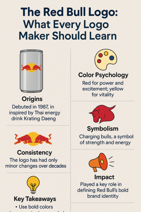
The Red Bull logo was not invented in Austria. Its two charging bulls and golden sun come from Krating Daeng, a Thai energy drink whose name means “red gaur,” and Dietrich Mateschitz kept the idea almost intact when he launched Red Bull in 1987. Nearly four decades later the mark has barely moved. It has outlasted dozens of rebrands at Pepsi and Coke, survived a lawsuit over its slogan, and ended up on Formula One cars, cliff-diving platforms and a capsule at the edge of space. For a logo built from three elements, that is a lot of mileage.
From Krating Daeng to Red Bull
In the early 1980s, the Austrian entrepreneur Dietrich Mateschitz came across Krating Daeng. The story goes that the caffeinated drink helped him through his jet lag. In 1984 he went into partnership with Chaleo Yoovidhya, the drink’s creator, to adapt it for Western tastes. They changed the recipe, but they kept the picture.
The Krating Daeng label showed two red gaurs, Thai wild oxen, charging at each other against a golden background. It was raw and rooted in Thai culture, where the animals stand for strength and vitality. When Red Bull launched in Austria in 1987, the image was refined but its core stayed the same: two red bulls with horns lowered, about to collide, framed by a golden sun. That was a smart move. Mateschitz took a culturally specific symbol and found that its meaning, energy and confrontation, needed no translation.
The result was a deliberate piece of branding, not a template. Three elements, bulls, sun and wordmark, made it easy to scale, easy to remember and quick to read, which is most of what a logo needs to do.
Red, Gold and Silver
The colors do a lot of the work. The red of the bulls reads as heat, urgency and power, which suits a drink sold on the promise that it “gives you wings.” The gold sun suggests optimism and vitality, with a faint echo of sun worship. Below it, the silver and blue of the can cool everything down and add a sense of reliability. Warm on top, cool underneath: it is a simple arrangement and very effective on a crowded shelf.
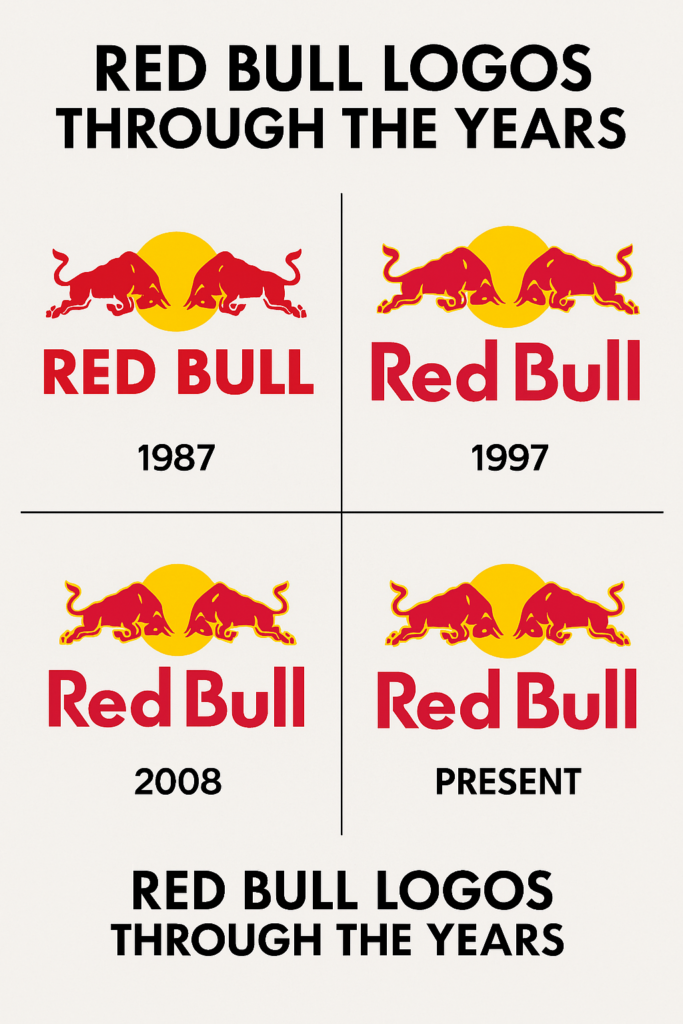
In 2008, Red Bull adjusted the logo, adding gradient shading to the bulls and replacing the blue circle with a silver background. It was a polish rather than an overhaul, meant to help the mark stand out on screens and on glossy packaging. The underlying lesson is that colors should be chosen for the feeling they produce, not just for how they look together. Red Bull’s palette feels like the product, and that is why it sticks.
Economy of Means
The bulls are locked in a fight that never resolves, and that frozen moment is the whole idea. It is a picture of drive and of pushing limits, and the layers are easy to read: the bulls for strength and aggression, the sun for energy, and the collision for competition.
What makes it work is economy. A few shapes carry motion and intensity. The bulls are set on diagonals, which gives the composition energy, and the circle of the sun frames the action and pulls the eye toward the point where the horns are about to meet. There is nothing extra in it, which is part of why it has hardly been touched in nearly forty years.
Refinement, Not Rebranding
Red Bull has resisted the habit of constant rebranding. Pepsi and Coke have cycled through many logos; Red Bull has made small refinements. The bulls arrived on the cans in 1997, replacing the plain text of the earliest ones, and since then the changes have been minor: sharper lines, smoother gradients and a cleaner typeface close to Futura SH-Dem Bold.
That restraint is the point. Each update kept the mark crisp on Instagram and bold on billboards without changing its character. A logo should evolve with the media it appears in, not chase whatever style is popular that year. Red Bull’s has never tried to look fashionable, and it has aged better for it.
The Wings Lawsuit and the 2008 Critics
The logo has had its share of trouble. In 2014 the slogan “Red Bull gives you wings” led to a $13 million class-action settlement in the U.S., after plaintiffs argued that it implied performance benefits the drink did not deliver. The logo, tied so closely to that promise, was dragged in indirectly. The problem was in the claim, not in the drawing, and the mark came out of it unharmed.
The 2008 update drew a different complaint: critics said it was too timid and that Red Bull had played it safe. They were wrong, or at least the result proved them wrong, because the logo stayed instantly recognizable. Between them, the two episodes make a useful point. A strong mark can ride out a lot, but it cannot cover for dishonest messaging. The claims attached to a logo matter as much as the logo itself.
The Logo and the Money
In 2020 Red Bull reported €6.31 billion in revenue and a 43% share of the energy drink market. The logo is the face of that business, painted on cans, Formula One cars and extreme sports events around the world.
There is no stock price to point to, since Red Bull GmbH is privately held, so the logo’s financial effect cannot be measured directly. Its global recognition plainly feeds the company’s brand equity, though, and posts on X often link Red Bull’s dominance to its visual identity, noting how the boldness of the mark matches the company’s aggressive expansion. For any business, the takeaway is that a logo is an asset as well as a picture, private company or not.
Three Eras, One Mark
The logo has meant different things at different times without changing shape. In the 1980s it announced a new category, the energy drink, from a small company taking on the soda giants. By the 2000s it was tied to extreme sports such as cliff diving, air racing and skateboarding, and it had become a kind of badge for people who liked to push limits.
Today it is a lifestyle emblem that shows up at music festivals and esports arenas. The form stayed the same and the context moved around it. That is the kind of flexibility worth designing for: a mark that can belong to several decades, not one that is tied to a single season.
What Designers Can Learn
A few lessons come straight out of the Red Bull mark. Simplicity works: three elements are enough. Know your audience: the logo speaks to thrill-seekers, not to accountants, and it does not try to please everyone. And balance continuity with small updates, so that the logo stays fresh without alienating the people who already like it.
Being bold and being disciplined are not opposites. Red Bull’s logo is loud, but every element is under control. If you are iterating on a design, try as many variations as you like, then check each one against what the brand actually stands for.
Bulls, Suns and Old Symbols
The symbols underneath the logo are very old. Bulls have stood for power in many places, from Spanish bullfighting to the Wall Street bull. The clash suggests competition, and not only between animals; it is easy to read it as a fight between caution and nerve. The golden sun stands for life, energy and the start of something. These are images that most people understand without being told.
That is why the logo travels. In Thailand it still nods to Krating Daeng’s heritage. In the West it reads as pure machismo. Symbols that need no language are one of the most valuable tools a logo designer has.
Beyond the Can
Red Bull’s logo has spread far beyond the drink. The company has sponsored athletes like Shaun White, staged events like the Flugtag, and backed Felix Baumgartner’s jump from the edge of space. The bulls were on all of it. What the company sells is as much a mindset, live boldly and ignore limits, as a beverage, and that mindset has shaped a generation of thrill-seekers.
On X, hashtags like #RedBullWings collect fans’ stunts and adventures under the same banner. The logo has become something people gather around. Most logos only need to identify a company, but the ones that also give people something to rally behind earn a lot more attention.
Modern Without Trying
Red Bull’s logo is a good example of modernism in a logo. Its clean lines and bold shapes look as current now as they did in 1987. It does not lean on nostalgia, and it adapts easily to new places, from VR headsets to neon billboards. There are no gimmicks in it, just a confident drawing.
The 2008 update, with its gradients and silver sheen, helped the mark settle into the digital age. The broader lesson is that a logo should feel current without being chained to the trends of the moment.
The Classic Principles
The logo meets all the classic principles of logo design: simplicity, memorability, versatility, relevance and timelessness. It is simple enough to sketch on a napkin and memorable enough to spot across a stadium. It works on a can and on a parachute. It suits its high-energy audience, and it has outlasted every fad of the last forty years. Every element in it has a purpose.
That makes it a handy checklist. For each element in your own design, ask whether it adds meaning. If it does not, take it out.
The Logo Is the Brand
With Red Bull, it is hard to separate the logo from the brand. The bulls are the visual form of “gives you wings.” Every stunt, every can and every event carries them, and each one reinforces an identity built on daring and energy. People trust what they recognize, and they recognize the bulls.
That kind of cohesion is rare. Many brands water down their identity with inconsistent visuals, while Red Bull has stayed remarkably steady. The lesson is basic but often ignored: decide what your logo is and then stop changing it.
Anatomy of the Bulls
Take the logo apart and each piece has a job. The bulls are the focal point, and their angular forms suggest movement. The sun, a perfect circle, balances their aggression with calm. The typeface, custom, bold and sans-serif, anchors the image with authority. Negative space matters too: the gap between the two heads is full of tension, and it pulls the viewer in.
It is a compact composition in which every line and curve counts. Studying it is a good way to learn how to balance strong shapes with small details, and how much work empty space can do if you leave it alone.
What the Bulls Say
The message is direct: let loose. Charging bulls are not subtle. The logo is effectively a call to action, drink this and take on the world, and while the slogan “gives you wings” reinforces it, the image could carry the message on its own.
Plenty of logos are vague about what they stand for. Red Bull’s promises energy and nothing else. The more precisely a logo states its one idea, the faster people get it.
Hashtags and Fan Culture
The logo has done well online, carried by hashtags like #RedBull, #GivesYouWings and #RedBullAirRace. On X these tags fill up with stunt videos and fan art, with the bulls in nearly every frame. The logo works as a kind of social glue for a community that formed around it.
That shows how far a design can travel beyond its packaging and become cultural shorthand. A logo that people want to share and remix gets seen far more often than one that only sits on a product.
From Austria to 171 Countries
The logo’s spread mirrors the brand’s. In 1987 Red Bull was an Austrian oddity. By 1997 it was a hit in the U.S. Today it is sold in 171 countries, at a rate of 9.8 billion cans a year. The mark’s scalability, bold on a small can and huge on a stadium, helped that expansion along.
It also grew because it never pretended to be anything else. A logo has to scale in two ways, physically across sizes and emotionally across cultures, and Red Bull’s does both.
The Bulls on Screen
Technology has changed how logos are used, and Red Bull has kept up. The 2008 update was partly about screens. Today the logo animates in ads, moves in apps and appears in AR filters. It no longer just sits on a can.
For any new logo, that means thinking about motion, responsive sizes and how it looks on a phone, not just on paper. A mark that only works as a static print image is already behind.
Why the Bulls Last
From its Thai origins to its global reach, the Red Bull logo shows how far color, old symbols and a simple composition can carry a brand. It has survived a lawsuit and a lukewarm redesign, defined a few eras of youth culture, and stayed loyal to its bulls throughout. Not every update was an improvement; the 2008 gradients look more dated now than the flat 1987 drawing. But the core image was strong enough that it did not matter.
The test it sets is simple. Does your logo carry a feeling as clearly as two bulls about to collide? If you want to try out ideas quickly, Semplr’s free AI logo generator can give you a first draft to react to.
For another long-running drinks logo, see the evolution of the Coca-Cola logo.


