The Converse Logo: How the Star Became a Style Icon
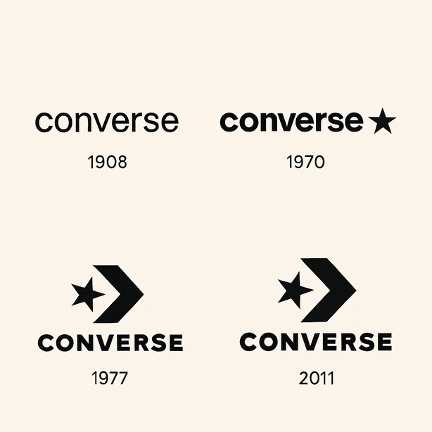
Converse was founded in Malden, Massachusetts, in 1908, but the star most people picture when they hear the name did not show up until 1963. It took the success of the All-Star shoe to give the company its symbol, and the logo has been adjusted, tilted and re-lettered several times since without ever losing that five-pointed star. For a brand that has been worn by basketball players, punks and fashion students in turn, that is a remarkably stable piece of design.
How the Star Arrived
Marquis Mills Converse set up his company decades before anyone had heard of skinny jeans or Instagram, and its identity did not arrive fully formed. It grew slowly, the way a pair of Chuck Taylors breaks in. The All-Star line had been selling since 1932, and by 1963 the company had turned its success into the star emblem we know now. Inkbot Design has described it as a simple and powerful mark: a black star paired with lowercase lettering, for a brand that wanted to be both approachable and something to aspire to.
The lesson is that simplicity is a strength. A good logo does not cram in every idea a company has. It reduces the brand to one thing people can remember. In this case: a star and a name, and nothing else.
Black, White and the Odd Splash of Red
If logos were cocktails, Converse would be a classic martini: clean, timeless and a little rebellious. The black-and-white palette is deliberate. Black reads as authoritative and sophisticated, and white keeps it fresh and friendly. Converse has stuck with that monochrome scheme, with an occasional red or navy, and the restraint comes across as confidence. The brand does not need a rainbow to get noticed.
A logo’s job is to identify, and Converse’s identifies a brand that is cool without trying too hard. The stark contrast works for punk rockers and preppy influencers alike, which shows how much color decides the way a brand is perceived. Less is often more. Choose a scheme and commit to it, and keep it bold.
From Delicate Lowercase to Heavy Type
The lettering has changed more than the star. Early versions, as Kreafolk points out, used delicate lowercase type that came across as friendly, the voice of a brand that wanted to be a friend rather than a boss. In 1977 Converse switched to a bolder typeface, similar to Display Pump, with thick strokes that projected confidence. It was the type equivalent of trading an acoustic guitar for an electric one.
That shift is a good example of how much type sets the tone. Converse went from playful to assertive as it moved from basketball courts into wider culture and onto fashion runways, and the lettering followed. When you pick a typeface, pick one that matches where your brand is going, not only where it is now, and be prepared to change it as the brand changes.
What the Star Means
The star is there for a reason. Introduced in 1963, it stands for excellence and quality, which suits a line called All-Star. The emblem works as a statement of intent as well as a picture. Add the chevron, introduced in 2007 for extra movement, and the logo starts to feel like a slam dunk in progress.
Good logos tell a story. Before you draw anything, think about which shape actually captures what your brand stands for. A star for excellence, a circle for unity: Converse picked a symbol that matched its product name and has never had to explain it.
Small Changes, Kept Fresh
The Converse logo feels like a vinyl record in the streaming age: retro, and still cool. Its minimal design comes from the modernist era and has mostly avoided trends, which is why it still looks current. The 2007 update tilted the star, which, as Inkbot Design observed, gives it the look of a basketball player mid-jump. It was a small change, and it refreshed the logo without betraying where it came from.
That is the balance to aim for. A logo should be adaptable and consistent at the same time, able to sit on a sneaker, a billboard or a TikTok filter and still be itself. The way to get there is the way Converse did it: small, careful updates rather than a new logo every decade.
From Hoops to Grunge to Hip-Hop
Few brands have moved between scenes as easily as Converse. The logo has been on the feet of basketball legends, grunge musicians and Gen Z fashion fans. Kurt Cobain wore battered Chucks, and in 2022 the Comme des Garçons PLAY collaboration added a heart-and-eyes twist to the logo. In 2015 KTLA covered the redesign of the Chuck Taylor, the first since 1917, another sign of how willing the brand is to reinvent itself.
Converse is one of the best examples of playful branding there is. The logo sells an attitude along with the shoes: rebellious, young and relaxed. A good mark should be able to speak to more than one generation and look right in a punk zine as well as on a high-fashion runway.
Knockoffs and Questions of Authenticity
The star has had its share of trouble. Markets are full of cheap knockoffs copying the star and chevron. There is also a recurring argument about authenticity. Converse has been adopted by subcultures including punk and hip-hop, and that has raised questions about whether the brand is exploiting rebellion or amplifying it. A brand is largely what people say about it when it is not in the room, and the conversation about Converse is loud, messy and very much alive.
A strong logo attracts imitation and scrutiny together. Make your design distinctive enough to stand out, and think about the communities it will be associated with before it is out in the world.
The Star as a Business Asset
Nike bought Converse in 2003 for $305 million and has used the logo to drive growth ever since. It is hard to pin down the effect on Nike’s share price (the ticker is NKE), but Converse’s cultural standing has clearly strengthened Nike’s portfolio. The logo appears on sneakers, clothing and collaborations, and that visibility builds loyalty that turns into sales. In 2022 the Comme des Garçons PLAY release sold out in hours.
That is the business case for good design. A logo is a source of revenue as well as a piece of art, and for a startup a clear, memorable mark is one of the cheapest ways to build recognition.
Consistency
Converse handles its identity well. On a Chuck 70 or a skateboard deck, the star and chevron say Converse without any explanation. That consistency builds trust, and Kreafolk has argued that the logo reflects the brand’s wish to connect with people personally.
The lesson is to fix a core identity and protect it. Fonts and colors can be tweaked for a campaign, but the central mark should be instantly recognizable whether it is on a business card or a billboard.
What Logo Designers Can Borrow
Converse’s logo boils down to a short playbook:
- Keep it simple. A star and a wordmark, and that is it.
- Use a symbol that means something. The star stands for excellence.
- Stay adaptable. The logo works on canvas sneakers and on high-fashion collaborations.
- Know your audience. Converse speaks to rebels and trendsetters alike.
Start with your brand name and a clear sense of style, playful or minimal, then sketch a handful of options. Refine them with Converse’s clarity in mind and throw out anything that needs a caption to make sense.
A Visual Language in Two Parts
Converse’s visual language is short and sharp, like a well-timed joke. The star and chevron suggest motion and energy, and the lowercase wordmark keeps it friendly. Inkbot Design reads that balance as a brand changing along with fashion and culture.
Focus on the message. A logo should tell its story in a glance. Try different combinations of icon and lettering until you find a pairing that sounds like your brand and nobody else’s.
The Star on Social Media
Online, the Converse logo is everywhere. #Converse and #ChuckTaylors are social media staples, and a 2025 post from @ultravioleta_co called the brand a cultural icon, a fair reflection of how present it is online. The simple design works well in Instagram grids and TikTok edits.
Designing for digital is no longer optional. Your logo needs to be clear on a small screen, scalable without losing detail and simple enough to sit in a hashtag post without getting lost.
Technology and AI
Technology has changed how logos are made, and the Converse star has handled it easily, from vector files to AR filters. At the same time AI logo generators such as Looka, Hatchful, Zoviz, Canva, PicLumen, FreeLogo.co and Semplr have made design available to people with no training, generating logos from a description of a brand’s style and showing them on mockups. ZDNET has said Hatchful produces cohesive logos that look less generic than most, which suits startups.
Converse’s clean lines would come through any of these tools intact, which says something about the design: good work survives whatever tools you use. Take advantage of the technology, but keep your own judgment about what the logo needs to say.
More Than Chucks
Converse sells far more than Chucks. The brand makes clothing and accessories and runs collaborations, all carrying the star, from hoodies to the 2022 Comme des Garçons PLAY Chuck 70s. The logo holds a varied range together. Recent news has focused on sustainability, with eco-friendly Chucks gaining ground.
That range is a test of versatility. A logo has to work on T-shirts and tote bags as well as on the product it was drawn for, so check it on mockups of everything you plan to sell.
Converse’s events show the logo at its most expressive. At Love, Chuck Live! in Manila, part of the global “Love, Chuck” campaign, Juan Karlos debuted his “Time Machine” music video and local creatives celebrated the Chuck Taylor’s history. The event treated the logo as a symbol of individuality, bringing artists and tastemakers together around music, customization and the lasting appeal of the shoe. It is good evidence that a sneaker logo can stand for self-expression rather than just a product.
Converse Against Nike and Adidas
Compared with Nike’s swoosh or Adidas’s three stripes, the Converse logo is more literal and less abstract. The swoosh is pure motion, and the Adidas stripes suggest structure. Converse’s star and chevron are more like a handshake, friendly but firm. Where Nike and Adidas lean on athletic performance, Converse sits between sport and culture, as its credibility in punk and hip-hop shows.
The lesson is differentiation. Look at what the competitors are doing and find a shape that sets you apart, the way the star stands out among the swooshes.
If Converse Tried an AI Logo Tool
As a thought experiment, imagine the Converse design team running their brand through one of those generators: “Converse,” a playful and minimal style, black and white. The tool might suggest a version of the star with a twist, say a heart-shaped chevron for a limited release. The team would probably play with a futuristic typeface for a while and then go back to the classic look.
Converse would never overhaul its logo on the strength of a generator’s output, and it has no reason to. But for collaborations and merchandise, quick variations like these can be a useful way to start the conversation before a designer takes over.
Converse in 2025
Converse is still busy in 2025. In May, @ultravioleta_co traced the brand’s path from a rubber sole to a global cultural icon. Sustainability work, such as Chucks made from recycled materials, and collaborations with artists like Tyler, The Creator keep the logo in view. The brand’s message stays on individuality and creativity, in line with its playful, rebellious roots.
What the Star Teaches
The Converse logo is a lesson in getting a few things right and then leaving them alone. The star has carried the brand through more than sixty years of changing fashion, with the lettering doing most of the adapting. If you want to make a logo that works on any screen, start the same way: one strong symbol, a clear color choice and type that can change while the symbol stays put.


