The Levi’s Logo: How the Batwing Took Over
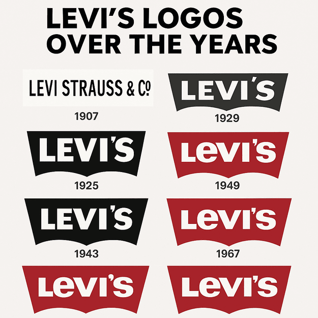
The Levi’s batwing borrows its shape from the stitching on the back pocket of a pair of jeans. Introduced in 1967, it took a detail every wearer already knew and turned it into the frame for the brand’s name: two sharp, angular wings holding the word “Levi’s.” It is one of the best examples of a logo that comes straight out of the product, and it is the reason the brand’s identity has barely needed to change in almost sixty years.
The company itself goes back much further. Levi Strauss was a tailor in gold rush San Francisco in the 1850s, making sturdy trousers for miners, and the early logos were plain text designs that put utility well ahead of style. By 1925 the brand had a bold red wordmark with a black outline, a nod to the toughness of its denim. But it was the batwing that made the logo part of pop culture. Its simplicity is the whole point: clean, bold and easy to remember.
Legend has it that the batwing was inspired by the shape of a seagull’s wings, the same curve as the pocket stitching. Either way, it ended up on pockets and tags, and it became a sign of the real thing in a market full of knockoffs. For anyone designing a logo the lesson is to start with what the brand actually is. Levi’s was not chasing trends with the batwing. It was pointing at its own product.
Red and White
Color does a lot for the Levi’s logo. Red reads as energy, passion and strength, which suits a brand born in the rough goldfields. White adds a sense of cleanness and permanence that balances the red’s boldness. Together they are as durable as the jeans. The red grabs attention; the white quietly suggests reliability.
Set this next to Gucci’s green-red-green stripes, which signal Italian luxury, or Nike’s black swoosh, which is all about motion, and Levi’s looks unmistakably American, rooted in the blue-collar history of denim. When you choose colors for your own logo, they should tell the brand’s story before anyone reads a word.
Shape and Type
The Levi’s logo is an exercise in minimalism. The sans-serif lettering is blocky, bold and unpretentious, much like the people who wear the jeans. The batwing’s sharp angles feel like a nod to the rough landscape of the American West. Levi’s has adjusted the type and colors over the years, with a short-lived move to black in 1949 and a brighter red in 1953, but the core design has stayed the same.
That consistency is the key. A logo should distill a brand, not distract from it, and Levi’s avoids fussy decoration and lets the batwing carry the weight. If you are designing a logo, resist the urge to overcomplicate it. A logo is not a place for every idea you have. It is one clear note.
What the Batwing Stands For
The batwing has come to stand for durability and freedom. Wings suggest flight, movement and the open road, which suits a brand worn by rebels, rock musicians and road-trippers. Levi’s has deliberately lined itself up with counterculture, from James Dean’s 501s in Rebel Without a Cause to Kurt Cobain’s grunge-era denim. The logo carries an invitation to be part of something bigger than a pair of trousers.
The takeaway is that a logo should carry a story. AI logo tools such as Semplr or BrandCrowd will produce designs from keywords like “freedom” or “strength,” but it is your job to make sure the result means something. The batwing sells a way of life as well as jeans.
Why It Has Aged Well
Trends come and go quickly, and the Levi’s logo has stayed put. Its modernist simplicity, all clean lines and strong color, keeps it looking as fresh in 2025 as in 1967. A 2003 update adjusted the red slightly. That was a polish rather than a redesign, and it shows Levi’s knows better than to tamper with a classic.
This is one of the most useful lessons in modern logo design. It is easy now to produce thousands of options quickly, but the ones worth keeping are the ones that age well, the ones that look as if they have always existed. Iterate fast if you like, but choose a design that will not look dated next year.
The Logo Through Fashion Eras
The Levi’s logo has fitted into every fashion era while staying true to itself. In the 1950s it was the badge of greasers and rockabilly rebels. In the 1970s it was worn by hippies, in the 1990s by grunge kids, and today it is a streetwear staple. Each era added its own meaning to the batwing, and none of them changed its identity.
That adaptability matters for playful brands too. Jungl, a dating app with a whimsical green logo, aims for a sense of youthful adventure, and Levi’s shows that a brand can be playful without losing substance. Experiment with bold, minimal or quirky styles, but make sure your logo can grow with its audience.
Knockoffs and the AI Model Backlash
Levi’s has had its share of controversy. Knockoffs are everywhere, with cheap imitations copying the batwing to borrow the brand’s cachet. In 2022 Levi’s faced backlash over a partnership with Lalaland.ai, which used AI-generated models to show diversity. Critics argued that it avoided hiring real models from diverse backgrounds, and the episode set off a wider debate about authenticity in branding.
The point for logo designers is that a logo is only as strong as the brand behind it. Software can produce a striking design, but if the company’s actions do not match its image, the logo will not save it. Stitching a batwing onto polyester does not make it denim.
The Logo and the Business
Levi Strauss & Co.’s stock (LEVI) has had ups and downs, but the logo has been a steady source of brand value. In 2024 the company reported strong growth, helped by collaborations like Beyoncé’s “Reiimagine” project, which recreated classic Levi’s ads. The logo’s presence on everything from crystal-studded denim jackets to classic 501s keeps the brand current. A logo does not make a brand on its own, but it makes it memorable, and the batwing’s reach across products has helped Levi’s hold a market value of around $12 billion in 2025.
Consistency
Consistency is what makes the Levi’s logo work. On a trucker jacket or a TikTok ad, the batwing is unmistakable, and that sameness builds trust. If you are developing a brand, you can try different fonts and colors along the way, but do not drift far from the core design once it is set. Levi’s shows that a coherent identity, logo, colors and tone together, is what builds a legacy.
Design Lessons
If you want a logo with the batwing’s staying power, these are the main lessons:
- Keep it simple. The batwing shows you do not need extra decoration.
- Know your story. Levi’s logo reflects its working-class roots. Start from your own brand’s values and make sure the design matches them.
- Test for versatility. A logo has to look right on a billboard and on a business card. Tools that offer quick revisions, like Fiverr Logo Maker, help here.
- Use color deliberately. Red for passion, white for trust: choose colors that speak your brand’s language.
The Logo’s Voice
The Levi’s logo communicates. The bold red says the brand is here to stay; the batwing suggests it belongs to free spirits. Software is getting better at producing this kind of visual language, and tools like Designs.ai let you enter words like “rebellious” or “authentic” to get logos with some personality. But as Levi’s shows, the message has to match what your audience actually values.
Levi’s on Social Media
Online, the Levi’s logo is everywhere. #LevisJeans and #LevisVintage trend on X, with people showing off thrifted 501s and customized denim. Social media spreads the logo further still, from Beyoncé’s “Levii’s Jeans” campaign (a playful nod to her Cowboy Carter album) to streetwear influencers wearing Levi’s collaborations. The lesson is to design for sharing. A logo that stands out in an Instagram Story is worth a great deal.
Products and Collaborations
Levi’s sells far more than jeans. The logo appears on trucker jackets, T-shirts and even corduroy vests, as in the 2025 Undercover collaboration with its nail motifs and peering-eye prints. From Beyoncé’s crystal-studded denim to initiatives such as the 2022 DE&I report, Levi’s uses its logo to tie a wide range of work together. A logo that scales from physical products to digital campaigns is a valuable thing.
Against Gap, Wrangler and the Luxury Houses
Gap’s minimal wordmark feels corporate and a bit soulless. Wrangler’s cowboy-inspired logo is rugged but niche. The batwing manages to be universal and distinctive at once. Unlike Gucci’s ornate monogram or Louis Vuitton’s intricate LV, Levi’s keeps things simple, which proves you do not need complexity to stand out. Aim for that balance: distinctive without being overworked.
Could AI Redraw the Batwing?
AI is changing how logos are made, and it is easy to imagine the batwing going through one of these tools. Logopony or Microsoft Designer can produce hundreds of variations in seconds, letting a brand test new takes on a classic shape. Levi’s designers could enter “rugged, red, batwing, timeless” and get back batwings with sharper angles or neon colors, a cheap way to test bold ideas without committing to any of them.
The catch, as Altitude Marketing has pointed out, is that AI lacks the human sense of deeper meaning. Software can produce a sleek design, but it cannot carry the cultural weight of the original, because that weight came from decades of people wearing the jeans. For quick experiments the tools are useful. For deciding what the batwing should become, Levi’s will still need people.
Levi’s in 2025
Levi’s is doing well in 2025. The Beyoncé “Reiimagine” collaboration, launched in 2024, earned $5 million in media impact value, with the logo front and center. The January 2025 Undercover collection, which featured Flea in some unusual denim, showed the brand is still willing to take risks. The company’s diversity efforts, including hiring its first Black executive, Kenneth Mitchell, show a brand changing with the times. Through all of it, the logo has stayed the same.
What the Batwing Teaches
The Levi’s logo works because it was taken from the product and then left alone. Keep it clean, meaningful and versatile is easy advice to give and hard to follow, and the batwing is one of the few logos that follows it completely. If you are designing your own, look first at what is already distinctive about what you make, the equivalent of a pocket stitch, and see whether the logo is hiding in it.


