The Panda Express Logo: History, Design and Meaning
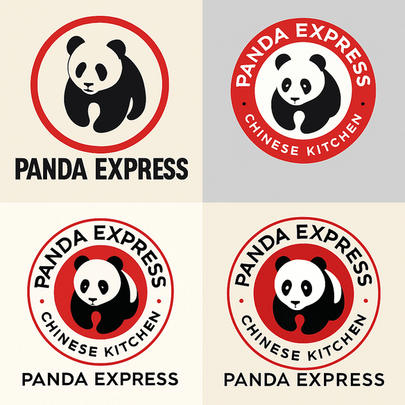
Panda Express is the rare fast-food chain whose mascot looks relaxed. Since 1983 its logo has been a black-and-white panda in a red circle, calm where its rivals shout, and that one choice has carried the brand from a mall in Glendale, California, to more than 2,400 locations. Golden arches and a smiling colonel are built to grab you. The panda just sits there, and somehow that works as well.
It is a small mark doing a lot of work. It has to say “Chinese food,” “fast” and “friendly” at once, on a sign, a takeout box and a phone screen, and it has had to survive real arguments about how it represents Chinese culture. Here is how it was put together and what has changed since.
How the Panda Express Logo Began
Andrew and Peggy Cherng opened the first Panda Express in Glendale in 1983, the year of Reagan’s first term and Return of the Jedi. The original logo was simple: a panda, black and white as nature made it, inside a red circle. It was minimal and clearly Asian-inspired. The panda pointed to the Cherngs’ Chinese heritage, while the red circle recalled the sun, a motif that runs through East Asian imagery.
What stands out, looking back, is how little it tries to do. American fast-food branding in the early 1980s was loud: big type, bright mascots, slogans everywhere. A quiet animal in a plain disc was a bold choice in that company. It also left room for the logo to be adjusted for decades without losing its identity, which is exactly what has happened.
Red, Black and White
The palette is red plus the panda’s black and white. Red is the classic restaurant color, associated with appetite, urgency and warmth: chili peppers, a hot wok, the suggestion that you should eat now. Against it, the black and white fur adds contrast and a sense of balance, with an obvious echo of yin and yang.
Compare McDonald’s, which leans on cheerful yellow, or Subway, whose green hints at health. Panda Express uses red to stake out a different promise: fast, flavorful and bold. Color in a logo sets a mood before anyone reads a word, and here the mood is a hot kitchen.
Shape, Type and the Circle
The panda is a stylized drawing, not a realistic animal, which is part of why it has aged well. Early versions were playful, almost cartoonish. Over time the drawing slimmed down into something sleeker and more abstract. The lettering is bold, sans-serif and unpretentious. It supports the image without competing with it.
The circular frame recalls East Asian seals, which roots the mark in the culture the menu draws on. The panda’s relaxed pose makes it approachable, very different from the stern Colonel Sanders on KFC’s buckets. A good logo tells a short story at a glance, and this one says friendly, flavorful and connected to a tradition. None of that needs more detail than the logo already has.
What the Panda Stands For
In Chinese imagery the panda stands for peace and friendship, and the animal has come to represent resilience too. Those associations fit a chain that sells accessible, crowd-pleasing food. Next to the regal MGM lion or the Starbucks siren, the panda is disarming, almost cuddly. It invites rather than impresses, which matters when your customers are families and college students.
There is a second layer. Pandas are famously endangered, so the animal also suggests rarity. It is universally loved and yet a little special, which is a neat match for a brand that wants to be mass-market and culturally distinct at the same time. Good symbols tend to work like this, with more than one meaning sitting inside a simple shape.
Small Changes Over Four Decades
The logo has been revised several times: sharper lines, bolder type, a more streamlined panda. It has never drifted far from the original. That is modernism working as intended, clean and adaptable, and it compares well with brands that chase trends. Pepsi’s 2008 redesign is the usual cautionary example.
Each era brought its own update. The 1990s saw a bolder font to match the chain’s growth. In the 2010s the panda was simplified again for digital screens. A 2025 redesign, reported by the Bay Area Creative Foundation, worked in more traditional Chinese elements, such as brushstroke-inspired lines and a nod to calligraphy, without losing the logo’s broad appeal. Evolution, in other words, rather than revolution, and the result still feels current without being tied to a passing style.
Branding a Whole Cuisine
Panda Express did more than brand a restaurant. In the 1980s Americanized Chinese food was still mostly something you got in a takeout carton from an independent shop. The chain turned it into a fast-casual business, and the logo signaled what that meant: reliable, consistent and easy to find. It became shorthand for Chinese food, done quickly.
As the chain expanded internationally in the 2000s, the logo took on a bridging role, introducing lo mein to customers from London to Beijing. The calligraphy-influenced 2025 update reflects a wider move among brands toward cultural authenticity. Our piece on Chipotle covers how a logo can anchor a brand through decades of change, and Panda Express is another clear example.
Criticism and Copycats
The logo has not escaped criticism. Some in Asian-American communities have asked whether the chain commodifies Chinese culture, with a smiling panda as the friendly face of it. A 2025 article from the Bay Area Creative Foundation argued that the logo, however iconic, sometimes simplifies Chinese heritage for mass appeal. The redesign tried to answer this by drawing on traditional elements, but the debate has not gone away. It is a fair question for any brand built on someone’s heritage, and no amount of brushwork fully settles it.
Then there are the imitators. Local takeout shops and overseas businesses have copied the look many times. Being copied is a sign of success and also a constant problem, since every imitation weakens the original a little. The best defense is a mark distinctive enough that copies look obviously like copies.
The Business Behind the Bear
Panda Express is privately owned, so there is no share price to track, but the growth is plain to see. The chain has more than 2,400 locations worldwide, and analysts estimate its revenue at about $5 billion a year. A logo that is instantly recognizable is part of that, printed on everything from napkins to delivery bags.
For comparison, Chipotle, with its own minimalist logo, has a market capitalization of around $60 billion, and Yum! Brands, the owner of KFC and Taco Bell, reports $6.8 billion in revenue. Panda Express holds its own in that company. A logo is a design object, but it is also a business asset, and it gets paid back every time a customer recognizes it from the highway.
Consistency
The logo looks the same on a neon sign in Times Square and on a takeout menu in Tulsa, and that sameness builds trust. Customers know the experience they are signing up for: quick, tasty, reliable. That is why the company has preferred small adjustments to dramatic redesigns, and why each change has kept the panda, the red and the circle.
It is also a useful discipline for anyone generating variations of a logo. It is easy to produce dozens of versions. It is harder, and more important, to make sure every version still belongs to the same brand.
Lessons for Logo Designers
Three things stand out. First, simplicity wins; a cluttered logo is hard to read and harder to remember. Second, cultural resonance matters, as KFC also shows, and the panda works because it means something beyond being cute. Third, adaptability counts. Decades of small tweaks have kept the mark fresh without changing what it is.
The logo also speaks without words. The panda says friendly, the red circle says bold, the clean lines say modern, and together they line up with the chain’s message of fast, flavorful, family-friendly food. Taco Bell’s bell and Wendy’s pigtailed girl each do something similar for their own brands. When you design a mark, decide what each element is supposed to say before you start drawing, and cut anything that says nothing.
Built for Small Screens
On social media the logo is everywhere. Hashtags like #PandaExpress and #OrangeChicken run to millions of posts, many of them with the panda in shot. The design is simple, bold and scalable, so it works as a profile picture, in stories and in memes. A 2025 campaign featuring the redesigned logo went viral, with fans praising its nod to Chinese artistry.
Any logo now has to work at the size of a smartwatch face and the size of a billboard. Thick shapes, few colors and no fine detail is the formula, and the panda follows it closely.
Where AI Fits
AI logo makers such as Semplr, Looka and Canva have put basic logo design within reach of anyone. You enter a business name and an industry, choose a few preferences, and get a page of options in seconds, usually ready to download without a watermark. For a small business that cannot afford a designer, that is a real help.
They have limits, though. Panda Express’s logo was drawn by people and refined over decades. Software can produce options quickly, but someone still has to pick the right one and know why it is right, or the result will look like everyone else’s.
What’s on the Menu
The menu is a greatest-hits list of American Chinese food, from orange chicken to Beijing beef. Beyond the restaurants, the chain offers catering, meal kits and a loyalty program, all under the same panda. Recent moves include plant-based options such as Beyond Orange Chicken and partnerships with local artists on limited-edition packaging.
The logo ties all of this together, on chopsticks and on delivery apps. Whatever you sell, one mark should be able to cover every product and channel without strain.
From its start in 1983 as a family-run Chinese restaurant in Glendale, Panda Express has become a fast-casual giant known for dishes like The Original Orange Chicken, chow mein and fried rice. Its serene panda in a red circle is a real success, combining heritage with accessibility. The menu has its strengths, from savory Kung Pao Chicken to creamy Honey Walnut Shrimp, and its misses, such as bland fried rice.
Against the Competition
McDonald’s arches are known everywhere but carry little cultural meaning. Chipotle’s pepper is sleek but specific to one cuisine. Taco Bell’s bell is playful but less flexible. Panda Express sits in between: culturally rooted, visually simple and adaptable. The panda is as recognizable as KFC’s Colonel and a good deal friendlier.
The comparison is a reminder to study the competition before designing. Panda Express found its space by combining cultural heritage with fast-food directness, and nobody else in the category owns anything like it.
If Panda Express Tried an AI Logo Generator
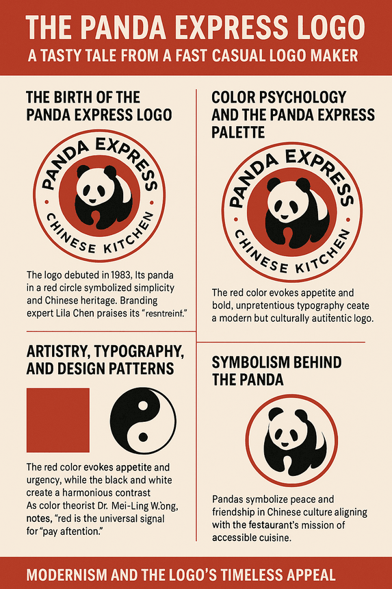
Suppose the company wanted to explore a refresh with one of these tools. The team types in “Panda Express,” picks “Asian-inspired” and “bold red,” and asks for a more modern pose. Back come a minimalist panda, a brushstroke panda and probably a neon panda aimed at Gen Z. Someone picks one and it goes out across 2,400 locations.
The scenario is not far-fetched. Testing variations this way is cheap and quick, and it lets a brand look at ideas without committing to them. The last step is the one software cannot do: deciding whether the result still feels authentic, especially for a mark that has already been criticized for how it handles Chinese culture.
Recent News
2025 has been busy. The logo redesign, unveiled in February, drew attention for its calligraphy-inspired touches. The chain launched a scholarship program for Asian-American students and expanded its plant-based menu, which was well received. There was a minor controversy when a knockoff chain in Asia copied the logo, and Panda Express took legal action. All of it shows a company using its brand actively, and defending it when it has to.
What the Panda Gets Right
The Panda Express logo is simple, carries real cultural meaning and has adapted for four decades without losing itself. It is not flawless, and the questions about how it represents Chinese heritage are fair ones. But as a piece of design it does what a fast-food logo has to do: you can recognize it from a moving car, and it tells you what you are going to eat.
The method is easy to state and hard to follow. Pick one strong image, give it a color that sets the mood, and change it slowly. Most brands give up on the third part long before the logo has had time to work.


