The Rolex Logo: How the Crown Has Barely Changed Since 1908
A Name From a Genie and a Five-Pointed Crown
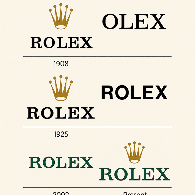
Hans Wilsdorf founded the company in London in 1905 and coined the name Rolex in 1908. In a 1958 speech he claimed a genie had whispered it to him. That may be true, or it may be good marketing, but the logo that followed soon after has hardly changed since: a five-pointed coronet, chosen to stand for the brand’s ambition to be the “King of Watches.”
The early logo was simple, a crown above the brand name set in a serif typeface. Even at the start, it had an air of authority, the look of a mark that knew exactly what it was for. By the 1920s Rolex had registered the coronet as a trademark, fixing it in the history of watchmaking. Since then, the story has been one of small adjustments, never a reinvention, and that consistency is most of what makes the logo valuable.
Gold and Green
The colors are specific and carefully chosen. The crown is a metallic gold (#A37E2C), the color of royal regalia and celebration, and it reads as luxury immediately. The lettering is a deep green (#006039), a color associated with wealth, growth and ambition. Together they suggest someone who has made it, without needing to say so loudly.
The pairing does two different jobs. The green ties the brand to heritage and stability, and the gold adds aspiration. A logo’s palette is the first impression it makes, and Rolex’s shows how much two colors can carry when each has a clear role.
Type and Crown
The typography is restrained. The custom serif lettering, often compared to a refined Garamond, is elegant and legible at once, which is a harder balance to strike than it looks. The coronet, with its five points, is minimal: every line is clean and deliberate, and nothing is there for ornament. The whole mark has the precision of a well-cut suit.
Next to the busier logos many brands use today, that restraint stands out. The Rolex logo does not need to raise its voice. It assumes it already has your attention, and usually it does.
The Crown on the Dial
The coronet stands for power, precision and prestige. Wilsdorf chose it to claim leadership in watchmaking, a crown for the king of watches. In the 1950s Rolex began putting the coronet on the dial itself, in place of the 12 o’clock marker on models such as the Oyster Perpetual and the Datejust. That was a bold decision. It turned the logo into part of the instrument, sitting where the wearer looks every time they check the time.
The lesson for designers is that a symbol works best when it carries a story. Before settling on a logo, it is worth asking what it says about the brand, and whether that is what you want it to say.
The 2002 Refresh
The 2002 Rolex logo redesign was a polish, not a revolution. The crown stayed gold, the lettering returned to its familiar green, and a gold outline was dropped for a cleaner result. It was a return to the brand’s roots rather than an attempt to look new.
Compare that with brands like Pepsi, which have changed logos often, and Rolex’s steadiness looks like a strategy. It is a good lesson for modern logo design. Chasing trends dates a mark, and a logo that ignores them tends to last longer.
A Logo Across the Decades
Rolex is as much a cultural symbol as a watch brand. Its watches have been worn by James Bond, Winston Churchill and countless celebrities on red carpets. In the 1960s the crown stood for jet-set glamour. In the 1980s it was the yuppie status symbol. Today it reads as a quiet show of success at a time when many brands are loud.
Through all those eras the logo stayed the same, and that is its biggest strength. Competitors such as Omega and TAG Heuer have adjusted their logos to stay current. Rolex has not needed to, because its crown never looked tied to any one decade.
Counterfeits and Class
The logo’s fame has costs. The luxury watch market is full of fakes, from street stalls in Bangkok to listings on eBay, and many copy the crown with unsettling accuracy, which chips away at its exclusivity. In 2023, Rolex won a high-profile trademark infringement case against a Chinese manufacturer, a reminder that protecting a logo is as important as designing it.
There is also a cultural argument about what the crown means. Critics see it as a status symbol for new money, and defenders see it as a reward for hard work. Either way, it gets people talking, which is more than most logos manage.
Brand Value
Rolex is privately held, so there is no share price to track, but its brand is enormously valuable. Interbrand’s 2024 report put Rolex’s brand value at more than $10 billion, driven largely by its logo and its unwavering identity. The crown is recognized instantly from New York to Tokyo. A logo that is both distinctive and durable is one of the most valuable things a company can own.
Consistency
Rolex is very consistent with its identity. The logo appears on everything from Submariners to billboards, always in the same gold and green. That sameness builds trust, because people know what the crown promises before they look closely. It also requires a design that works at every scale, from the tiny crown on a dial to a sign on a skyscraper.
What Designers Can Learn
The Rolex logo offers four clear lessons. Simplicity is powerful: the crown and lettering are uncluttered, and the brand shows through. Color matters: choose colors that tell a story. Evolve rather than reinvent: small changes keep a logo current without throwing away its history. And protect what you make: whatever tool you design with, make sure the result is original, so you are not the one accused of copying.
How the Crown Communicates
The logo’s language is luxury, precision and aspiration, delivered quietly. The crown suggests royalty, the green lettering suggests heritage, and together they tell the wearer they have arrived. Every element supports the same message, which is the standard any brand should hold its own logo to.
The Crown Online
The logo does well on social media. Hashtags like #Rolex and #RolexLovers have millions of posts on Instagram, with owners photographing their watches against yachts and city skylines. The clean design is recognizable even in a small thumbnail, which is a good test for any logo now: it has to work on a two-inch screen.
Technology and AI
AI logo generators such as Looka, Hatchful and Canva have opened up logo design to almost anyone, producing a professional-looking logo in minutes. They analyze trends, suggest palettes and generate designs tailored to a brief. Wix Logo Maker and FreeLogo.co offer watermark-free downloads of basic designs, which helps startups on a tight budget.
Could one of these tools have produced the Rolex crown? Probably not. They are fast and flexible, but they lack the judgment that went into the coronet, and the decades of discipline that made it valuable. They are still a useful place to start.
The Watches
The products are as famous as the logo. From the rugged Submariner to the elegant Datejust and the 70-year-old GMT-Master, every watch carries the crown. Rolex also sponsors events like Wimbledon and the Masters, which places the logo in the world of elite sport and reinforces its association with excellence.
Rolex Against Omega, Patek Philippe and TAG Heuer
Omega’s logo, with its sleek red lettering, leans sporty and modern. Patek Philippe’s Calatrava cross feels aristocratic but niche. TAG Heuer’s bold shield suggests energy but lacks Rolex’s broad appeal. The Rolex crown strikes a rare balance, luxurious and approachable, timeless and current, in the same way the Louis Vuitton monogram does.
If Rolex Used an AI Generator
Imagine Rolex trying an AI logo generator. The brief is luxury, precision and heritage. Typing “gold crown, green text, serif font” into a tool like Looka might produce a passable coronet, but it would not have the history that makes the real one matter. AI can produce clean designs quickly. What makes the Rolex logo valuable is more than a century of consistent use, starting with Wilsdorf’s genie story. For a quick prototype, though, a watermark-free generator would let Rolex test ideas without committing to a redesign.
Recent News
Rolex remains a cultural heavyweight in 2025. Its partnership with the Australian Open put the crown on courtside clocks and reinforced its place in elite sport. It also launched a new Oyster Perpetual model with the logo prominent on the dial, which got collectors talking. On X, some fans have even argued over whether the green of the logo has shifted slightly, which says a lot about how closely people watch this brand.
What the Crown Teaches
The Rolex logo is a good model for anyone building a brand. Its strength comes from a clear symbol, two colors with distinct jobs and a refusal to follow fashion. Playful brands such as Barbie and T-Mobile show that bold color can work too, but whatever the tone, the same rule applies: decide what the logo is, and then keep it. Rolex has been doing that for more than a century.


