The Snapchat Logo: History and Design of the Ghost
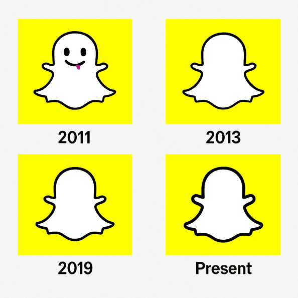
The Snapchat ghost has a name, Ghostface Chillah, borrowed from Wu-Tang Clan’s Ghostface Killah, and it was drawn by Evan Spiegel himself in 2011. It is one of the few big tech logos with no letters at all, just a white ghost on a yellow square. At a time when many app icons are crowded with gradients and detail, it is about as simple as a mark can get, and it sticks.
It is also a logo that explains its product. Snapchat’s messages disappear. Its mascot is a ghost. Few brands have ever made the link between what the product does and what the logo shows this direct.
Where the Ghost Came From
In 2011 Evan Spiegel, Bobby Murphy and Reggie Brown were students with an idea for an app where messages vanished after they were seen. They wanted a logo that felt temporary, fun and a little rebellious. The answer was Ghostface Chillah: a white ghost on a mustard-yellow background. Spiegel drew it himself, and it shows. The first version had more youthful energy than polish, and that suited an app built by and for people in their early twenties.
The early ghost was a simple, cartoonish silhouette, and by 2013 it had lost its eyes and mouth to become the featureless outline we know now. Without a face, the ghost became a blank that users could read their own mood into. The change followed Snapchat’s own growth, from a niche app with a reputation for sexting to a global platform for sharing everyday moments. The history of this logo is mostly a history of taking things away.
Why Yellow
The bright, almost neon yellow is the most distinctive thing about the brand. It has the energy of a Post-it note on a monitor. In color psychology, yellow is linked with optimism, youth and energy, which fits a platform aimed at Gen Z and millennials. It is also a risky color. It is loud and confident and demands to be seen, but it is warm, too, and less aggressive than red.
The choice made more sense against the competition. Most of tech was blue or red at the time (Facebook, Twitter, LinkedIn), and on a phone screen full of blue icons, Snapchat’s yellow is impossible to miss. Instagram and TikTok have since moved toward brighter palettes as well, but Snapchat got there first and made playful color part of its identity.
A Logo Without Words
There are no gradients and no shadows, just a bold silhouette on a flat background. The lack of any type is unusual for a tech brand, and it puts all the work on the image. That is a gamble. It pays off here because the ghost is so easy to remember that it has become a sort of pictogram for the app, recognized without a name attached.
The rounded, organic outline makes the ghost look friendly rather than spooky. The design follows the old Bauhaus idea of form following function: simple, clean and effective. It belongs in the same small group as Apple’s bitten apple and Nike’s swoosh, marks that do not need a word to identify the brand. For a designer, the useful takeaway is that simple does not have to mean dull. It means trusting the audience to get it.
What the Ghost Means
The ghost is cute, but it is also a straightforward metaphor for the app’s central promise. Messages disappear, stories vanish after a day, and a ghost is the obvious image for something that is here and then gone. It also catches something about being young: the fun of a moment that will not last and is not meant to.
That fits how Snapchat’s users treat the app, as a place to express themselves without everything being kept forever, as it is on other platforms. The ghost also avoids most cultural baggage. It has no religious or political meaning, just a broad sense of fun and a little mystery.
Refined, Not Redesigned
In 2019 the logo got a small update: a thicker outline and a slightly bolder yellow, so it would look crisp on high-resolution screens. It was a refinement, not a reinvention. Twitter’s bird went through several redesigns, and Google’s wordmark keeps shifting. Snapchat’s ghost has stayed recognizably the same, which shows that a logo can stay current without being redrawn every few years.
The lesson is to keep the core and resist overcomplicating it. Brands tempted to follow every design trend should note how well a strong, simple identity has survived a decade of fads.
The Logo of an Era
The ghost became a symbol of the shift to disappearing content. In the early 2010s, when Instagram was still mostly sepia filters and Facebook was where your mom was, Snapchat brought a different feel: raw, unfiltered and temporary. It was the logo of late-night snaps, streaks kept up through festivals and the dog-face filter. As online culture changed, the ghost came to stand for young people pushing back against an internet that remembered everything.
Gen Z made Snapchat a company valued at $3.5 billion, according to its 2024 valuation. The logo did not do that by itself, but it is the face of a brand that understands its audience, from AR lenses to disappearing stories.
Knockoffs and Criticism
The ghost has attracted its share of trouble. Copycat apps in Asia and Europe have used similar ghosts, leading to trademark disputes. In 2016 a Chinese app called “Snow” used a ghost that looked suspiciously close, and Snapchat responded with legal pressure. There has also been a cultural argument. Some critics say the ghost, a playful take on a traditionally frightening figure, trivializes folklore from cultures where ghosts carry deeper meaning.
Snapchat has mostly kept things light and leaned into its playful branding rather than mounting heavy defenses. It probably helps that the ghost is hard to dislike. It looks closer to a soft toy than to anything from a horror film.
The Business Behind the Ghost
Snap Inc.’s share price has swung hard, peaking at $83 in 2021 and falling to around $10 in 2023. The logo plays a quiet part in the business. Recognition drives engagement, and engagement drives advertising revenue, which is most of Snap’s income. In 2024 Snap reported $4.8 billion in revenue and 422 million daily active users, many of them drawn in by the app’s playful feel.
The logo’s consistency has helped through the bad stretches. Uber’s repeated logo overhauls confused users. Snapchat’s ghost has stayed put, which gives a sense of stability to a company whose stock has been anything but stable.
Consistency
The ghost appears on the app icon, on merchandise and in ads, always in the same basic form. That sameness builds trust, and it is one of the most useful lessons here for any designer: a logo should be a fixed point, not a moving target. The ghost is recognizable on a billboard or on a phone screen, and it has never needed reinventing.
TikTok’s logo is sleek but less distinctive. Instagram dropped its retro camera for a gradient outline. Snapchat’s ghost has held its ground, and it is stronger for it.
Design Lessons
Whatever tools you use to make a logo, the ghost suggests a few rules:
- Keep it simple. One bold shape can beat a busy design.
- Choose color on purpose. Pick colors for the feeling they create and for how they stand out from competitors.
- Make it scalable. The ghost works as well on a smartwatch as on a Times Square billboard.
- Tell a story. The logo should hint at what the brand does, the way Snapchat’s ghost hints at disappearing messages.
AI logo makers such as Looka, Semplr and Canva can help you try out shapes, colors and type quickly, and many offer free downloads without a watermark. They are most useful once you know which of these rules you are trying to meet.
The Visual Language Around It
Snapchat’s whole visual language is built on play. The ghost sets the tone for an app where dog ears, rainbow vomit and AR lenses are the main attractions. The messaging, fun, fleeting and heavy on filters, matches the logo. Apple feels clean and controlled and Google feels corporate. Snapchat feels like a party you have heard about and want to get into.
That match between logo and product is the real achievement. The ghost promises fun, and the app delivers it. When a logo promises something the product does not deliver, people notice quickly.
Hashtags and Fan Use
The ghost is popular on social media, with hashtags like #SnapchatGhost and #SnapIt. Since the early days users have put it on stickers, T-shirts and even tattoos. A simple shape like this is easy to turn into memes and merchandise. In 2024 a #SnapchatLens campaign went viral, with users making AR filters featuring the ghost and the posts drawing billions of views.
That kind of reuse shows a logo that has moved beyond its app and into wider culture. Brands that want the same should make their logos easy to share and easy to play with.
Technology and AI in Logo Design
AI logo generators like Looka and Canva can produce options very quickly. They draw on design trends, color psychology and the brand goals you type in, and the best free ones let you download without a watermark, which matters to a startup on a small budget.
Snapchat’s ghost was drawn by hand, but its shape is simple enough that an AI tool could produce something like it. These tools are good at reducing ideas to simple shapes. More brands will likely use them for early drafts, with people doing the choosing and refining.
Products Beyond the Chat
Snapchat now does much more than disappearing messages:
- Stories: 24-hour posts that started the format later copied by Instagram and TikTok.
- Lenses: AR filters that turn you into a puppy or a pirate, used by 75% of daily users.
- Spectacles: camera glasses that let you capture video in 3D, though they have yet to take off.
- Spotlight: a TikTok-style feed for short, viral videos.
Each one carries the ghost and the same playful identity. From filters to hardware, the logo is what makes these feel like parts of one product.
Against the Competition
Instagram’s gradient square is sleek but has little personality. TikTok’s musical-note logo is cool but easy to forget. Twitter’s bird, before the change to X, was iconic but tied to one action, tweeting. In our view Snapchat’s ghost beats all of them for emotional pull and versatility. It is the one that most clearly looks like itself.
If Snapchat Used an AI Logo Generator
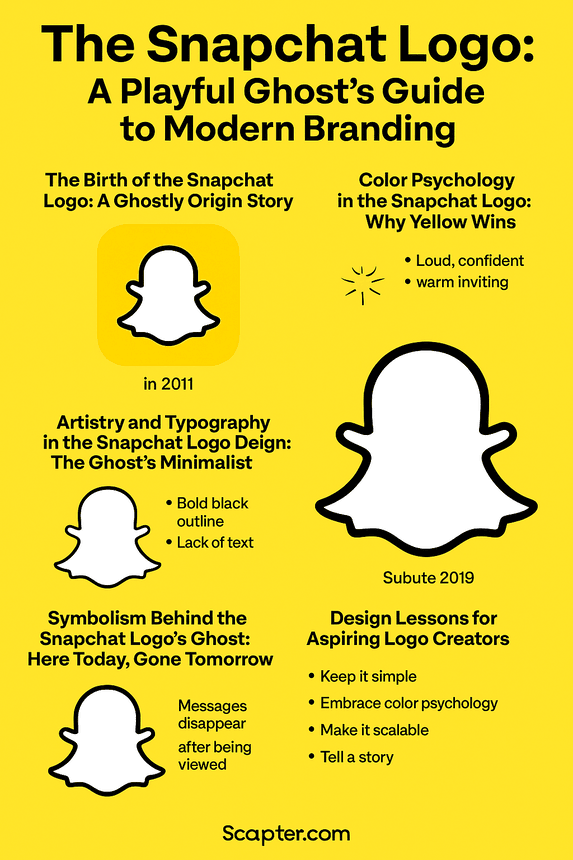
Suppose Snapchat’s design team in 2025 typed “playful,” “youthful” and “ephemeral” into a logo generator and asked for a bold yellow palette. It would get back a dozen ghosts. The likely winner would be a sharper version, maybe rendered in 3D for AR and VR displays, but still recognizably Ghostface Chillah.
It is a thought experiment, not a plan. But it makes a fair point: AI tools are not just for beginners, and even a well-known brand could use one to test ideas before committing to a change.
Recent News
In 2024 there were rumors of a Snapchat logo redesign for 2025, but no major change appeared. Snap put its effort into AR instead, releasing new lenses and expanding Spotlight. It also partnered with brands such as Nike and Gucci on exclusive filters. Posts on X noted how well the app was holding up, with 422 million daily users despite TikTok’s dominance.
Snap’s messaging has stayed simple: be real, have fun, be yourself. The ghost anchors all of it. Snapchat has never tried to look corporate, and the logo is a big reason why.
At the Augmented World Expo 2025, Snap Inc. showed its next-generation Specs AR glasses, a lighter, AI-powered wearable due in 2026 that uses OpenAI and Google Gemini models for multimodal AI Lenses. The Specs run on Snap OS and support shared games and location-based tools. New developer APIs (Depth Module, Automated Speech Recognition and Snap3D) are meant to let developers build immersive, location-based experiences and generate 3D objects.
What the Ghost Teaches
The Snapchat logo works because the simple shape, the loud color and the meaning all point the same way. If you are starting a logo of your own, a generator like Semplr can give you a set of first drafts. Then pick the one with a clear idea behind it, strip away whatever is not helping, and keep it the same long enough for people to learn it.


