Emoji Evolution: From Pixelated Smiles to Global Icons
The first emoji set had 176 icons, each drawn on a grid just 12 pixels square. Shigetaka Kurita designed them in 1999 for NTT Docomo’s mobile internet service in Japan, and within two decades their descendants had become something close to a global written language. A heart can now stand in for a declaration of love, a pile of poo for a laugh and the thinking face for quiet despair.
Emoji also turn out to be some of the most heavily tested small graphics ever made. Each one has to be recognizable at a tiny size, on every kind of screen, to people from every culture, which is more or less the brief for a good logo.
Where Emoji Came From
In 1999 Japan’s mobile phone market was booming, and text messages were short and blunt. Kurita, a designer at NTT Docomo, wanted a way for people to add tone and nuance without typing long messages. His answer was 176 pixel icons, 12 by 12 pixels each, drawn from manga, kanji and street signs. The set went beyond faces. It included a music note, a sun and, according to some accounts, an early ancestor of the poo emoji. The idea was a visual shorthand for feelings, and it spread far faster than anyone at Docomo could have expected.
In 2010 the Unicode Consortium, which acts roughly as the United Nations of digital text, added emoji to its standard so they could work across phones and platforms. By 2015 the face with tears of joy (😂) had been named Oxford Dictionaries’ Word of the Year, a picture beating out every actual word. There are now more than 3,600 emoji, from the custom sets used on Discord to the infamous eggplant, all competing for space on your emoji keyboard.
Copy-and-paste emoji sites have made it easy to grab a red heart or a sparkle for any message. They also show how much design work goes into each one. An emoji is minimalist design under severe constraints, and it has a lot in common with making a logo.
A Language Without Borders, Mostly
Emoji work a little like Esperanto for the internet, only far more popular. A thumbs up means approval in Tokyo and in Timbuktu. But meanings drift. In the West the peach has become a stand-in for a backside; in Japan it is still mostly a fruit. The eggplant has its own well-known second career. That mix of universal and local makes emoji both useful and surprisingly messy.
Take the heart eyes (😍). It is a love letter in one character, but so many influencer captions use it (“Obsessed with this smoothie! 😍”) that it now draws eye-rolls. The crying face (😢) and the loudly crying face (😭) have become Gen Z’s answer to everything from heartbreak to something being very funny. Emoji tend to carry tone more than literal meaning. They work like a raised eyebrow or a wink in a written conversation.
Emoji and Hashtags
Emoji and hashtags go together. A fire emoji next to #OOTD turns up the energy, and a clown emoji in a pointed tweet makes the sarcasm obvious. A 2018 study found that emoji raised engagement on Twitter by 25%. Brands noticed. Sparkles turn up in ad copy and camera emoji in Instagram Stories. Even The Emoji Movie, a questionable piece of filmmaking, existed because emoji had become big business.
Why the Red Heart Wins
The red heart feels sincere partly because of color psychology. Red signals passion and urgency, which suits love and desire. The blue heart suggests loyalty and calm. The black heart is edgy, ironic or openly villainous. Emoji designers lean on these associations so each icon lands with the right feeling.
Logo design works the same way. McDonald’s golden arches feel warm and inviting, while IBM’s blue stripes feel trustworthy and corporate. Emoji, with only a few pixels to work with, rely on color even more. The sun is yellow for optimism and the moon is drawn in cool tones for a touch of mystery. For an emoji or a brand mark alike, color carries a large share of the message.
Anatomy of an Emoji
Designing an emoji is a bit like writing a haiku. Every pixel matters. The shrug (🤷), with its raised shoulders and open palms, says “I don’t know” in a 32-by-32-pixel square. That is modernist design at its most efficient: simple, scalable and instantly recognizable. The teams that draw emoji at Apple and Google work to strict rules about clarity, consistency and cultural sensitivity.
The clapping hands (👏) suggest movement through the angle of the hands, which is why they turn up so often in sassy tweets. The eyes (👀) use white space to suggest a sideways glance. These are tiny designs, and the best of them are as well made as any logo, at a fraction of the size.
What Emoji Teach Logo Designers
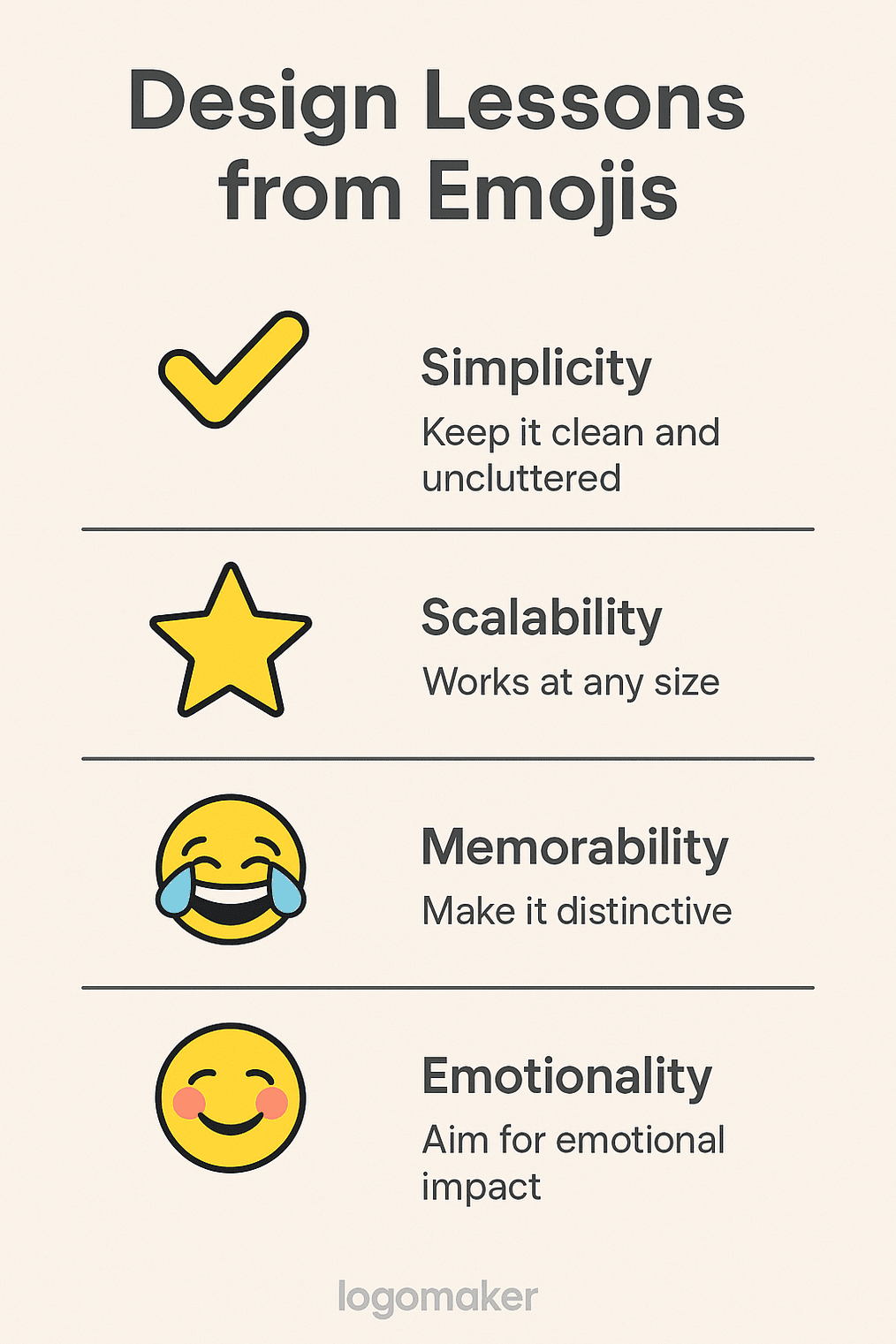
If you are designing a logo, by hand or with an AI logo generator, emoji offer three useful tests:
- Simplicity. Like the check mark, the design should be clean and quick to read.
- Scale. The star works at any size; your logo should too.
- Feeling. The blushing face radiates warmth. A good logo should carry an emotion as well.
Emoji Controversies
Emoji have caused plenty of arguments. In 2015 Apple’s push for a range of skin tones was a step forward for inclusivity, but it irritated people who preferred their smiley faces yellow and neutral. The gun emoji was once a realistic pistol and is now a toy-like water gun, after campaigns against violence. And the middle finger (🖕) made it through Unicode’s approval process, to the delight of some users and the dismay of others.
The poo emoji (💩) divides people too. Some find it gross; Burger King decided it was funny and used it in ads. Other misunderstandings are more awkward. Many people in the West read the folded hands (🙏) as a high-five rather than prayer or thanks, which can go badly in a serious conversation. Like logos, emoji have to work in a world where the same image can mean very different things.
Modern Hieroglyphs
Emoji are something like modern cave paintings, packing big ideas into small symbols. The crown suggests royalty or confidence. The ghost can be spooky or can mean someone has vanished from a conversation. The 100 (💯) works as a stamp of approval, and the skull (💀) can mean danger, irony or “I’m dead” laughter. That is how logos work too: a swoosh or an apple carries a whole set of associations.
Brands use emoji the same way. A wave in a Coca-Cola tweet feels friendly, and a money bag in a fintech ad suggests ambition. When you design a logo, it helps to think like an emoji designer and ask which single symbol could stand for the whole brand.
How Emoji Changed Behavior
Emoji do more than reflect culture. They shape it. Hearts are a big part of online romance: a 2016 Match.com survey found that 92% of online daters used emoji. The crying face has made it easier to admit you are not okay without spelling it out. Even the clown has become a political insult, aimed at public figures with a single tap.
Emoji can also leave people out. Early sets had little diversity, which led to campaigns for a hijab emoji and a wheelchair emoji. The Unicode Consortium now treats inclusivity as a priority, though there are still gaps. For anyone designing symbols meant for everyone, it is a reminder to check who is missing.
Emoji as Time Capsules
Emoji capture the time they were made. The floppy disk (💾) belongs to the 1990s, and the syringe (💉) took on new meaning during COVID. The Emoji Movie in 2017 confirmed their place in pop culture, for better or worse. Each new Unicode release now gets treated as news, with additions like the pleading face and the hug reflecting a need for connection.
Logos work the same way. MTV’s constantly changing logo captured the mood of each decade it lived through. Good design combines shapes that last, like a check mark, with touches that feel current, like sparkles. Emoji show that design has to keep moving with its audience.
Emoji in Marketing
Emoji are not traded on any stock market, but they sell things. Domino’s let customers order a pizza by tweeting the pizza emoji. Chevrolet put out a press release written entirely in emoji. Neither was just a gimmick: according to a 2020 Sprout Social study, a muscle emoji in a gym ad or a camera emoji in a travel campaign can lift clicks by 15%.
What emoji show logo designers is the value of instant recognition. A heart says “we care” faster than any tagline. A logo should communicate just as quickly, whether it is built on a sleek arrow or a bold crown.
Logo Principles in Miniature
Emoji are a crash course in logo design. The good ones are:
- Memorable. The laughing face sticks in the mind.
- Versatile. A hand gesture works in almost any context.
- Emotional. The weary face makes you feel something.
Logos need the same qualities: bold enough to notice, flexible enough to live anywhere. The sparkle works in a text, a tweet and a tattoo, and a good logo should be that adaptable.
From Japanese Phones to a Billion-Dollar Business
Emoji have grown from Japanese phone screens into a $1 billion industry, according to a 2021 Forbes report. They appear in ads and films and even in court, where a knife emoji has been presented as evidence. The emoji keyboard is standard on every smartphone, and copy-and-paste sites spread them further still. That growth mirrors the rise of digital branding, where a well-made logo can help a startup stand out.
The hot face (🥵) and the astonished face (😲) show how emoji meanings shift with slang. Brands have to keep up in the same way. Fall behind and you look as dated as a pager emoji.
What Emoji Leave Behind
Kurita’s 176 icons were a workaround for clumsy text messages. They became a shared vocabulary for billions of people, and in the process they showed how much a well-drawn symbol can carry when it has almost no room to work with. A heart, a skull or a shrug can do in a dozen pixels what a paragraph struggles to.
That is the bar for a logo. The next time you use a smiley face or paste a heart into a message, look at how little is actually there, and how quickly you understood it.


