Logoluv

Tag

AI Logo generation page 4

95 LogoLuv stories about AI Logo generation: logo history, design choices and what they mean.

Iconic Logos

The Heinz Logo: The Keystone Behind the Ketchup

The shape around the Heinz name is a keystone, the wedge that locks an arch in place and the symbol of Pennsylvania, the state where Henry J. Heinz started bottling horseradish in 1869. More than 150 years later it is still on nearly every bottle the company sells.
· 8 min read

Iconic Logos

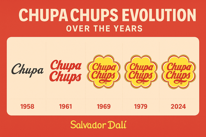
The Chupa Chups Logo: Salvador Dalí’s Daisy

The yellow daisy on every Chupa Chups wrapper was drawn by Salvador Dalí, reportedly in about an hour at a café in 1969. It has barely changed since, which tells you something about how right he got it.

· 9 min read

Iconic Logos

The MTV Logo: How a Chunky M Rewrote the Rules

The MTV logo was built to be redrawn. When the channel launched in 1981, Manhattan Design gave it a fat, blocky “M” with a scrawled “TV” sprayed across it, and the shape was meant to be repainted, animated and dressed up differently on air from the start.

· 8 min read

Iconic Logos

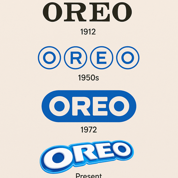
The Oreo Logo: From a 1912 Wordmark to Bold Blue

When Nabisco launched the Oreo in 1912, its logo was a stamp rather than a design: a plain wordmark whose only job was to tell you whose cookie you were holding. More than a century later the name sits in heavy, rounded capitals on a deep blue field, and that blue has become as much a part of the cookie as the cream.

· 9 min read

Iconic Logos

The Converse Logo: How the Star Became a Style Icon

Converse was founded in Malden, Massachusetts, in 1908, but the star most people picture when they hear the name did not show up until 1963. It took the success of the All-Star shoe to give the company its symbol, and the logo has been adjusted, tilted and re-lettered several times since without ever losing that five-pointed star.

· 9 min read

Iconic Logos

The Toys R Us Logo and Its Backward R

The most famous thing about the Toys R Us logo is a mistake made on purpose: the R is printed backward, the way a small child might write it. Charles Lazarus put it there when he renamed his Children’s Bargain Town, and it has lasted through a bankruptcy and a comeback.

· 9 min read

Iconic Logos

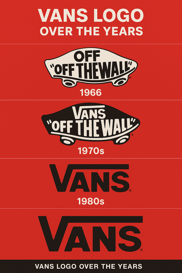
The Vans Logo: Skate Culture in Black and White

The Vans logo started as plain lettering on the shoeboxes of a single shop in Anaheim, California, opened in 1966 by Paul Van Doren and his brother Jim. Nobody designed it to be a symbol of skateboarding. Skaters made it one.

· 9 min read

Iconic Logos

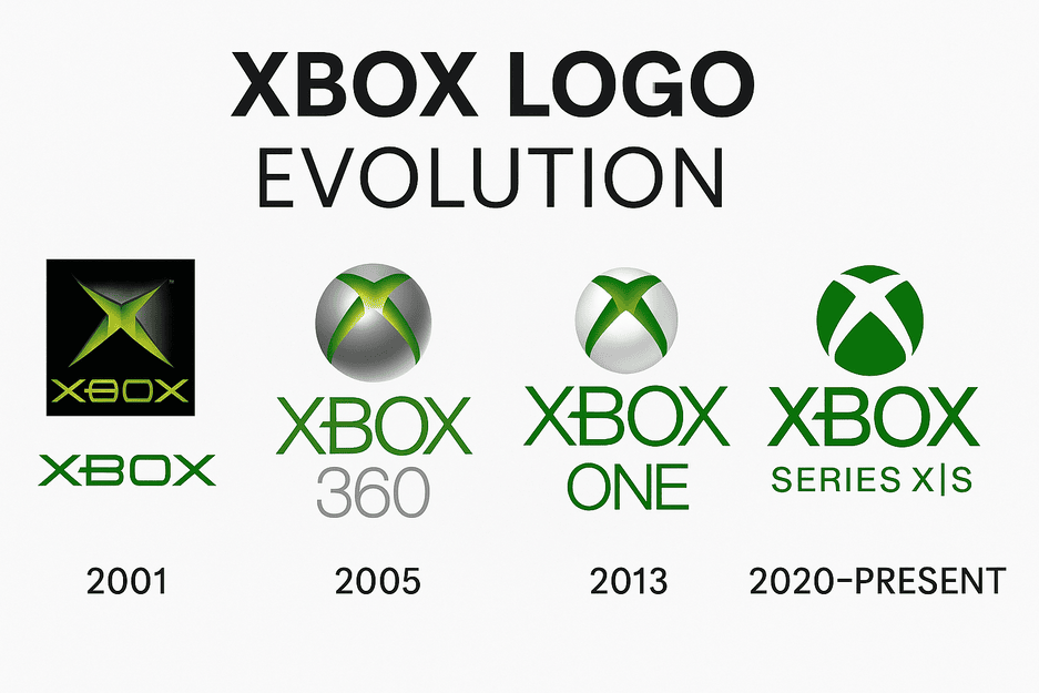
The Xbox Logo: How Microsoft’s Green X Evolved

The first Xbox logo, in 2001, was a chunky metallic X wrapped in a glowing, almost radioactive green. Microsoft was entering a market owned by Sony and Nintendo, and the logo looked like it knew it had to shout.

· 8 min read