The Target Logo: How the Bullseye Got Simple
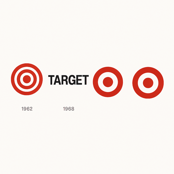
Target’s first bullseye, in 1962, had three rings. Six years later it was down to one red ring and a dot, and that stripped-back version has been on carts, bags and Super Bowl ads ever since.
Tag
95 LogoLuv stories about AI Logo generation: logo history, design choices and what they mean.
Target’s first bullseye, in 1962, had three rings. Six years later it was down to one red ring and a dot, and that stripped-back version has been on carts, bags and Super Bowl ads ever since.
Panda Express is the rare fast-food chain whose mascot looks relaxed. Since 1983 its logo has been a black-and-white panda in a red circle, calm where its rivals shout, and that one choice has carried the brand from a mall in Glendale, California, to more than 2,400 locations.
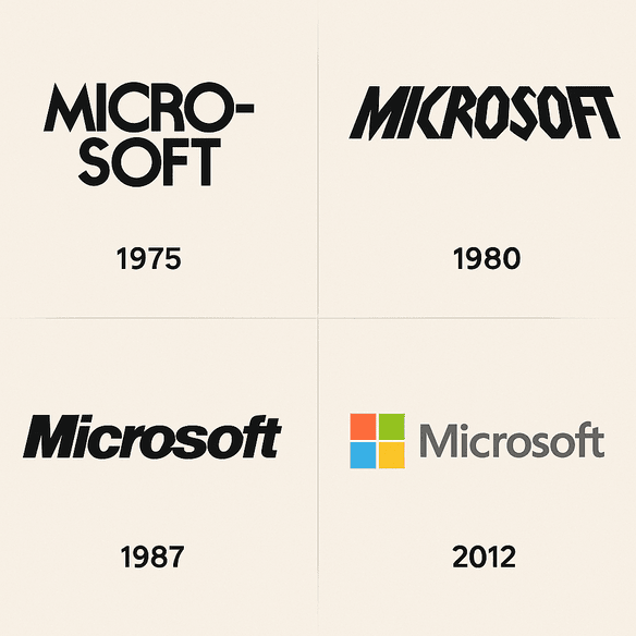
Microsoft’s first logo spelled the company’s name with a hyphen, “Micro-Soft,” in lettering that made it obvious the founders were programmers, not designers. Its current logo is four colored squares and the word Microsoft in Segoe, and it took the company nearly four decades to get there.
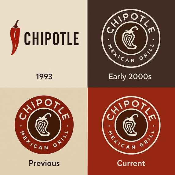
Chipotle now has more than 3,700 restaurants, and every one of them is marked by the same thing it started with in Denver in 1993: a single chili pepper and a plain typeface. Very few restaurant chains have grown that much while changing their logo so little.
The Snapchat ghost has a name, Ghostface Chillah, borrowed from Wu-Tang Clan’s Ghostface Killah, and it was drawn by Evan Spiegel himself in 2011. It is one of the few big tech logos with no letters at all, just a white ghost on a yellow square.
The TikTok logo is a single music note, and it looks like it is vibrating even when it sits still on your home screen. That effect comes from two offset colors, cyan and magenta, printed slightly out of register against black, and it has made one of the plainest symbols in music into one of the most recognizable app icons of the past decade.
The Timberland logo was drawn for a waterproof work boot sold to New England laborers in 1973. Twenty years later the same tree was a fixture of New York hip-hop, and the logo had not changed at all.
When Bob Kane and Bill Finger introduced Batman in 1939, the bat on his chest was small, black and so plain that nobody would have called it a logo. Since then it has been rounded off, sharpened, stretched and roughed up for almost every decade’s version of the character, and the silhouette has never stopped reading as Batman.
The Star Wars logo began in 1976 with designer Suzy Rice, who drew on the hard, authoritarian lettering of 1930s German propaganda and on sci-fi pulp covers. That is an odd starting point for a family adventure, and it is a large part of why the logo still looks so commanding.
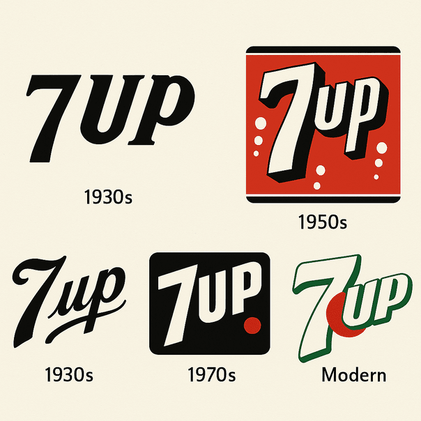
7 Up started life in 1929 under one of the worst product names in soft drink history: Bib-Label Lithiated Lemon-Lime Soda. The short name came soon after, and the logo that grew around it, green with a small red dot, has carried the brand for most of a century.