Logoluv

Tag

logo maker page 4

91 LogoLuv stories about logo maker: logo history, design choices and what they mean.

Iconic Logos

The Batman Logo: Its History and What Designers Can Learn

When Bob Kane and Bill Finger introduced Batman in 1939, the bat on his chest was small, black and so plain that nobody would have called it a logo. Since then it has been rounded off, sharpened, stretched and roughed up for almost every decade’s version of the character, and the silhouette has never stopped reading as Batman.

· 11 min read

Iconic Logos

The Star Wars Logo: How It Was Made and Why It Lasts

The Star Wars logo began in 1976 with designer Suzy Rice, who drew on the hard, authoritarian lettering of 1930s German propaganda and on sci-fi pulp covers. That is an odd starting point for a family adventure, and it is a large part of why the logo still looks so commanding.

· 9 min read

Iconic Logos

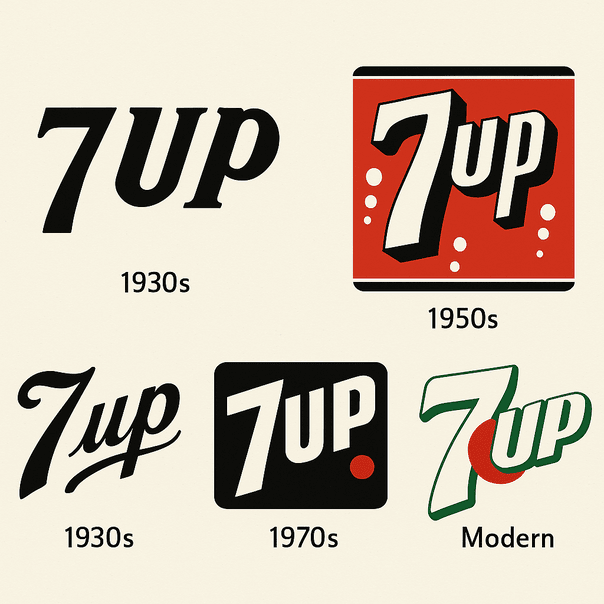
The 7 Up Logo: History of the Uncola’s Red Dot

7 Up started life in 1929 under one of the worst product names in soft drink history: Bib-Label Lithiated Lemon-Lime Soda. The short name came soon after, and the logo that grew around it, green with a small red dot, has carried the brand for most of a century.

· 10 min read

Iconic Logos

The Heinz Logo: The Keystone Behind the Ketchup

The shape around the Heinz name is a keystone, the wedge that locks an arch in place and the symbol of Pennsylvania, the state where Henry J. Heinz started bottling horseradish in 1869. More than 150 years later it is still on nearly every bottle the company sells.

· 8 min read

Iconic Logos

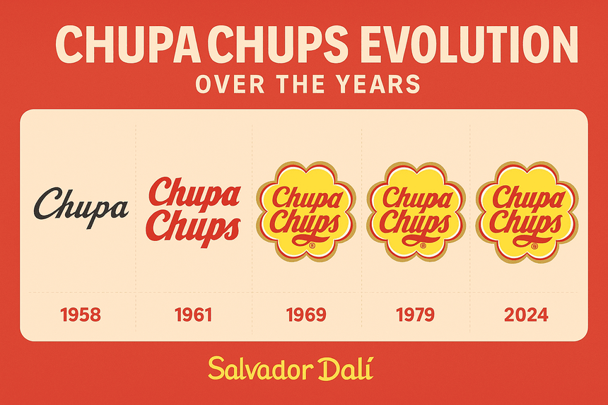
The Chupa Chups Logo: Salvador Dalí’s Daisy

The yellow daisy on every Chupa Chups wrapper was drawn by Salvador Dalí, reportedly in about an hour at a café in 1969. It has barely changed since, which tells you something about how right he got it.

· 9 min read

Iconic Logos

Famous Logos and the Hidden Ideas Inside Them

There is a bear standing in the Toblerone mountain, an arrow between the E and the x of FedEx, and the number 31 tucked into the Baskin Robbins initials. Famous logos are full of these small jokes and secrets, and the best of them are also simple, well-colored marks that would work even if nobody ever spotted the trick.

· 14 min read

Iconic Logos

The MTV Logo: How a Chunky M Rewrote the Rules

The MTV logo was built to be redrawn. When the channel launched in 1981, Manhattan Design gave it a fat, blocky “M” with a scrawled “TV” sprayed across it, and the shape was meant to be repainted, animated and dressed up differently on air from the start.

· 8 min read

Iconic Logos

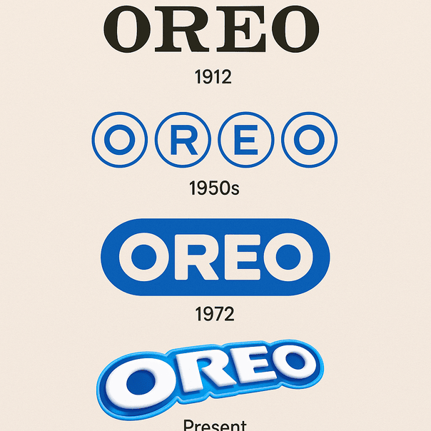
The Oreo Logo: From a 1912 Wordmark to Bold Blue

When Nabisco launched the Oreo in 1912, its logo was a stamp rather than a design: a plain wordmark whose only job was to tell you whose cookie you were holding. More than a century later the name sits in heavy, rounded capitals on a deep blue field, and that blue has become as much a part of the cookie as the cream.

· 9 min read