Logoluv

Tag

logo maker page 5

91 LogoLuv stories about logo maker: logo history, design choices and what they mean.

Iconic Logos

The Converse Logo: How the Star Became a Style Icon

Converse was founded in Malden, Massachusetts, in 1908, but the star most people picture when they hear the name did not show up until 1963. It took the success of the All-Star shoe to give the company its symbol, and the logo has been adjusted, tilted and re-lettered several times since without ever losing that five-pointed star.

· 9 min read

Iconic Logos

The Toys R Us Logo and Its Backward R

The most famous thing about the Toys R Us logo is a mistake made on purpose: the R is printed backward, the way a small child might write it. Charles Lazarus put it there when he renamed his Children’s Bargain Town, and it has lasted through a bankruptcy and a comeback.

· 9 min read

Iconic Logos

The Vans Logo: Skate Culture in Black and White

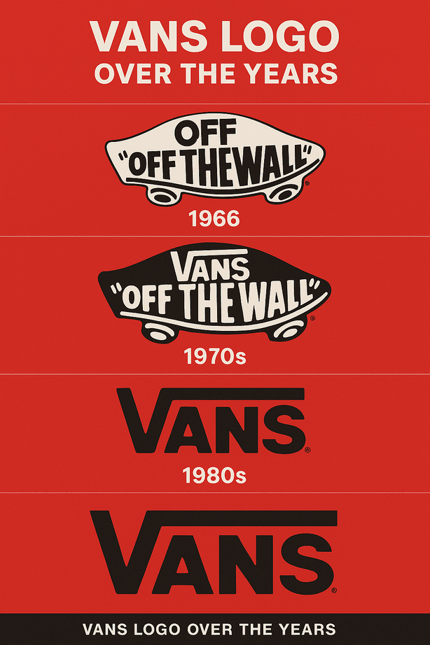
The Vans logo started as plain lettering on the shoeboxes of a single shop in Anaheim, California, opened in 1966 by Paul Van Doren and his brother Jim. Nobody designed it to be a symbol of skateboarding. Skaters made it one.

· 9 min read

Iconic Logos

The Xbox Logo: How Microsoft’s Green X Evolved

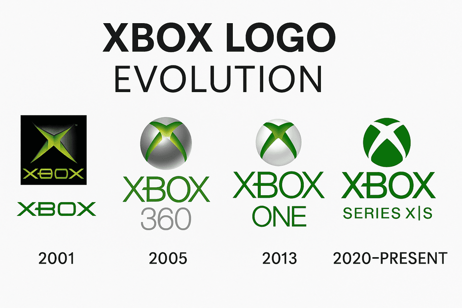
The first Xbox logo, in 2001, was a chunky metallic X wrapped in a glowing, almost radioactive green. Microsoft was entering a market owned by Sony and Nintendo, and the logo looked like it knew it had to shout.

· 8 min read

Iconic Logos

The Barbie Logo: How a Pink Script Became a Brand

When Ruth Handler introduced Barbie in 1959, the doll’s name came in a cheerful handwritten script, in pink. More than sixty years and several redesigns later, the logo is still pink and still a script, and that stubbornness is most of the reason it works.

· 9 min read

Iconic Logos

The Levi’s Logo: How the Batwing Took Over

The Levi’s batwing borrows its shape from the stitching on the back pocket of a pair of jeans. Introduced in 1967, it took a detail every wearer already knew and turned it into the frame for the brand’s name.

· 8 min read

Iconic Logos

The KFC Logo: How the Colonel’s Face Became a Brand

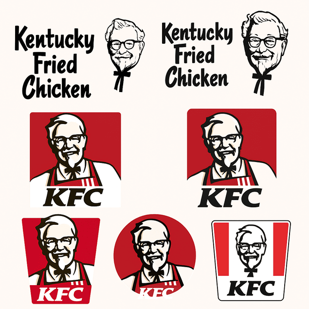
KFC is one of very few global fast-food chains whose logo is a real man’s face. Colonel Harland Sanders has looked out from the brand’s signs since the 1950s, and every redesign since has had to answer the same question: how much of the Colonel to keep.

· 8 min read