Logoluv

Tag

logo maker page 7

91 LogoLuv stories about logo maker: logo history, design choices and what they mean.

Iconic Logos

The Starbucks Logo: How the Siren Became an Icon

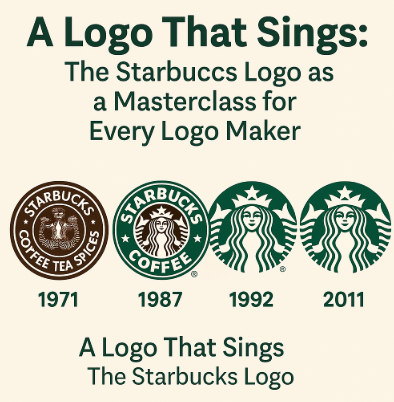
The Starbucks siren started life as a bare-breasted, twin-tailed figure lifted from a 16th-century Norse woodcut, printed on the bags of a single Seattle coffee-bean shop in 1971. Over four decades the company covered her up, cropped her in and finally took its own name off the logo altogether.
· 7 min read

Iconic Logos

The Instagram Logo, From Polaroid Camera to Gradient

Instagram’s first icon was a little brown Polaroid-style camera with a rainbow stripe, drawn in 2010 when the app was a photo-filter toy. In 2016 the company threw out the camera’s textures and shading and kept only its outline, filled with a magenta-to-orange gradient.

· 9 min read

Iconic Logos

The Pepsi Logo: From Brad’s Drink to the 2023 Globe

Pepsi began in 1898 as “Brad’s Drink,” a digestive aid mixed by Caleb Bradham in a North Carolina pharmacy, and its first logo looked like something from the apothecary shelf. Over the next century the name went from spidery script to a bottle cap, a globe and a much-mocked “smile,” and in 2023 it came back to bold capitals in the middle of the globe.

· 8 min read

Iconic Logos

The BBC Logo: Three Boxes and a Century of Trust

The BBC logo is three letters in three boxes, and that is all it has been for decades. The version introduced in 1997 set B, B and C in Gill Sans, a typeface Eric Gill drew in the 1920s, and it has become one of the most trusted marks in broadcasting.

· 7 min read

Sports Logos

The Real Madrid Logo: Crown, Monogram and Banda

Real Madrid’s crest is essentially a monogram with a crown on top, and the crown was a royal favor: King Alfonso XIII granted the club the title “Real” in 1920. Almost everything else about the badge has been adjusted over the past century, but those two elements have stayed.

· 9 min read

Iconic Logos

The YouTube Logo, From “Tube” to Play Button

The first YouTube logo was a joke about old televisions: “You” in black, “Tube” in white inside a red, rounded rectangle shaped like a cathode-ray screen. Twelve years later the screen became a play button, and the play button became the logo.

· 4 min read

Iconic Logos

Emoji Evolution: From Pixelated Smiles to Global Icons

The first emoji set had 176 icons, each drawn on a grid just 12 pixels square. Shigetaka Kurita designed them in 1999 for NTT Docomo’s mobile internet service in Japan, and within two decades their descendants had become something close to a global written language.

· 8 min read