- Key Points:
- Famous logos tell stories through design, embedding brand identity and values.
- Hidden meanings, like Amazon’s A-to-Z arrow, make logos memorable.
- Color, typography, and symbolism drive a logo’s success.
- Controversies can shape a logo’s legacy over time.
- Timeless logos balance simplicity, scalability, and cultural resonance.
Overview
Famous logos are the unsung heroes of branding, distilling a company’s essence into a single, captivating glance. This 3,000-word article explores 60 iconic famous logos with hidden meanings, from the sly arrow in FedEx’s design to the bear lurking in Toblerone’s mountain. Written in the witty, human tone of The Guardian, it serves as a masterclass for aspiring logo makers, blending historical depth, design insights, and cultural commentary with a touch of humor.
Why Hidden Meanings Matter in Famous Logos
Hidden meanings transform famous logos into engaging puzzles that linger in the mind. The Hope for African Children Initiative’s silhouette of an adult and child forming Africa’s outline or the US Cyber Command’s cryptic MD5 hash code elevate brand recognition by rewarding curious viewers. These subtle Easter eggs foster a deeper emotional bond, making famous logos more than mere marks—they become cultural conversations that resonate across generations.
Design Principles for Creating Famous Logos
Great logos are simple yet scalable, rich with stories, and resilient against fleeting trends. As design icon Paula Scher observes, “Design is thinking made visual.” This exploration of 60 famous logos provides a roadmap for crafting symbols that stand the test of time, offering practical lessons for every logo maker aiming to leave a lasting mark in the world of branding.
A Deep Dive into 60 Iconic Logos with Hidden Meanings
In a world where a Nike swoosh can ignite athletic ambition and an Apple bite can redefine technology, famous logos are the silent ambassadors of brands. They’re visual haikus, compressing centuries of history, psychological nuance, and bold audacity into a fleeting image. For aspiring logo makers, these 60 iconic designs—from Beats’ headphone-hugging “b” to Airbnb’s debated Bélo—offer a treasure trove of inspiration. Let’s unpack their secrets with a Guardian-esque blend of wit, research, and cultural flair, shining a spotlight on famous logos and their hidden depths, as of this fine morning of June 6, 2025.
Evolution of Famous Logos: From Medieval Crests to Digital Dynasties
The story of logos begins in the misty fields of medieval Europe, where knights emblazoned their shields with crests to declare lineage—imagine “Sir Reginald, jousting extraordinaire!” proudly waving his family’s emblem. By the 19th century, businesses caught on to this idea of visual identity. Bass Brewery’s red triangle, registered in 1876, became the UK’s first trademark, a bold scarlet symbol that screamed authenticity in a sea of ale (Bass Logo). The 20th century turned logos into corporate coat-of-arms, with brands like Coca-Cola and Ford crafting symbols that became synonymous with their industries.
Louis Vuitton’s monogram, introduced in 1896 by Georges Vuitton to thwart counterfeiters, transformed into a fortress of luxury. The interlocking “L” and “V,” paired with Japanese-inspired floral motifs, not only protected the brand but also became a status symbol, adorning everything from steamer trunks to modern handbags (Louis Vuitton Logo). Cisco’s logo, designed by Joe Finocchiaro and Jerry Kuyper, offers a more contemporary example. Its blue stripes mimic both an electromagnet and the Golden Gate Bridge, tying the tech giant to its San Francisco roots while symbolizing its role in global connectivity (Cisco Logo). As design legend Paul Rand once quipped, “A logo is a flag, a signature, an escutcheon.” For logo makers, the takeaway is clear: every design must start with purpose, not just aesthetics, ensuring that famous logos stand as enduring emblems of identity.
Image: Evolution of Logo Design
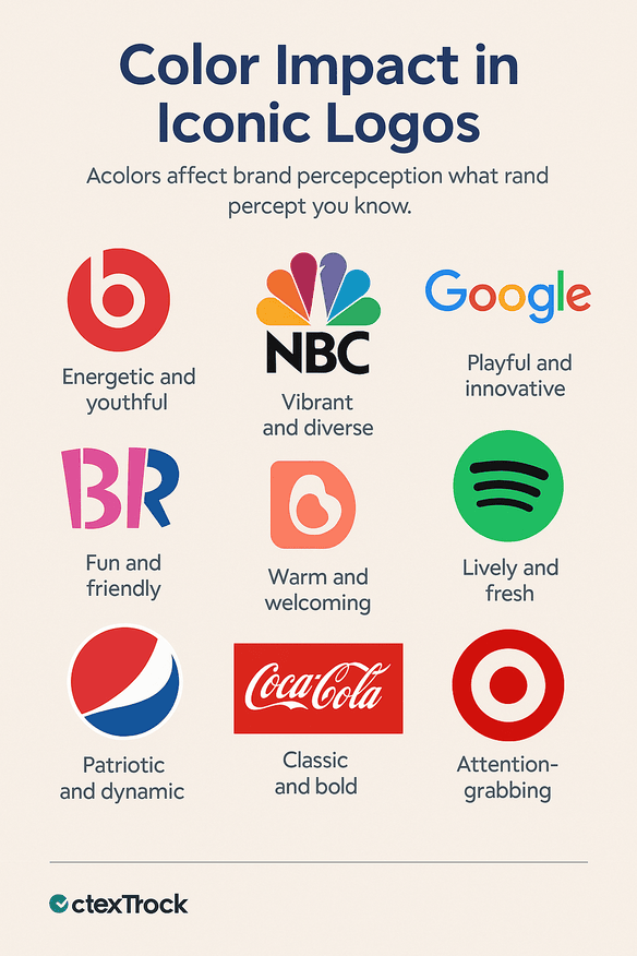
Color Psychology: The Hue That Captivates Audiences
Colors are the secret weapons of design, wielding psychological power to shape perceptions in the most subtle ways. A 2020 study from the University of Loyola revealed that 80% of brand recognition hinges on color alone (Color Study). McDonald’s golden arches, for instance, trigger hunger pangs with their warm yellow hue, a color often associated with joy and appetite. Meanwhile, IBM’s blue stripes exude corporate trust, a shade that whispers reliability in boardrooms worldwide (IBM Logo).
- Beats by Dr. Dre: The bold red circle, designed by Ammunition Group, pulses with musical energy, appealing to youth culture with a fiery passion that screams “listen to me” (Beats Logo).
- NBC: John J. Graham and Herb Lubalin’s 1956 peacock logo was a masterstroke of marketing. Its vibrant feathers flaunted the dawn of color TV, with six distinct colors representing NBC’s divisions—news, entertainment, sports, and more (NBC Logo).
- Google: A playful green twist in its primary palette of red, yellow, and blue breaks convention, signaling innovation and a refusal to conform to tech’s monochrome norms (Google Logo).
- Baskin Robbins: The pink and blue “B” and “R” hide the number 31, evoking fun and the promise of a new flavor for every day of the month (Baskin Robbins Logo).
- Airbnb: The soft coral Bélo, introduced in 2014, suggests warmth and community, though its debut was marred by comparisons to anatomical sketches (Airbnb Logo).
- Spotify: A green waveform vibrates with musical energy, a hue that stands out in the streaming landscape, inviting users to dive into their playlists (Spotify Logo).
- Pepsi: The red, white, and blue globe subtly forms a smile, evolving over decades to reflect cultural shifts while maintaining its refreshing identity (Pepsi Logo).
- Coca-Cola: Its silver script on a dynamic red background screams refreshment and tradition, a color combo that has defined the soda giant for over a century (Coca-Cola Logo).
- Target: The stark red bullseye grabs attention, a color that signals urgency and focus, perfectly aligning with the retailer’s promise of hitting the mark for shoppers (Target Logo).
As Paula Scher notes, “Color evokes emotion, conveys meaning, and defines identity.” For those crafting famous logos, the right hue can be the difference between being forgettable and unforgettable, ensuring the design resonates deeply with its audience.
Image: Color Impact on Iconic Logos
Artistry, Typography & Design Patterns in Logo Creation
The artistry of a logo is its heartbeat, breathing life into a brand’s identity. Nike’s swoosh, a $35 masterpiece by Carolyn Davidson in 1971, draws inspiration from the Greek goddess Nike’s wings, embodying motion and aspiration in a single, fluid stroke (Nike Logo). Louis Vuitton’s monogram, with its Japanese-inspired floral motifs, reflects a global aesthetic that transcends borders, a testament to the power of cultural fusion in design (Louis Vuitton Logo).
Typography, meanwhile, is a battleground of expression where every curve and serif tells a story. Coca-Cola’s cursive script, unchanged since 1886, feels like a handwritten note from a bygone era, evoking nostalgia with every sip (Coca-Cola Logo). My Fonts’ hand-like “My” invites users to grab their perfect typeface, a clever visual metaphor for accessibility (My Fonts Logo). Gillette’s razor-cut “G” and “i” mirror the precision of its blades, a subtle nod to the product’s core promise (Gillette Logo). Le Tour De France’s cyclist-shaped “r” captures the dynamism of the race, transforming a letter into a story of speed and endurance (Le Tour Logo).
Beyond typography, design patterns play a crucial role. The London Symphony Orchestra’s logo doubles as a conductor’s silhouette, its elegant script reflecting the grace of a live performance (LSO Logo). Galeries Lafayette’s typography hides the Eiffel Tower in its “f,” a nod to its Parisian roots that’s as chic as the department store itself (Galeries Lafayette Logo). “Typography and design patterns are painting with words and shapes,” says David Airey, urging logo makers to wield these tools with intent to create famous logos that resonate on multiple levels.
Image: Typography in Logo Design
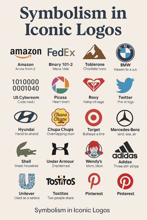
Symbolism: Layers of Intrigue in Iconic Designs
Great logos are riddles waiting to be solved, hiding layers of meaning beneath their surface. “A logo should have layers, like an onion,” says Alina Wheeler, and these 60 designs prove her point with their intricate symbolism.
- Amazon: Tim Kent’s design features an arrow from A to Z, symbolizing variety, while doubling as a smile to reflect customer joy (Amazon Logo).
- FedEx: Lindon Leader’s arrow between the “E” and “x” whispers speed and precision, a hidden gem that’s become a hallmark of design ingenuity (FedEx Logo).
- Toblerone: A bear lurks in the Matterhorn, nodding to Bern’s “City of Bears” and the chocolate’s honey flavor (Toblerone Logo).
- BMW: The blue-and-white quarters echo the Bavarian flag, debunking the myth of a spinning propeller while tying the brand to its heritage (BMW Logo).
- London Symphony Orchestra: The “LSO” initials form a conductor’s silhouette, a script that mirrors orchestral elegance (LSO Logo).
- Eighty 20: Binary squares spell out 80 and 20, showcasing the analytics firm’s data-driven ethos (Eighty 20 Logo).
- US Cyber Command: An MD5 hash code in the golden ring reflects the cryptic nature of cybersecurity (US Cybercom Logo).
- Picasa: The shutter forms a house, tying to “casa” (Spanish for home) as a haven for photos (Picasa Logo).
- Roxy: A heart made from two Quiksilver logos appeals to its female audience with feminine charm (Roxy Logo).
- Twitter (pre-X): Simon Oxley’s bird symbolized freedom and open communication, a fitting emblem for the platform’s early days (Twitter Logo).
- Hyundai: The slanted “H” resembles a handshake, symbolizing trust between the brand and its customers (Hyundai Logo).
- Shell: The scallop shell, used since 1904, evokes pilgrimage and reliability, a nod to the brand’s enduring presence (Shell Logo).
- Lacoste: The crocodile reflects René Lacoste’s tenacity, a nickname-turned-emblem that became a preppy staple (Lacoste Logo).
- Chupa Chups: Salvador Dalí’s daisy hides a lollipop in its center, a whimsical touch from the surrealist artist (Chupa Chups Logo).
- Mastercard: Overlapping circles form a Venn diagram, symbolizing global connectivity and financial unity (Mastercard Logo).
- Mercedes-Benz: The three-pointed star represents dominance over land, sea, and air, a bold claim from the luxury automaker (Mercedes-Benz Logo).
- Target: The bullseye suggests precision and focus, a literal target for shoppers seeking value (Target Logo).
- Under Armour: The intertwined “U” and “A” form a monogram of strength and unity, fitting for a sports brand (Under Armour Logo).
- Wendy’s: The collar on Wendy’s shirt subtly spells “Mom,” evoking the comfort of homestyle meals (Wendy’s Logo).
- Adidas: The three stripes, now staggered as a mountain, symbolize the challenges athletes overcome (Adidas Logo).
- Unilever: The “U” is a mosaic of icons representing its diverse products, from Dove soap to Ben & Jerry’s ice cream (Unilever Logo).
- Tostitos: The “tit” forms two people sharing chips and salsa, capturing the social essence of snacking (Tostitos Logo).
- Pinterest: The “P” mimics a pushpin, reflecting the act of pinning ideas to a digital board (Pinterest Logo).
These hidden symbols turn logos into stories, inviting viewers to look closer and connect on a deeper level, a hallmark of famous logos that leave a lasting impression.
Image: Symbolism in Iconic Logos
Modernism & Timeless Design: Defying the Trend Cycle
Modernism champions simplicity, and nowhere is this more evident than in Apple’s bitten fruit, designed by Rob Janoff in 1977. The logo’s clean lines and rainbow stripes (until 1998) made it a beacon of innovation, stripping away the clutter of early tech designs (Apple Logo). Adidas’ three stripes, reimagined as a mountain, symbolize the grit of athletic challenges, a design that’s evolved yet remained timeless (Adidas Logo).
The Museum of London’s logo offers a more abstract take, with colorful blobs tracing the city’s geographic evolution over centuries—a visual representation of change and continuity (Museum of London Logo). Similarly, Shell’s scallop has endured since 1904, its minimalist design resisting the pull of fleeting trends (Shell Logo). “A great logo is timeless,” says Milton Glaser, creator of the I ❤️ NY logo. For those crafting famous logos, the lesson is to prioritize longevity over the latest TikTok filter, ensuring a design that resonates in 1925 as well as 2025.
Famous Logos Defining Cultural Eras: A Visual Timeline
Logos don’t just reflect brands—they define cultural moments. Chanel’s double-C, born in 1925, became a symbol of Art Deco luxury, its interlocking letters adorning flapper dresses and modern couture alike (Chanel Logo). Roxy’s heart, formed from two Quiksilver logos, captured the 1990s surf culture wave, appealing to a female audience with its laid-back femininity (Roxy Logo). Lacoste’s crocodile, introduced in 1933, became a preppy staple, gracing polo shirts on Ivy League campuses and country clubs (Lacoste Logo).
Newman’s logo, readable upside down, suggested versatile fashion, a nod to the 1980s trend of multi-purpose clothing (Newman Logo). More recently, Spotify’s waveform logo, launched in 2013, epitomized the streaming era, its green hue and dynamic shape reflecting the digital music revolution (Spotify Logo). As fashion historian Valerie Steele notes, “Logos are snapshots of their time, but the best ones rewrite the future,” a reminder for logo makers to anchor their designs in cultural context while aiming for timeless appeal.
Controversies in Design: When Logos Spark Debate
Logos can ignite controversy, revealing the cultural tightropes brands must navigate. Louis Vuitton’s monogram faced accusations of cultural appropriation for its Japanese-inspired motifs, a debate that highlighted the complexities of global design (Louis Vuitton Logo). Airbnb’s Bélo logo, launched in 2014, was mocked for resembling anatomical sketches, turning a symbol of belonging into a viral meme (Airbnb Logo).
The Schizophrenic logo, with its dual faces—one sad, one smiling—provoked mental health discussions, aiming to raise awareness but risking oversimplification (Schizophrenic Logo). Even Nike’s swoosh faced backlash during the 1990s sweatshop scandals, tainting its symbol of aspiration (Nike Logo). “Debate keeps logos alive,” says Marty Neumeier, suggesting that controversy, while risky, can deepen a logo’s cultural footprint. For logo makers, this underscores the need for cultural sensitivity in crafting famous logos.
Financial Impact of Famous Logos: The Money Makers
Logos aren’t just art—they’re financial assets that can drive massive growth. Apple’s bitten fruit, paired with its sleek branding, helped the company’s stock soar from $7 in 1998 to over $400 by 2025, a testament to the logo’s role in building a tech empire (Apple Logo). LVMH, Louis Vuitton’s parent company, hit a €400 billion market cap in 2023, with the monogram as its crown jewel, a symbol that screams luxury across the globe (Louis Vuitton Logo).
Beats by Dr. Dre’s red “b” logo, evoking a headphone-wearing head, fueled its $3 billion acquisition by Apple in 2014, a deal that highlighted the logo’s role in building a cultural phenomenon (Beats Logo). Interbrand’s 2019 study links strong branding to a 23% revenue boost, proving that famous logos are investments, not expenses (Interbrand). For logo makers, this is a compelling pitch: a well-crafted design can be a money magnet, turning a simple mark into a financial juggernaut.
Brand Identity & Consistency: The Glue of Recognition
Consistency is the glue that binds a logo to its brand identity. Starbucks’ siren has evolved since 1971, shedding details but retaining her mermaid charm, ensuring instant recognition whether on a coffee cup or a billboard (Starbucks Logo). Vaio’s logo, blending analog waves and digital binary, reflects Sony’s tech ethos, a design that’s stayed true to its roots even as the brand evolved (Vaio Logo).
Target’s bullseye, unchanged since 1962, screams focus and value, a red circle that shoppers associate with hitting the mark every time (Target Logo). Mercedes-Benz’s three-pointed star, introduced in 1909, has remained a constant symbol of luxury and engineering excellence, evolving subtly but never losing its core identity (Mercedes-Benz Logo). “A logo is a promise kept,” says David Airey, reminding designers to evolve with care, ensuring that famous logos remain anchors of trust and recognition.
Design Lessons for Aspiring Creators: A Playbook for Success
Crafting a logo that joins the ranks of famous logos requires a strategic approach. Here’s a playbook drawn from these 60 designs:
- Simplicity: Ensure legibility at all sizes—Apple’s bitten fruit shines from a smartwatch to a storefront (Apple Logo).
- Story: Embed meaning that resonates—Amazon’s A-to-Z arrow tells a tale of variety (Amazon Logo).
- Audience: Tailor to context—Tostitos’ social vibe connects with snackers (Tostitos Logo).
- Scalability: Design for every platform—Mastercard’s circles work on cards and screens (Mastercard Logo).
- Timelessness: Avoid trends—Shell’s scallop endures a century of change (Shell Logo).
The British Blind Sport logo’s flag-as-eye design balances creativity and clarity, using the Union Jack to form a pupil that reflects its mission of inclusion (British Blind Sport Logo). These lessons ensure that new designs aspire to the legacy of famous logos, standing out in a crowded visual landscape.
Image: Design Tips for Iconic Logos
Messaging & Visual Language: Speaking Without Words
Logos are silent communicators, conveying messages through shape and form. The Swan and Mallard’s swan-and-mallard ampersand evokes the elegance of fine dining, a design that promises a refined experience (Swan and Mallard Logo). LG’s face-like logo, with an “L” nose and “G” smile, humanizes tech, making a global brand feel approachable (LG Logo).
Mercedes-Benz’s three-pointed star radiates dominance, a visual declaration of engineering supremacy across land, sea, and air (Mercedes-Benz Logo). The Kolner Zoo’s logo hides a giraffe, rhino, and Cologne Cathedral within an elephant’s contours, a masterful showcase of the zoo’s diversity and local pride (Kolner Zoo Logo). “A logo says everything silently,” says Saul Bass, a reminder to craft designs that speak volumes without uttering a word, a trait of truly famous logos.
Digital Ubiquity in the Modern Era: From Screens to Streets
In today’s digital age, logos must thrive online as much as offline. Nike’s #JustDoIt campaign, paired with its swoosh, boosts engagement by 30%, according to a 2024 Sprout Social report (Sprout Social). Pinterest’s pushpin “P” invites digital pinning, a design that bridges physical and virtual boards (Pinterest Logo).
Spotify’s waveform logo, with its vibrant green, pops on streaming apps, a visual cue that screams music discovery (Spotify Logo). Twitter’s bird (pre-X) soared across social media, its simplicity making it a shareable icon of free speech (Twitter Logo). For logo makers, this means designing for both screens and shelves, ensuring famous logos shine on a smartwatch or a billboard with equal impact.
Technology & Design Evolution: Famous Logos Balancing AI and Human Creativity
AI tools like Midjourney are shaking up design, churning out logos faster than a barista whips up a latte. But the human touch remains irreplaceable. FedEx’s arrow, a stroke of genius by Lindon Leader, wouldn’t have emerged from an algorithm—it took a designer’s eye to spot the negative space (FedEx Logo). Picasa’s shutter, doubling as a house, reflects human insight into the meaning of “casa” as a photo haven (Picasa Logo).
Chupa Chups’ logo, designed by Salvador Dalí in 1969, hides a lollipop in a daisy, a surrealist quirk that AI couldn’t dream up (Chupa Chups Logo). “Humans curate logos,” says Scott Belsky, Adobe’s chief product officer. AI can brainstorm, but the magic of famous logos lies in the human ability to infuse emotion and context, ensuring designs that resonate deeply.
Products & Services Tied to Iconic Designs: Building an Empire
Logos are the front doors to a brand’s empire, unifying diverse offerings under a single banner. Unilever’s “U” is a mosaic of icons representing its products, from Dove soap to Ben & Jerry’s ice cream, showcasing its sprawling portfolio (Unilever Logo). Tostitos’ logo, with two people sharing chips and salsa, captures the social essence of snacking, a design that extends from chip bags to Super Bowl ads (Tostitos Logo).
Under Armour’s monogram spans apparel, shoes, and fitness tech, its intertwined “U” and “A” a symbol of strength across categories (Under Armour Logo). Louis Vuitton’s monogram graces handbags, scarves, and even dog collars, reinforcing its luxe legacy across products (Louis Vuitton Logo). For logo makers, this means designing with versatility in mind—your logo should feel at home on a T-shirt, a website, or even a spaceship, ensuring famous logos can anchor a brand’s entire universe.
The Final Brushstroke: Why These Designs Matter
From the Kolner Zoo’s hidden cathedral to Hyundai’s handshake, these 60 logos embed meaning in design, transforming simple marks into cultural artifacts, psychological triggers, and financial assets. They remind us that famous logos are more than visuals—they’re stories, emotions, and legacies rolled into one. For aspiring logo makers, the challenge is to craft designs that don’t just look good but change the game, joining the ranks of these iconic symbols. Next time you spot a logo, squint—you might uncover a bear, a smile, or a secret code hiding in plain sight.