Logoluv

Tag

logo creator page 6

70 LogoLuv stories about logo creator: logo history, design choices and what they mean.

Iconic Logos

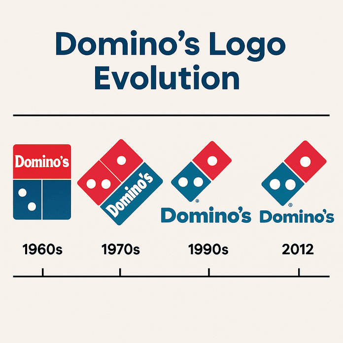
The Domino’s Logo: Three Dots and How It Evolved

The three dots on the Domino’s logo were meant to be a running total. Each one stood for a store, and the plan was to add a new dot every time the chain opened another location. With more than 20,000 stores today, that idea did not last long, but the three dots did.

· 8 min read

Iconic Logos

The Mercedes Logo: How the Three-Pointed Star Evolved

The Mercedes star started as a mark on a postcard. Gottlieb Daimler is said to have drawn a three-pointed star on a card to his wife in the 1870s, predicting it would one day shine over his factories, and by 1909 his company had adopted it.

· 8 min read

Iconic Logos

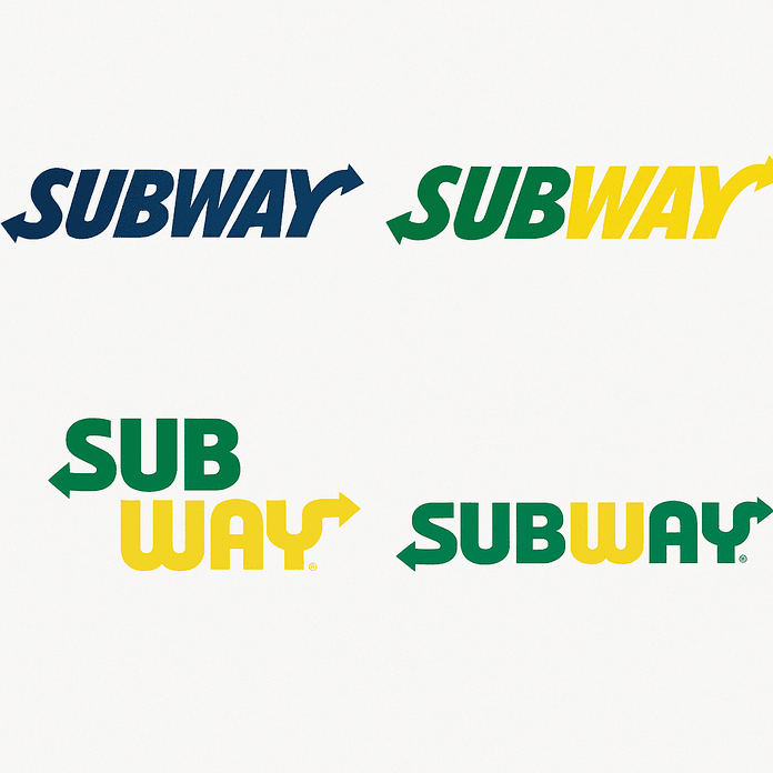
The Subway Logo: How It Evolved and Why It Works

Subway started in 1965 as Pete’s Super Submarines, a single shop in Bridgeport, Connecticut, paid for with a $1,000 loan. The logo that grew out of it, green and yellow with an arrow at each end, is now one of the most familiar marks in fast food.

· 9 min read

Iconic Logos

Gillette Logo Evolution, From 1901 to Today

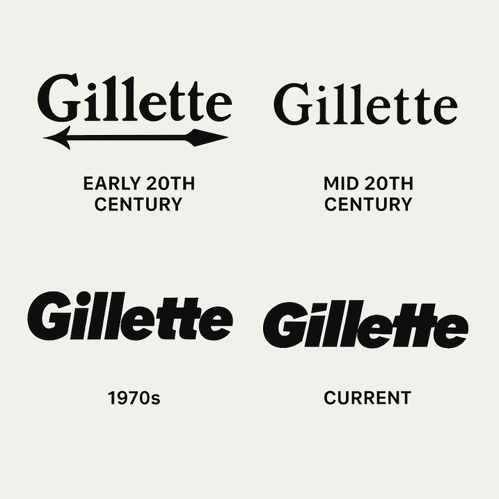
The Gillette logo has spent more than a century doing one job: making a man trust a blade near his throat. King C. Gillette started the company in 1901, and the earliest wordmark carried his name with an arrow piercing the “G,” a plain signal of precision.

· 7 min read

Iconic Logos

The Starbucks Logo: How the Siren Became an Icon

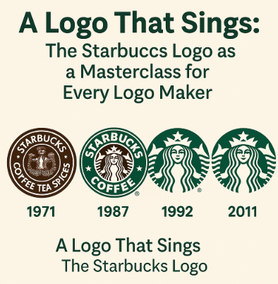
The Starbucks siren started life as a bare-breasted, twin-tailed figure lifted from a 16th-century Norse woodcut, printed on the bags of a single Seattle coffee-bean shop in 1971. Over four decades the company covered her up, cropped her in and finally took its own name off the logo altogether.

· 7 min read

Logo Generation Ideas

Logo Design That Works on Every Screen

Georges Vuitton drew the LV monogram in 1896 to stop people copying his father’s trunks. More than a century later the same pattern works on a luggage tag, a billboard and a 16-pixel browser icon, which is a better result than most logos designed last year can claim.

· 9 min read

Iconic Logos

The Pepsi Logo: From Brad’s Drink to the 2023 Globe

Pepsi began in 1898 as “Brad’s Drink,” a digestive aid mixed by Caleb Bradham in a North Carolina pharmacy, and its first logo looked like something from the apothecary shelf. Over the next century the name went from spidery script to a bottle cap, a globe and a much-mocked “smile,” and in 2023 it came back to bold capitals in the middle of the globe.

· 8 min read