Logoluv

Tag

logo creator page 5

70 LogoLuv stories about logo creator: logo history, design choices and what they mean.

Iconic Logos

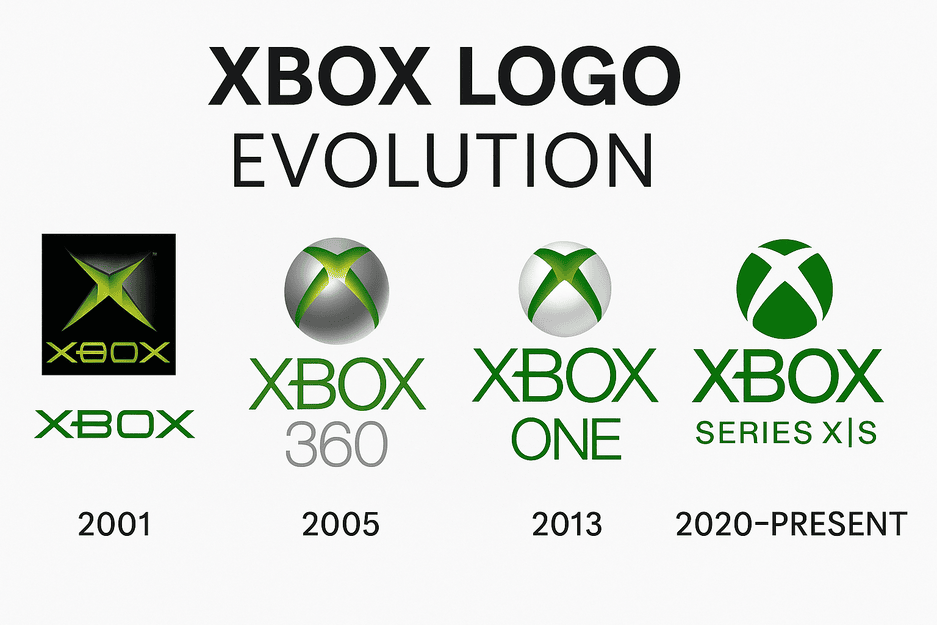
The Xbox Logo: How Microsoft’s Green X Evolved

The first Xbox logo, in 2001, was a chunky metallic X wrapped in a glowing, almost radioactive green. Microsoft was entering a market owned by Sony and Nintendo, and the logo looked like it knew it had to shout.

· 8 min read

Iconic Logos

The Barbie Logo: How a Pink Script Became a Brand

When Ruth Handler introduced Barbie in 1959, the doll’s name came in a cheerful handwritten script, in pink. More than sixty years and several redesigns later, the logo is still pink and still a script, and that stubbornness is most of the reason it works.

· 9 min read

Iconic Logos

The Levi’s Logo: How the Batwing Took Over

The Levi’s batwing borrows its shape from the stitching on the back pocket of a pair of jeans. Introduced in 1967, it took a detail every wearer already knew and turned it into the frame for the brand’s name.

· 8 min read

Iconic Logos

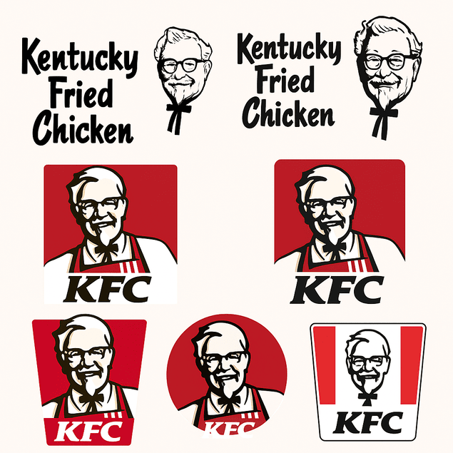
The KFC Logo: How the Colonel’s Face Became a Brand

KFC is one of very few global fast-food chains whose logo is a real man’s face. Colonel Harland Sanders has looked out from the brand’s signs since the 1950s, and every redesign since has had to answer the same question: how much of the Colonel to keep.

· 8 min read

Iconic Logos

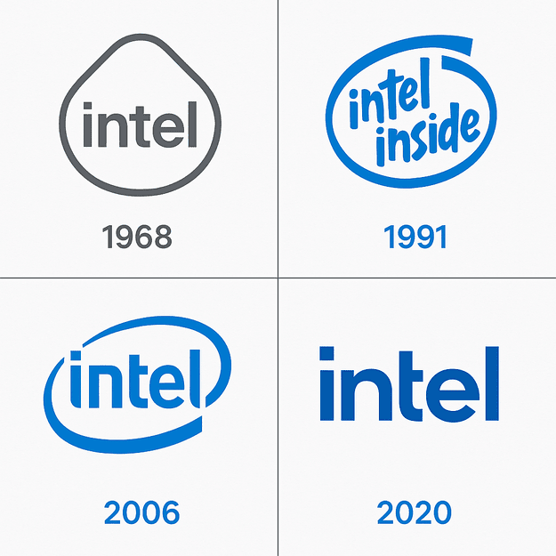
Intel Logo Evolution, From 1968 to the 2022 Redesign

Intel’s logo has spent more than fifty years selling something almost nobody sees. The chips sit sealed inside other companies’ computers, so the blue wordmark and the “Intel Inside” sticker had to do the job of making a component feel like a brand.

· 9 min read

Iconic Logos

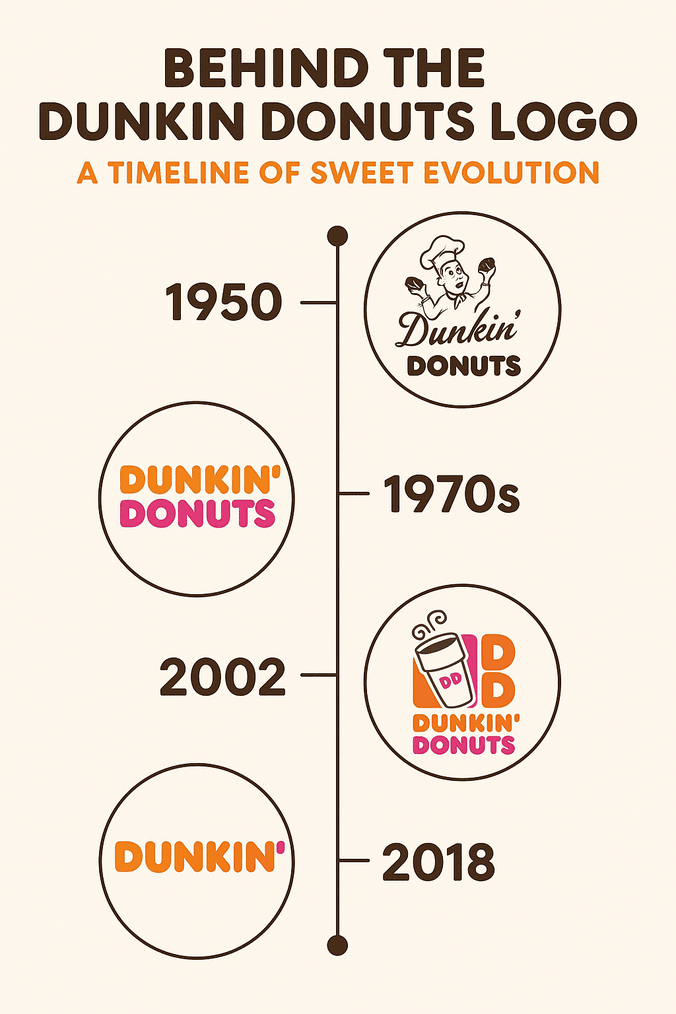
The Dunkin’ Donuts Logo: Orange, Pink and Nostalgic

In 2018 Dunkin’ Donuts took the word “Donuts” out of its own name, which is a strange thing for a donut chain to do. The logo barely flinched: the same orange and pink, the same chunky, friendly lettering, now spelling only “Dunkin’.”

· 8 min read

Iconic Logos

Baskin-Robbins Logo Evolution and the Hidden 31

Look at the pink parts of the Baskin-Robbins “BR” and you will find a 31, the number of flavors the chain built its name on. It is one of the better-known hidden details in fast-food branding, and it is the reason this logo is more interesting than its cheerful colors suggest.

· 7 min read