Why the Dominos Logo Is a Masterclass for Every Logo Maker
If logos were pizzas, the Dominos logo would be a perfectly baked Margherita—simple, bold, and universally recognizable. Since its debut in 1960, the Dominos logo has undergone a transformation as dramatic as a pizza tossed high in the air, yet it remains a beacon of brand consistency. For anyone wielding an AI logo generator or dreaming of crafting the next iconic emblem, the Dominos logo history offers a slice of inspiration. Let’s dive into the saucy story of this design masterpiece, explore its cultural and psychological layers, and uncover how tools like an AI logo generator without watermark can help you create your own brand legend.
The Birth of the Dominos Logo: Three Dots, One Dream
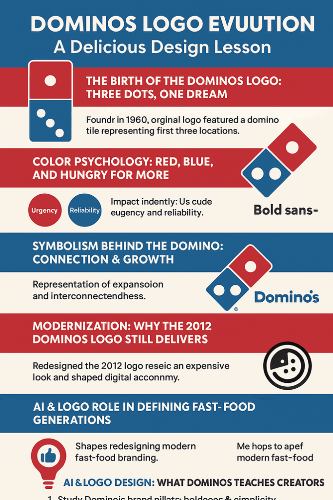
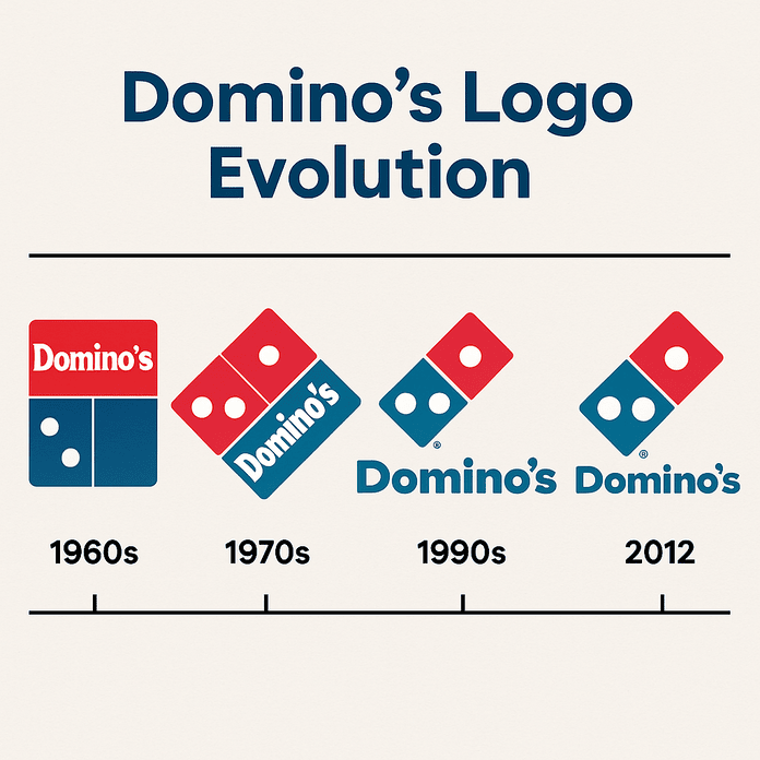
Picture 1960s Michigan, where a young Tom Monaghan took over a failing pizzeria called DomiNick’s. A delivery driver, with the kind of offhand genius that sparks revolutions, suggested the name “Domino’s.” Why? It rolled off the tongue like a catchy jingle. The original logo was as straightforward as a cheese pizza: a red-and-blue domino tile with three white dots, symbolizing the first three stores. The plan? Add a dot for every new location. Spoiler: with over 20,000 stores today, that idea was abandoned faster than a cold pizza at a party.
Branding expert Laura Ries once quipped, “A logo doesn’t need to tell your whole story—it just needs to stick.” The Dominos logo did exactly that, embedding itself into the cultural psyche with minimalist charm.
Color Psychology: Red, Blue, and Hungry for More
Why do you feel a pang of hunger when you see the Dominos logo? Blame color psychology. The logo’s red screams urgency and appetite (think: “Order now!”), while blue whispers trust and reliability (“We’ll deliver in 30 minutes or less”). Together, they’re a branding power couple, as harmonious as pepperoni and mozzarella.
Dr. Sally Augustin, an environmental psychologist, explains, “Red grabs attention and stimulates action, while blue builds loyalty. Dominos nailed this balance.” For aspiring logo creators, this is a lesson: colors aren’t just pretty—they’re emotional puppet masters. Tools like Looka or Canva in the best free AI logo creator tools category let you experiment with palettes to evoke similar feelings.
Artistry & Typography: The Domino Tile That Defined a Brand
The Dominos logo is a study in simplicity. Its domino tile shape is geometric genius—clean lines, bold contrast, and a nod to the game that inspired the name. The typography, especially in the 2012 redesign, leans into a sans-serif font that’s modern yet approachable, like a friendly delivery driver who always has change for a twenty.
Compare this to Pizza Hut’s swoopy red roof or Papa John’s cursive script. Dominos’ design feels like the cool, minimalist cousin who shows up to the family reunion in a tailored blazer. For AI logo generator users, platforms like Semplr can replicate this clean aesthetic, ensuring your logo is scalable from a pizza box to a billboard.
Symbolism Behind the Domino: More Than Meets the Pie
The domino tile isn’t just a cute nod to the name—it’s a metaphor for connection. One store leads to another, just as one domino topples the next. The three dots, though no longer tied to store counts, symbolize growth, ambition, and a brand that’s always moving forward. It’s the kind of storytelling that makes a logo memorable.
As brand strategist Marty Neumeier puts it, “A logo is a flag, a signature, an escutcheon.” The Dominos logo waves its flag proudly, inviting customers into its world. Aspiring logo makers can use AI logo generators without watermark to craft symbols that tell their own stories, whether it’s a coffee shop or perishable or a tech startup.
Modernization: Why the 2012 Dominos Logo Still Delivers
The 2012 new Dominos logo was a glow-up, not a reinvention. It ditched the “Pizza” from the name (because, duh, everyone knows what Dominos does) and embraced a sleeker, digital-friendly design. This modernist approach ensures the logo looks as good on a smartphone screen as it does on a delivery car. It’s a lesson in adaptability—great logos evolve without losing their soul.
For logo creators, this balance is key. Tools like Canva or Looka let you tweak designs iteratively, ensuring your logo stays fresh yet timeless. The Dominos logo history shows that subtle updates can keep a brand relevant across decades.
The Logo’s Role in Defining Foodie Eras
Dominos has ridden the waves of cultural shifts, from the pizza boom of the ‘80s to the delivery app era. Its logo has been a constant, anchoring the brand through fads like stuffed crust and gluten-free pies. It’s a visual shorthand for comfort food, whether you’re a college student or a family of four.
The logo’s omnipresence—on boxes, apps, and even Super Bowl ads—has made it a pop culture staple. It’s the pizza equivalent of Coca-Cola’s script or Nike’s swoosh. For AI logo generator users, this is a reminder: aim for ubiquity. Your logo should feel like home, no matter where it’s seen.
Controversies: Knockoffs and Cultural Missteps
No brand is immune to drama, and Dominos has had its share. Counterfeit logos on shady pizza joints? Check. Social media backlash over tone-deaf ads? Yep. But the Dominos logo itself has largely dodged controversy, thanks to its inoffensive design. Still, the brand’s global expansion has sparked debates about cultural sensitivity—pizza toppings like corn in Japan or tikka masala in India don’t always translate smoothly.
For logo makers, this is a cautionary tale. A logo must resonate across cultures without stepping on toes. AI logo generators like Semplr offer templates that consider global aesthetics, helping you avoid unintended faux pas.
Stock Price & Business Growth: The Logo’s Economic Slice
Dominos’ stock (DPZ) has soared over the years, with a market cap of $16 billion as of 2025. The logo’s role? It’s the face of a brand that’s synonymous with convenience. Every pizza box bearing those red-and-blue tiles reinforces trust, driving sales and franchise growth. As Warren Buffett might say, a great logo is a moat—a competitive edge that’s hard to breach.
For logo creators, this underscores the stakes. A well-designed logo can boost brand equity, whether you’re a pizzeria or a tech unicorn. Best free AI logo creator tools like Looka make professional-grade design accessible, leveling the playing field.
Brand Identity & Consistency: The Dominos Way
Dominos’ logo is a masterclass in consistency. From Anchorage to Auckland, those red-and-blue tiles scream “Dominos.” This uniformity builds trust, ensuring customers know exactly what they’re getting. It’s why the brand can experiment with menu items (tacos, anyone?) without losing its core identity.
Branding guru Seth Godin says, “A brand is a promise.” The Dominos logo keeps that promise, delivering familiarity in an unpredictable world. For AI logo generator users, consistency is non-negotiable—your logo should be a north star, guiding every touchpoint.
Messaging & Visual Language: Dominos Logo That Speaks
The Dominos logo doesn’t just sit there—it communicates. Its bold colors say “fast and fun,” while the domino tile hints at community and connection. The 2012 redesign added a playful tilt, making it feel less corporate and more like your pizza pal.
For logo makers, this is a call to action: your logo should speak your brand’s language. How to create a logo using AI starts with defining your message—fun? Sophisticated? Rebellious?—then using tools like Canva to bring it to life.
Hashtag History & Digital Ubiquity
Search #Dominos on Instagram, and you’ll find millions of posts—pizza selfies, delivery unboxings, and even fan art of the logo. The Dominos logo thrives in the digital age, popping up on TikTok dances and X memes. Its clean design ensures it’s hashtag-ready, never looking pixelated or dated.
For logo creators, digital versatility is crucial. An AI logo generator without watermark like Semplr delivers high-res files that shine on social media, from Instagram Stories to X banners.
The Impact of Technology & AI on Logo Design
AI has revolutionized logo design, making it faster and more accessible. Platforms like Looka, Canva, and Semplr use algorithms to generate logos based on your brand’s vibe, colors, and industry. The Dominos logo, with its clean lines and bold shapes, could easily be reimagined with these tools, proving that AI isn’t just for tech bros—it’s for creatives, too.
Recent news shows Dominos embracing tech, from AI-powered ordering systems to drone delivery trials. The logo’s adaptability ensures it fits seamlessly into these innovations, whether on an app or a robot.web:recent_dominos_news
Products and Services: Beyond the Pizza
Dominos isn’t just about pizza anymore. Wings, lava cakes, sandwiches, and even pasta bowls share the menu, all branded with the iconic logo. The company’s services—like online ordering, tracker apps, and loyalty programs—lean heavily on the logo’s recognizability to tie everything together.
For logo makers, this is a lesson in versatility. Your logo should work across products, from merch to digital platforms. Best free AI logo creator tools let you test your design on mockups, ensuring it pops everywhere.
Logo Comparison: Dominos vs. Competitors
Compared to Pizza Hut’s nostalgic roof or Little Caesars’ toga-clad mascot, the Dominos logo feels modern and uncluttered. It’s less fussy than Papa John’s script and more dynamic than Round Table’s medieval vibe. This simplicity gives Dominos an edge in a crowded market, proving that less is often more.
When using an AI logo generator, aim for clarity over complexity. Tools like Looka help you benchmark against competitors, ensuring your logo stands out without screaming.
How Dominos Might Use an AI Logo Generator Without Watermark
Imagine Dominos’ design team firing up Semplr for a logo refresh. They’d input “bold, red, blue, domino-inspired” and let the AI churn out options. A watermark-free download would let them mock up the design on pizza boxes and apps, tweaking until it’s perfect. The result? A logo that’s unmistakably Dominos but with a 2030s twist—maybe a holographic domino or a pulsing animation for VR menus.
This speculative fun shows AI’s potential. For logo creators, watermark-free tools like Canva Pro or Looka ensure your designs are ready for prime time.
Tips for Readers: How to Create a Logo Using AI

Ready to channel your inner Dominos? Here’s how to create a logo using AI:
- Define Your Brand: Are you playful like Dominos or luxe like Louis Vuitton? Nail your vibe.
- Choose a Tool: Try Looka for polished designs, Canva for flexibility, or Semplr for speed.
- Experiment with Colors: Use red for energy, blue for trust, or mix it up.
- Keep It Simple: Dominos’ logo works because it’s clean. Avoid clutter.
- Test It: Mock your logo on business cards, apps, and social media.
- Go Watermark-Free: Upgrade to a premium plan on Canva or Looka for clean downloads.
These steps, powered by the best free AI logo creator tools, will have you designing like a pro in no time.
Call to Action: Design Your Own Iconic Logo
The Dominos logo is more than a pretty picture—it’s a masterclass in branding, from its three-dot origin to its digital-age swagger. Whether you’re a budding entrepreneur or a seasoned logo maker, take a page from Dominos’ playbook: keep it simple, bold, and true to your story.
Ready to create your own legend? Fire up an AI logo generator like Looka, Canva, or Semplr and start experimenting. Explore the best free AI logo creator tools to craft a design that’s as timeless as a perfectly baked pizza. Share your creations on X with #LogoDesign and let the world see your masterpiece. What’s your brand’s domino effect going to be?
