Logoluv

Tag

Design Inspiration page 2

39 LogoLuv stories about Design Inspiration: logo history, design choices and what they mean.

Iconic Logos

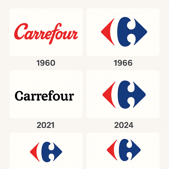
The Carrefour Logo: History, Hidden C and Design

Most shoppers who walk past a Carrefour sign never notice the letter in the middle of it. Between the red arrow and the blue one sits a white “C,” formed entirely by the empty space, and it has been there since 1966.
· 9 min read

Iconic Logos

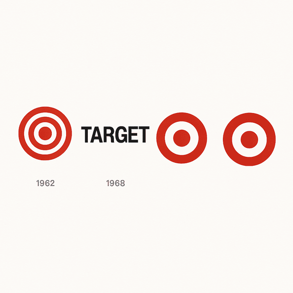
The Target Logo: How the Bullseye Got Simple

Target’s first bullseye, in 1962, had three rings. Six years later it was down to one red ring and a dot, and that stripped-back version has been on carts, bags and Super Bowl ads ever since.

· 10 min read

Iconic Logos

The Panda Express Logo: History, Design and Meaning

Panda Express is the rare fast-food chain whose mascot looks relaxed. Since 1983 its logo has been a black-and-white panda in a red circle, calm where its rivals shout, and that one choice has carried the brand from a mall in Glendale, California, to more than 2,400 locations.

· 9 min read

Iconic Logos

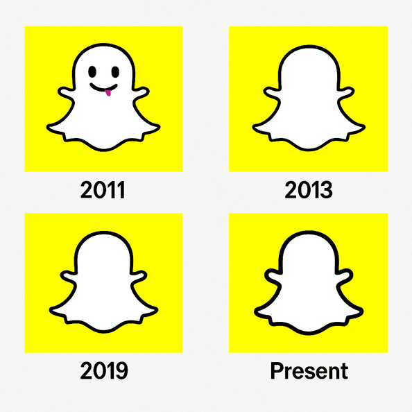
The Snapchat Logo: History and Design of the Ghost

The Snapchat ghost has a name, Ghostface Chillah, borrowed from Wu-Tang Clan’s Ghostface Killah, and it was drawn by Evan Spiegel himself in 2011. It is one of the few big tech logos with no letters at all, just a white ghost on a yellow square.

· 9 min read

Iconic Logos

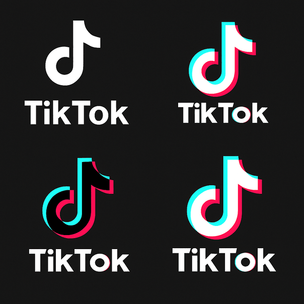
The TikTok Logo: History, Colors and Design

The TikTok logo is a single music note, and it looks like it is vibrating even when it sits still on your home screen. That effect comes from two offset colors, cyan and magenta, printed slightly out of register against black, and it has made one of the plainest symbols in music into one of the most recognizable app icons of the past decade.

· 10 min read

Iconic Logos

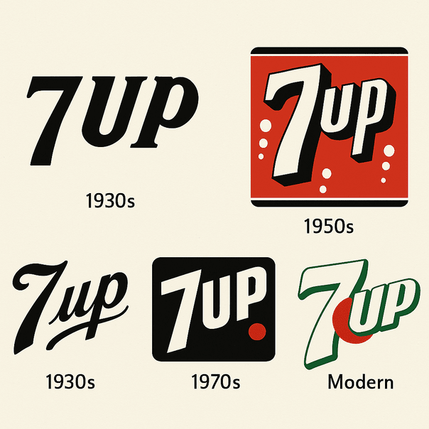
The 7 Up Logo: History of the Uncola’s Red Dot

7 Up started life in 1929 under one of the worst product names in soft drink history: Bib-Label Lithiated Lemon-Lime Soda. The short name came soon after, and the logo that grew around it, green with a small red dot, has carried the brand for most of a century.

· 10 min read

Iconic Logos

The MTV Logo: How a Chunky M Rewrote the Rules

The MTV logo was built to be redrawn. When the channel launched in 1981, Manhattan Design gave it a fat, blocky “M” with a scrawled “TV” sprayed across it, and the shape was meant to be repainted, animated and dressed up differently on air from the start.

· 8 min read

Iconic Logos

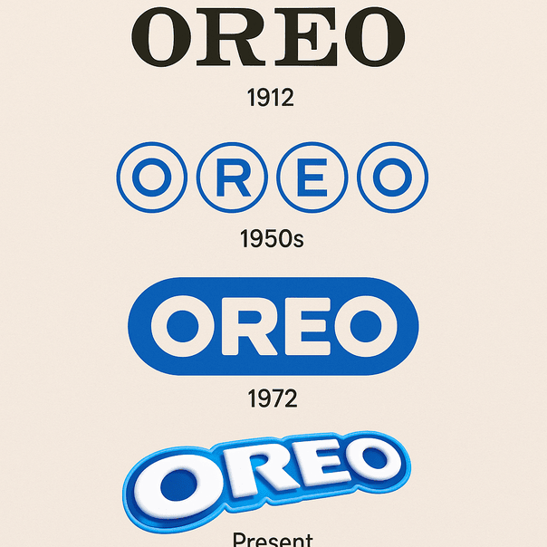
The Oreo Logo: From a 1912 Wordmark to Bold Blue

When Nabisco launched the Oreo in 1912, its logo was a stamp rather than a design: a plain wordmark whose only job was to tell you whose cookie you were holding. More than a century later the name sits in heavy, rounded capitals on a deep blue field, and that blue has become as much a part of the cookie as the cream.

· 9 min read

Iconic Logos

The Toys R Us Logo and Its Backward R

The most famous thing about the Toys R Us logo is a mistake made on purpose: the R is printed backward, the way a small child might write it. Charles Lazarus put it there when he renamed his Children’s Bargain Town, and it has lasted through a bankruptcy and a comeback.

· 9 min read

Iconic Logos

The Barbie Logo: How a Pink Script Became a Brand

When Ruth Handler introduced Barbie in 1959, the doll’s name came in a cheerful handwritten script, in pink. More than sixty years and several redesigns later, the logo is still pink and still a script, and that stubbornness is most of the reason it works.

· 9 min read