Logoluv

Tag

Brand Identity page 4

45 LogoLuv stories about Brand Identity: logo history, design choices and what they mean.

Iconic Logos

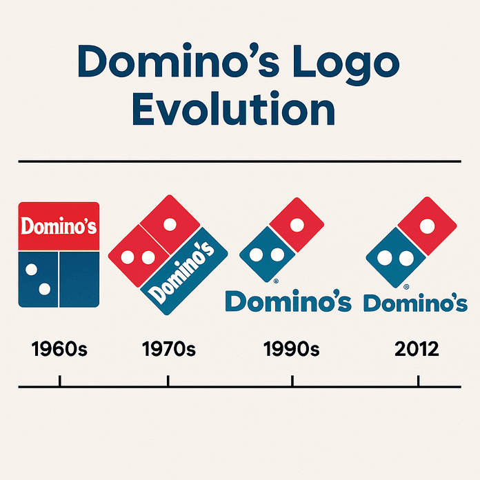
The Domino’s Logo: Three Dots and How It Evolved

The three dots on the Domino’s logo were meant to be a running total. Each one stood for a store, and the plan was to add a new dot every time the chain opened another location. With more than 20,000 stores today, that idea did not last long, but the three dots did.

· 8 min read

Iconic Logos

The Instagram Logo, From Polaroid Camera to Gradient

Instagram’s first icon was a little brown Polaroid-style camera with a rainbow stripe, drawn in 2010 when the app was a photo-filter toy. In 2016 the company threw out the camera’s textures and shading and kept only its outline, filled with a magenta-to-orange gradient.

· 9 min read

Logo Generation Ideas

Logo Design That Works on Every Screen

Georges Vuitton drew the LV monogram in 1896 to stop people copying his father’s trunks. More than a century later the same pattern works on a luggage tag, a billboard and a 16-pixel browser icon, which is a better result than most logos designed last year can claim.

· 9 min read

Sports Logos

The Lakers Logo: History of the Purple and Gold

The Lakers are named after Minnesota’s ten thousand lakes, and they have played in Los Angeles, a city not known for its lakes, since 1960. The logo they adopted there, a purple-and-gold basketball with the team name across it, has outlasted the mismatch and become one of the best-known marks in American sport.

· 7 min read

Iconic Logos

Emoji Evolution: From Pixelated Smiles to Global Icons

The first emoji set had 176 icons, each drawn on a grid just 12 pixels square. Shigetaka Kurita designed them in 1999 for NTT Docomo’s mobile internet service in Japan, and within two decades their descendants had become something close to a global written language.

· 8 min read

Iconic Logos

The Dell Logo: Lessons From the Blue Circle

Dell’s logo is so plain it could pass for a drinks coaster: a blue circle with “DELL” inside and the E tipped on its side. That plainness has carried the company from a college dorm in 1984 to a business worth around $100 billion.

· 7 min read

Iconic Logos

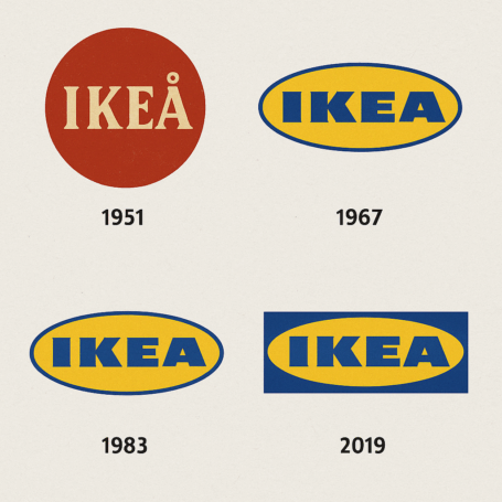
The IKEA Logo: How Blue and Yellow Became a Brand

The four letters of IKEA are an address. They stand for Ingvar Kamprad, the farm he grew up on and the parish around it, and they have been sitting in a blue-and-yellow box on the side of stores around the world for decades.

· 8 min read

Iconic Logos

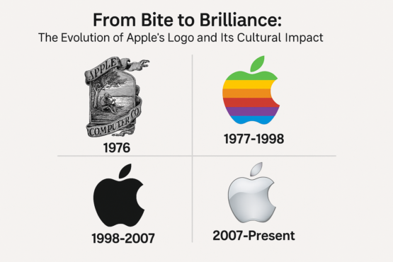
The Apple Logo: From Newton to the Bitten Apple

Apple’s first logo was a pen-and-ink drawing of Isaac Newton sitting under a tree. It lasted about a year. Its replacement, Rob Janoff’s bitten apple, has now been on the company’s products for almost five decades.

· 7 min read

Iconic Logos

The Red Bull Logo: Two Bulls, a Sun and a Thai Original

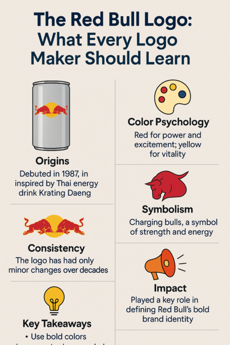
The Red Bull logo was not invented in Austria. Its two charging bulls and golden sun come from Krating Daeng, a Thai energy drink whose name means “red gaur,” and Dietrich Mateschitz kept the idea almost intact when he launched Red Bull in 1987.

· 10 min read