Logoluv

Tag

Brand Identity page 3

45 LogoLuv stories about Brand Identity: logo history, design choices and what they mean.

Iconic Logos

The Xerox Logo: History, Design and Reinvention

Few companies get turned into a verb. Xerox did, so thoroughly that it has had to fight to stop “xeroxing” becoming a generic word for photocopying, and its logo has had to carry that weight through more than half a century of reinvention.
· 10 min read

Iconic Logos

The Target Logo: How the Bullseye Got Simple

Target’s first bullseye, in 1962, had three rings. Six years later it was down to one red ring and a dot, and that stripped-back version has been on carts, bags and Super Bowl ads ever since.

· 10 min read

Iconic Logos

The Panda Express Logo: History, Design and Meaning

Panda Express is the rare fast-food chain whose mascot looks relaxed. Since 1983 its logo has been a black-and-white panda in a red circle, calm where its rivals shout, and that one choice has carried the brand from a mall in Glendale, California, to more than 2,400 locations.

· 9 min read

Iconic Logos

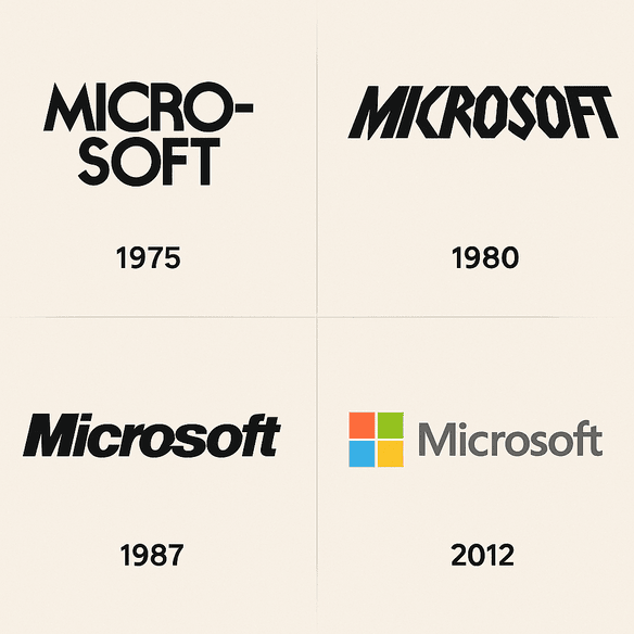
The Microsoft Logo, From “Micro-Soft” to Four Squares

Microsoft’s first logo spelled the company’s name with a hyphen, “Micro-Soft,” in lettering that made it obvious the founders were programmers, not designers. Its current logo is four colored squares and the word Microsoft in Segoe, and it took the company nearly four decades to get there.

· 9 min read

Iconic Logos

The Star Wars Logo: How It Was Made and Why It Lasts

The Star Wars logo began in 1976 with designer Suzy Rice, who drew on the hard, authoritarian lettering of 1930s German propaganda and on sci-fi pulp covers. That is an odd starting point for a family adventure, and it is a large part of why the logo still looks so commanding.

· 9 min read

Iconic Logos

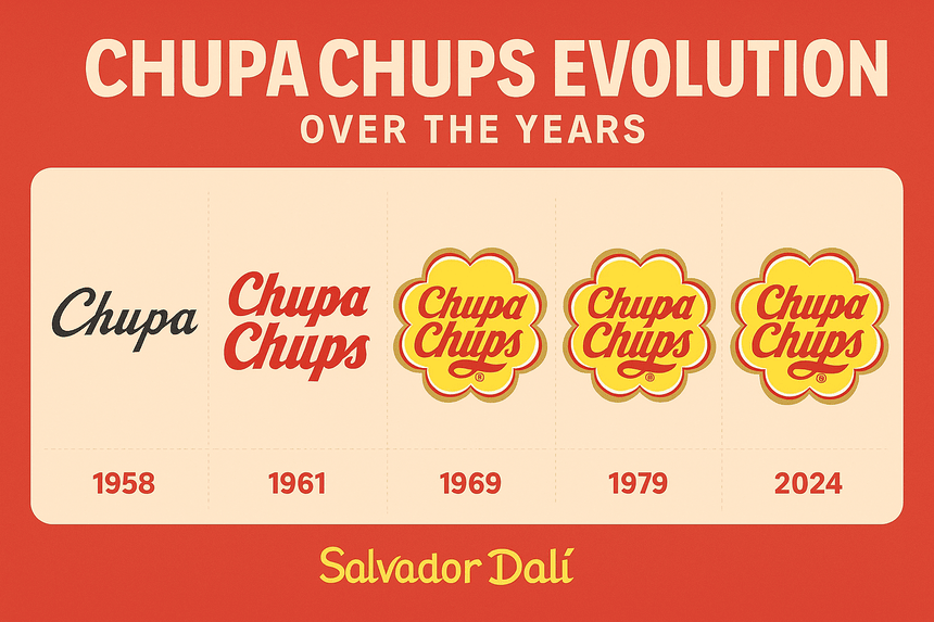
The Chupa Chups Logo: Salvador Dalí’s Daisy

The yellow daisy on every Chupa Chups wrapper was drawn by Salvador Dalí, reportedly in about an hour at a café in 1969. It has barely changed since, which tells you something about how right he got it.

· 9 min read

Iconic Logos

The Levi’s Logo: How the Batwing Took Over

The Levi’s batwing borrows its shape from the stitching on the back pocket of a pair of jeans. Introduced in 1967, it took a detail every wearer already knew and turned it into the frame for the brand’s name.

· 8 min read

Iconic Logos

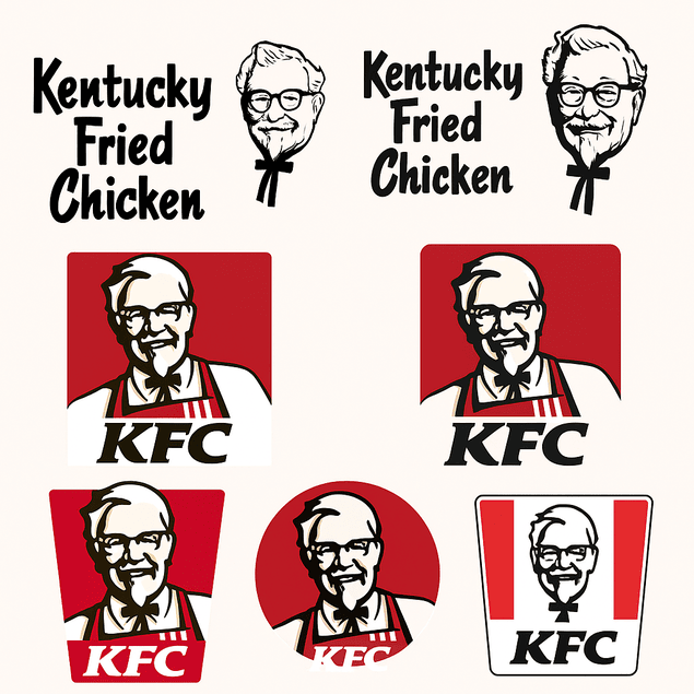
The KFC Logo: How the Colonel’s Face Became a Brand

KFC is one of very few global fast-food chains whose logo is a real man’s face. Colonel Harland Sanders has looked out from the brand’s signs since the 1950s, and every redesign since has had to answer the same question: how much of the Colonel to keep.

· 8 min read