Logoluv

Tag

Design History page 3

68 LogoLuv stories about Design History: logo history, design choices and what they mean.

Iconic Logos

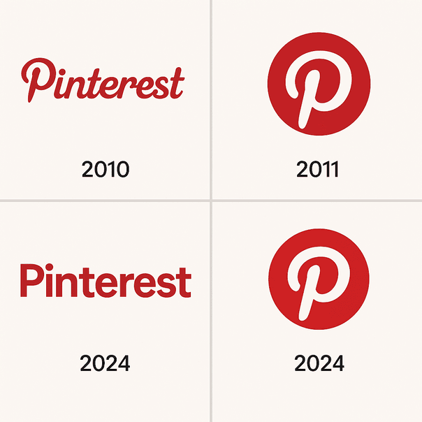
The Pinterest Logo: History, Color and Design

Pinterest’s logo is one letter, a curved red “P” whose tail doubles as the point of a pin. It has stayed largely untouched since 2011, through a decade in which almost every other social app redrew its icon at least once.
· 10 min read

Sports Logos

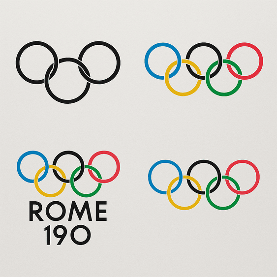
The Olympic Rings: History and Design of the Olympics Logo

The Olympic rings were drawn in 1913 by Pierre de Coubertin, the French baron who founded the modern Games, and the design has not needed to change since. Five interlocking circles in blue, yellow, black, green and red, on white, stand for the five inhabited continents joined together.

· 11 min read

Iconic Logos

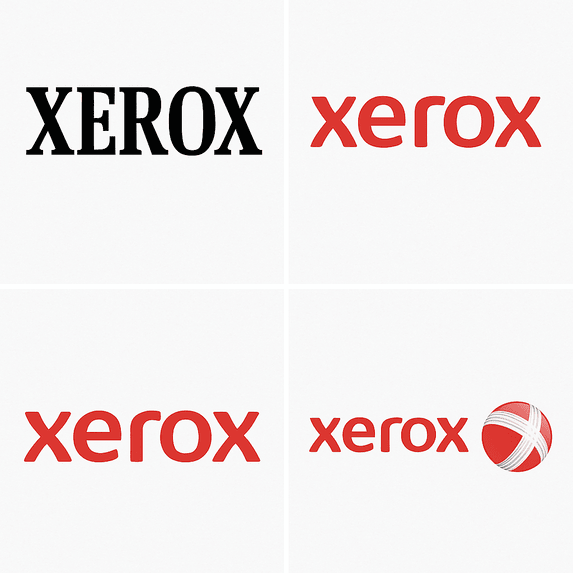
The Xerox Logo: History, Design and Reinvention

Few companies get turned into a verb. Xerox did, so thoroughly that it has had to fight to stop “xeroxing” becoming a generic word for photocopying, and its logo has had to carry that weight through more than half a century of reinvention.

· 10 min read

Iconic Logos

The Target Logo: How the Bullseye Got Simple

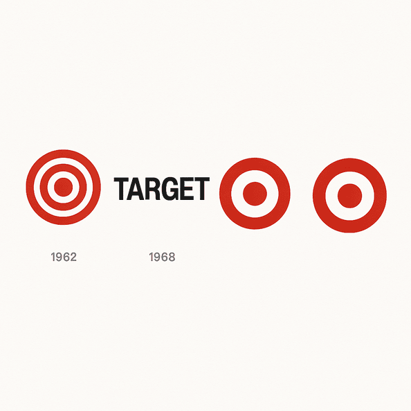
Target’s first bullseye, in 1962, had three rings. Six years later it was down to one red ring and a dot, and that stripped-back version has been on carts, bags and Super Bowl ads ever since.

· 10 min read

Iconic Logos

The Panda Express Logo: History, Design and Meaning

Panda Express is the rare fast-food chain whose mascot looks relaxed. Since 1983 its logo has been a black-and-white panda in a red circle, calm where its rivals shout, and that one choice has carried the brand from a mall in Glendale, California, to more than 2,400 locations.

· 9 min read

Iconic Logos

The Microsoft Logo, From “Micro-Soft” to Four Squares

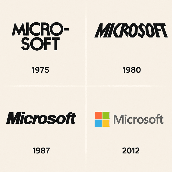
Microsoft’s first logo spelled the company’s name with a hyphen, “Micro-Soft,” in lettering that made it obvious the founders were programmers, not designers. Its current logo is four colored squares and the word Microsoft in Segoe, and it took the company nearly four decades to get there.

· 9 min read

Iconic Logos

The Chipotle Logo: History, Color and Design Lessons

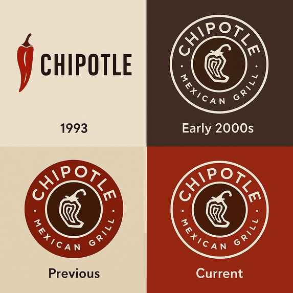
Chipotle now has more than 3,700 restaurants, and every one of them is marked by the same thing it started with in Denver in 1993: a single chili pepper and a plain typeface. Very few restaurant chains have grown that much while changing their logo so little.

· 12 min read

Iconic Logos

The TikTok Logo: History, Colors and Design

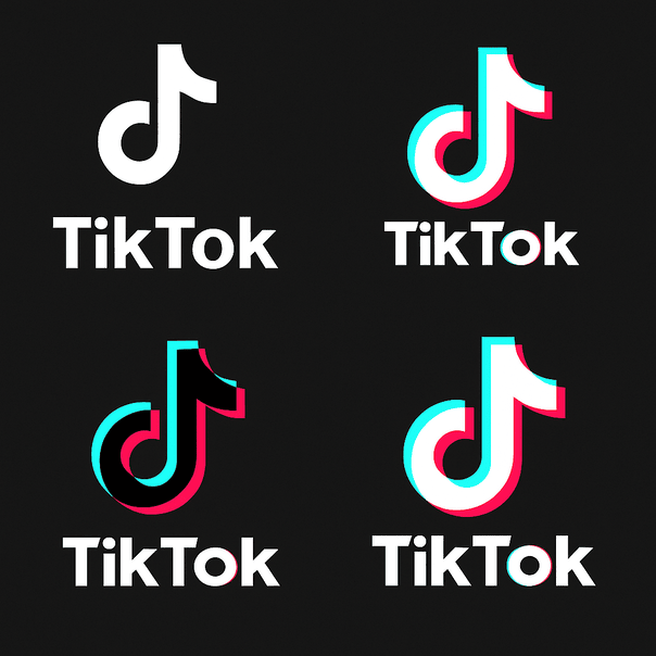
The TikTok logo is a single music note, and it looks like it is vibrating even when it sits still on your home screen. That effect comes from two offset colors, cyan and magenta, printed slightly out of register against black, and it has made one of the plainest symbols in music into one of the most recognizable app icons of the past decade.

· 10 min read

Iconic Logos

The Batman Logo: Its History and What Designers Can Learn

When Bob Kane and Bill Finger introduced Batman in 1939, the bat on his chest was small, black and so plain that nobody would have called it a logo. Since then it has been rounded off, sharpened, stretched and roughed up for almost every decade’s version of the character, and the silhouette has never stopped reading as Batman.

· 11 min read