Picture this: you’re strolling through a bustling city, clutching a steaming latte, and there it is—that unmistakable green circle with a twin-tailed mermaid staring back at you. The Starbucks logo isn’t just a corporate emblem; it’s a cultural beacon, a caffeinated call to arms for coffee lovers worldwide. For aspiring designers and entrepreneurs wielding an AI logo generator, the Starbucks siren offers a masterclass in branding that’s as rich and layered as a triple-shot espresso. Let’s dive into the Starbucks logo history, unpack its design DNA, and explore how you can brew your own iconic mark with the best free AI logo creator tools.
The Birth of the Siren: A Mythical Start
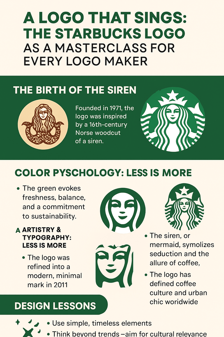
In 1971, when Starbucks was just a humble Seattle coffee bean shop, its founders—Jerry Baldwin, Zev Siegl, and Gordon Bowker—needed a logo that screamed “coffee” with nautical flair. Enter the Starbucks logo history, which begins with a 16th-century Norse woodcut of a siren (or “mermaid” for the less mythologically inclined). This bare-breasted, twin-tailed temptress was plucked from maritime lore, symbolizing seduction and the irresistible pull of the sea—or, in this case, a damn good cup of joe.
“The original Starbucks logo was raw, unpolished, and a bit cheeky,” says branding expert Laura Ries. “It leaned into the siren’s seductive mystique, which was perfect for a brand aiming to lure customers into a new kind of coffee culture.”
Color Psychology: Why the Starbucks Logo Is Green
Why green? The Starbucks logo’s verdant hue isn’t just easy on the eyes—it’s a psychological power play. Green evokes freshness, sustainability, and calm, aligning perfectly with Starbucks’ ethos of ethically sourced beans and cozy café vibes. According to color theorist Karen Haller, “Green is the color of balance, which makes you feel safe to linger, sip, and spend.”
For logo makers using an AI logo generator without watermark, color is your first handshake with the audience. Tools like Looka or Canva let you experiment with palettes, but take a cue from Starbucks: pick a hue that tells your brand’s story before a single word is read.
Artistry & Typography: Less Is More
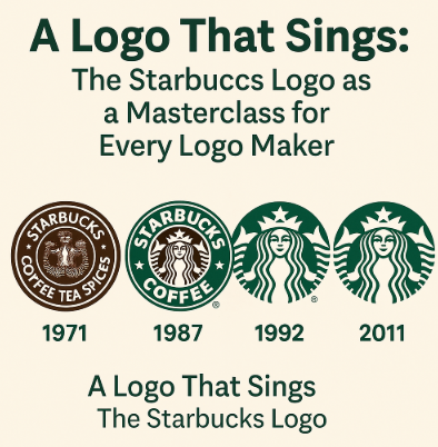
The new Starbucks logo, unveiled in 2011, ditched the outer text ring and zoomed in on the siren’s face, proving that minimalism can pack a punch. The sans-serif typeface of earlier iterations gave way to a wordless emblem, a bold move that screamed confidence. “Starbucks didn’t need its name spelled out anymore,” notes design historian Steven Heller. “The siren had become a global shorthand for coffee.”
For those tinkering with a logo creator, this is a lesson in restraint. AI tools like Semplr let you play with fonts and shapes, but don’t overstuff your design. A logo should be a whisper, not a shout.
Symbolism: The Siren’s Seductive Spell
The siren, or “Melusine” in myth, is a symbol of enchantment and danger. Starbucks cleverly harnessed this duality, positioning its coffee as both a daily ritual and an indulgent escape. The twin tails, once prominent, nod to maritime trade routes—a subtle wink to coffee’s global journey from bean to cup.
Aspiring designers using an AI logo generator should think symbolically. What’s the heart of your brand? A fox for cunning? A tree for growth? Tools like BrandCrowd can help translate abstract ideas into visual metaphors.
Logo Modernism: Starbucks and Timeless Design
The Starbucks logo has evolved four times since 1971, each iteration sleeker than the last. Yet, its core—green, circular, siren-centric—remains untouched. This balance of evolution and consistency is why the logo feels both modern and timeless, like a Beatles song remixed for 2025.
“Timelessness comes from simplicity and adaptability,” says Paula Scher, a Pentagram design legend. “Starbucks nailed it by keeping the siren versatile enough for cups, apps, and billboards.”
Branding Culture: How the Starbucks Logo Defined Coffee
From its Seattle roots to 38,000 stores worldwide, the Starbucks logo has shaped how we see coffee. It’s not just a drink; it’s a lifestyle. The logo’s omnipresence on cups, aprons, and Instagram feeds has made it a badge of urban sophistication. Remember the pumpkin spice latte craze? That’s the siren’s magic at work.
For logo makers, this is a reminder: your design isn’t just a pretty picture. It’s a cultural signal. Use an AI logo generator without watermark to craft something that resonates beyond the screen.
Controversies: When the Starbucks Logo Stirred the Pot
The Starbucks logo hasn’t escaped scrutiny. The original 1971 design raised eyebrows for its topless siren, prompting a more modest redesign in 1987. In 2006, a Christian group in San Diego called the logo “too suggestive,” likening it to a “slattern.” More recently, Starbucks faced flak for cultural appropriation in its Ethiopia-inspired blends, with critics arguing the siren’s exotic allure glosses over coffee’s colonial past.
Controversy isn’t always bad—it keeps a brand in the conversation. For designers, this is a nudge to anticipate how your logo might be read (or misread). Test your designs with tools like Hatchful to ensure they’re bold but not divisive.
Stock Price & Branding: The Siren’s Financial Froth
Starbucks’ branding, anchored by its logo, has fueled jaw-dropping growth. As of May 2025, its market cap hovers around $100 billion, with the logo playing a starring role in customer loyalty. “A strong logo is a silent salesperson,” says Interbrand’s Gonzalo Brujó. “Starbucks’ siren makes every cup a billboard.”
For entrepreneurs, this underscores the ROI of great design. Investing time in an AI logo generator isn’t just cosmetic—it’s a business strategy.
Brand Identity: Consistency Is King
Starbucks’ logo is a masterclass in consistency. Whether on a Tokyo storefront or a TikTok filter, the siren is instantly recognizable. This uniformity builds trust, which is why Starbucks can charge $5 for a latte without blinking.
Using a logo creator like Canva, ensure your design scales across platforms. A logo that looks great on a website but pixelates on a business card is a rookie mistake.
Design Lessons from the Starbucks Logo
What can the Starbucks logo teach you? First, simplicity scales. Second, symbolism matters. Third, evolve without losing your soul. “A logo should feel inevitable, like it’s always existed,” says designer Michael Bierut. Study Starbucks’ iterations, then fire up an AI logo generator to experiment with your own.
Messaging & Visual Language: What the Starbucks Logo Says
The Starbucks logo doesn’t just sell coffee—it sells a vibe. Its clean lines and green palette whisper “premium yet approachable.” For your brand, think about the story your logo tells. Tools like Looka let you tweak shapes and colors to match your message.
Hashtag History: The Siren Goes Viral
Search #Starbucks on Instagram, and you’ll find millions of posts, many showcasing that iconic logo. The siren’s digital ubiquity is no accident—it’s designed to be shared. For logo makers, this is a call to create something hashtag-worthy. Use an AI logo generator without watermark to ensure your design pops on social media.
The Impact of Technology: AI and the Future of Logos
AI is revolutionizing logo design, and Starbucks’ minimalist approach aligns perfectly with the clean aesthetics of AI logo generators. Tools like Semplr or BrandCrowd use machine learning to churn out professional designs in seconds, democratizing branding for startups and solopreneurs.
“AI isn’t replacing designers—it’s empowering them,” says Adobe’s Scott Belsky. “Starbucks’ logo could’ve been refined with AI to test color variations or streamline its curves.”
What If Starbucks Used an AI Logo Generator Without Watermark?
Imagine Starbucks’ design team in 2011, huddled around a laptop, plugging “siren, green, coffee” into an AI logo generator without watermark. Would Looka have suggested a bolder tail flip? Would Canva have proposed a gradient? The result might’ve been close to the current logo—proof that AI can amplify human creativity.
For fun, I ran “coffee siren” through Semplr. The output? A sleek, circular emblem with a mermaid winking cheekily. Not bad, but it lacked the Starbucks logo’s soul. AI is a tool, not a muse.
How to Create a Logo Using AI: Tips for Readers

Ready to craft your own siren? Here’s how to create a logo using AI:
- Choose a Platform: Try the best free AI logo creator tools like Looka, Canva, or Hatchful. They’re user-friendly and offer watermark-free downloads.
- Define Your Brand: Input keywords that capture your vibe (e.g., “modern, bold, tech”).
- Experiment with Colors: Use Starbucks’ green as inspiration—pick a hue that evokes emotion.
- Keep It Simple: Avoid clutter. The new Starbucks logo proves less is more.
- Test Scalability: Ensure your logo looks sharp on a favicon and a billboard.
- Download Without Watermarks: Opt for tools like BrandCrowd for clean, professional files.
Brew Your Own Legend
The Starbucks logo is more than a pretty face—it’s a global icon that’s weathered controversies, defined coffee culture, and inspired countless knockoffs. For aspiring logo makers, it’s a reminder that great design isn’t about flash; it’s about feeling inevitable. So, fire up an AI logo generator, channel the siren’s seductive simplicity, and create something that sings.
Explore the best free AI logo creator tools like Looka, Semplr, or Canva today. Your brand’s next chapter starts with a single, unforgettable mark. What’s your siren’s song?
