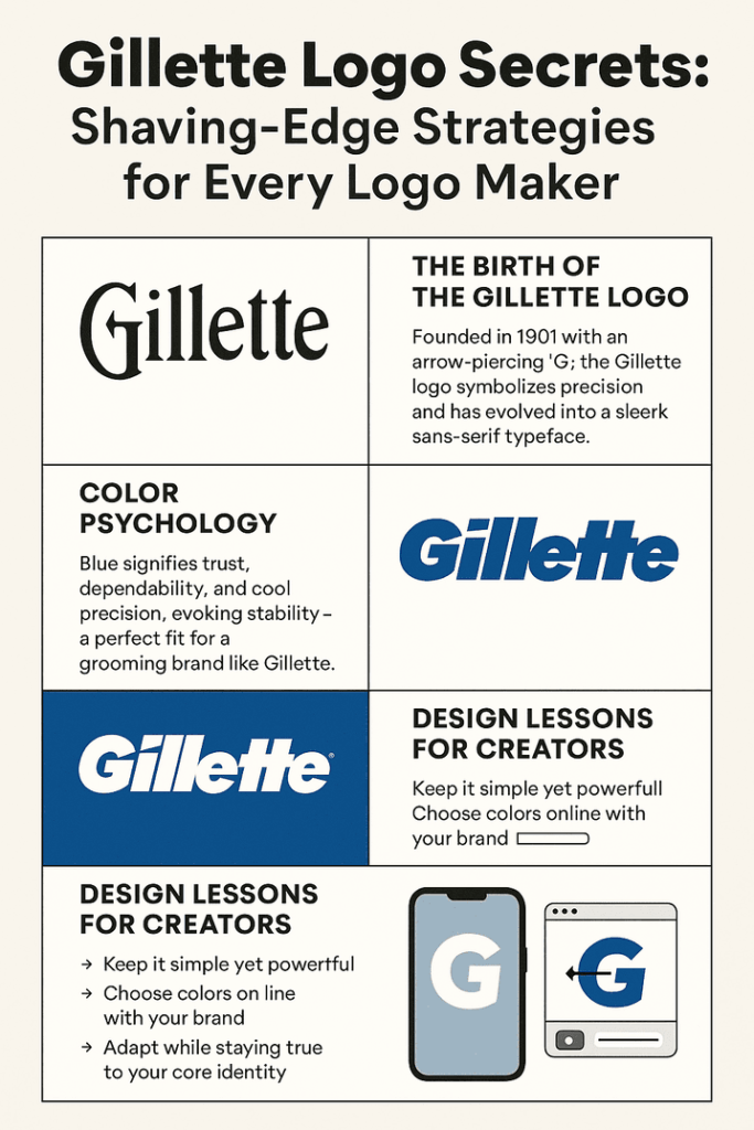
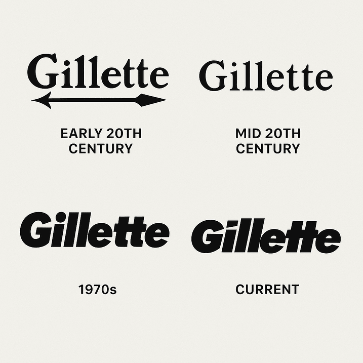
In 1901, King C. Gillette didn’t just invent a razor; he birthed a brand that would become synonymous with grooming. The original Gillette logo was a straightforward affair: a simple wordmark with the founder’s name, paired with an arrow piercing the “G” to symbolize precision. It was less “Mad Men” and more “man with a plan,” but it worked. As branding expert Alina Wheeler notes, “A logo’s job is to be a shorthand for trust.” Gillette’s early design did just that, signaling reliability to men who’d rather not bleed for a clean shave.
Fast forward to the 1960s, and the new Gillette logo began to take shape. The arrow was retired, and the brand embraced a sleek, sans-serif typeface in bold black, occasionally accented with silver or blue. This evolution mirrored the era’s obsession with modernity—think Kennedy’s New Frontier or the clean lines of a Corbusier chair. The logo’s simplicity was its strength, a visual handshake that said, “We’ve got this.”
Color Psychology Behind the Gillette Logo
Ever wonder why the Gillette logo leans so heavily on blue? It’s not just because it looks snappy on a razor package. Blue is the color of trust, dependability, and cool-headed competence—qualities you’d want in a brand that’s literally scraping your face. According to color psychologist Angela Wright, “Blue communicates stability and professionalism, making it a go-to for brands that want to be taken seriously.” Gillette’s blue accents, often paired with crisp white or metallic silver, evoke a sense of cleanliness and precision, like a freshly shaved jawline.
Compare this to, say, Coca-Cola’s red, which screams excitement, or Starbucks’ green, which whispers eco-conscious calm. Gillette’s color palette is a deliberate choice, aligning with its promise of a smooth, no-nonsense experience. For aspiring logo creators, this is a lesson in intentionality: your color scheme isn’t just aesthetic; it’s a psychological contract with your audience.
Typography & Design Patterns of the Wordmark
The Gillette logo is a masterclass in typography. Its current sans-serif font—clean, bold, and unadorned—channels a modernist ethos that’s both timeless and contemporary. Think of it as the Helvetica of grooming: universally appealing, no frills, just function. The logo’s letter spacing is meticulous, ensuring legibility whether it’s stamped on a razor or splashed across a Super Bowl ad.
Design patterns in Gillette’s branding often incorporate sharp angles and metallic finishes, reinforcing the idea of cutting-edge technology. As Paula Scher, the legendary designer behind Citibank’s logo, once quipped, “A good logo is like a good haircut—it’s instantly recognizable and never goes out of style.” Gillette’s design achieves this by balancing simplicity with a hint of futuristic flair, a blueprint for anyone dabbling in how to create a logo using AI.
Symbolism in the Gillette Logo’s Sharp Lines
Unlike Louis Vuitton’s monogram, which flaunts luxury, or Nike’s swoosh, which embodies motion, the Gillette logo relies on its wordmark to convey meaning. The absence of a graphic symbol isn’t a flaw; it’s a flex. By focusing on the brand name, Gillette underscores its legacy and confidence. The logo’s sharp, clean lines symbolize the precision of its razors, while the occasional use of a diagonal slash in marketing materials nods to the act of shaving itself.
For logo makers, this is a reminder that symbolism doesn’t always need a literal icon. Sometimes, the shape of a letter or the weight of a font can tell your story just as powerfully.
Modernism & Timeless Appeal in Logo Evolution
The Gillette logo has aged like a fine wine—or, more aptly, a well-maintained razor. Its modernist roots keep it relevant in a world obsessed with minimalism. While competitors like Dollar Shave Club opt for playful, millennial-friendly branding, Gillette sticks to its guns: clean, professional, universal. This timelessness is no accident. As brand strategist Marty Neumeier puts it, “A logo should be a flag that never goes out of fashion.”
In an era where trends like Y2K aesthetics or maximalist gradients come and go, Gillette’s restraint is refreshing. It’s a logo that doesn’t shout; it simply exists, confident in its place. Aspiring designers take note: chasing trends is a trap. Build something that can outlast TikTok’s algorithm.
Gillette Logo Across Grooming Eras
From the Roaring Twenties to the metrosexual noughties, the Gillette logo has been a constant in men’s grooming. It’s been there through the rise of safety razors, the electric shaver craze, and the multi-blade wars of the 2000s. Each era saw subtle tweaks to the logo’s presentation—bolder fonts for the assertive ‘80s, sleeker lines for the tech-savvy ‘90s—but the core identity remained unshaken.
This consistency has helped Gillette define what it means to be well-groomed. The logo isn’t just a mark; it’s a cultural touchstone, appearing in everything from James Bond’s bathroom to your dad’s medicine cabinet. For logo creators, this underscores the power of staying true to your brand’s essence, even as the world changes around you.
Controversies & Gillette Logo Enforcement Challenges
No brand is immune to controversy, and Gillette’s had its share. In 2019, its “The Best a Man Can Be” campaign sparked backlash for tackling toxic masculinity, with some accusing the brand of alienating its core audience. The Gillette logo, plastered across the ads, became a lightning rod for debate. Critics argued the brand was straying from its roots, while supporters praised its boldness.
Then there’s the issue of knockoffs. Cheap razors mimicking Gillette’s sleek packaging and logo flood markets worldwide, diluting the brand’s premium aura. As design critic Steven Heller notes, “A logo’s strength is only as good as its enforcement.” Gillette’s legal team stays busy, but the proliferation of fakes is a reminder: a great logo is both a blessing and a target.
Stock Price & Business Growth: The Logo’s Economic Edge
Gillette’s parent company, Procter & Gamble, has seen its stock price climb steadily, with branding playing a pivotal role. The Gillette logo is a cornerstone of this success, anchoring a brand that commands premium pricing in a crowded market. According to a 2023 Forbes report, Gillette’s global market share in razors hovers around 50%, a testament to its visual identity’s pull.
A strong logo drives recognition, and recognition drives sales. For small businesses using AI logo generators, this is a wake-up call: invest in a design that can scale with your ambitions. A logo isn’t just art; it’s an asset.
Brand Consistency: The Gillette Logo Gospel
Gillette’s brand identity is a masterclass in consistency. From razor packaging to Super Bowl ads, the Gillette logo is omnipresent, always in its signature blue and white, always bold. This uniformity builds trust, making the brand instantly recognizable across cultures and continents.
For those exploring how to create a logo using AI, consistency is key. Tools like Looka or Canva let you generate logos, but it’s your job to ensure they’re applied uniformly across business cards, websites, and social media. Gillette’s playbook? Stick to your colors, fonts, and vibe—no exceptions.
Design Lessons for Aspiring Logo Creators
What can Gillette teach us about logo design? Plenty. First, simplicity is king. A cluttered logo is like a dull blade—ineffective and forgettable. Second, know your audience. Gillette’s logo speaks to men (and increasingly women) who value quality and reliability. Third, evolve thoughtfully. The new Gillette logo tweaks over the years show a brand that adapts without losing its soul.
Finally, test your logo’s versatility. Gillette’s mark looks as good on a tiny razor handle as it does on a billboard. When using AI logo generators without watermark, like Kittl or Fotor, ensure your design works in black and white, small sizes, and across mediums.
Messaging & Visual Language: Speaking Without Words
The Gillette logo doesn’t need a tagline to communicate. Its clean lines and bold typography say, “We’re the best at what we do.” This visual language extends to Gillette’s marketing, where sleek visuals and confident messaging reinforce the brand’s authority.
For logo makers, this is a call to think beyond the graphic. Your logo should align with your brand’s voice, whether it’s playful, luxurious, or utilitarian. Tools like best free AI logo creator tools let you experiment with fonts and colors to find that perfect harmony.
Hashtag History & Digital Ubiquity
In the age of social media, the Gillette logo is a digital darling. Hashtags like #Gillette and #BestAManCanBe trend regularly, amplifying the logo’s reach. It’s a reminder that a logo today must thrive online, from Instagram grids to Twitter headers. Gillette’s design, with its high-contrast clarity, is tailor-made for digital screens.
When designing with an AI logo generator, prioritize scalability. A logo that pixelates on a phone screen is a branding faux pas. Test your designs across platforms to ensure they pop, just like Gillette’s.
The Impact of Technology & AI on Logo Design
Technology has reshaped logo design, and Gillette’s journey reflects this. Early logos were hand-drawn; today, they’re refined with digital precision. The rise of AI logo generators has democratized design, letting anyone create a professional logo in minutes. Platforms like Logo.com or Logomaster.ai use machine learning to analyze millions of designs, offering tailored options based on your input.
Gillette’s design team likely uses similar tech to iterate on concepts, ensuring the logo stays fresh yet familiar. For small businesses, this is a game-changer. You don’t need a Madison Avenue budget to craft a logo that rivals Gillette’s.
AI Tools & the Future of Gillette‑Style Logos
Imagine Gillette’s design team sneaking into the future, firing up an AI logo generator without watermark like GizAI or Ucraft. They’d input “Gillette,” select “grooming industry,” and choose a minimalist style with blue hues. The AI would churn out options: a sleek “G” with a razor-slash accent, a futuristic wordmark with metallic gradients, or a bold sans-serif that screams 2025.
They’d tweak the winner in the editor, adjusting kerning and testing it on mock razor packs. The result? A new Gillette logo that honors its heritage while winking at the TikTok generation. It’s a playful thought, but it shows how AI can spark creativity, even for a brand as established as Gillette.
Tips for Readers on How to Create a Logo Using AI

Ready to channel Gillette’s brilliance? Here’s how to create a logo using AI:
- Choose the Right Tool: Opt for best free AI logo creator tools like Looka, Canva, or Kittl. They offer robust customization and watermark-free downloads.
- Be Specific with Prompts: Input your brand name, industry, and style preferences. Want a Gillette-esque vibe? Specify “minimalist, blue, professional.”
- Customize Thoughtfully: Tweak fonts, colors, and layouts to align with your brand’s personality. Ensure versatility for print and digital.
- Test Versatility: Check how your logo looks on business cards, websites, and social media. Gillette’s logo shines everywhere—yours should too.
- Download High-Quality Files: Use platforms like Fotor or Ucraft for AI logo generators without watermark to get clean PNGs and SVGs.
Conclusion: Slice Through the Noise with Your Own Gillette Logo
The Gillette logo is more than a mark; it’s a lesson in clarity, consistency, and confidence. Whether you’re a startup or a side-hustler, its design offers a blueprint for crafting a brand that endures. With AI logo generators like Looka, Canva, or Semplr, you can create a logo that’s as sharp as Gillette’s, no design degree required. So, fire up one of the best free AI logo creator tools, take inspiration from Gillette’s razor-sharp legacy, and carve out your own place in the branding world. Ready to make your mark? Start designing today!
