The Birth of the Facebook Logo: A Dorm Room Dream
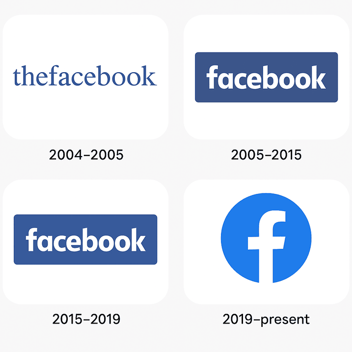
Picture 2004: Mark Zuckerberg, a hoodie-clad Harvard sophomore, is coding what would become the social media juggernaut in his dorm room. The original Facebook logo for “TheFacebook” (yes, with that clunky definite article) was a far cry from today’s sleek “f.” It featured a retro, almost clunky typeface in white, set against a gradient blue background, with a faint map-like texture. Think of it as the graphic design equivalent of a flip phone—functional but not exactly chic.
By 2005, the company dropped “The” and embraced a cleaner, bolder logo. The lowercase “f” we know today debuted, crafted in a custom typeface called Klavika, designed by Eric Olson. “The choice of a lowercase letter was radical for its time,” says branding expert Paula Scher. “It signaled informality, approachability—a rebellion against the corporate stiffness of early internet brands like Yahoo! or MSN.” This was a logo that whispered, “We’re your friend, not your overlord.”
Color Psychology and Brand Perception: Why Blue?
Why is the Facebook logo blue? The answer is both practical and poetic. Blue is the color of trust, reliability, and calm—qualities any social platform needs to foster. Studies in color psychology suggest blue evokes feelings of security, which is why banks and tech giants love it. But there’s a simpler reason: Zuckerberg is red-green colorblind, and blue was the hue he could see most clearly. Talk about a design decision born of necessity!
This blue, a shade dubbed “Facebook Blue” (hex code #3B5998), became a branding cornerstone. “Color is the first thing you feel in a logo,” notes designer Jessica Walsh. “Facebook’s blue is like a warm hug—it’s familiar, dependable, yet modern.” Variations of this hue have persisted through logo updates, including the new Facebook logo in 2023, which adopted a slightly brighter, more “electric” blue, as Meta described it, to reflect a “bolder, more harmonious” identity.
Artistry, Typography & Design Patterns: The Power of Simplicity
The Facebook logo is a masterclass in minimalism. Its Klavika typeface, with its geometric precision and soft curves, balances techy precision with human warmth. The lowercase “f” is both a letter and a symbol, a nod to the platform’s focus on personal connection. “Typography is the voice of a brand,” says typographer Jonathan Hoefler. “Facebook’s choice of a clean, sans-serif font screams accessibility—anyone, anywhere, can read it.”
Design patterns in the logo’s evolution show a shift toward flatter, more versatile aesthetics. The 2015 update stripped away gradients and shadows, embracing the flat design trend sweeping tech. The 2019 and 2023 refreshes further refined the logo, with subtle tweaks to spacing and color intensity. Each iteration proves that less is more—a lesson for anyone using an AI logo generator to craft their own brand mark.
Symbolism Behind the Monogram: The “f” as a Flag
The Facebook logo isn’t just a letter; it’s a flag planted in the digital landscape. The lowercase “f” symbolizes informality, friendship, and openness. It’s a monogram that says, “This is a space for you.” Unlike the ornate monograms of luxury brands like Louis Vuitton, Facebook’s “f” is egalitarian, a design choice that aligns with its mission to “connect the world.”
Yet, this simplicity belies its power. The logo is a visual shorthand for social interaction, instantly recognizable whether on a smartphone screen or a billboard. “A great logo is a story in a single image,” says branding guru Marty Neumeier. “Facebook’s ‘f’ tells a story of connection without saying a word.”
Modernism & the Facebook Logo’s Timeless Appeal
The Facebook logo is a modernist marvel, rooted in the Bauhaus principle that form follows function. Its clean lines and lack of ornamentation make it timeless, able to adapt to new platforms and technologies. From desktop browsers to smartwatches, the logo scales effortlessly, a testament to its thoughtful design.
This timelessness is why the logo has needed only minor updates over two decades. The new Facebook logo in 2023, with its slightly bolder blue and refined proportions, keeps the core intact while signaling evolution. “A logo should evolve, not revolutionize,” says designer Michael Bierut. “Facebook nails this balance, staying fresh without alienating its billions of users.”
Facebook Logo’s Role in Defining Digital Eras
The Facebook logo has been a constant through the internet’s adolescence. In the 2000s, it heralded the rise of social media. In the 2010s, it became synonymous with global connectivity (and, let’s be honest, oversharing). By the 2020s, as Meta pivoted to the metaverse, the logo remained a grounding force, a familiar face in a sea of virtual ambition.
Each era has seen the logo adapt to new contexts—profile pictures, app icons, even VR headsets. Its consistency has helped Facebook (now Meta) maintain brand equity through acquisitions like Instagram and WhatsApp. “A logo is a company’s North Star,” says brand strategist Alina Wheeler. “Facebook’s ‘f’ has guided it through digital revolutions.”
Controversies: From Privacy to Knockoffs
No logo is without baggage, and the Facebook logo has weathered its share of storms. The platform’s privacy scandals—Cambridge Analytica, anyone?—have cast a shadow over its friendly blue “f.” Critics argue the logo’s wholesome design masks corporate overreach, a smiling facade for data collection.
Then there’s the issue of knockoffs. The Facebook logo is so iconic that it’s been endlessly mimicked, from phishing scams to parody accounts. In 2019, Meta sued a company for using a suspiciously similar “f” logo, proving that even a single letter can spark legal battles. “Imitation is flattery, but it’s also a headache,” quips trademark attorney Sarah Hsia. These controversies highlight the logo’s double-edged sword: its simplicity makes it universal but also vulnerable.
Stock Price & Business Growth: Facebook Logo’s Economic Impact
A logo doesn’t directly move stock prices, but it’s a linchpin of brand value. Meta’s market cap, hovering around $1.3 trillion in 2025, owes much to the Facebook logo’s global recognition. Branding studies estimate that a strong logo can boost brand equity by up to 20%, and Facebook’s “f” is a case study in this. It’s a visual anchor for a company that’s expanded from a social network to a tech conglomerate.
The logo’s role in user retention can’t be overstated. Its familiarity keeps users coming back, even amid privacy concerns. “A logo is a promise,” says economist Umair Haque. “Facebook’s ‘f’ promises connection, and that promise has fueled Meta’s growth.”
Brand Identity & Consistency: The Glue of Trust
Consistency is the Facebook logo’s secret weapon. Across billions of devices, the logo remains a constant, reinforcing trust. Whether it’s the app icon on your phone or the watermark on a sponsored post, the “f” is a reassuring presence. “Consistency builds recognition, and recognition builds loyalty,” says brand consultant David Aaker.
This consistency extends to Meta’s broader ecosystem. The Facebook logo sets the tone for Instagram’s camera glyph and WhatsApp’s green bubble, creating a cohesive visual language. For aspiring designers, this is a lesson in brand architecture: a strong logo unifies even the most sprawling empire.
Design Lessons for Aspiring Logo Creators
What can the Facebook logo teach those wielding an AI logo generator? First, simplicity is king. A logo should be memorable at a glance, like a catchy pop hook. Second, color matters—choose hues that evoke the right emotions. Third, versatility is crucial; your logo must shine on a business card or a billboard.
Finally, don’t underestimate typography. The Facebook logo’s Klavika font is a silent hero, balancing modernity and warmth. “A logo without great typography is like a song without a melody,” says designer Stefan Sagmeister. So, whether you’re using Canva or Looka, prioritize clean, readable fonts.
Messaging & Visual Language: Speaking Without Words
The Facebook logo communicates connection, community, and accessibility. Its lowercase “f” is a visual whisper, inviting rather than commanding. This aligns with Meta’s mission to “bring the world closer together.” The logo’s blue reinforces this, evoking trust and openness.
In contrast, consider Twitter’s (now X’s) bird, which suggests freedom, or Apple’s bitten fruit, which screams innovation. Each logo speaks a unique language, and Facebook’s is one of camaraderie. For designers, this underscores the power of visual among other things—your logo should say what your brand stands for without uttering a syllable.
Hashtag History & Digital Ubiquity of the Facebook logo
The Facebook logo is a hashtag hero. From #Facebook to #Meta, it’s fueled countless social media moments. Its omnipresence on profile pictures, ads, and memes has made it a digital chameleon, adapting to every trend from selfies to Stories. “A logo that thrives in hashtags is a logo that lives,” says social media strategist Gary Vaynerchuk.
This ubiquity is a double-edged sword. The logo’s overexposure can breed fatigue, yet its simplicity keeps it fresh. For creators using best free AI logo creator tools, the lesson is clear: design for adaptability. Your logo should feel at home in a tweet or a TikTok.
The Impact of Technology & AI on Logo Design
The rise of AI logo generators has flipped the design world upside down. Tools like Looka, Canva, and Semplr let anyone create professional logos in minutes, no design degree required. These platforms use machine learning to analyze trends, suggest layouts, and generate endless variations, much like a digital Picasso.
The Facebook logo itself predates this AI boom, but its clean, scalable design is the kind AI tools excel at replicating. Modern AI logo generators without watermark, like Fotor or DesignEvo, can produce logos with Facebook-esque simplicity, offering high-resolution downloads for free or a small fee. This democratization of design is both a blessing and a curse—while it empowers entrepreneurs, it risks flooding the world with generic logos.
How Meta Might Use an AI Logo Generator Without Watermark
Imagine Meta’s design team, sipping artisanal coffee in Menlo Park, deciding to refresh the Facebook logo using an AI logo generator without watermark. They’d start with a prompt: “Create a minimalist, blue logo for a global social platform, evoking trust and connection.” Tools like Logo Diffusion or Recraft.ai would churn out dozens of options, from sleek monograms to abstract icons.
The team might tweak the hue to match the 2023 “electric” blue, adjust the font for better legibility, and export a vector file for scalability. The result? A logo that feels like the classic “f” but with a futuristic twist, ready for the metaverse. This speculative exercise shows how even giants can benefit from how to create a logo using AI—it’s fast, cost-effective, and sparks creativity.
Tips for Readers on How to Create a Logo Using AI

Ready to craft your own iconic logo? Here’s how to use best free AI logo creator tools like a pro:
- Choose the Right Tool: Platforms like Canva, Looka, or Fotor offer user-friendly interfaces and watermark-free downloads.
- Be Specific with Prompts: Describe your brand clearly—e.g., “modern, tech-focused logo in blue and white.” Specificity yields better results.
- Customize Thoughtfully: Tweak fonts, colors, and layouts to make the logo yours. Avoid overcomplicating—simplicity wins.
- Test Versatility: Preview your logo on business cards, websites, and social media to ensure it scales well.
- Download High-Quality Files: Opt for vector formats (SVG, PDF) for flexibility in print and digital use.
Call to Action: Unleash Your Inner Logo Maker
The Facebook logo is more than a design—it’s a blueprint for branding success. Its simplicity, consistency, and emotional resonance offer lessons for anyone dreaming of their own iconic mark. So, why not take inspiration from the blue “f” and create your own logo? Dive into best free AI logo creator tools like Looka, Canva, or Semplr, and let your brand’s story shine. Whether you’re launching a startup or rebranding a passion project, the perfect logo is just a few clicks away. Go forth and design—your digital monogram awaits!
