The Birth of the Xbox Logo: A Green Spark in a Digital Universe
When Microsoft unveiled the Xbox in 2001, it wasn’t just launching a console—it was throwing a gauntlet into Sony and Nintendo’s ring. The original Xbox logo, a chunky, metallic “X” cradled by a radioactive green glow, screamed ambition. It was less a logo and more a battle cry, designed to stand out in a market dominated by sleek PlayStations and family-friendly Nintendos. As branding expert Paula Scher once quipped, “A logo doesn’t sell, it identifies.” And identify it did—Xbox was here to disrupt.
The logo’s debut was no accident. Microsoft leaned into a futuristic aesthetic, with a nod to sci-fi films like The Matrix. The green hue wasn’t just a random pick; it was a deliberate choice to evoke energy, innovation, and a touch of rebellion. As we’ll see, the Xbox logo history is a story of evolution, but that first iteration laid the groundwork for a brand that’s now worth billions.
Color Psychology in the Xbox Logo
Let’s talk color psychology in logos. The Xbox logo’s signature green isn’t just eye-catching—it’s a psychological power move. Green symbolizes growth, vitality, and trust, but Xbox’s neon twist adds an edge of excitement. According to color theorist Angela Wright, “Green is the color of balance, but it can also signal ambition.” Xbox’s choice was a masterstroke, blending reliability (trust us, this console won’t crash) with adrenaline (get ready to frag your friends in Halo).
The green orb, especially in early iterations, felt like a portal to another world—a fitting metaphor for gaming. Over time, as the new Xbox logo designs emerged, the green softened but never vanished, maintaining brand consistency while adapting to sleeker, modern aesthetics. For logo makers, this is lesson one: pick a color that tells your story, then stick with it like a dog with a bone.
Artistry & Typography of the Xbox Logo
The Xbox logo’s typography and design patterns are a study in simplicity meeting sophistication. The original logo’s bold, sans-serif “X” was rugged, almost industrial, reflecting the chunky hardware of the first Xbox console. By the time the Xbox 360 rolled out in 2005, the logo slimmed down, embracing a cleaner, more minimalist font. The Xbox logo redesign 2022 took this further, with a refined “X” that feels both futuristic and timeless.
Typography aside, the logo’s spherical motif—whether the glowing orb or the subtle curve of the “X”—is a nod to unity and accessibility. As designer Paul Rand once said, “Design is the silent ambassador of your brand.” The Xbox logo’s artistry lies in its ability to say “gamer” without shouting it, a balance every logo creator should aim for.
The Symbolism of the Xbox Logo
The “X” in the Xbox logo isn’t just a letter—it’s a symbol loaded with meaning. In gaming culture, “X” marks the spot: a destination, a challenge, a victory. It’s the button you mash to swing a sword or fire a rocket. It’s a crossroads, inviting players of all stripes to converge. This monogram’s simplicity makes it versatile, appearing on consoles, controllers, and even digital storefronts without losing its punch.
Compare this to, say, Louis Vuitton’s interlocking “LV,” which screams luxury, or Nike’s swoosh, which whispers motion. The Xbox “X” roars inclusivity and adventure, a beacon for gamers worldwide. For those using an AI logo generator, the lesson is clear: a monogram can be more than letters—it can be a story.
Modern Updates & Timelessness of the Xbox Logo
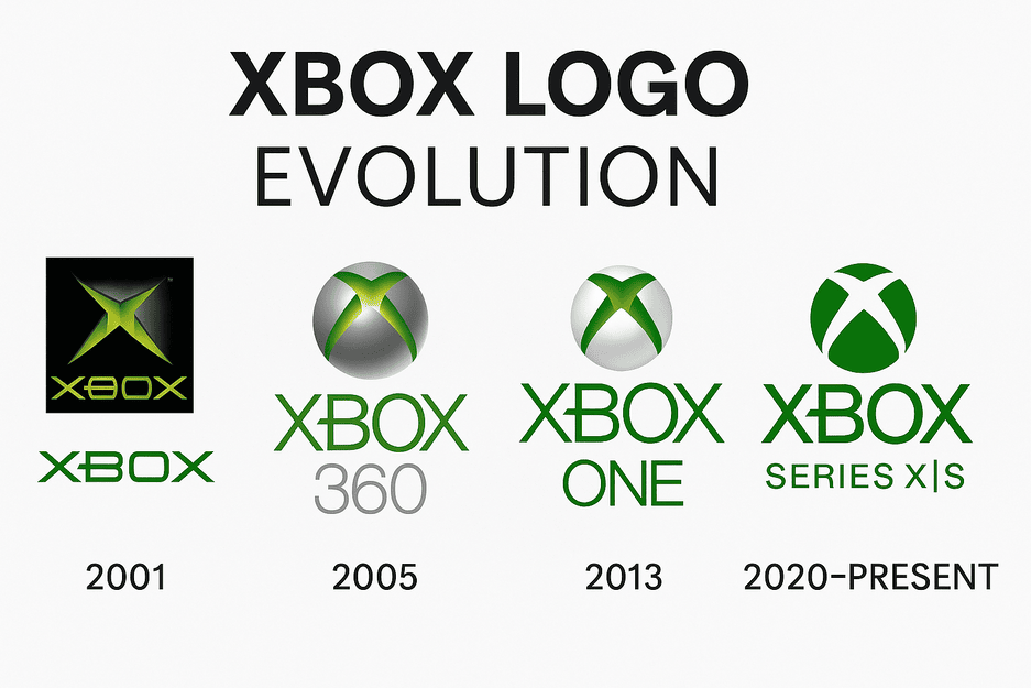
The Xbox logo’s journey from 2001 to the Xbox logo redesign 2022 is a case study in modernism. Each iteration—Xbox, Xbox 360, Xbox One, and Series X/S—has refined the logo without abandoning its core identity. The 2022 redesign, for instance, introduced a subtler green and a sharper “X,” aligning with the minimalist trends dominating tech branding. Yet, it still feels unmistakably Xbox.
This timelessness is no fluke. As branding guru Marty Neumeier notes, “A logo should be simple enough to be remembered, but strong enough to be distinctive.” Xbox nails this, evolving with design trends while staying true to its roots. Aspiring logo makers, take note: timeless doesn’t mean static—it means adaptable.
The Xbox Logo’s Influence on Gaming Eras
The Xbox logo hasn’t just marked consoles; it’s marked eras. The original logo ushered in the Halo era, when Xbox became synonymous with first-person shooters. The Xbox 360 logo, with its sleek silver and green, defined the mid-2000s multiplayer boom, from Gears of War to Xbox Live. The Xbox One era leaned into media integration, with the logo reflecting a broader entertainment focus. Today’s Series X/S logo, with its clean lines, mirrors gaming’s shift to cloud streaming and accessibility.
Each era’s logo tweak reflects Xbox’s knack for reading the room—or rather, the gaming world. For logo creators, this adaptability is key: your design must evolve with your audience’s expectations.
Controversies Around the Xbox Logo
No logo is immune to controversy, and Xbox’s has had its share. Knockoff consoles in emerging markets often mimic the Xbox logo’s green glow, leading to legal battles over trademark infringement. Then there’s the cultural debate: some critics argue the logo’s sci-fi aesthetic alienates non-gamers, pigeonholing Xbox as a “hardcore” brand. Microsoft’s response? Double down on inclusivity with campaigns like Xbox Adaptive Controller, proving the logo’s reach extends beyond stereotypes.
These controversies highlight a universal truth for logo makers: your design will face scrutiny. Embrace it, learn from it, and keep iterating. As the Xbox logo history shows, resilience is part of the game.
Xbox Logo’s Role in Business & Growth
Microsoft’s stock price tells a story of branding success. Since Xbox’s debut, Microsoft’s market cap has soared, with gaming now a cornerstone of its portfolio. The 2023 acquisition of Activision Blizzard for $68.7 billion underscores Xbox’s clout, with the logo front and center in this growth. As The Hindu noted, Xbox has “steadily built up its stable of studios,” cementing its place in gaming’s pantheon.
A strong logo doesn’t just look good—it drives business. For logo creators, this is a reminder: your design isn’t just art; it’s a financial asset.
Design Lessons from the Xbox Logo
Xbox’s brand identity is a masterclass in consistency. The green hue, the bold “X,” the futuristic vibe—these elements persist across consoles, ads, and even Xbox Game Pass. This consistency builds trust, making Xbox instantly recognizable. As branding expert David Aaker puts it, “A brand is a promise.” Xbox promises fun, innovation, and community, and its logo delivers.
For those using best free AI logo creator tools like Looka or Canva, consistency is your North Star. Ensure your logo aligns with your brand’s voice, whether it’s playful like Xbox or luxe like Louis Vuitton.
The Xbox Logo & AI Logo Generators
What can aspiring logo makers learn from Xbox? Plenty. First, simplicity is king—Xbox’s logo is bold yet uncluttered. Second, color matters—green sets Xbox apart in a sea of grey tech brands. Third, evolve thoughtfully—the Xbox logo redesign 2022 refined without reinventing. Finally, embrace symbolism—the “X” is more than a letter; it’s a rallying cry.
Try tools like Semplr or Hatchful to experiment with modern logo design tips. Play with shapes, colors, and fonts, but keep Xbox’s clarity in mind. As designer Paula Scher advises, “Don’t overcomplicate. A logo should be a handshake, not a speech.”
Messaging & Visual Language: Speaking to Gamers
Xbox’s visual language is direct: “Power Your Dreams,” as the tagline goes. The logo amplifies this, with its futuristic “X” and green glow signaling endless possibilities. It’s a visual shorthand for adventure, community, and cutting-edge tech. For logo makers, this is a lesson in alignment: your logo must echo your brand’s message, whether it’s “game on” or “buy now.”
Hashtag History & Digital Ubiquity
In the social media age, the Xbox logo is a digital darling. Hashtags like #Xbox, #XboxSeriesX, and #GamePass have racked up billions of views, with the logo front and center. Its clean design shines on X posts, Instagram Reels, and TikTok clips, proving its versatility. As playful logo branding examples go, Xbox’s ability to dominate digital spaces is unmatched.
For logo creators, this is a call to think beyond print. Your logo must pop on a 4K screen or a tiny phone. Test it with an AI logo generator to ensure it scales without losing its soul.
The Impact of Technology & AI on Logo Design
Enter the age of AI. Tools like Looka, Canva, and Semplr have democratized logo design, letting anyone create a logo using AI. These best free AI logo creator tools analyze trends, suggest color palettes, and generate designs in seconds. But can they match Xbox’s magic? Maybe. AI can churn out sleek designs, but human intuition—like Microsoft’s choice of green—adds the spark.
Recent advancements, like Microsoft’s integration of GPT-4o into Copilot for image generation, show AI’s potential in branding. For logo makers, AI is a collaborator, not a replacement. Use it to brainstorm, then refine with your own flair.
Xbox’s Products and Services: Beyond the Logo
The Xbox logo graces more than consoles. Xbox Game Pass, a Netflix-style gaming service, has over 25 million subscribers. The Xbox Adaptive Controller champions accessibility. Cloud gaming via Xbox Game Pass Ultimate lets you play on phones, PCs, or even smart TVs. Each product carries the logo’s promise of innovation, tying them together like a well-orchestrated symphony. Minecraft, the blocky brainchild of Markus Persson, has sold over 300 million copies since 2009, making it the best-selling game ever. Its pixelated charm and infinite creativity keep players hooked, building everything from cozy cabins to sprawling metropolises. The Xbox logo proudly graces its editions, tying it to Microsoft’s gaming empire.
Logo Comparison: Xbox vs. Competitors
How does Xbox stack up against rivals? Sony’s PlayStation logo, with its bold “PS,” is minimalist but lacks Xbox’s vibrant personality. Nintendo’s red-and-white Switch logo screams fun but feels less premium. Xbox’s green “X” strikes a balance: approachable yet authoritative. For logo creators, this comparison underscores the need to differentiate while staying true to your brand’s ethos.
How Xbox Might Use an AI Logo Generator Without Watermark

Imagine Microsoft’s design team sneaking into an AI logo generator without watermark like Looka or Semplr. They’d input “futuristic gaming logo, green, bold X, minimalist.” The AI might spit out a neon orb with a sleek “X,” not far off the new Xbox logo. They’d tweak the hue to match Xbox’s signature green, ensuring no watermark mars their masterpiece. The result? A logo that feels both fresh and familiar, proving AI can amplify creativity when guided by human vision.
Recent Xbox News: A Brand on the Move
Xbox is never far from the headlines. In March 2025, CNET reported that Xbox Game Pass Core subscribers gained access to Batman: Arkham Knight and Octopath Traveler II, reinforcing Xbox’s commitment to diverse gaming experiences. The Activision Blizzard acquisition continues to ripple, with Call of Duty titles boosting Game Pass. On May 28, 2025, Microsoft launched the beta for Copilot for Gaming, an AI assistant in the Xbox mobile app, offering real-time tips like “How do I craft a sword in Minecraft?” or “What’s my Gamerscore?” Available in over 50 countries, including the US and India, it’s a glimpse into Xbox’s AI-driven future. Meanwhile, Microsoft’s broader AI push—integrating tools like Copilot into Windows—hints at future Xbox innovations, perhaps even AI-driven logo tweaks.
Create Your Own Logo Inspired by the Xbox Logo
The Xbox logo is more than a design—it’s a legacy. Whether you’re a gamer or a budding logo maker, its lessons in color, simplicity, and adaptability are universal. Ready to create your own iconic logo? Dive into the best free AI logo creator tools like Looka, Canva, or Semplr. Experiment with color psychology in logos, play with modern logo design tips, and channel Xbox’s playful yet powerful vibe. Your brand deserves a logo that powers dreams—start designing today!
