Introduction: Can a Logo Generator AI Free Tool Match a Century of Branding?
You’re walking through an airport, groggy from travel, and there it is: Toblerone’s legendary triangular box gleaming on the duty-free shelf. But before the chocolate hits your tastebuds, it hits your eyes—that logo. A sharp mountain silhouette, a hidden bear, and a bold font that practically yodels “Swiss luxury.”
Now imagine this: could a logo generator AI tool have created that? A prompt-based system, maybe with keywords like “Swiss,” “chocolate,” “premium.” Sure, it might produce something clean. But iconic? Emotional? Culturally loaded?
That’s what we’re here to explore—how Toblerone’s logo became a global design icon, and what today’s AI logo design tools can learn from it.
Let’s unwrap it all: the history, the color theory, the controversies, and the modern tech that’s trying to keep up.
A Swiss Legacy: The Birth of Toblerone’s Logo
The story begins in Bern, Switzerland, in 1908. Theodor Tobler and his cousin Emil Baumann didn’t just invent a new chocolate—they created a new category. Toblerone’s triangular shape and almond-honey flavor were revolutionary. But it needed something more: a visual identity.
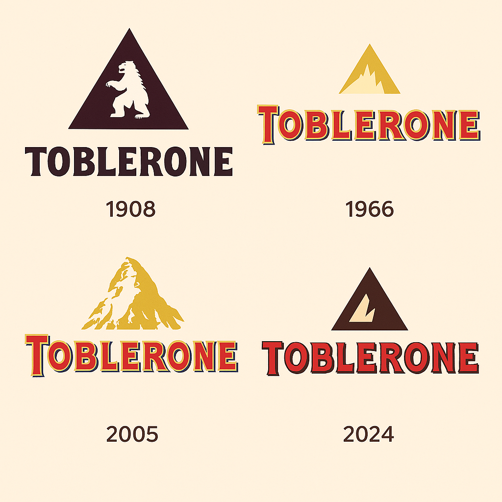
Their logo featured a stylized mountain—later linked to the famous Matterhorn—and a blocky serif typeface. Simple. Bold. Distinct.
But wait—there’s more. Hidden in that mountain? A bear, the official symbol of Bern. That kind of layered symbolism is rare even today, and it’s a lesson in design depth most logo generator by prompt tools don’t touch unless you spell it out.

Design with Purpose: A Case Study for Logo Generator by Prompt Tools
Today’s AI-driven tools can churn out dozens of logos in seconds. You can type in “Swiss chocolate, luxury, heritage” into a logo generator by prompt, and you’ll get a polished output. But you likely won’t get the same emotional depth.
Toblerone’s logo connects to:
- A place (Bern)
- A product (triangular bar)
- A story (family tradition)
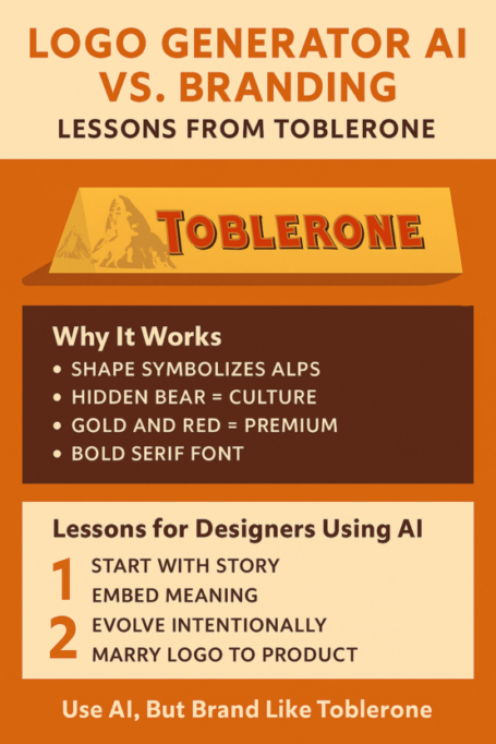
This is branding with layers—literally. The mountain reflects the product’s shape. The bear ties to local pride. The custom serif font offers a bold contrast to the Alps’ ruggedness. It’s a masterclass in brand storytelling—and a lesson most AI logo tools are still learning.
Color Psychology: Gold, Red, and Swiss Identity
What do gold, red, white, and blue say together? In Toblerone’s case:
- Gold: Luxury, exclusivity, indulgence
- Red: Energy, appetite, boldness
- White: Purity, Swiss alpine charm
- Blue (used sparingly): Calm, trust, balance
These colors weren’t chosen at random. They evoke emotional reactions while reinforcing the brand’s story. While a logo generator AI tool may follow color theory algorithms, it still lacks instinct.
Gold became even more prominent in the 1960s, riding the wave of consumerism and visual opulence. A calculated pivot, not a coincidence.
Typography: More Than Letters
Toblerone’s custom typeface balances playfulness with gravitas. It’s serif, slightly squared-off, and completely recognizable.
Could a logo generator by prompt guess that? Possibly. But would it tie it to a family legacy, or to the era’s Art Nouveau influences? Not unless you told it so.
The original typeface was hand-drawn—something AI design tools are only beginning to replicate using machine-trained handwriting modules. But handwriting without meaning? That’s just pixels.
The Peaks Controversy: A Crisis in Logo Integrity
In 2016, Toblerone reduced the weight of its bar while keeping the same packaging. When Mondelez widened the spaces between chocolate triangles to save on ingredients—while keeping the logo the same? The logo remained proud—but the product? Hollowed out.
Social media erupted. “It’s not Toblerone if it’s mostly air!” raged one fan on Twitter. Outrage ensued. Fans felt betrayed. And rightly so: the logo, a symbol of consistency and indulgence, now misrepresented the product. The controversy highlighted a crucial truth: logos don’t exist in a vacuum. When the product experience breaks the logo’s promise, you get backlash.
It’s a lesson for designers and AI systems alike: alignment between design and experience is everything.
2023: The Matterhorn Vanishes
After Mondelez shifted some production to Slovakia, Swiss law prohibited the use of the Matterhorn in branding. Toblerone had to replace its iconic peak with a generic mountain.
Minimal? Yes. Modern? Maybe. But emotionally neutral? Definitely.
Many loyal fans felt a disconnect. A logo generator AI free might have offered hundreds of new peaks—but only humans understood the loss.
Market Performance: Does a Great Logo Move Stock?
Since Toblerone’s early days, and particularly under Mondelez, its brand value has soared. Mondelez’s stock climbed steadily, supported by consistent branding.
A strong logo doesn’t just sell chocolate—it anchors trust, justifies pricing, and supports international growth.
Would a logo generator by prompt create a logo that builds stockholder confidence? Possibly. But it still requires a human marketer to know what “trust” looks like.
Design Evolution: Decade by Decade
- 1920s: Art Deco influences—bold, linear structure
- 1960s: Playful mid-century modernism with flying ribbons
- 1990s: Streamlined minimalism
- 2000s: Digitally polished, glossy 3D render
- 2023: Clean, flat peak—more modern, less personal
While many brands overhaul their logos completely, Toblerone kept evolving—without abandoning its roots.
That’s another place where AI tools struggle. Logo generator AI free platforms often emphasize “fresh” over “familiar.” And familiarity builds legacy.
Lessons for Every AI Logo Generator
Want to train a model to design better? Here’s what Toblerone teaches us:
- Keep it simple: A shape and a word is often enough
- Add meaning: Every design element should say something
- Build consistency: Don’t change your face every decade
- Match product and logo: Form should reflect function
- Tell a story: From bear to Bern, every element should matter
These aren’t just design tips—they’re brand-building fundamentals.
AI Logo Generator vs. Handcrafted Heritage
A good AI logo generator can deliver dozens of designs in seconds. But Toblerone’s branding was never about volume—it was about story.
It tied together:
- Geography (the Alps)
- Culture (Bern’s bear)
- Product shape (triangular)
- Luxury symbolism (gold, serif fonts)
A machine could theoretically mimic this—but only after decades of training and storytelling. Toblerone’s logo wasn’t just designed. It was earned. Toblerone’s custom serif font strikes a balance between old-world seriousness and quirky charm. It’s heavy, memorable, and totally ownable. The font in Toblerone’s logo reinforces the brand’s commitment to quality. And that’s a lesson every AI logo generator should learn: type is tone.
Symbolism: More Than Meets the Eye
The triangle isn’t random—it symbolizes strength, stability, and tradition. The bear adds heritage and local relevance. Together, they say: “This is a product of pride and precision.”
Most logo generator by prompt tools can output shapes and shadows. But can they give you that? Not without guidance—and sometimes not even then.
Social Media: Hashtags and Pop Culture
Toblerone isn’t just chocolate. It’s a vibe. A flex. A meme.
- #TobleroneMoments
- #HiddenBear
- #TobleroneAddict
It’s appeared in “Friends,” on fashion runways, and in tweets about breakups and indulgence. Its logo fuels all of that.
Even the best AI logo generator free tools can’t plan for memeability. That’s where design meets sociology.
Modernism and the Risk of Blandness
In 2023, the Matterhorn disappeared from the packaging. The new mountain? Simple. Geometric. Generic.
It’s the kind of logo you might actually expect from a logo generator by prompt. Clean, safe, symmetrical—but not iconic.
Toblerone’s branding success lies in emotion and imperfection. Too much perfection is forgettable.
Design Anatomy: Dissecting the Peaks
- Logomark: Stylized mountain + bear (before 2023)
- Wordmark: Custom serif typeface
- Color: Gold, red, white, blue
- Form: Triangle = chocolate + strength + Swiss Alps
- Function: Product tie-in, shelf impact, cultural continuity
You could literally feed this to a logo generator—but would it return the same brilliance? Not likely.
AI Tools, Brand Authenticity, and the Future
Tools like logo generator AI free are amazing for prototyping. They help indie brands get off the ground and enable creators to move fast. But when it comes to legacy-building design?
You still need intuition, culture, and storytelling—qualities that can’t (yet) be encoded.
Conclusion: From Swiss Peaks to Branding Masterpiece
The Toblerone logo is more than iconic. It’s emotional, consistent, symbolic, and smart. It shows what’s possible when storytelling and design collide.
So go ahead—use a logo generator AI free to start your brand. But if you want your logo to last 100 years, take a lesson from Toblerone:
Design with heart. Evolve with care. Hide a bear in your mountain.
Want to know how other famous brands designed their logo? Check out our story on Ferrari’s logo evolution.
