The Apple logo—a sleek, bitten apple—stands as one of the most recognizable symbols in the world. It’s not just a logo; it’s a cultural icon, a beacon of innovation, and a masterclass in branding. But how did this simple fruit become synonymous with cutting-edge technology? In this 2,500-word journey, we’ll explore the evolution of Apple’s logo through its birth, artistry, controversies, and societal impact. From logo maker inspiration to AI logo generator trends, we’ll unpack the design principles, color psychology, and symbolism that make Apple’s logo timeless. Let’s take a bite out of history.
The Birth of Apple’s Logo: A Humble Beginning
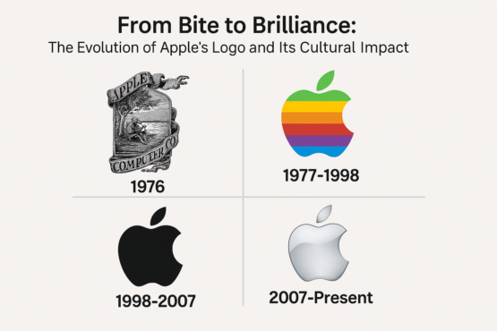
In 1976, Apple was a fledgling company founded by Steve Jobs, Steve Wozniak, and Ronald Wayne. Their first logo, designed by Wayne, was a far cry from the minimalist masterpiece we know today. Picture this: a detailed, Dickensian engraving of Sir Isaac Newton sitting under an apple tree, with a fruit dangling precariously above his head. It was intricate, intellectual, and utterly impractical for branding.
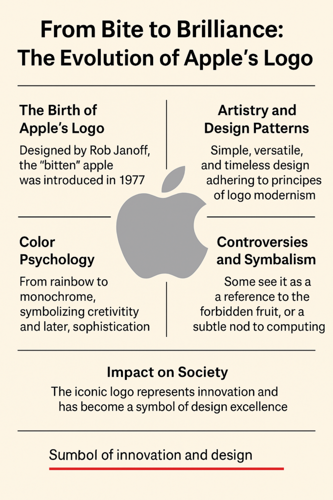
“It looked like something you’d find on a dusty library book, not a tech company,” quipped design historian Steven Heller. The logo screamed ambition but lacked clarity. Realizing its limitations, Jobs turned to Rob Janoff, a graphic designer, in 1977. Janoff’s brief was simple: create something clean, modern, and memorable. Thus, the bitten apple was born.
Why the bite? Theories abound. Some say it’s a nod to Alan Turing, the computing pioneer who died after biting a cyanide-laced apple. Janoff, however, debunked this, explaining it was a practical choice: “A whole apple could be mistaken for a cherry. The bite gives it scale.” Practicality aside, the bite added wit—a cheeky twist that humanized the brand.

Artistry and Design Patterns: From Stripes to Simplicity
Janoff’s 1977 logo wasn’t just a shape; it was a rainbow-striped rebellion. The six vibrant colors—green, yellow, orange, red, purple, and blue—reflected Apple’s ethos of creativity and accessibility. “The rainbow said, ‘We’re for everyone,’” Janoff recalled. It was bold, playful, and perfectly aligned with the countercultural vibe of the late ’70s.
But by 1998, the rainbow gave way to a monochromatic silhouette. Why? Apple was evolving from a quirky upstart to a global powerhouse. The shift to a sleek, black logo (later silver, then glossy variations) mirrored the company’s focus on sophistication. “The monochrome logo felt like Apple growing up,” said Paula Scher, a renowned designer. “It was shedding its youthful exuberance for elegance.”
This evolution showcases key principles of logo design:
- Simplicity: The bitten apple is instantly recognizable, even at tiny sizes.
- Versatility: It works on screens, packaging, and billboards.
- Timelessness: No fussy details to date it.
Want a logo that lasts? Try an AI logo generator without watermark to create clean, scalable designs inspired by Apple’s minimalist ethos.
Color Psychology: What the Apple Says Without Words
Colors aren’t just pretty—they’re psychological triggers. The rainbow logo of 1977 radiated inclusivity and optimism, appealing to a generation craving freedom. “Those colors were a statement,” said color theorist Leatrice Eiseman. “They screamed individuality in a world of grey corporations.”
When Apple ditched the rainbow for monochrome, it embraced restraint. Black and silver evoked luxury and precision, aligning with products like the iMac and iPod. Later iterations—glossy, gradient, or white—kept the logo fresh while maintaining its core identity. “Apple’s logo proves you don’t need color to convey emotion,” Eiseman noted. “Shape alone can speak volumes.”
Aspiring designers can use best free AI logo creator tools to experiment with color palettes, but Apple’s journey shows that less is often more.
Controversies: A Logo Under Scrutiny
No icon escapes controversy, and Apple’s logo has had its share. In the early 2000s, some religious groups claimed the bitten apple referenced the biblical forbidden fruit, implying Apple promoted sinful knowledge. Others revived the Turing myth, sparking debates about cultural appropriation. Apple stayed silent, letting the logo’s ambiguity fuel intrigue.
Then there was the 2011 “Think Different” campaign, where the logo became a canvas for rebellion. Critics argued it glorified consumerism disguised as creativity. “Apple’s logo isn’t just a symbol—it’s a lightning rod,” wrote cultural critic Naomi Klein. Yet, these controversies only amplified its mystique.
The Logo’s Role in Defining Eras
Apple’s logo has been a time capsule for the company’s evolution:
- 1977-1998 (Rainbow): The era of scrappy innovation, with products like the Apple II.
- 1998-2007 (Monochrome): The Jobs comeback, marked by the iMac and iPod.
- 2007-Present (Glossy/Flat): The iPhone era, where simplicity met global dominance.
Each shift mirrored Apple’s growth and cultural influence. “The logo didn’t just reflect Apple—it shaped how we saw technology,” said branding expert David Airey. It became a shorthand for innovation, much like Nike’s swoosh or Coca-Cola’s script.
Need a logo that defines your brand? An AI logo generator can help you craft a symbol as era-defining as Apple’s.
Symbolism: The Apple as Metaphor
Why an apple? Beyond Janoff’s practical bite, the fruit carries layers of meaning. It’s the fruit of knowledge, evoking curiosity and discovery. It’s a nod to simplicity—nature’s perfect shape. And yes, it’s a playful jab at “byte,” tying it to computing.
“The apple is universal,” said mythologist Joseph Campbell in a 1980s lecture. “It’s Eden, it’s gravity, it’s temptation.” Apple’s logo taps into this archetype, making it more than a corporate badge—it’s a story we all instinctively understand. Need a logo that defines your brand? A Logo Maker can help you craft a symbol as era-defining as Apple’s.
Impact on Society: A Logo That Changed the Game
Apple’s logo didn’t just sell computers; it reshaped culture. In the ’80s, it was the flag of the creative class—designers, artists, and rebels who saw Apple as their ally. By the 2000s, it was a status symbol, gleaming on MacBooks in coffee shops. Today, it’s a global emblem of aspiration, from Silicon Valley to Shanghai.
“It’s not just a logo—it’s a lifestyle,” said sociologist Sherry Turkle. The logo’s omnipresence fueled hashtags like #AppleAddict and #ThinkDifferent, turning consumers into evangelists. It also inspired countless parodies, from bitten pears to spoofed slogans, proving its cultural weight.
Want to go viral? Use an AI logo generator without watermark to create a symbol that sparks conversation, just like Apple’s.
Logo Modernism: Apple as Design Pioneer
Apple’s logo epitomizes logo modernism—a movement prioritizing clarity and economy. Unlike ornate logos of the past (think Pepsi’s swirling globe), Apple’s design is ruthlessly efficient. “It’s the haiku of logos,” said designer Milton Glaser. “Every curve is deliberate.”
This modernism influenced a generation of brands. Airbnb, Uber, and Spotify all owe a debt to Apple’s less-is-more philosophy. Even logo maker tools now default to clean lines and bold shapes, echoing Apple’s legacy.
Design Lessons: What Apple Teaches Us
Apple’s logo offers a masterclass in branding:
- Embrace Simplicity: A single shape can outshine complexity.
- Evolve Thoughtfully: Change with purpose, not whimsy.
- Tell a Story: Even a bite can carry meaning.
For startups, these lessons are gold. “Apple shows you don’t need a big budget to make a big impact,” said entrepreneur Sara Blakely. Modern AI logo generators make it easier than ever to apply these principles, offering templates that prioritize clarity and versatility.
Brand Identity: The Apple That Binds
Apple’s logo is the glue of its brand identity. It’s consistent across products, ads, and stores, creating a seamless experience. “The logo is Apple’s handshake,” said branding guru Marty Neumeier. “It’s familiar, trustworthy, and cool.”
This consistency helped Apple weather storms, from stock dips in the ’90s to antitrust scrutiny today. Even when stock prices wobbled (like the 2013 dip to $55 from $100), the logo remained a beacon of resilience.
Design Anatomy: Dissecting the Bite
Let’s nerd out on the logo’s anatomy:
- Shape: The apple’s organic curves contrast with the sharp bite, balancing warmth and edge.
- Proportions: The bite is precisely 1/8th of the apple, ensuring harmony.
- Negative Space: The leaf adds whimsy without clutter.
These details aren’t accidental. “Every pixel is intentional,” said Janoff. This precision inspires logo maker platforms to prioritize balance and scalability.
Messaging: What the Logo Says
Apple’s logo speaks without words. It says, “We’re innovative, approachable, and premium.” It’s no accident that Apple rarely changes it—why mess with perfection? “The logo’s silence is its strength,” said ad legend Lee Clow. It lets products like the iPhone do the talking.
Hashtag History: Apple’s Digital Footprint
The logo’s simplicity made it a social media darling. Hashtags like #AppleLogo and #ThinkDifferent trend regularly, with fans sharing sketches, tattoos, and memes. In 2023, a viral X post claimed the logo’s bite was a Fibonacci spiral—mathematically false but endlessly engaging. “It’s a logo that invites obsession,” said digital strategist Amy Webb.
AI Logo Maker: Growth and Impact of Technology
As technology evolved, so did the logo’s canvas. From pixelated screens in the ’80s to Retina displays today, the logo adapted seamlessly. The rise of AI logo generators owes a nod to Apple’s scalable design—proof that good art thrives in any medium.
Stock Price and Cultural Cachet
Apple’s logo isn’t just art; it’s a financial asset. When Apple hit a $3 trillion market cap in 2022, the logo was its flag. Stock fluctuations (like a 2024 dip to $180 from $220) never dimmed its shine. “The logo is worth billions,” said analyst Toni Sacconaghi. “It’s Apple’s soul.”
Conclusion: A Logo for the Ages
From a quirky rainbow to a polished icon, Apple’s logo is a testament to design’s power. It’s a symbol of innovation, a spark for creativity, and a mirror of society’s dreams. Whether you’re a designer using an AI logo maker or a fan snapping an #AppleLogo selfie, this bitten fruit inspires us all.
So, next time you see that sleek silhouette, take a moment to appreciate its journey. It’s not just a logo—it’s a bite of brilliance.
Want to go viral? Use an AI logo generator without watermark to create a symbol that sparks conversation, just like Apple’s.
