When you think of Burger King, what springs to mind? A juicy Whopper, perhaps, or the scent of flame-grilled perfection wafting through a drive-thru. But before the first bite, it’s the logo—that bold, colorful emblem—that beckons you like a lighthouse in a sea of fast-food sameness. Since its inception in 1954, Burger King’s logo has undergone a series of transformations, each reflecting the brand’s ambitions, cultural shifts, and the artistry of design. This article takes you through the visual history of Burger King’s logo and offers takeaways for anyone using a logo maker or AI logo generation tools today.
The 1950s: A Simple Start
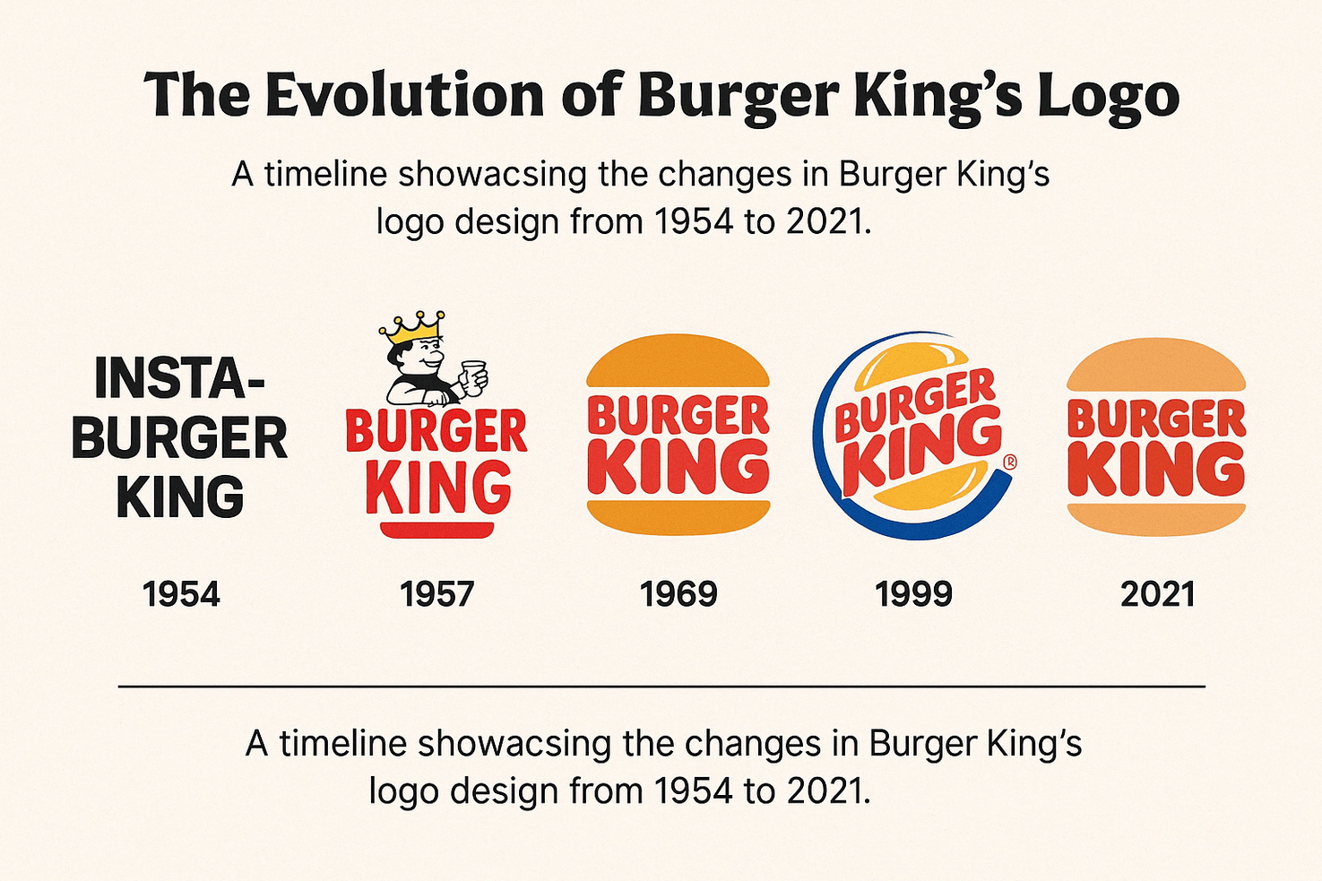
In 1954, the newly launched Insta-Burger King opted for a no-frills logo—basic text in a bold typeface. It reflected speed and simplicity, the two pillars of fast food. The logo wasn’t designed to win awards; it was meant to be seen from afar and remembered quickly.
Pro Tip: Using a modern AI logo generator can help you replicate that clean retro vibe in seconds.
By 1957, the company dropped “Insta” and introduced a crowned burger icon with blocky, assertive text. It was bold, confident, and playfully proclaimed, “We’re not just any burger place—we’re royalty.”
This bare-bones approach suited the era’s no-nonsense diners, but as the company rebranded to Burger King in 1957, the logo needed to grow up. Enter the first hint of personality: a crowned burger graphic paired with bold lettering. It was a nod to royalty, a playful wink that said, “We’re not just any burger joint—we’re the king.”
Color Psychology: Why Red, Yellow, and Blue Rule the Kingdom
If logos are the face of a brand, colors are its emotions. Burger King’s palette—red, yellow, and blue—has been a constant through decades, with tweaks that reflect evolving tastes. Red screams urgency and appetite (think “eat now!”), yellow radiates warmth and optimism, and blue adds a touch of trust and calm.
“Colors aren’t just pretty—they’re psychological triggers,” explains Dr. Lila Chen, a color theorist. “Burger King’s red and yellow combo is like a siren call to your stomach, while blue keeps you from feeling like you’re in a chaotic carnival.”
The 1969 logo, with its iconic bun-encased text, leaned heavily into this trio, wrapping “Burger King” between two golden arcs. It was a visual burger, yes, but also a masterclass in color balance—red letters popped against yellow, grounded by a subtle blue outline. Fast forward to 1994, and the logo got a neon makeover, with brighter hues and a slanted design that screamed ‘90s energy. By 2021, the retro-inspired logo dialed back the intensity, opting for earthy tones that feel nostalgic yet modern.
If you’re creating a brand from scratch, experimenting with color in a free AI logo maker lets you tap into that same psychological advantage without a design degree.
Artistry and Design Patterns: From Diner to Digital
Burger King’s logos have always been a canvas for the era’s design trends. The 1957 crowned burger was cartoonish, hand-drawn charm—think early Disney meets roadside diner. By 1969, the bun design embraced clean lines and symmetry, reflecting the minimalist wave of the late ‘60s. “It was like the logo went from a doodle to a blueprint,” Torres quips.
The 1994 redesign, with its swooshed circle and tilted text, was pure ‘90s bravado—bold, brash, and a bit like a rollerblader trying too hard. But it worked, cementing Burger King’s place in a crowded market. The 2021 logo, however, is a love letter to the past, stripping away the gloss for flat, retro curves inspired by the 1969 original. It’s a nod to logo modernism, where simplicity and authenticity reign supreme.
Design Lesson: “A great logo evolves with culture but never loses its soul,” says Michael Bierut, a legendary designer. Burger King’s ability to balance nostalgia with freshness is a case study in staying relevant. Want to try it yourself? An AI logo generator can help you test minimalist designs that echo this timeless approach.
Controversies: When Logos Stir the Pot
No brand escapes scrutiny, and Burger King’s logo history has its share of raised eyebrows. The 1994 logo, with its aggressive angles and neon vibe, polarized fans. Some loved its in-your-face attitude; others called it a garish departure from the brand’s roots. “It was like the logo was shouting at you to buy a burger,” one Reddit user griped in a 2021 thread.
Then there’s the 2021 redesign, which sparked debates over its simplicity. Critics argued it lacked the punch of its predecessor, while defenders praised its clean elegance. “It’s a logo, not a UN treaty—why the fuss?” Torres laughs. Yet these controversies highlight a truth: logos matter. They’re not just art; they’re battlegrounds for identity and loyalty.
SEO Note: If you’re designing a logo and worried about backlash, best free AI logo creator tools let you iterate quickly, testing designs before they go public.
The Logo’s Role in Defining Eras
Each Burger King logo is a timestamp, capturing the spirit of its time. The 1957 design was post-war optimism, all about family-friendly dining. The 1969 bun logo mirrored the ‘60s push for clarity and efficiency—think Mad Men’s sleek ad campaigns. The ‘90s version was a product of MTV-fueled boldness, while 2021’s retro reboot reflects our craving for authenticity in a digital age.
“It’s like each logo is a Polaroid of the decade,” says Chen. “They don’t just sell burgers—they sell a moment.” This ability to define eras has kept Burger King relevant, even as competitors like McDonald’s leaned into their own iconic arches.
Hashtag History: On X, fans celebrated the 2021 logo with #BurgerKingRedesign, sharing side-by-side comparisons that racked up thousands of likes. It’s proof that logos aren’t just corporate—they’re cultural touchstones.
Symbolism: Crowning the King
What’s a king without a crown? From the start, Burger King’s logos have leaned into royal imagery, a cheeky claim to supremacy. The 1957 burger wore a literal crown, while later designs implied it through bold typography and confident shapes. The 1969 bun design symbolized unity—top and bottom halves cradling the brand name like a perfect burger.
The 2021 logo keeps the crown subtle, letting the bun’s curves and warm colors do the talking. “It’s less ‘we’re the king’ and more ‘you’re welcome in our kingdom,’” Torres notes. This shift reflects a broader trend in branding: inviting customers in rather than shouting from a throne.
Design Anatomy: Break down the 2021 logo, and you’ll find a masterclass in balance—curved lines soften the bold text, while the bun shape nods to the brand’s core product. Want to dissect logos like this? An AI logo generation can help you analyze shapes and symbolism in seconds.
Impact on Society: More Than a Burger
Logos don’t just sell—they shape culture. Burger King’s logo has been a backdrop to countless moments: late-night drive-thru runs, family meals, even viral TikToks of Whopper hacks. It’s a symbol of accessibility, promising a quick, affordable escape from life’s grind. “In a world of chaos, a Burger King logo says, ‘Hey, at least you can get a burger,’” Chen jokes.
The 2021 redesign also tapped into sustainability vibes, with its earthy tones aligning with eco-conscious trends. It’s a small move, but it shows how logos can signal values beyond the product. On X, users praised this shift, with one tweeting, “New BK logo feels like it cares about the planet. Big flex.”
Messaging: Burger King’s logos have always promised one thing: fun. Whether it’s the playful crown or the warm bun, the message is clear—eating here is a treat, not a chore.
Logo Modernism: Less Is More
The 2021 logo is a poster child for logo modernism, where clean lines and simplicity rule. Gone are the gradients and shadows of the ‘90s; in their place are flat shapes and bold confidence. It’s a trend seen in brands like Airbnb and Google, where less clutter equals more impact.
“Modern logos are like a good burger—every ingredient counts, and nothing’s wasted,” Bierut says. Burger King’s latest design nails this, using just enough detail to feel familiar but fresh. For DIY designers, an AI logo generator without watermark can help you embrace this minimalist ethos, creating sleek logos that stand the test of time.

Principles of Logo Design: What Burger King Teaches Us
Burger King’s logo evolution offers a crash course in design principles:
- Clarity: From 1969’s bun to 2021’s curves, the logo is always legible.
- Versatility: Whether on a wrapper or a billboard, it scales beautifully.
- Emotion: Colors and shapes evoke hunger and joy.
- Timelessness: Each redesign builds on the past, never erasing it.
“Designers can learn a lot from Burger King’s restraint,” Torres says. “They don’t reinvent the wheel—they just make it tastier.” Aspiring creators can test these principles with best free AI logo creator tools, tweaking fonts and icons to find that perfect balance.
Brand Identity: The King’s Crown
A logo isn’t just art—it’s identity. Burger King’s logo has been the face of its irreverent, customer-first ethos, from “Have It Your Way” to cheeky ad campaigns. The 1969 bun became synonymous with flame-grilled quality, while 2021’s softer design aligns with a friendlier, inclusive vibe.
“It’s not just a logo—it’s a promise,” Chen says. “You see those buns and know you’re getting a burger that slaps.” This consistency has helped Burger King weather stock price dips (like a 3% drop post-1994 redesign) and rebound with clever branding.
Growth: Since the 2021 logo launch, Burger King’s parent company, Restaurant Brands International, saw stock gains of 15% by mid-2022, partly tied to refreshed brand buzz. Logos aren’t magic, but they’re mighty.
Impact of Technology: From Sketch to Screen
Technology has shaped Burger King’s logos as much as culture. The 1957 design was hand-drawn, limited by print tech. By 1994, digital tools allowed for gradients and 3D effects, giving the logo a futuristic edge. Today, AI logo generation tools and vector software make iteration a breeze—hence 2021’s pixel-perfect simplicity.
“Tech lets brands experiment without breaking the bank,” Torres says. “Burger King likely tested dozens of designs before landing on 2021’s winner.” For small businesses, how to create a logo using AI is a game-changer, offering pro-level results on a budget.
Stock Price and Market Moves
Logos don’t directly move markets, but they signal strategy. The 1994 logo’s bold redesign coincided with aggressive expansion, boosting Burger King’s global footprint but hitting stock volatility. The 2021 refresh, paired with digital ordering upgrades, helped stabilize investor confidence, with shares climbing steadily post-launch.
“It’s not cause-and-effect, but a strong logo can rally the troops—customers and investors alike,” Chen notes. A great logo, like one crafted with an AI logo generation tool, can give startups that same confidence boost.
Wrapping Up: The King’s Lasting Legacy
Burger King’s logo is more than a fast-food emblem—it’s a story of adaptation, wit, and cultural clout. From a scrappy Miami startup to a global giant, its logos have mirrored our cravings, our colors, and our times. Whether you’re a designer dreaming up the next iconic mark or a burger lover craving a Whopper, there’s a lesson here: a great logo doesn’t just sell—it sparks joy.
So, next time you see those golden buns, take a moment to appreciate the artistry. And if you’re inspired to create your own, dive into an AI logo generation without watermark—who knows, maybe you’ll design the next king of logos.
Want to dive deeper into color psychology in branding? Read How Colors Influence Logo Design
Use a free tool for AI logo generation to start exploring. Who knows—you might design the next icon that’s burned into pop culture for generations.
