YouTube Logo From Pixels to Pop Culture Powerhouse
The YouTube logo: so simple, yet so ubiquitous it’s practically a pop culture passport stamp. Whether you’re a late-night cat video connoisseur or a digital creator aiming for internet stardom, you know the play button—instantly recognizable, eternally clickable. But how did this modest design become the symbolic beacon for billions of videos and their billions of views? Let’s decode the YouTube logo’s journey through pixels, proportions, and a few bold redesigns, with a side of clever wit and cultural insight.
Origins of a Digital Icon
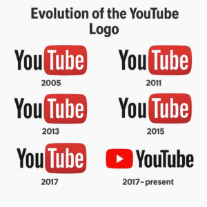
Back in the ancient era of 2005, when streaming video meant waiting for agonizing minutes (bless dial-up), three former PayPal employees—Chad Hurley, Steve Chen, and Jawed Karim—launched a site called YouTube. The original logo? A typographic treatment of “You” in black and “Tube” in a plump, TV-shaped red rectangle, nodding to the cathode-ray ‘tube’ TVs that once dominated living rooms.
The design was retro, playful, and a little bit clunky—yet oddly prescient. It captured a sense of grassroots “broadcast yourself” optimism that defined YouTube’s philosophy: everyone had a channel, and every channel had a chance to be heard. In a world awash with corporate gloss, the YouTube logo brought a touch of approachable DIY charm—and became the visual signal for the video revolution to come.
The Evolution and Redefinition of the Youtube Logo
/

As YouTube boomed, so too did its brand, and its logo needed to keep up. Subtle tweaks arrived over the years—refined edges, polished gradients, and a shift towards cleaner typography. In 2017, the most notable redesign dropped: the play button icon was finally unshackled from the ‘Tube’ text and proudly placed front and center.
Gone was the chunky TV reference; in its place, a minimalist red play button icon—instantly readable, universally understood, and optimized for every tiny app icon on your phone. Meanwhile, the wordmark got a modern makeover: think less ‘pirate broadcast,’ more ‘professional platform.’ The logo became bolder, sleeker, and easier to scale across the proliferating screens of YouTube’s new empire.
This shift reflected both the maturation of the brand and the increasing importance of visual clarity in a crowded digital marketplace.
Symbolism, Simplicity, and Semiotics in the Youtube Logo
Why does the YouTube logo work so well? A lot of it comes down to the hypnotic power of the play button—an emblem as universal as a smiley face or a lightning bolt. Regardless of language, age, or background, everyone knows: red rectangle + white triangle = press here for stuff. That’s semiotics genius.
Red signals urgency, excitement, and invitation—perfect for a platform built on impulses and intrigue. The TV reference is now vintage nostalgia, but the play button is eternally modern, representing action, participation, and engagement. YouTube’s visual identity does what the best logos do: it hints at the product’s purpose, makes you feel something, and stays stuck to your brain like an earworm.
Think of other brands with super-recognizable marks—like Nike’s Swoosh or Apple’s bitten apple (more on that here). YouTube’s logo fits right into this exclusive club of icons that work in any language, on any screen, anywhere on Earth.
Cultural Impact and Icon Status
The true magic of the YouTube logo isn’t just in its geometry—it’s how it became a symbol of our times. ‘YouTube’ is now a verb, and its logo has graced everything from video intros to Halloween costumes, memes, and even protest art. It anchors a brand ecosystem that spawned content creators, viral movements, and occasionally, platform-wide controversies—all while staying instantly recognizable.
Not many brands can say their logo triggers compulsive clicking, but YouTube can. The logo’s pervasiveness in vlogs, tutorials, reaction videos, and parodies has cemented it as a pillar of internet culture. Its adaptability—across desktop, mobile, app, and wearable—proves that true logo greatness looks effortless, even when it’s backed by meticulous design choices.
In short: the YouTube logo didn’t just keep up with the internet; it helped shape how the modern world consumes entertainment and information. It also helped shape the queer generation.
The YouTube logo masterfully navigates the chaotic evolution of internet video. Its trajectory—from a playful, TV-inspired mark to a minimal, universally-understood icon—is a study in effective brand storytelling. The enduring power of the play button, the clever use of color psychology, and the design’s cultural fluency have propelled the logo to near-legendary status. If you’re curious about how other iconic logos evolved to capture the zeitgeist, check out [our deep dives](https://www.logoluv.com/how-the-worlds-most-iconic-brands-transformed-over-time/) and [see what Apple, Nike, Coca-Cola, and more can teach your brand about lasting impact](https://www.logoluv.com/from-bite-to-brilliance-the-evolution-of-apples-logo-and-its-cultural-impact/).
From its TV-shaped roots to its slick play button present, the YouTube logo is a masterclass in staying relevant, simple, and iconic in a fast-changing digital universe. While its look evolved, its message remained direct: hit play and join the global conversation. Not bad for a logo born in a start-up living room. And remember: whether you’re building a brand or chasing the next viral hit, sometimes all you need is a symbol that makes people want to press play.
