🏍️ A Journey Through Design, Symbolism, and Cultural Impact
Introduction
The Harley-Davidson logo is more than just a graphic—it’s a story. For over a century, it has captured the spirit of rebellion, freedom, and brotherhood. But beyond its iconic design lies something deeper: branding wisdom that can guide even today’s creators using a logo generator AI to craft their own identity.
This article dives into the history, meaning, and evolution of the Harley-Davidson logo—and why understanding its structure, symbolism, and staying power is essential for anyone building a logo with modern tools like a logo generator AI.
1. The Birth of the Harley-Davidson Logo (1903–1910)
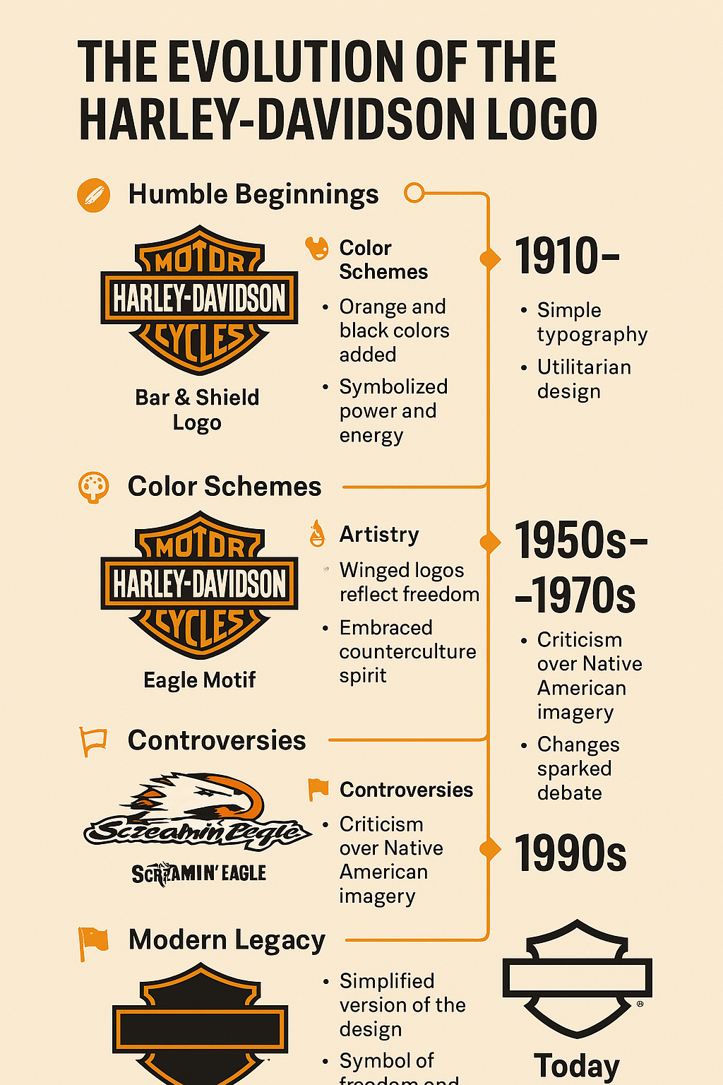
Harley-Davidson was founded in 1903 by William S. Harley and Arthur Davidson, with help from Arthur’s brothers Walter and William, in a modest shed in Milwaukee, Wisconsin. However, it wasn’t until 1910—seven years after the company’s inception—that the first official logo emerged. Known as the “Bar & Shield,” this inaugural design laid the foundation for the brand’s visual identity.
The first official Harley-Davidson logo emerged in 1910: the Bar & Shield. It featured a horizontal bar with the words “Harley-Davidson” overlaid on a shield, symbolizing protection and strength. The original logo was strikingly simple: a shield-shaped background with a horizontal bar running across it, bearing the words “Harley-Davidson” in bold, uppercase letters. The shield was metallic in tone, reflecting the industrial ethos of the early 20th century, while the bar resembled a license plate—a practical choice given the limited tools available for branding vehicles at the time. Patented in 1911, this design was born out of necessity and functionality, yet it carried an inherent strength that resonated with the rugged spirit of motorcycling.
Key Features:
- Font: Bold, all-uppercase serif type.
- Color: Monochrome—typically black on white or metallic surfaces.
- Style: Industrial, practical, and legible—reflecting the utilitarian era.
Though primitive, this version laid the foundation for what would become one of the most iconic logos in corporate history. Even the most advanced logo generator AI platforms today often recreate this kind of simplicity to ensure brand clarity.
2. The Role of Color in Branding (1910–1950)
Color has played a pivotal role in the Harley-Davidson logo’s evolution, shaping its aesthetic and emotional resonance. The original 1910 design was monochrome, relying on shades of black, white, and gray to convey a utilitarian vibe. This simplicity suited the era’s manufacturing constraints and mirrored the no-nonsense attitude of early riders.
1933: The Iconic Orange and Black
Over the years, the color palette has seen variations. The 1953 50th-anniversary logo incorporated silver, reflecting a celebratory milestone, while the 1965 redesign returned to a stark black-and-white scheme for a modern twist. Today, the logo often blends orange, black, and white, though a minimalist gray-and-black version emerged in 2019, signaling a shift toward contemporary simplicity. These color choices have not only defined the logo’s visual identity but also reinforced Harley-Davidson’s brand personality across generations. The first major color evolution happened in 1933, when Harley adopted orange and black. This bold move signified:
- Orange: Vitality, adventure, and energy.
- Black: Power, rebellion, and sophistication.
This palette reflected the dual personality of the brand—rugged but refined. Over time, the color scheme became as recognizable as the shield itself. Together, these colors are now a model of bold branding—replicated frequently in color palette tools inside a logo generator AI.
In fact, many logo generator free tools today offer pre-set palettes for emotions like power, excitement, or nostalgia—and Harley’s choices still serve as a gold standard.
3. The Artistry of Evolution: From Industrial to Iconic
The 1930s–50s
In the post-Great Depression era, Harley leaned more heavily into patriotism and freedom themes. The addition of eagles, wings, and chrome mirrored the aspirations of the American working class. The artistry of the Harley-Davidson logo lies in its ability to balance simplicity with sophistication. The “Bar & Shield” design is a masterclass in minimalist branding—clean lines and geometric shapes that convey strength without clutter. Early iterations used a traditional, blocky font, evoking a sense of solidity, while later versions introduced custom typography with sharper, more confident lines.
The “Willie G Skull”
Though not an official logo, the “Willie G Skull” design (often attributed to Willie G. Davidson) became a defining part of Harley’s visual ecosystem—especially among custom bike enthusiasts.
Today, modern logo generator AI with prompt tools can recreate similar gritty, countercultural motifs in seconds, proving how far visual tech has come.
4. Controversies: When Logos Make Noise
Trademark Fights
Harley-Davidson aggressively protects its brand. The company has sued numerous vendors and apparel shops for unauthorized use of the Bar & Shield.
Cultural Backlash
In the 1990s and 2000s, Harley faced criticism for designs that leaned on Native American imagery (e.g., the “Screaming Eagle”). While intended to honor heritage, critics accused the company of cultural appropriation.
Design Risk: The 2019 Textless Version
Harley released a textless version of the logo—just the shield and bar shape. While sleek and modern, some loyalists felt it diluted the logo’s history.
5. How the Logo Reflected Cultural Eras
Every version of the Harley-Davidson logo tells a story—not just of the brand, but of America.
Era Breakdown:
1910s–1930s:
- Industrial America, war support
- Logos were simple and mechanical
1940s–50s:
- Post-WWII resurgence
- Patriotism, chrome aesthetics
1960s–70s:
- The counterculture movement
- Skull logos, “Live to Ride” slogans
1980s–90s:
- Expansion into fashion and lifestyle
- Greater use of wings and typography play
2000s–Present:
- Anniversary editions (e.g., 100th in 2003)
- Shift to minimalism and digital-ready designs
Even if you’re building a brand today with a logo generator from image or text prompt, the importance of aligning with cultural relevance cannot be overstated.
6. Anatomy of the Modern Harley-Davidson Logo
Let’s break it down:
| Element | Meaning |
|---|---|
| Bar | Strength and backbone of the brand |
| Shield | Protection, legacy, tradition |
| Typography | Uppercase serif fonts = stability + power |
| Color | Black and orange = rebellion + energy |
| Negative Space | Smart visual balance and attention |
This level of detail shows that even a minimalist design, when done right, can pack emotional and symbolic weight.
7. Societal Impact: From Subculture to Global Status
Subcultures
The Harley-Davidson logo became a badge of rebellion, embraced by:
- Outlaw biker gangs
- Counterculture youth
- Military veterans
Pop Culture
It featured prominently in films like:
- Easy Rider (1969)
- The Wild One (1953)
- Terminator 2 (1991)
Fashion & Merch
Designers like John Varvatos created collections using the logo. It appears on everything from rings to refrigerators—proof of branding scalability.
In the world of modern branding, if your logo can appear on leather jackets, coffee mugs, and iPhone screens without losing power—you’ve won. And yes, even logo generator Canva templates aspire to this level of versatility.
8. Messaging Through the Logo
The Harley-Davidson logo sends a consistent, powerful message:
- Freedom
- Endurance
- Boldness
- Brotherhood
Even when reduced to the shape alone (no text), the logo maintains its voice. This is the pinnacle of brand communication.
9. Hashtag History & Digital Presence
Harley’s logo dominates on social media, where it appears as:
- Tattoos (#HarleyTattoo)
- Bike mods (#BarAndShield)
- Fashion tags (#HarleyStyle)
- Brand campaigns (#ScrewItLetsRide, #LiveYourLegend)
If you’re working with a logo generator for YouTube or social, keep this in mind: your logo must shrink and still speak.
10. Design Lessons from the Harley-Davidson Logo
Here’s what every brand or designer (AI-generated or not) can learn from this logo:
Simplicity Wins
The shield and bar format is easy to reproduce and remember. Don’t overcomplicate.
Stick with Core Symbols
Eagles. Shields. Bars. These remain even as everything else changes.
Adapt with the Era
Harley has walked the line between traditional and trendy—adding elements like chrome, skulls, and wings without losing its core.
Consistency + Flexibility
Retain the essence, but iterate when needed. A key for both heritage brands and new startups.
11. The Future of the Harley-Davidson Logo
As Harley moves into the electric bike space (LiveWire), its logo will face new tests:
🌱 Eco-Friendly Identity
Expect possible green accents, simplified shields, or energy-based metaphors.
📱 Digital Optimization
Icons, favicons, app logos, and motion graphics will require scalable and responsive versions.
🤖 AI Integration
The logo may evolve with personalized experiences, adapting colors or overlays in digital dashboards or smart helmets.
Conclusion: The Logo That Roars Across Generations
The Harley-Davidson logo is a design masterclass—a blueprint for timeless branding. Its history is a living document of design evolution, American ideals, and emotional resonance. A Logo That Roars Through Time
The Harley-Davidson logo is more than a corporate emblem—it’s a cultural artifact that has evolved with the brand and society. From its 1910 birth to its minimalist 2019 iteration, it has navigated color shifts, artistic innovations, and controversies while defining eras and imparting design lessons. Its symbolism and societal impact have made it a global icon, its anatomy a study in balance, and its messaging a call to the open road.
From factory stamping to fashion runways, from outlaw culture to electric innovation, this logo has done it all—and continues to inspire brand builders around the globe.
As AI-powered tools and logo generator AI free download platforms rise, Harley reminds us that true branding is human at heart. It’s about emotion, identity, and story. And that’s something no algorithm can replicate—at least not yet.
✨ Want a logo that captures legacy and emotion?
Try our free logo generator AI tool to start crafting your own iconic mark.
Explore how to create a timeless brand identity by checking out our in-depth look at the evolution of the Coca-Cola logo—another legendary design that proves the power of visual storytelling.