**How the Wendy’s Logo Was Born**
If you’ve ever driven by a Wendy’s restaurant and caught a glimpse of the bright, cheerful redhead smiling down from the sign, you’ve witnessed fast food history. The Wendy’s logo isn’t just a quirky drawing to fill space—the story of its creation is as rich and layered as the burgers inside. Let’s take a deep dive into how one of America’s most beloved logos made its way from idea to icon, and discover why it still tugs at our nostalgic heartstrings today.
It all starts with Dave Thomas, the legendary founder of Wendy’s and a man with a no-nonsense love for good food and real people. In 1969, Dave was on a mission. He wanted to open a burger joint that focused on quality and wholesome service. But he also wanted the place to feel welcoming—a place where families could gather and feel at home.
The name for this new restaurant wasn’t going to come from a corporate brainstorming session or a marketing agency. It came from Dave’s heart. He named it “Wendy’s” after his own daughter, Melinda Lou Thomas. “Wendy” was her nickname, given to her when she was a little girl because her younger siblings couldn’t pronounce “Melinda.” There’s something beautifully simple about that family connection. Dave wanted his customers to feel like they were being invited to sit at his family table.
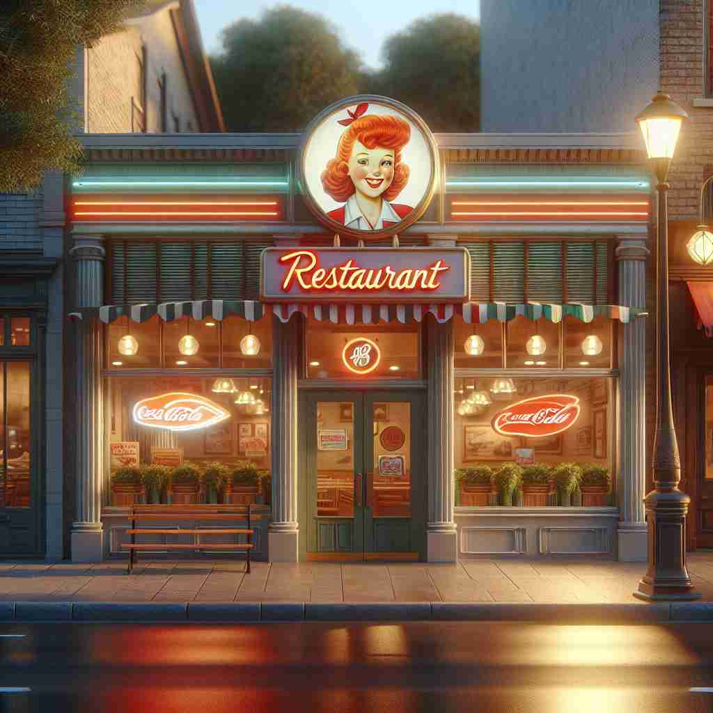
But Dave didn’t stop at the name. He put his daughter right on the sign. This wasn’t just any corporate mascot—it was a real kid, with real charm. Wendy appeared sporting the iconic red pigtails, a broad, friendly grin, and a blue-and-white striped dress. Every detail of the logo was lovingly considered.
Why red pigtails? For one thing, the look was instantly memorable and cheerful. It suggested playfulness and innocence. It hinted at fun. But more than that, it actually matched how Wendy looked in real life. That adorable freckled face looked out from signs across Ohio and soon, the world. Dave’s choice of image sent a clear message: This wasn’t a faceless chain. This was Dave’s place, where his family’s spirit lived on the walls.
The dress is just as important. Blue and white were clean, friendly, and fresh—a nod to good old-fashioned American values. Wendy’s dress even pops with frilly lace on the collar and puffed sleeves. There’s a sense of old-timey charm. People saw it and thought of birthday parties at grandma’s, church socials, or summer picnics in the park. It was a familiar, comforting look—one that made families smile.
But why these details, and why did they matter so much? For Dave Thomas, family was everything. He himself had a tough childhood, bouncing from one adoptive home to another. He longed to give people something he hadn’t always had: stability, togetherness, a sense of home. The Wendy’s logo was a living invitation. It said: “This is a place you can trust. We’re a family, and you’re welcome here.” That authenticity was radical in the fast food world.
Back in the 1960s and 70s, fast food giants were already planting golden arches and spinning crowns on every block. These brands felt big, loud, and a bit impersonal. Wendy’s, with its sweet-faced little girl, felt smaller and more genuine. It was homemade chili, not just fries. Hand-cut lettuce, not just limp iceberg. The logo was bright, warm, and a gentle nudge back to simpler times.
The nostalgia factor is key, too. The Wendy’s logo reminded people of childhood innocence, of times when things moved slower and smiles came easy. The design felt as if it could have been lifted from a classic children’s book. When parents saw the sign, they didn’t just think about burgers—they thought about baking cookies with their kids, or tucking them in at night. It forged a connection not many logos could claim.
And here’s a fun fact: If you look closely at the collar in the Wendy’s logo, you’ll spot the word “MOM” hidden in the ruffles. While this was never an intentional original detail, fans have drawn meaning from it—proof of the logo’s layered storytelling power and how deeply people look for family behind those smiling eyes.
So how did the public react when Wendy’s first opened in Columbus, Ohio in 1969? The response was ever-so-sweet. Locals were charmed by the sign’s friendly face, and word quickly spread that Wendy’s was a place with heart. As more locations rolled out, people wanted to know: Who’s the girl? Is she real? The story of Wendy, the daughter behind the burger, became part of the brand’s legend. Customers felt welcomed—not by a corporate mascot, but by real people.
This friendly, hand-crafted image helped Wendy’s carve out a unique place in the burger universe. The logo’s sincerity was unmistakable. In an industry that sometimes favored flappy birds or grinning clowns, Wendy’s gave us a face we could trust. Other fast food brands marketed happiness and fun—Wendy’s marketed family and belonging.
The logo’s staying power has been nothing short of remarkable. Though Wendy’s has updated its look in recent years, adding cleaner lines and modern fonts, the heart of the logo remains unchanged. Wendy—Dave’s daughter, and not just a face in a focus group—still beams with those unmistakable red pigtails and wholesome smile.
In the end, the Wendy’s logo wasn’t born in a boardroom. It was born at a kitchen table, among family, with laughter and love. From Dave Thomas’s simple wish to share what mattered most to him—family, authenticity, and good food—came one of the most recognizable and beloved brand icons anywhere. That’s how the Wendy’s logo was born, and why it still feels like home, every time we see it.
So next time you spot those bright red pigtails, remember: you’re glimpsing a bit of real family history. And maybe, just maybe, you’ll crave more than just a burger—you’ll crave a place where everyone belongs.