Secrets, Symbolism, and Next-Gen Logo Lessons
The Golden State Warriors are more than just a dynasty—they are a masterclass in sports branding, visually captivating generations with their sleek logo. Discover how the Warriors’ emblem, steeped in California pride, color psychology, and clever design decisions, has set a gold standard. This journey explores how their iconic logo inspires both fans and aspiring logo makers everywhere.
From the Bay to Immortality The Birth and Reinvention of the Warriors Logo
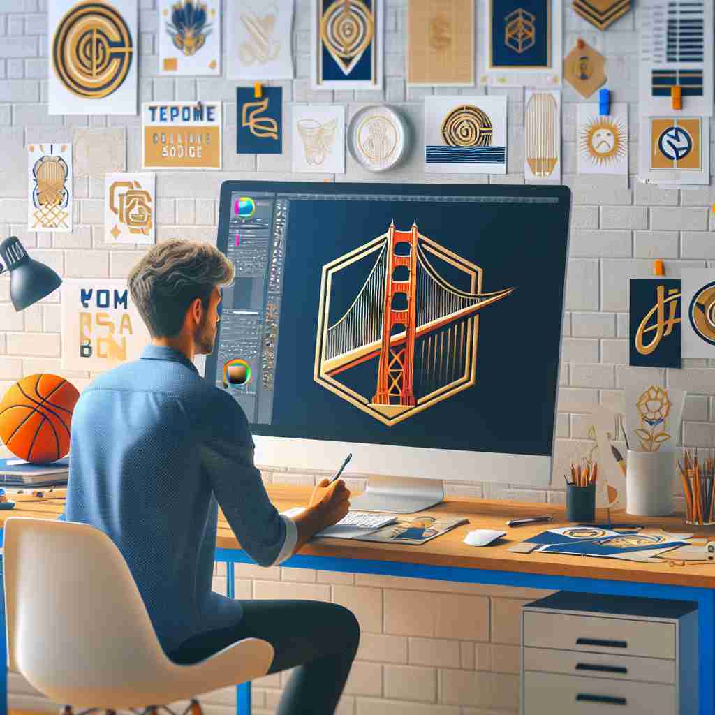
Since their West Coast relocation, the Golden State Warriors have reinvented not only their team but also the iconography that represents them—none more so than the famed logo. Originally evoking Native American themes when the franchise began as the Philadelphia Warriors, the earliest logos reflected the era’s limited understanding of cultural sensitivity. Fast-forward to the San Francisco move: suddenly, the logo spotlighted the Golden Gate Bridge, a masterstroke of regional pride. Why the bridge? It’s a motif anyone can spot from a mile away—bold, architectural, and emblematic of connection and journey, both fitting metaphors for a franchise always moving forward. Their most recent badge masterfully recycles the bridge in a clean, modern vector style, emphasizing clarity and versatility. For a logo maker, it’s a textbook lesson: ground your mark in an immediately recognizable local treasure, and your brand instantly feels rooted and relatable. Alongside the visual reinventions came name changes that sharpened brand focus: from “San Francisco” to “Golden State,” the team’s identity broadened from one city to stand for an entire region. That subtle shift made the bridge, which physically connects communities, a fitting logo centerpiece for a franchise aspiring to unite generations of fans. This interplay between geographic symbolism and graphic minimalism exemplifies how the Warriors’ branding team has constantly straddled heritage and hype—the gold standard (quite literally) for logo makers everywhere. Read more about historic logo makeovers at [How the World’s Most Iconic Brands Transformed Over Time](https://www.logoluv.com/how-the-worlds-most-iconic-brands-transformed-over-time).
Color Psychology Champion Blue, Gold, and the Language of Visual Identity
Palette is never an afterthought—it’s emotional architecture. The Warriors have long since dropped bland reds and clunky text, now riding to victory on bursts of rich blue and gold. Why these colors? Blue is trust, reliability, and unity. Gold, meanwhile, exudes excellence, achievement, and positivity. For a logo maker, this palette is a dream: blue roots your brand in credibility, while gold gives it star power. The Warriors’ designers use blue for stability (echoing the Bay’s water and the sky overhead), while gold is their bold, shining promise. But nuance lurks in the details: modern iterations fine-tune the exact gold shade, balancing warmth against readability and pop for digital screens. When the logo pops up on jerseys, merchandise, or a smartphone background, it’s instantly familiar—proof that consistent hues build unbreakable brand ties. Color choice is about more than looking good. It’s about feeling right—and the Warriors have aced that test. Dive deeper into effective color strategies with [Logo Maker Color Psychology](https://www.logoluv.com/logo-maker-color-psychology-logos/).
Modernism, Minimalism, and Digital Age Branding Lessons
The Warriors’ logo journey mirrors trends that every smart logo maker should watch. The earlier, detail-heavy logos—full of intricate lines and visual ‘noise’—have given way to streamlined, digital-ready design. Today’s version, debuting with their arena move in the 2010s, is stripped down yet full of intent: bold lines, clean shapes, and negative space elevating the iconic bridge. This adaptive minimalism makes the logo clear whether it appears stitched on a jersey, cast in a mural, or squeezed into a Twitter avatar. In the age where first impressions are made on mobile screens, flexibility is everything. Their designers also embraced scalable vector graphics early: no pixel lost, no message diluted. For creators using AI logo generators—a rising force in the logo maker world—the Warriors prove that less truly is more, and that a memorable shape trumpets identity better than ornate ornamentation. Inspired by the Warriors? Check out how AI powers logo ideation at [AI Logo Generation](https://www.logoluv.com/ai-logo-generation/).
Innovation, Technology, and How to Make Your Own Legendary Logo
If there’s a secret sauce to Warriors-branded greatness, it is adaptation. The franchise’s designers are not afraid to embrace new technology—AI-assisted logo generators and digital design tools have become indispensable. For aspiring logo makers, the message is clear: Use technological advancements as a springboard, not a shortcut. Want a Warriors-worthy logo? Start with a unique narrative: whether it is your city’s landmark, your personal symbolism, or just an audacious choice of colors. Test variations using online logo makers, then refine with feedback and iterations. Use vector-based AI tools to ensure scalability, and always preview your logo in real-world settings—from merchandise to mobile icons. For fun, imagine harnessing a free AI logo generator without a watermark. The results might surprise you: logos only stand out when they nail simplicity, meaning, and adaptability. Master more tips on AI-driven design with [AI Logo Generator Free Without Watermark](https://www.logoluv.com/ai-logo-generator-free-without-watermark/). In the digital age, inspiration is everywhere. Let the Warriors’ golden legacy embolden your next creative leap.
The Golden State Warriors’ logo is a powerful blend of heritage, artistry, and future-ready design. Aspiring logo makers can draw inspiration from its evolution, color strategy, and resonance in both digital and real worlds. Success comes from knowing your audience, embracing innovation, and never underestimating the power of a well-crafted visual identity.