Introduction
When you think of NASA, what comes to mind? Astronauts floating in zero gravity, rockets piercing the heavens—or perhaps that iconic logo, a swirl of stars and ambition. But did you know NASA’s branding journey offers valuable lessons for anyone trying to design a memorable logo—even with an AI logo generator free of watermarks? Over its 65-year history, NASA’s logo has evolved from the intricate “meatball” to the sleek “worm,” mirroring the agency’s mission, identity, and the very principles of great design. In this 2,500-word exploration, we’ll unpack the artistry, symbolism, and strategy behind NASA’s logos—and how modern tools like AI-driven logo generators can help you craft a brand just as timeless.
The Birth of NASA’s Logo: A Stellar Start
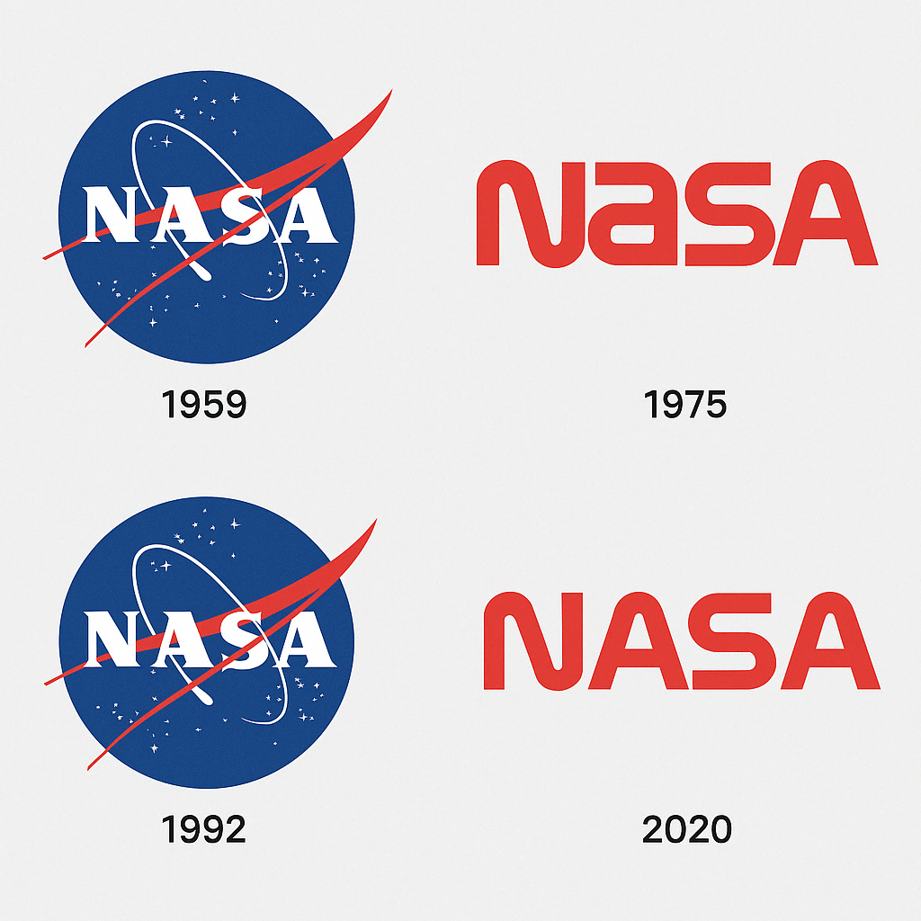
In 1958, the National Aeronautics and Space Administration (NASA) was born amid the Cold War’s space race. A year later, employee James Modarelli, an artist-engineer, crafted the agency’s first logo: the “meatball.” This wasn’t a casual doodle but a deliberate design packed with symbolism. Picture a blue sphere (a planet), a red chevron wing (aeronautics), a white orbit (space travel), and stars speckling the void. It was bold, busy, and brimming with optimism.
“The meatball was NASA saying, ‘We’re here to conquer the cosmos,’” says design historian Emily Gee. “It was a badge for a new era.” But complexity had its drawbacks—reproducing it on uniforms or documents was a nightmare. By 1975, NASA sought a sleeker alternative, hiring Danne & Blackburn to create the “worm”—a minimalist, red, futuristic logotype. The shift sparked debate, but more on that later.
Pro tip: Want a logo with impact? Modern AI logo generators can simplify your vision, much like NASA streamlined its identity with the worm.
Artistry and Design Patterns: Meatball vs. Worm
The meatball and worm represent opposite poles of design philosophy. The meatball was illustrative, almost baroque, with its layered elements. “It’s like a Renaissance painting for the space age,” quips designer Paula Scher. Every curve and star told a story, but it demanded attention—and patience—to decipher.
Enter the worm in 1975: a red, sans-serif logotype that screamed modernity. Its clean lines and single-color palette were a nod to the digital age. “The worm was NASA’s moon landing in typography,” says branding expert David Airey. It was scalable, reproducible, and effortlessly cool—perfect for the Apollo era’s swagger.
But by 1992, NASA reverted to the meatball, a move driven by nostalgia and public affection. The worm, though efficient, lacked the meatball’s warmth. This tug-of-war between complexity and simplicity mirrors broader principles of logo design:
- Clarity: A logo should communicate instantly.
- Adaptability: It must work across mediums.
- Emotion: It should feel human, not sterile.
SEO Keyword: Inspired by NASA’s bold designs? Use an AI logo generator without watermark to craft a logo that balances artistry and function.
Color Psychology: Painting the Cosmos
Colors aren’t just aesthetics—they’re emotions. The meatball’s blue sphere evokes trust and infinity, grounding NASA’s cosmic ambition. The red chevron bursts with energy, a nod to urgency and innovation. White stars on a dark field? Pure aspiration. “It’s a palette that says, ‘We’re serious but dreaming big,’” says color theorist Leatrice Eiseman.
The worm, by contrast, went all-in on red—a daring choice. Red is passion, power, and progress, aligning with NASA’s push into the shuttle era. But it risked aggression, which some felt clashed with NASA’s scientific ethos. When the meatball returned, its balanced palette restored calm authority.
SEO Tip: Colors shape perception. Experiment with best free AI logo creator tools to find hues that resonate, just as NASA’s logos did.

Controversies: A Logo War in Orbit
NASA’s logo history isn’t without drama. The worm’s 1975 debut was a lightning rod. Purists loved the meatball’s richness; modernists championed the worm’s clarity. “It was like choosing between Shakespeare and Hemingway,” jokes historian Roger Launius. NASA administrator James Fletcher reportedly called the worm “too corporate,” while others saw it as a fresh start post-Apollo.
The worm’s retirement in 1992 didn’t end the saga. In 2020, its revival on a SpaceX Falcon 9 rocket ignited X posts with hashtags like #TheWormIsBack. Some fans cheered its retro-futurism; others grumbled it diluted NASA’s heritage. “Logos are emotional landmines,” says branding guru Marty Neumeier. “Change them, and you’re asking for a fight.”
The Logo’s Role in Defining Eras
NASA’s logos mark distinct chapters:
- 1959-1975 (Meatball): The dawn of space exploration, from Mercury to Apollo.
- 1975-1992 (Worm): The shuttle era, emphasizing efficiency and progress.
- 1992-Present (Meatball): A return to legacy, embracing global collaboration.
Each shift reflected NASA’s priorities. The meatball’s complexity suited the audacious ’60s; the worm’s sleekness fit the tech-driven ’80s. Today’s meatball evokes timeless ambition, anchoring missions like Artemis. “The logo is NASA’s North Star,” says Gee. “It guides how we see the agency.”
Symbolism: A Cosmic Narrative
Why a sphere, wing, and orbit? The meatball’s elements are a visual manifesto. The sphere is Earth—or any planet we might reach. The chevron wing nods to NASA’s aeronautics roots, while the orbit loops toward infinity. Stars? They’re humanity’s dreams, twinkling in the void.
The worm, though abstract, carries its own weight. Its flowing letters suggest motion, like a rocket’s arc. “It’s a logo that moves,” says Airey. Both designs distill NASA’s mission: to explore, to connect, to inspire.
Impact on Society: A Logo That Launched Dreams
Today, both logos fuel hashtags like #NASAmeatball and #NASAlogo, with fans sharing fan art, memes, and tattoos. Posts on X in 2023 showed the worm on merch, patches, and even sneakers, proving its enduring cool. “NASA’s logo is a permission slip to wonder,” says Turkle.
Logo Modernism: NASA’s Design Legacy
NASA’s logos embody logo modernism—a design movement rooted in clarity, minimalism, and timeless appeal. The meatball, while intricate, uses geometry to convey purpose. The worm? Pure Bauhaus—a study in restraint and elegance.
“Nobody thought a government agency could be so stylish,” says designer Michael Bierut. “NASA’s worm looked like it belonged on a tech startup in 2025, not a rocket in 1975.” This futuristic approach inspired design revolutions at IBM, NASA spin-offs, and even modern AI logo generator templates.
Design Lessons: What NASA Teaches Us
NASA’s logo evolution offers real-world branding insights:
- Balance Meaning and Simplicity: Don’t sacrifice storytelling for style.
- Adapt to Mission, Not Trend: Design should evolve with purpose.
- Invite Emotion, Not Just Approval: Great logos ignite conversation.
“NASA proves logos aren’t just art—they’re strategy,” says branding expert Debbie Millman. Today, the best free AI logo creator tools allow anyone to apply these principles—no space agency required.
Brand Identity: NASA’s Cosmic Calling Card
NASA’s logo is its brand identity distilled. The meatball says heritage, ambition, and trust—perfect for an agency reliant on public support. The worm screamed innovation, aligning with the tech boom. “The logo is NASA’s handshake with the world,” says Neumeier.
This consistency helped NASA navigate budget cuts (like 1980s slashes) and tragedies (Challenger, Columbia). Even when funding dipped—say, 2011’s $18 billion vs. 1966’s $43 billion (adjusted)—the logo remained a rallying cry.
SEO Keyword: Building a brand? Use an AI logo generator to forge an identity as strong as NASA’s.
Design Anatomy: Dissecting the Icons
Let’s zoom in:
- Meatball:
- Sphere: A perfect circle, symbolizing unity.
- Chevron: Angled for dynamism, softened by curves.
- Orbit: A swoop that feels alive, not static.
- Worm:
- Typography: Custom, fluid, with letters merging like a spacecraft’s path.
- Red: Uniform, unrelenting, modern.
“Every line is a choice,” says Danne. These choices inspire logo maker platforms to prioritize precision.
Messaging: Silent but Loud
NASA’s logos speak without words. The meatball whispers, “We’re explorers, rooted in science.” The worm shouts, “We’re pushing limits.” Both say, “Trust us.” “A logo’s silence is its power,” says ad legend Lee Clow. NASA’s designs prove it.
SEO Tip: Craft a logo that speaks volumes. An AI logo generator can help you find that voice.
Hashtag History: NASA’s Digital Orbit
NASA’s logos thrive online. #NASALogo trends regularly, with 2024 X posts showcasing meatball tattoos and worm-inspired art. The worm’s 2020 revival sparked #TheWormIsBack, with users debating its vibe. “It’s a logo that lives on screens,” says digital strategist Amy Webb.
Growth and Impact of Technology
Technology shaped NASA’s logos. The meatball struggled with 1960s printing limits; the worm embraced digital precision. Today’s meatball shines on 4K screens, proving adaptability. AI logo generators owe a debt to this scalability, offering designs that flex across platforms.
Controversies and Stock Price: A Grounded Note
NASA isn’t a corporation, so no stock price swings here. But its logos reflect fiscal realities. The worm’s debut coincided with tight budgets, prioritizing cost-effective branding. The meatball’s return signaled confidence in NASA’s legacy, despite funding ebbs (2024’s $25 billion vs. peak Apollo years).
Conclusion: A Logo That Reaches for the Stars
From meatball to worm and back, NASA’s logo is a cosmic journey. It’s a testament to design’s power to inspire, unite, and endure. Whether you’re sketching with a logo maker or dreaming of the stars, NASA’s logos remind us: simplicity, symbolism, and story can take you far.
So, next time you spot that blue sphere or red curve, pause. It’s not just a logo—it’s humanity’s ticket to the unknown.
Ready to launch your own iconic logo? Discover how to create a logo using AI with best free AI logo creator tools and start your brand’s adventure today.
